Treating chronic pain with Aivo
Professor Vania Apkarian has led every major advance in brain imaging of chronic pain. Based on those advances, Aivo is a platform for recovering from chronic pain. We worked closely with the Aivo team to develop a brand that is human and friendly, but also has the scientific robustness and credibility backed by research.

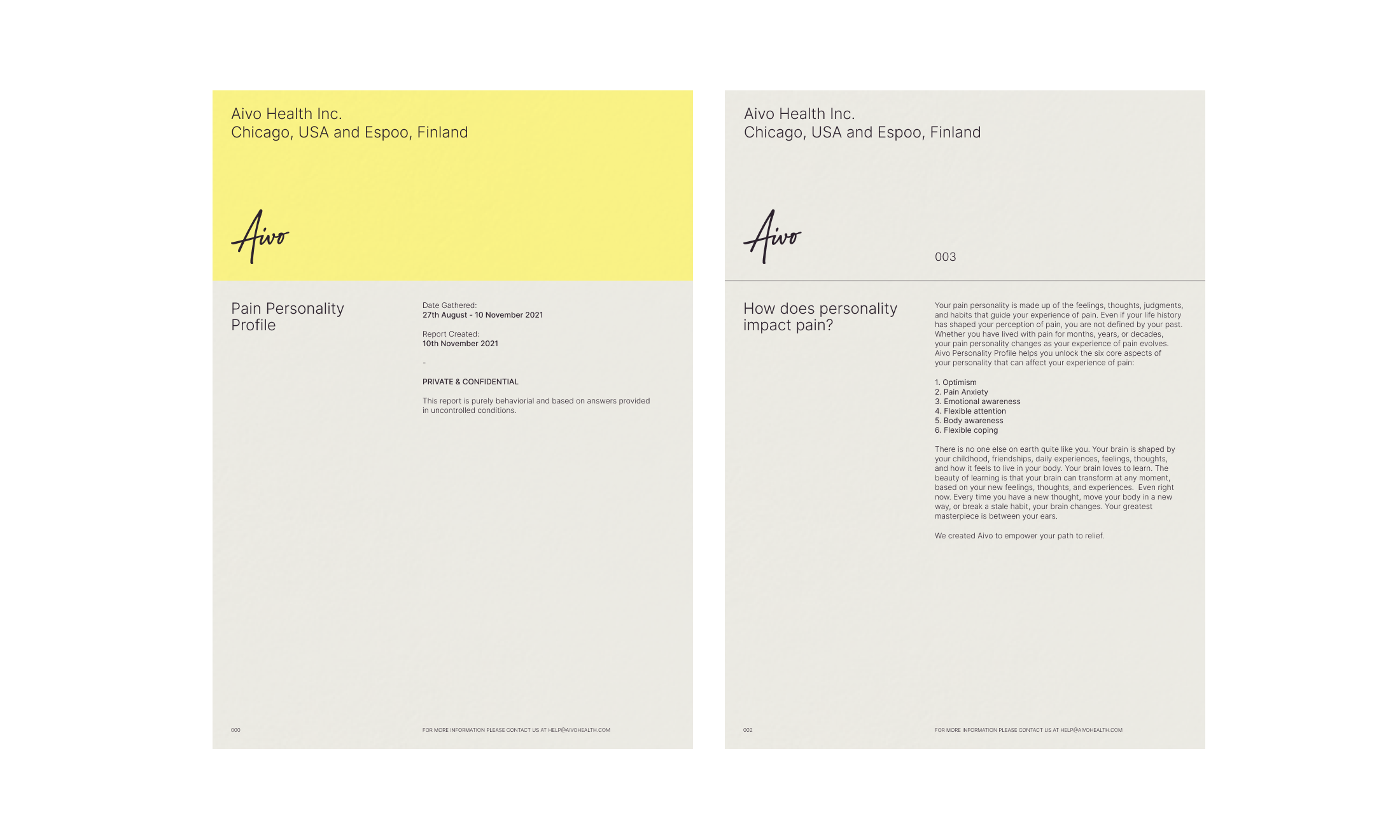
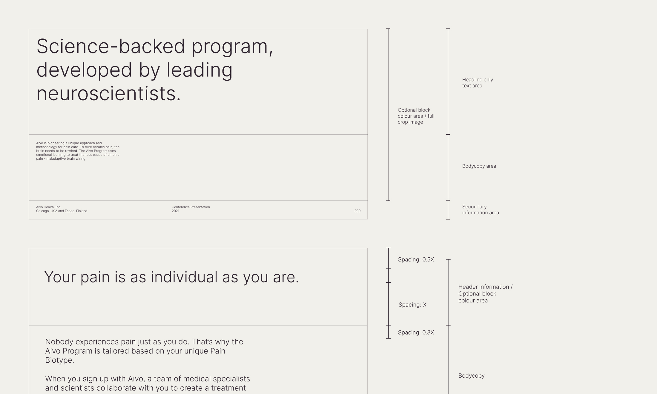
Aivo is a scientifically proven method for reversing chronic pain. Based on the work of neuroscientist, Professor Vania Apkarian, Proxy developed a brand that is both human and scientifically trustworthy. The new brand identity is an unexpected combination of grid-based, functional typography with a handwritten word mark and friendly, approachable illustrations.
Pain is a deeply personal, unpleasant topic to discuss. As we explored various approaches to a logotype, we found that a human signature had the warmth and reassurance we wanted to communicate with the Aivo brand.
We worked with lettering artist Rob Clarke to develop the final form of the logotype. With an upwards movement and an appearance of written ink, the final logotype takes a differentiated, reassuringly relevant form.
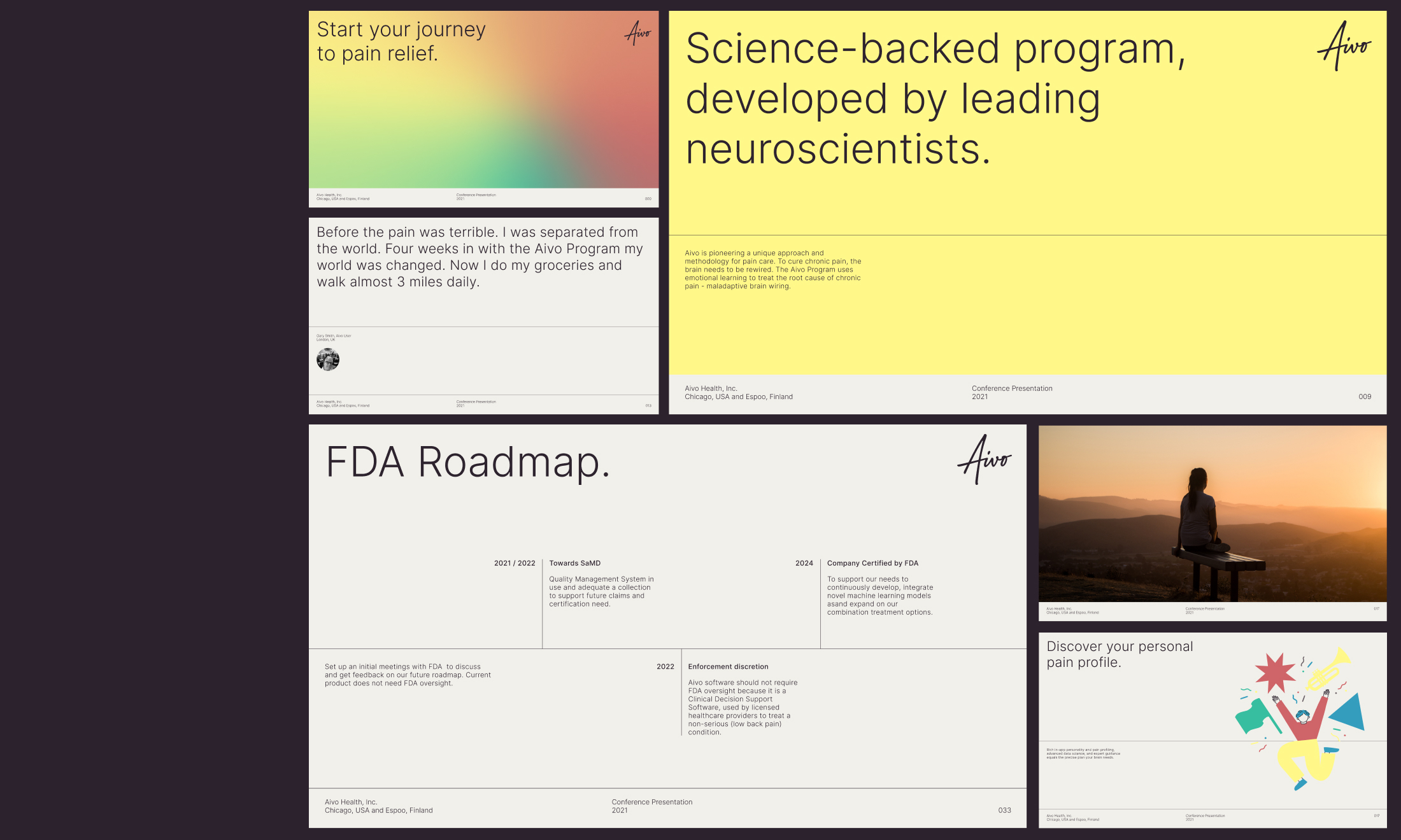
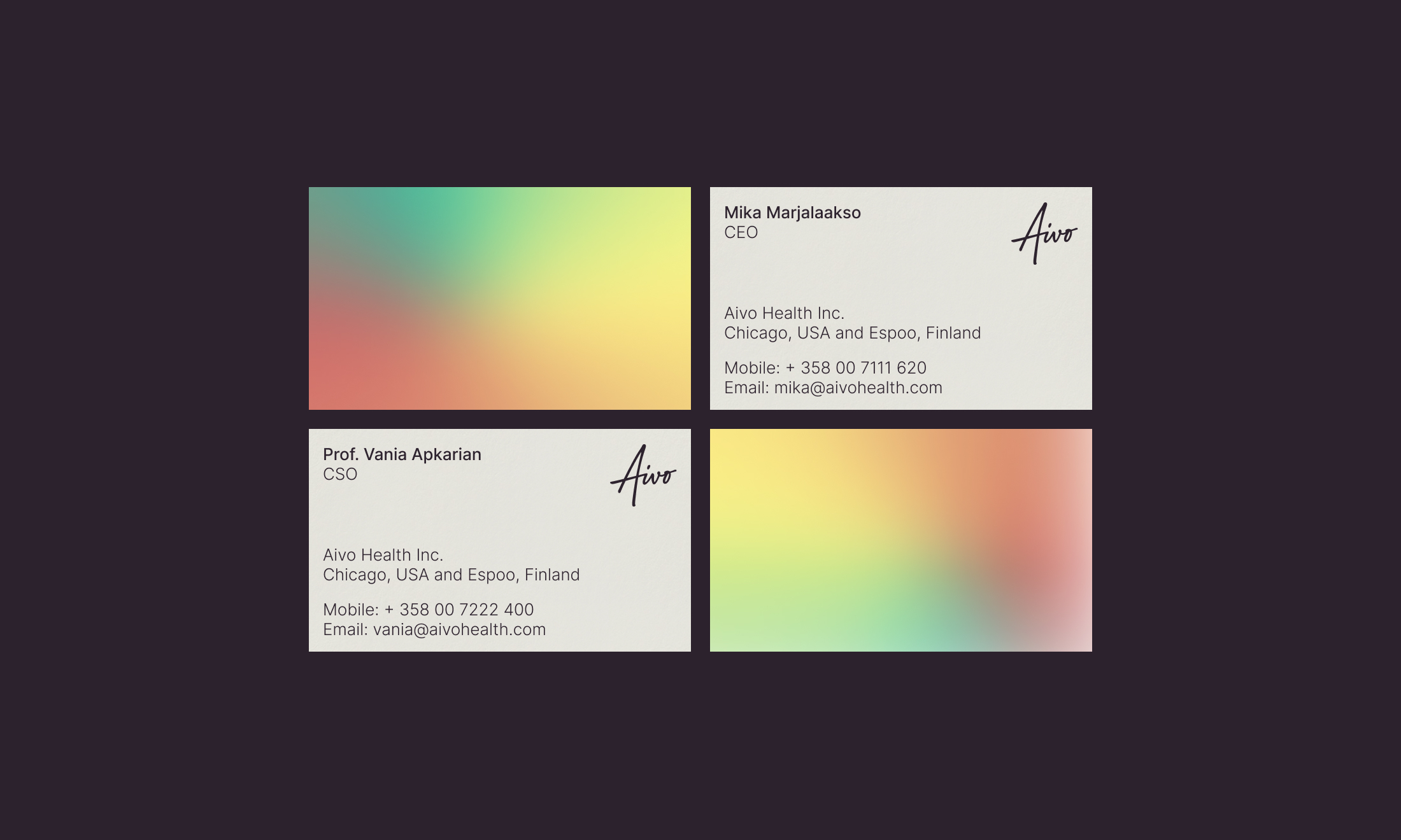
The dynamic, warm colour way is inspired by the patterns of pain signals travelling through the brain. With Aivo, sharp pain gives way to a pain free, optimistic existence. The gradient colour way was given a subtle animation, illustrating the journey.

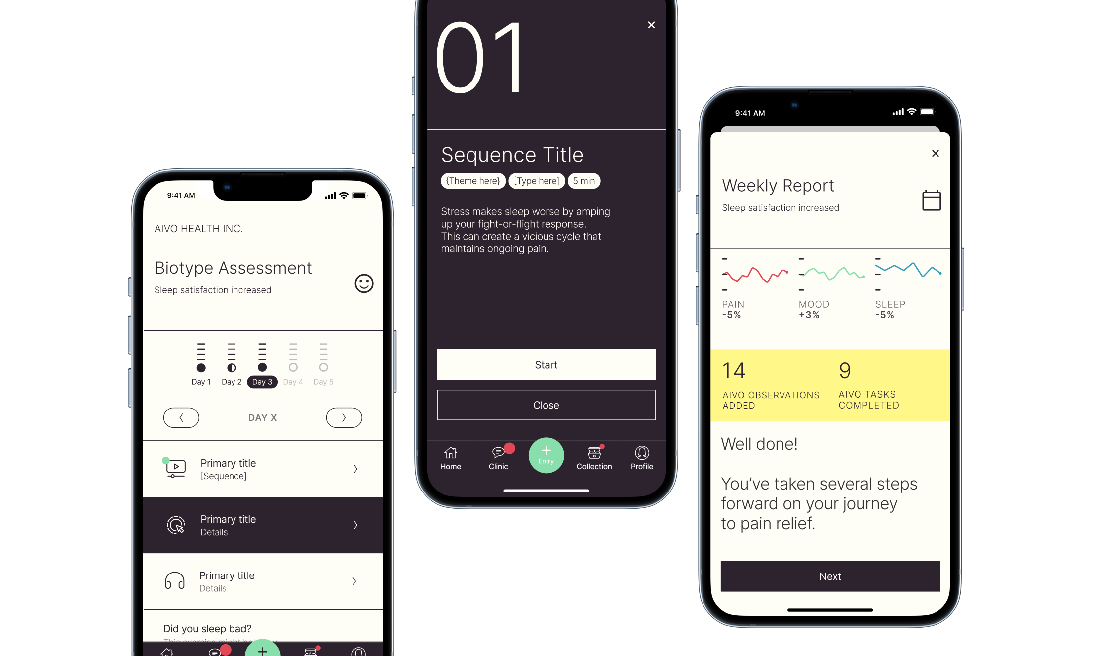

Illustrations lighten the app experience at key moments, and are useful in social media and presentations as well. An optimistic, bespoke illustration style was developed for Aivo with illustrator Esme Alice Mackey.

As Aivo begins its important mission to reverse chronic pain, the new brand gives the team a shape of things to come — a brand that uniquely combines human warmth with clinical trustworthiness to tackle a humanity scale problem.