Creating the name, logo and brand of Supercell
Our collaboration with Supercell dates to time before Proxy, and time before the company was founded in 2010. In a world where a small team from Espoo, Finland decided to take on gaming giants Zynga and King, we worked with the founders to develop the brand name and brand philosophy, and designed a unique logo embedded with cultural meaning. In the years that followed, Supercell reportedly exceeded $10 billion in value.
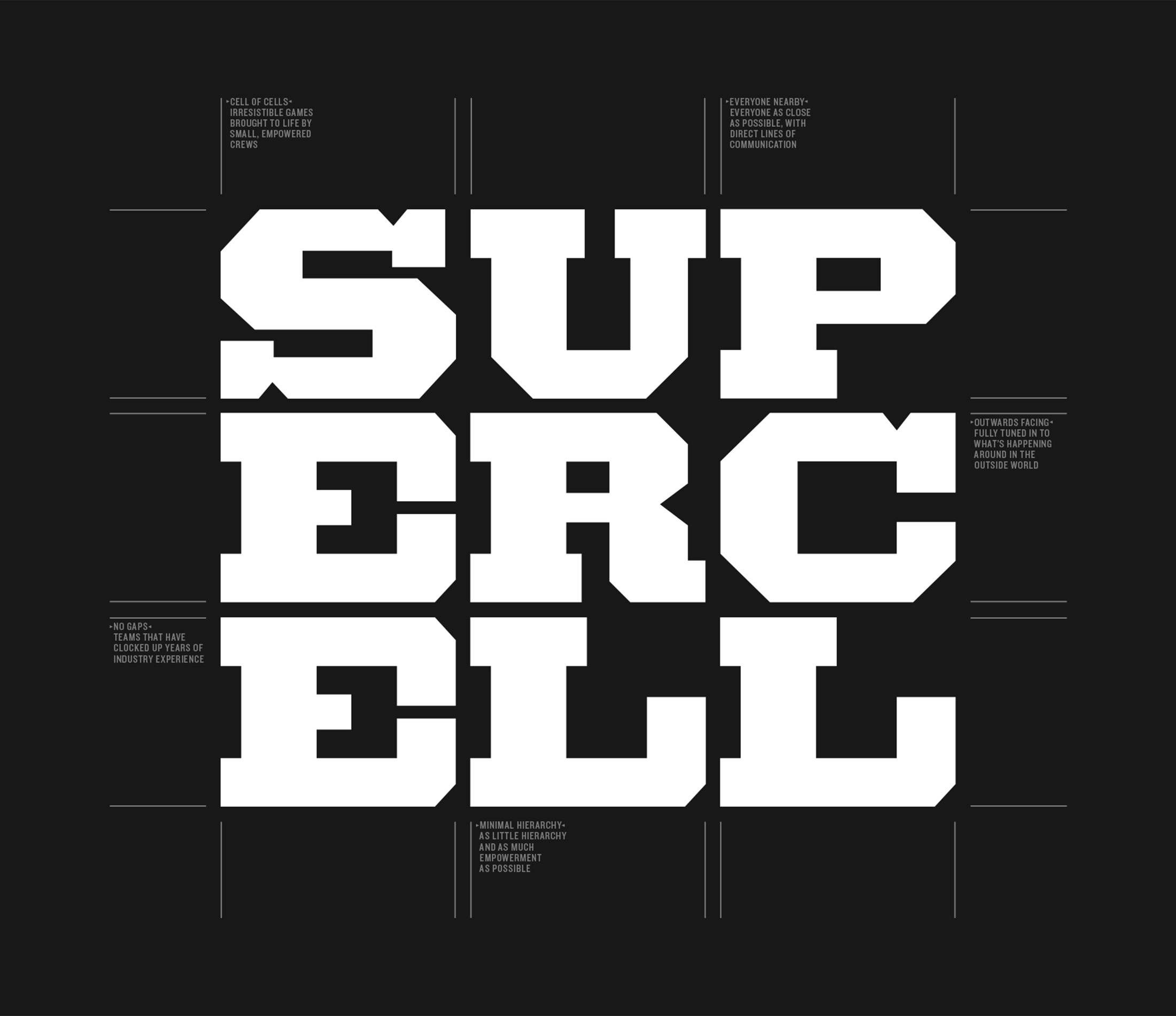
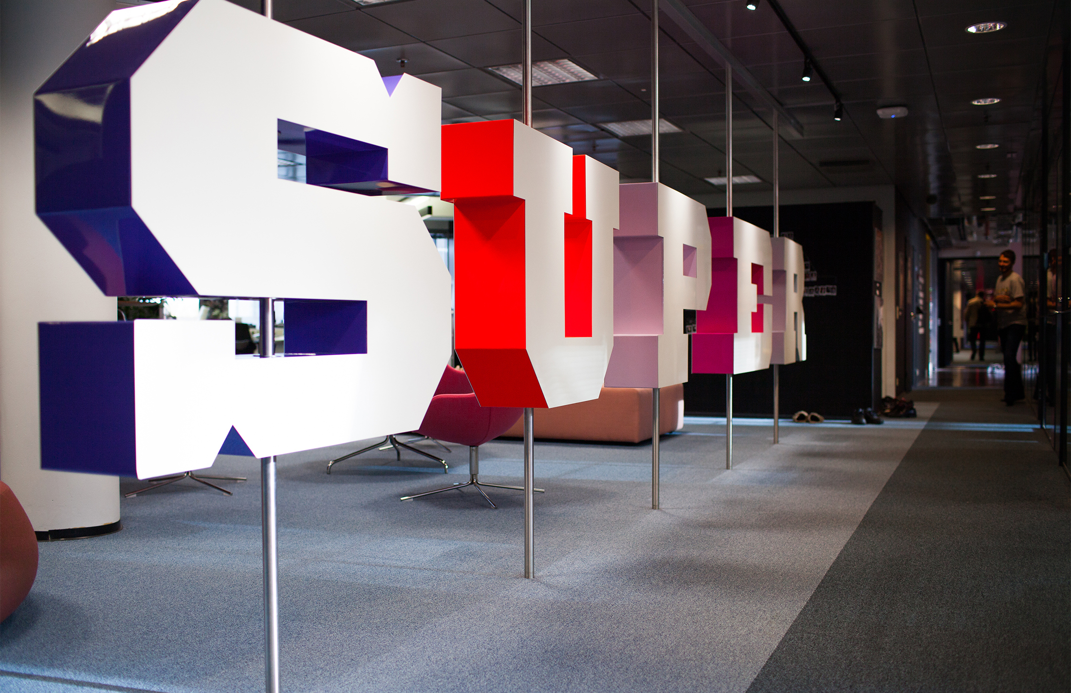
The power of the original Supercell brand we developed was in its ability to encapsulate a story of small teams working together, with minimal hierarchy – a philosophy embraced by the best talent in the industry, and worn like a badge.
By 2017 the Supercell had grown to a decacorn scale, with operations spanning the globe. We joined forces with the Supercell brand team to further refine the brand. Immersing ourselves at Helsinki, San Francisco and Seoul, within the span of a week, gave us a clear snapshot of the culture in time.
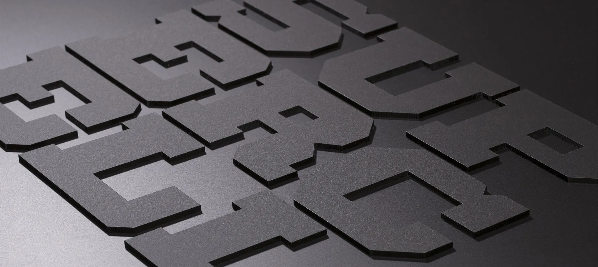
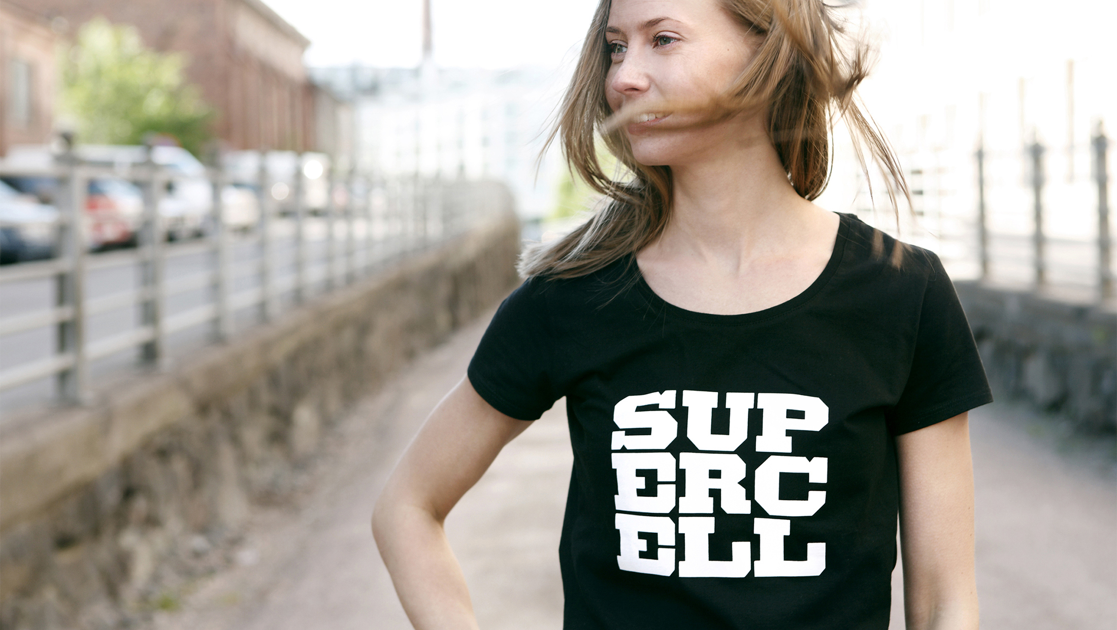
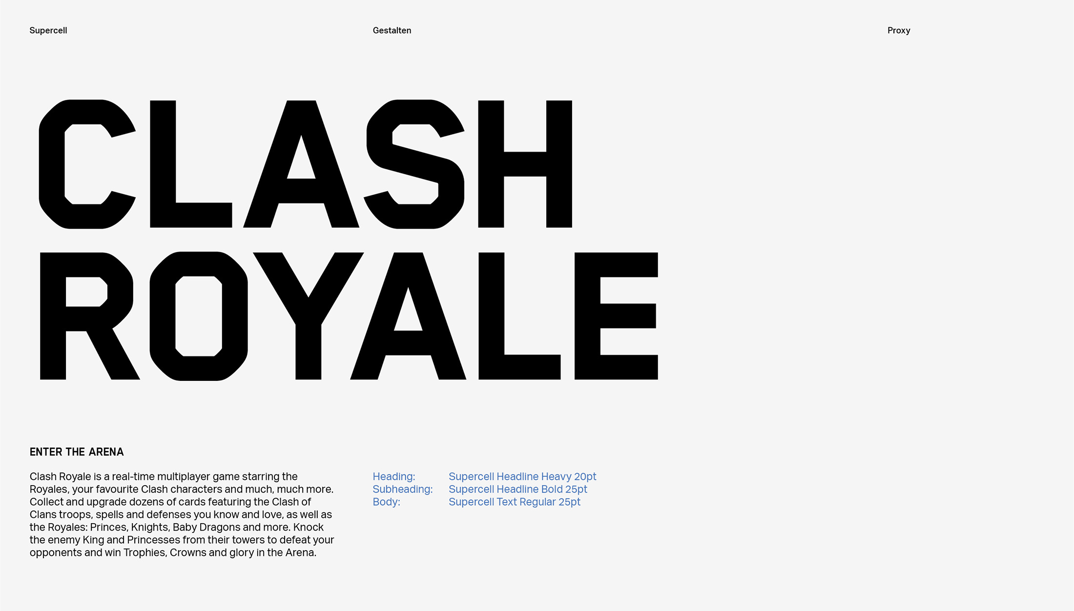
We worked with our friends at Gestalten to create a bespoke headline typeface, Supercell Headline, based on Gestalten Blender. The modifications Proxy did covered glyph details for key characters, leading and tracking.
The headline was paired with Supercell Text - a version of Aktiv Grotesk by Dalton Maag, a typeface family chosen for its wide language coverage and superb small size legibility and pixel hinting.
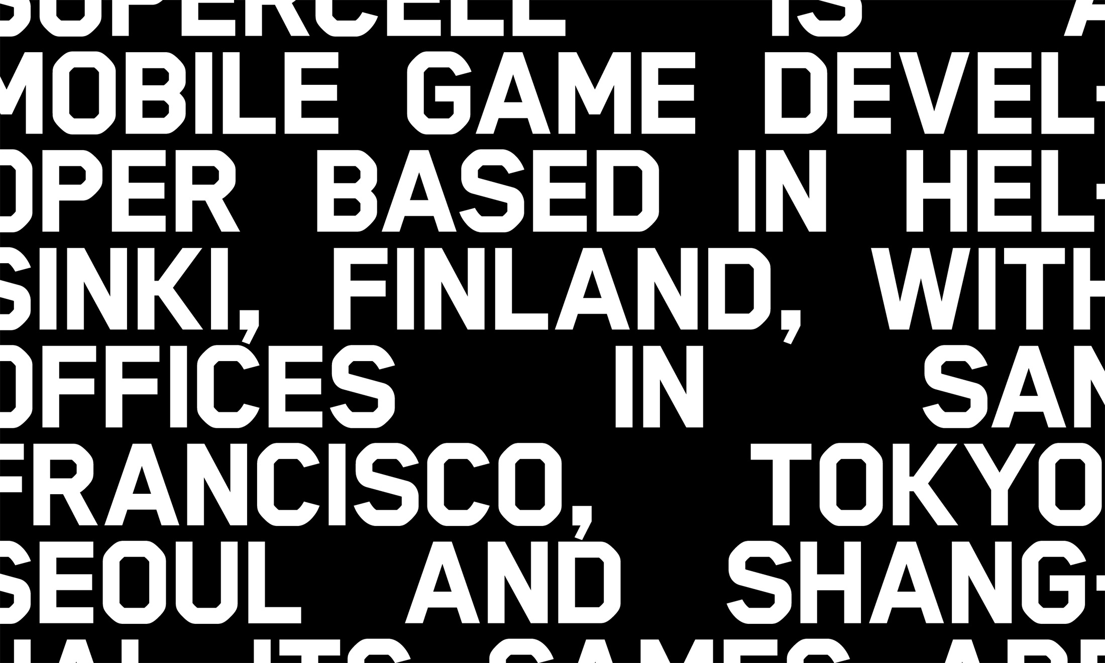
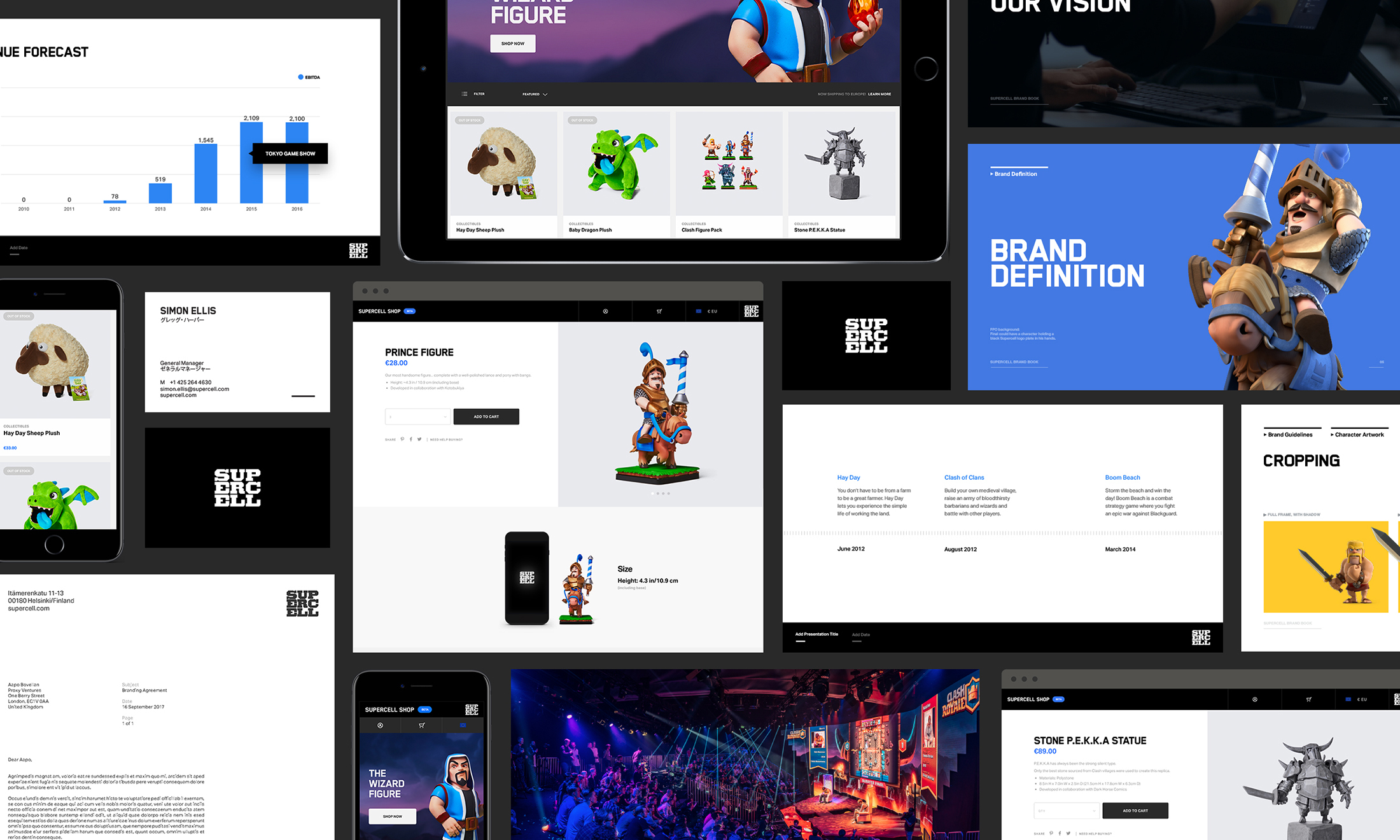
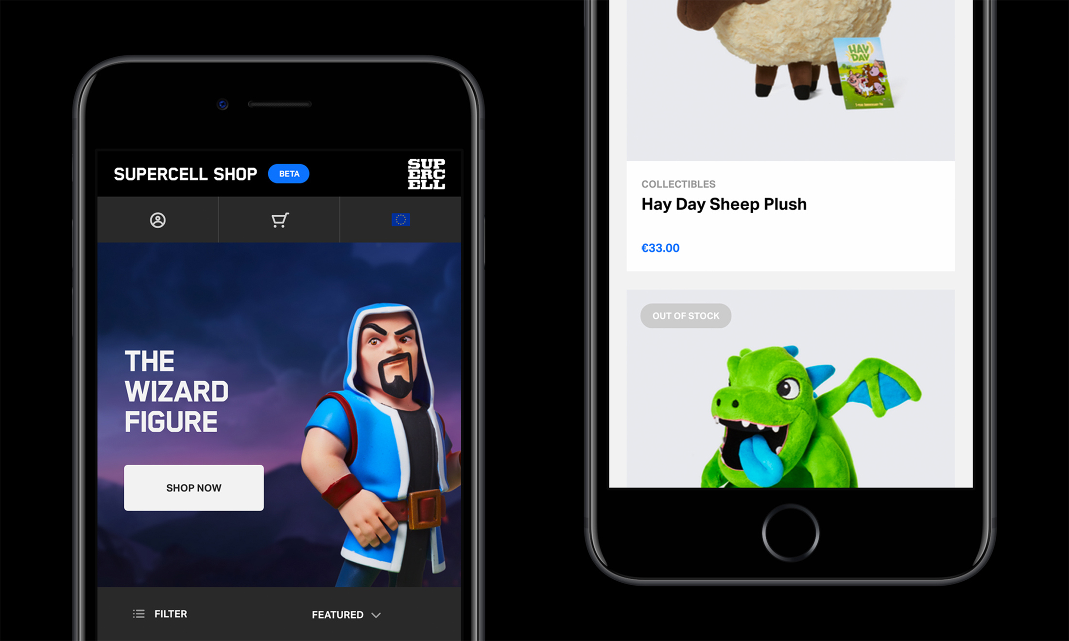
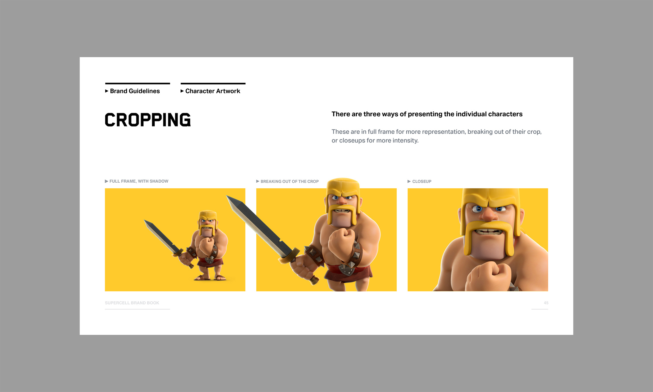
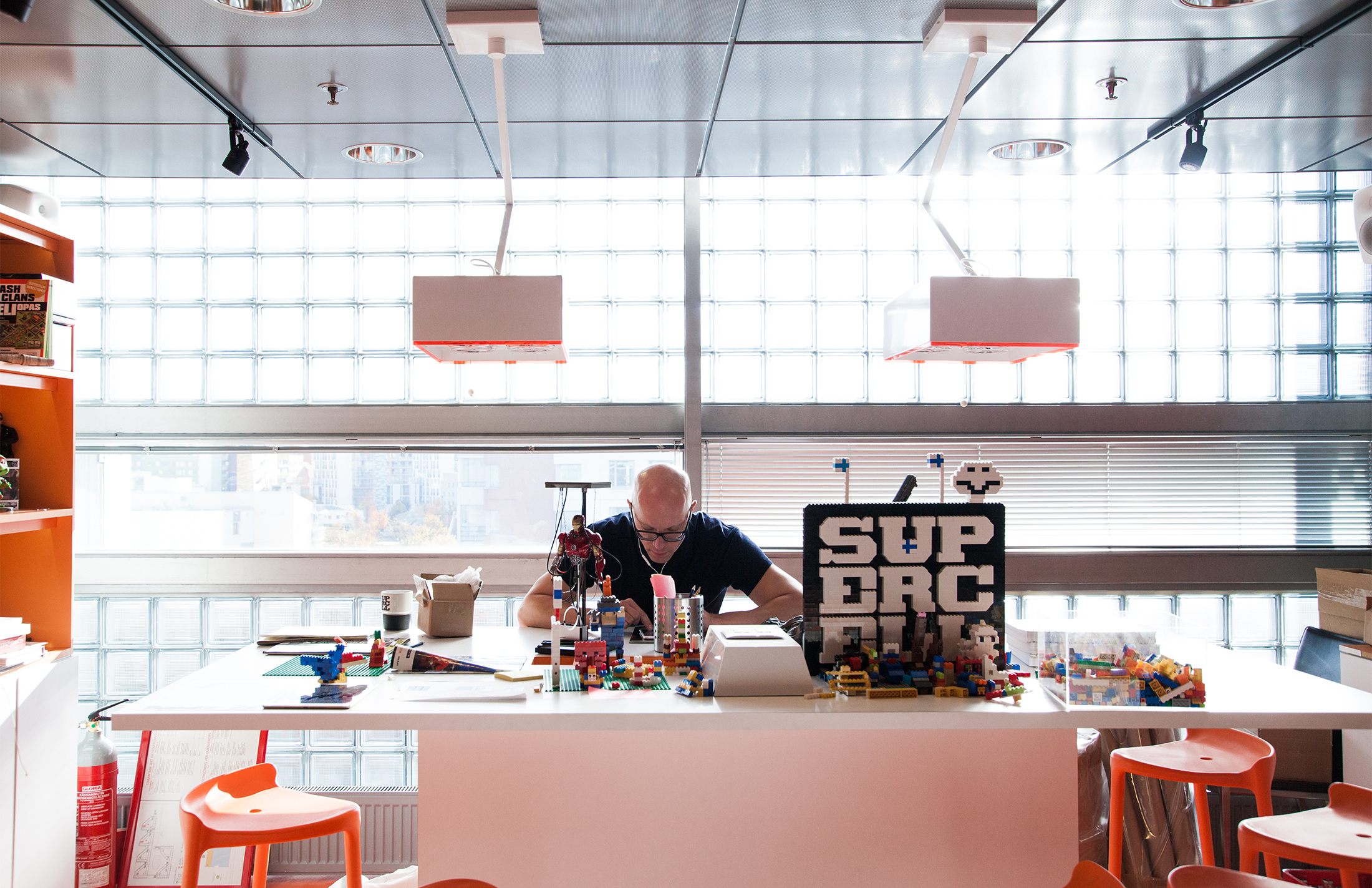
Some of the first in-house executions by Supercell based on the new corporate identity system are shown here, demonstrating a cohesive approach to typography, grids and game imagery treatment.