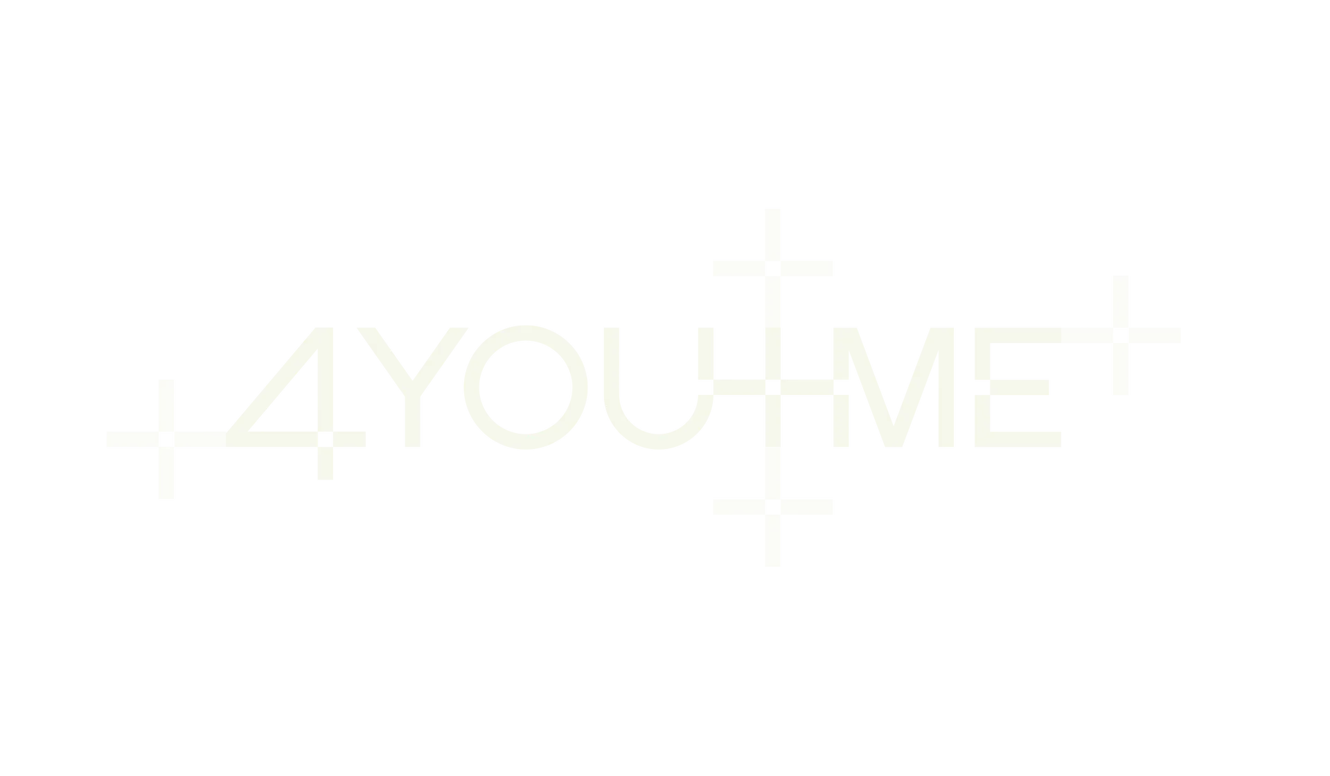
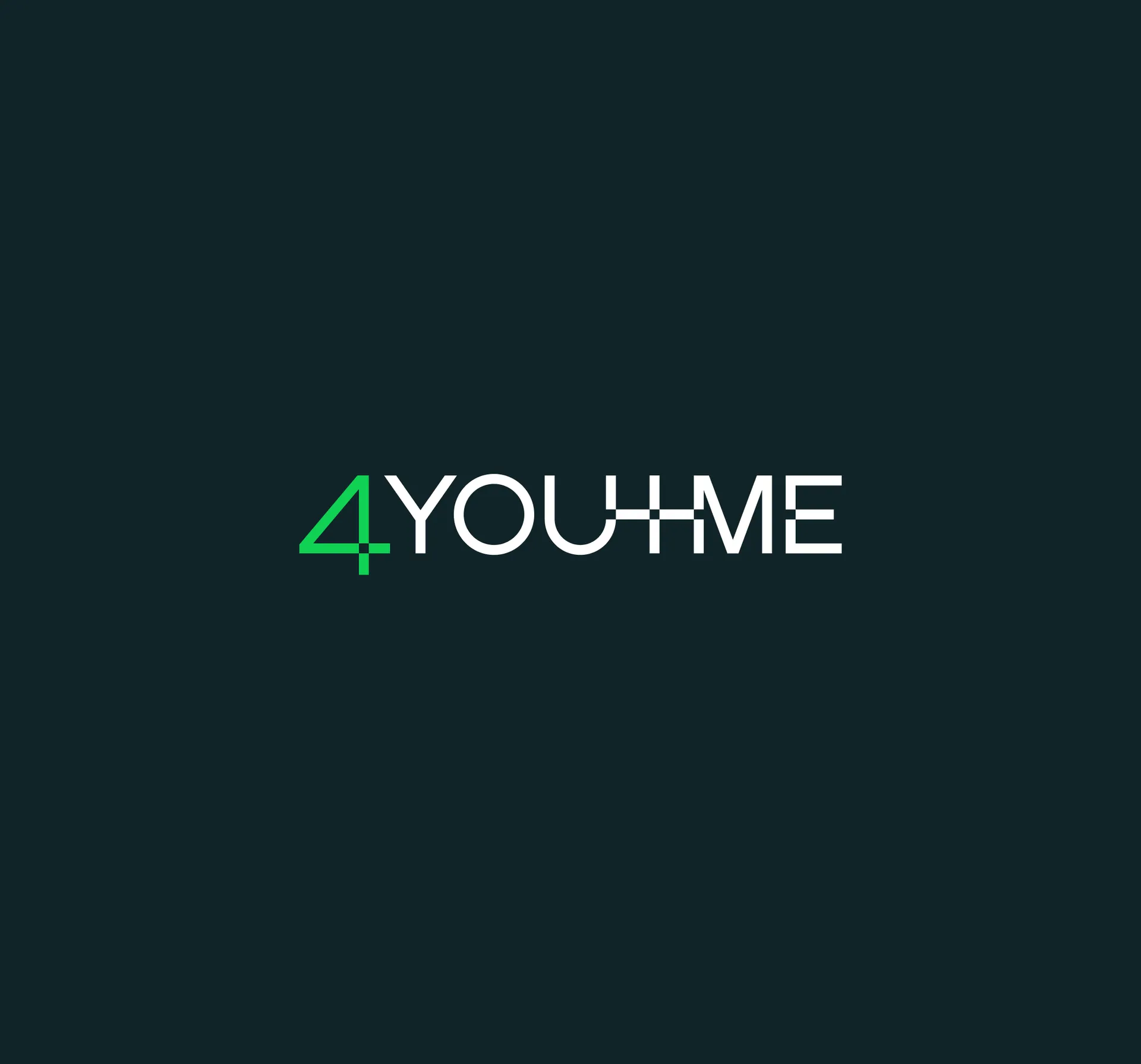
How can being part of a data set benefit us as individuals? How can giving up information about ourselves bring us agency? How can tech, which often seems to efface the interpersonal, allow us to share with and help those around us? 4YouandMe is a deeply curious organisation which takes these questions as a starting point to revolutionise the healthcare system. The wordmark sets the semantics of community in the aesthetic of the digital, representing the worlds 4YouandMe brings together.
The organisation is interested in data gathered by wearables — communication at the level of heartbeats and fractions of degrees in temperature; the precise details and abnormalities that might tell us more about lesser known health conditions. This precision is communicated in the mark, with bespoke lettering made at Proxy. The uniformity of monolinear letters are offset by cut outs to represent the quirks of individuals that close monitoring reveals.
A trio of font families each bring their own accent to the identity, combining to create a brand that speaks of modernity and technology while retaining a sophisticated, scholarly feel. GT Flexa's carved ink traps create bold, characterful headlines, while Grenette's delicacy is reminiscent of traditional biology textbooks. GT America bridges American Gothic and European Grotesque genres, with its mono variant providing a technological accent to complete the system.
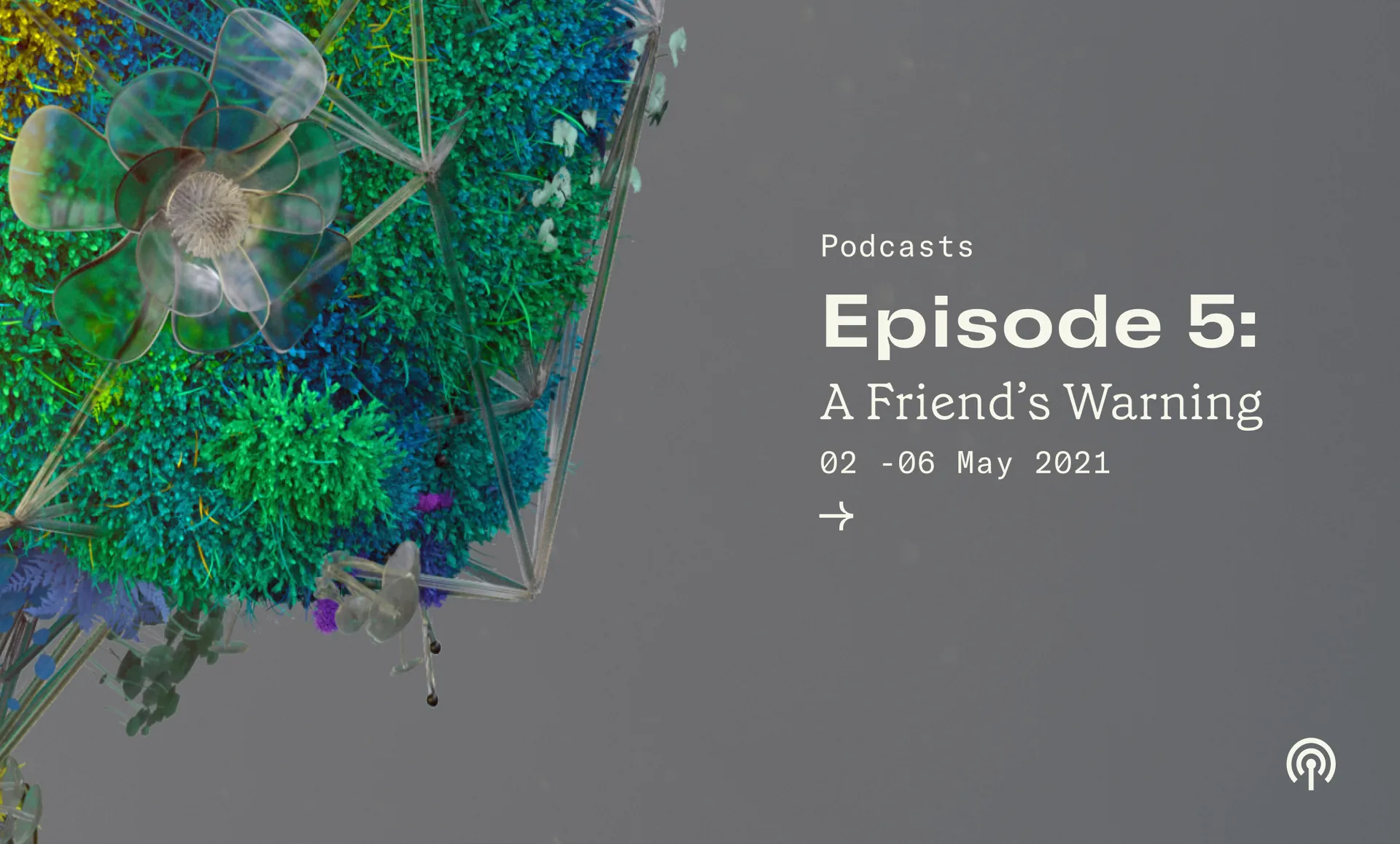
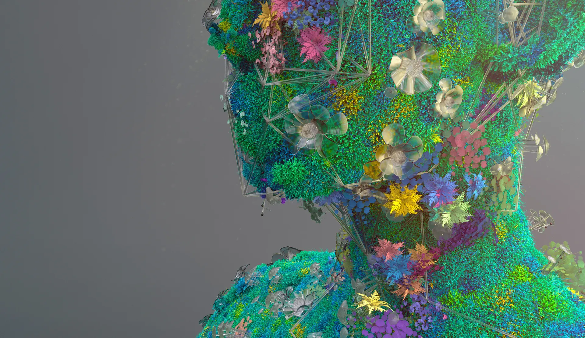
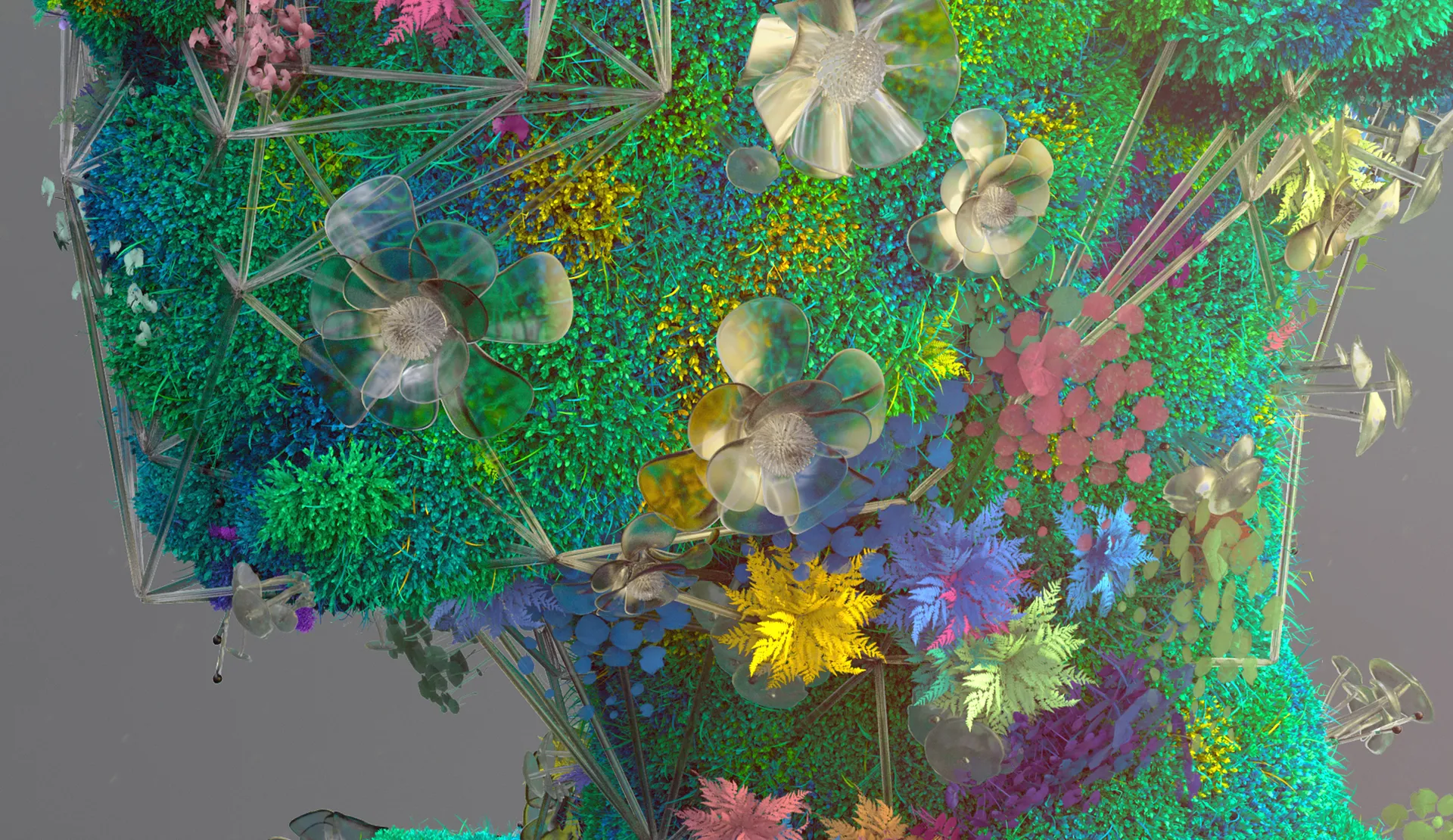
Organic plant life combined to represent natural human diversity. Surrealist renders to echo modern technology.
Inspired by the fascinating intricacies of the natural world, botanicals are combined with technological structures which appear to grow and merge with each other to create something reminiscent of the human form.
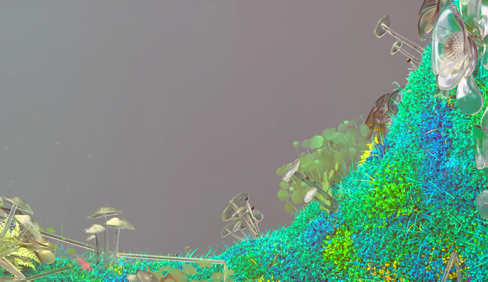
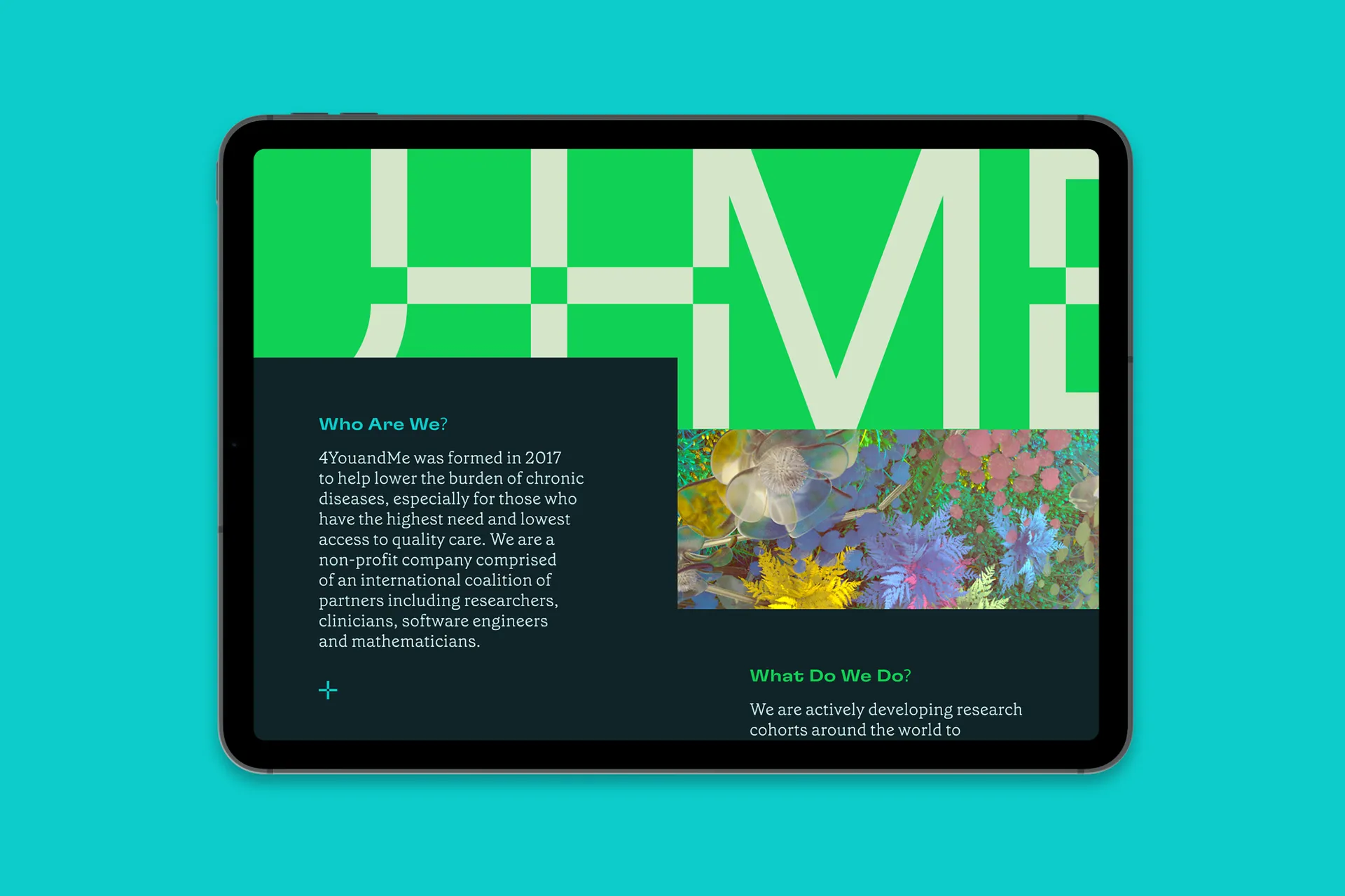
Botanicals have been carefully selected based on their meanings, with their forms and colours chosen to convey endless human complexity and the mission to create a better life 4YouandMe.
The brand’s primary colour palette combines both vibrant and earthy tones, to balance technology and humanity.
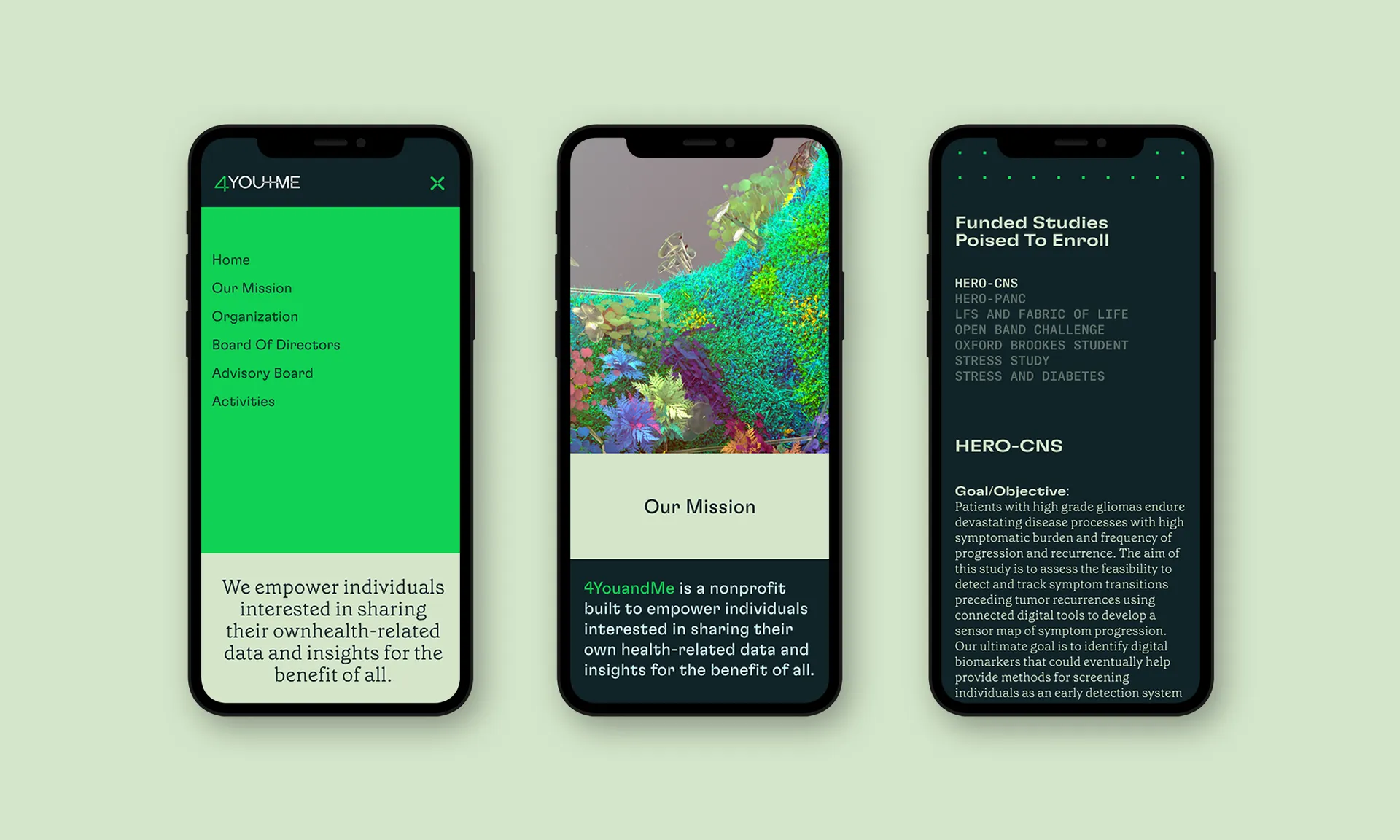
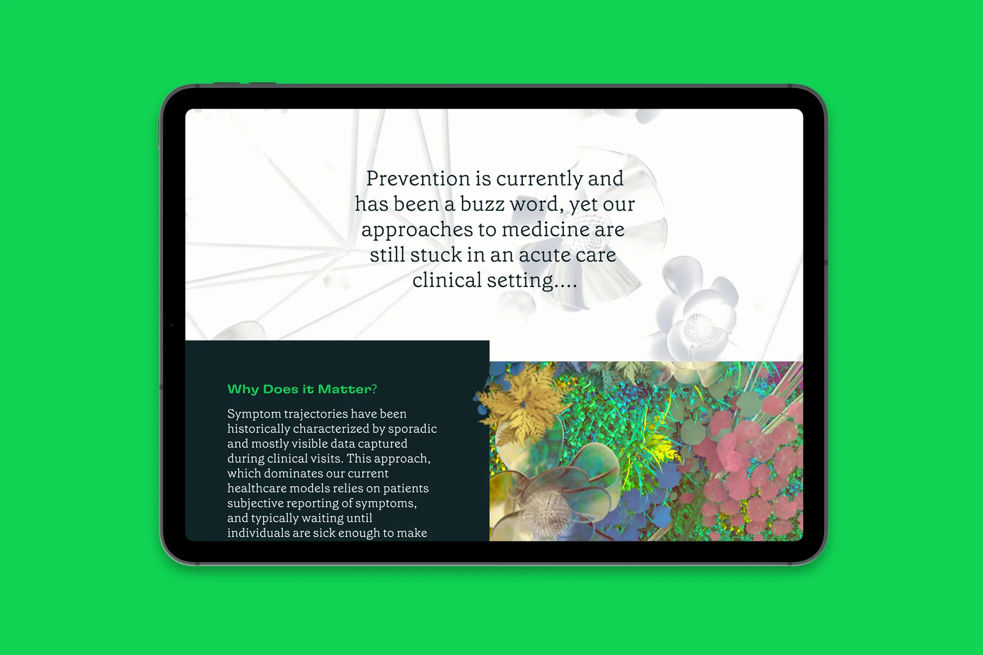
4YouandMe's website disrupts viewers' expectations before leading them on a a unique and intriguing journey. Content subtly parallaxes as you are drawn deeper into the information; when information becomes more complex and detailed, the imagery reflects that.
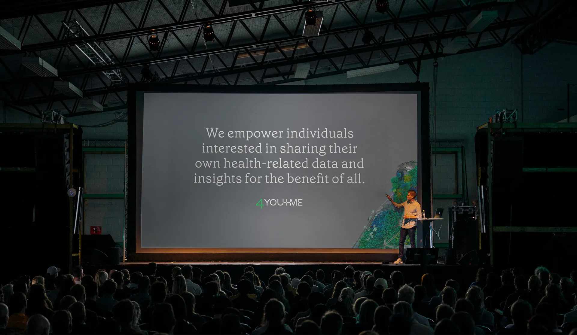
4YouandMe's work is in sharing insights by each other, for each other. These insights relate to times of change, whether these be brought on by illness or through natural parts of the life cycle such as pregnancy. Shifting the perspective, patients are viewed not just as people who are sick but as people who have something to share with others.
The identity we created is designed to spark and embellish conversations and exchanges of information; to be shared and dwelled upon. Minutely detailed renders at the centre of the system encourage the act of looking and careful observation, opening up the mentality of curiosity that 4YouandMe's team and collaborators share.
