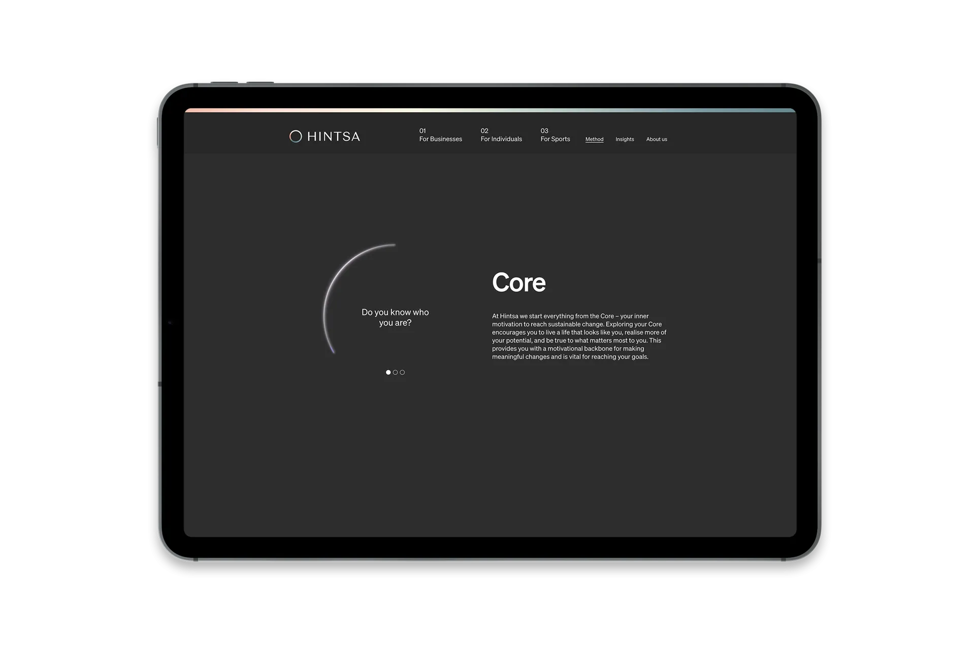
Do you know who you are?
Do you know what you want?
Are you in control of your own life?
These three questions were always the first the late doctor and physician Aki Hintsa asked patients at the outset of his relationship with them. Ranging from household name athletes to top CEOs, Hintsa’s clients came to him to improve their health, wellbeing and performance, holistically
Though Hintsa’s questions are deceptively simple, answering them can be difficult, necessitating a period of soul searching. Whoever these questions are put to must grapple to find their true identity and purpose in life. While the coaching programmes that followed were fairly straightforward and rarely contained advice clients hadn’t heard before (to get a good night’s sleep, reduce alcohol and move your body every day, for example), by asking these questions Hintsa helped clarify the client’s real motivations to change. The result: sustainable, long-lasting improvements to health, wellbeing and performance.
Today, Aki Hintsa’s legacy lives on through Hintsa Performance, the coaching company he founded. This triad of questions continues to be at the core of the Hintsa method. Our challenge was to create a brand that could embody this spirit of inside-out approach with the impressive ethos and experience of the founder while growing the company to a generation beyond him.


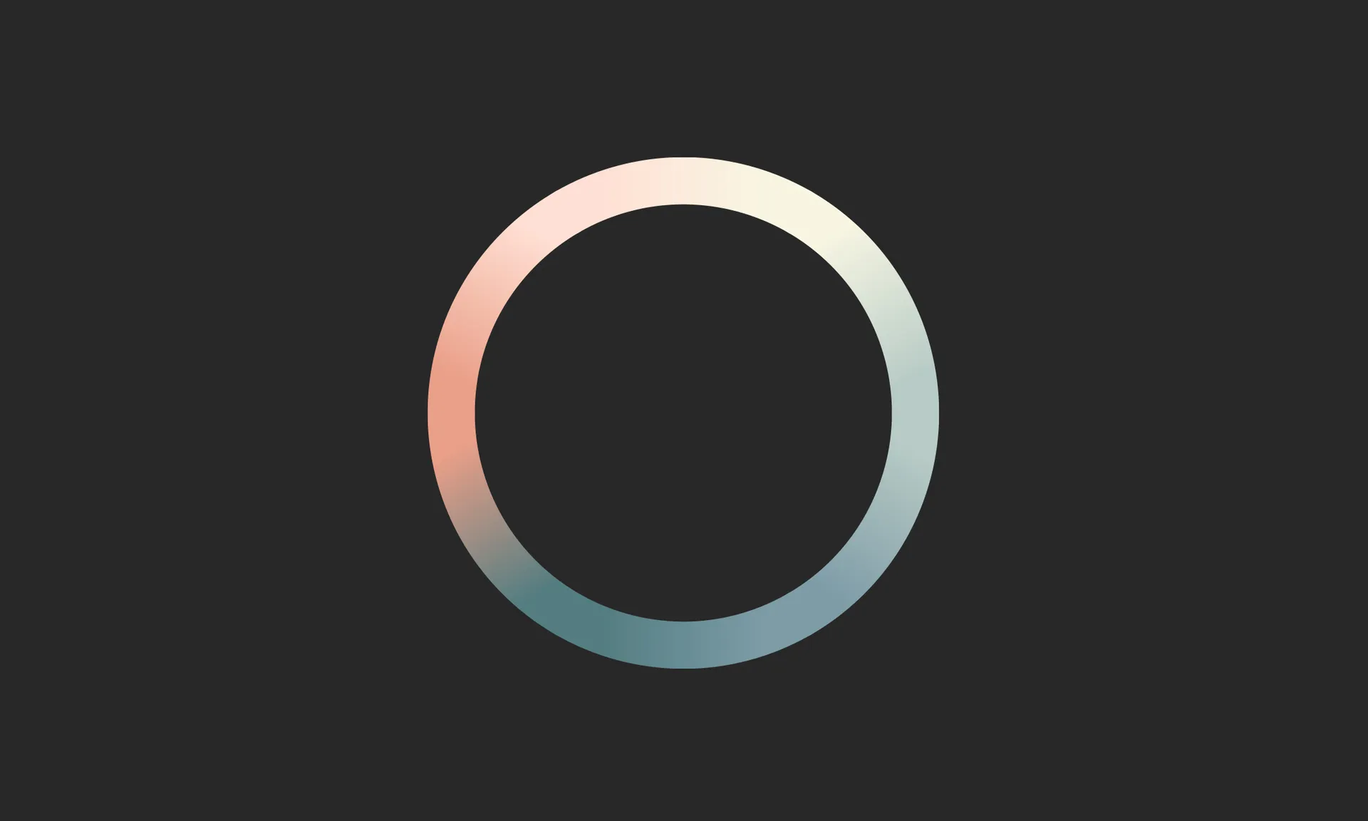

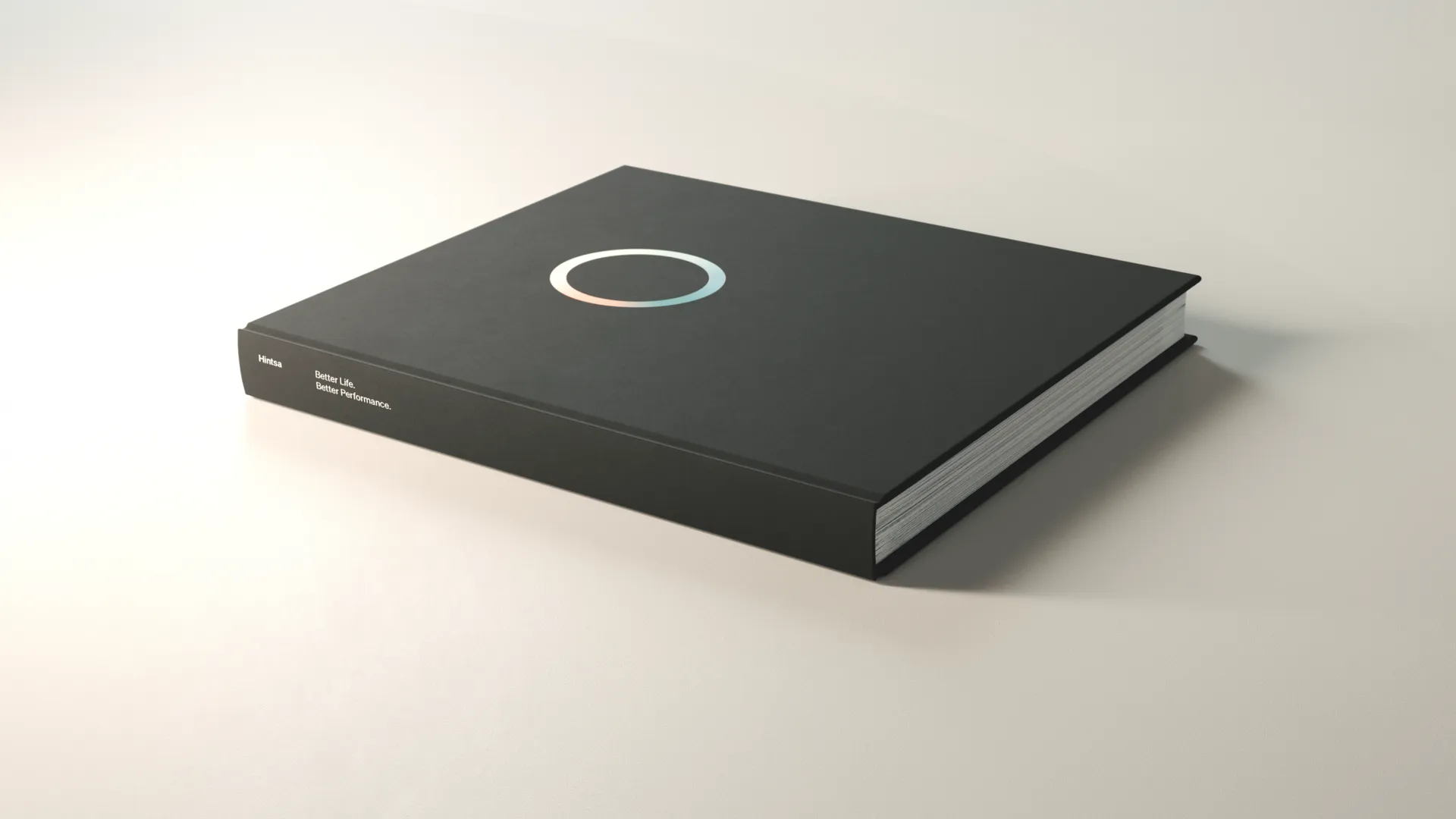
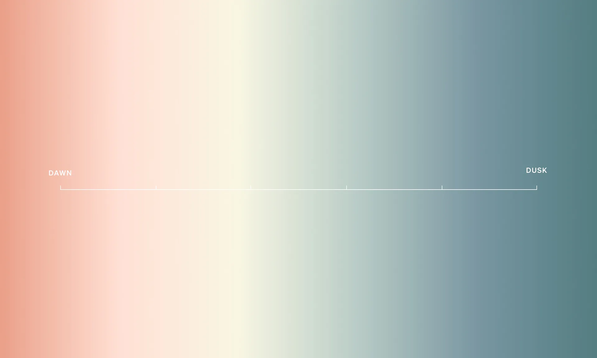
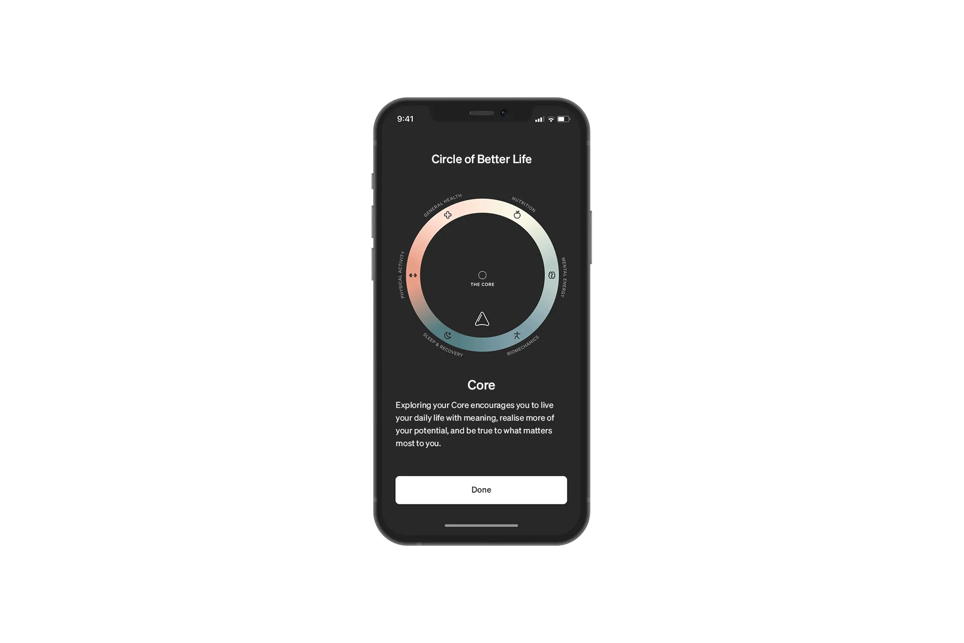
Like Hintsa's method, the logo we created was designed to be simple yet intriguing. While the negative space at the centre represents the Core (those three questions we can only discover the answer to by turning inward), each colour segment in the circle corresponds to one of the 6 key elements of health and wellbeing the Hintsa approach covers.
The mark exists to show what those pillars look like in a well balanced life. When each colour segment is of equal proportion, the wheel begins to turn; colours spin and blur into one another to create pleasing, harmonious gradients with no discernible beginning or end.
With Hintsa introducing an app as part of its offering, we had to ensure the new brand worked digitally. The updated word mark kept the sophistication of the handwritten, signature style original while increasing legibility and gravitas. Each letter was crafted and refined by Hot Type for optimum balance.
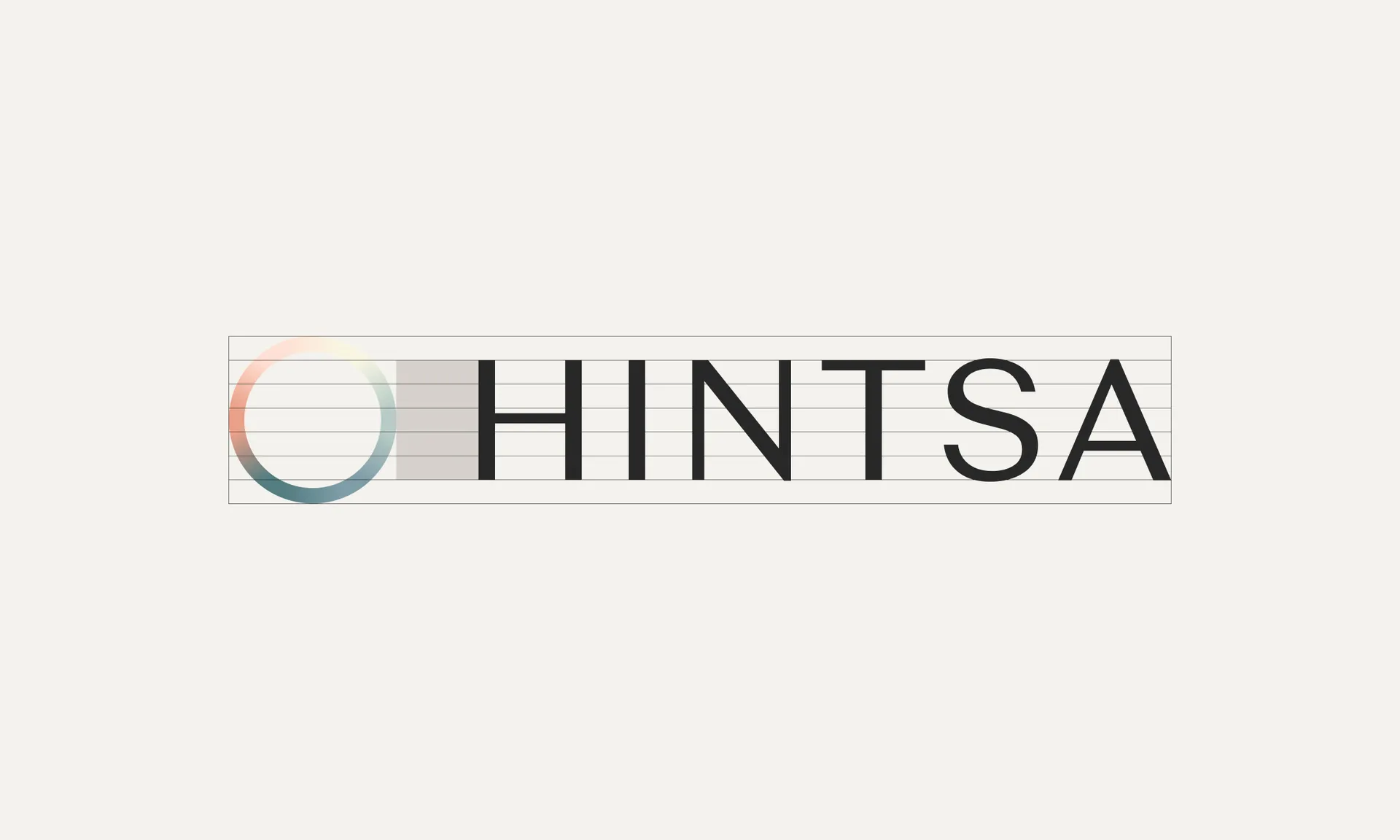
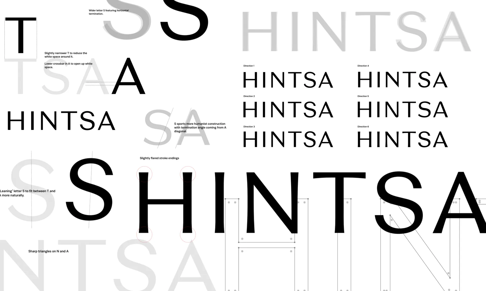
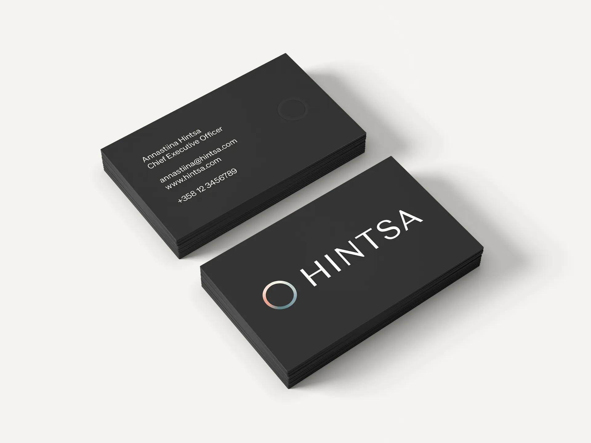
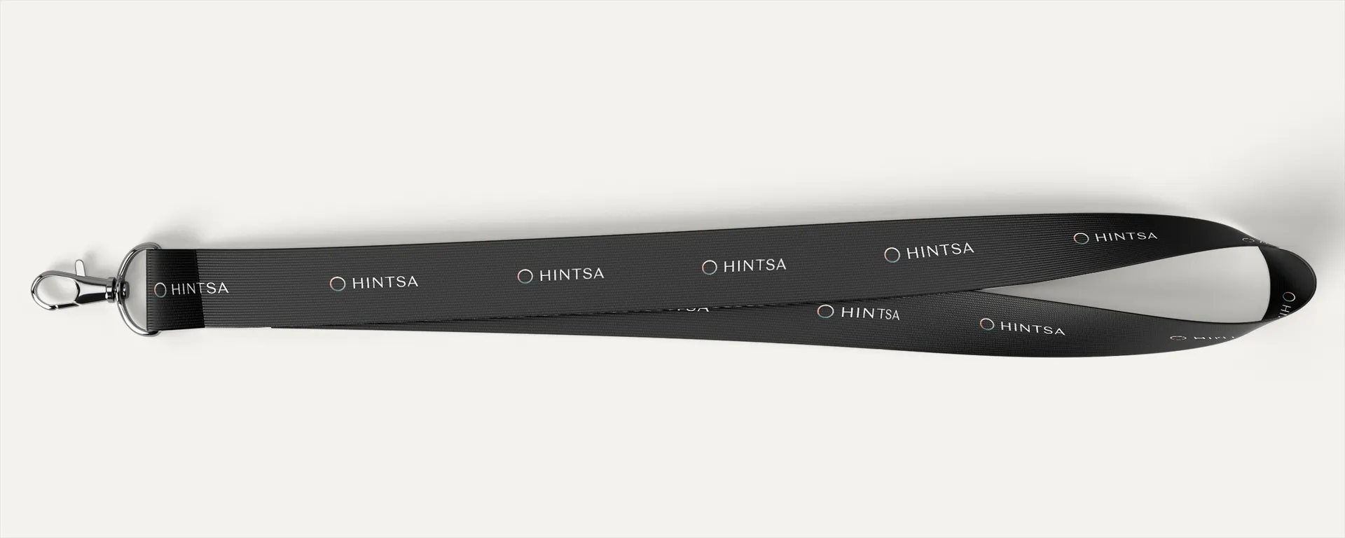
The wordmark for the brand was completely reimagined. Moving away from being a founder brand signified by a signature wordmark, the new wordmark was designed to signify the elegance and quality of the organisation, increasing legibility and gravitas. Each letter was crafted and refined by Hot Type for optimum balance.
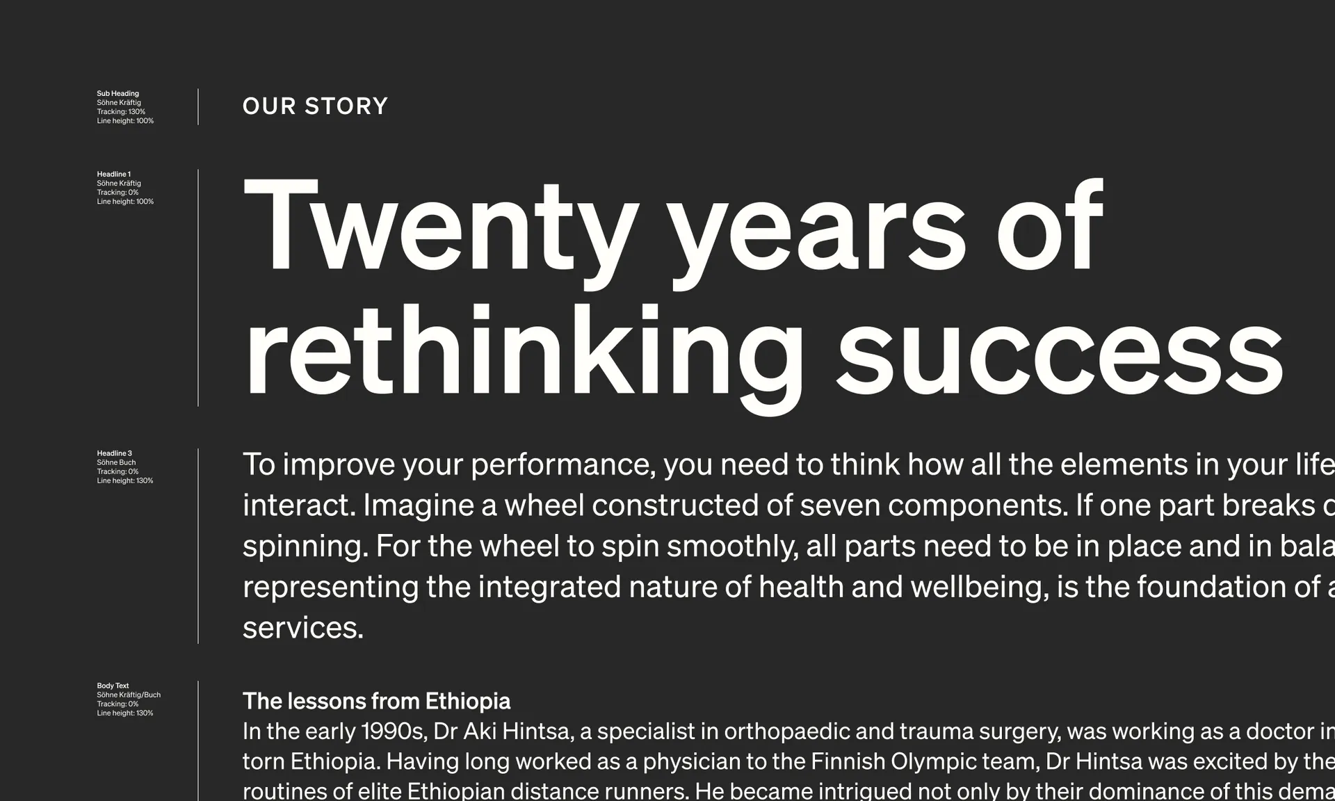
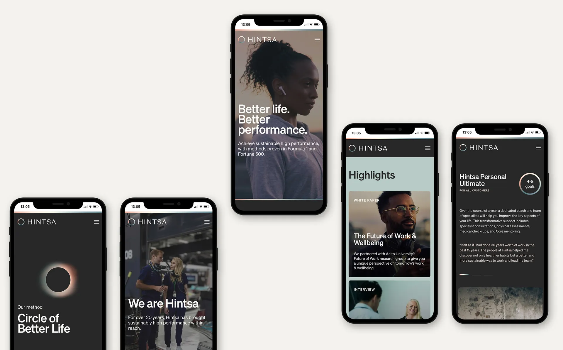
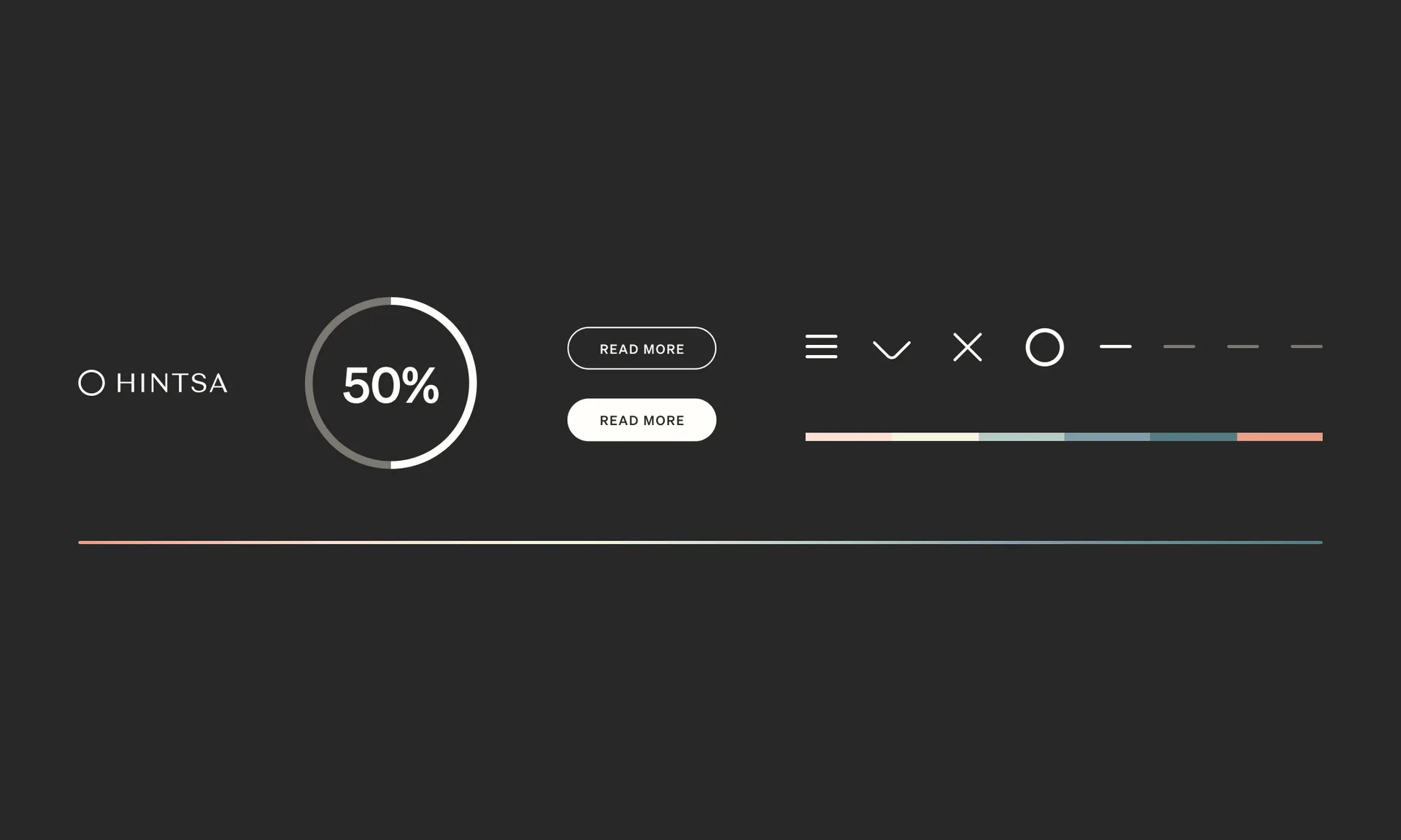
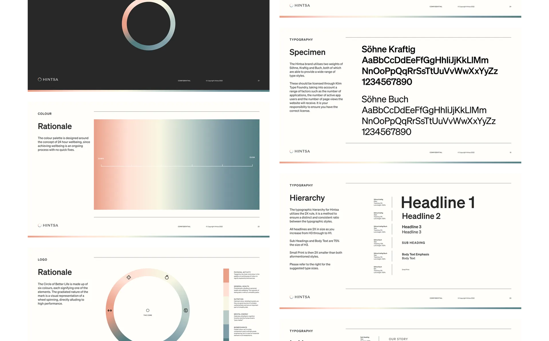
Inkeeping with the ideas of balance and harmony, we created a typographic system and a grid system that can be applied across all Hintsa's touchpoints, from print materials to the company website. The website was designed by Nordkapp and developed by Paper Planes based on brand assets created at Proxy.