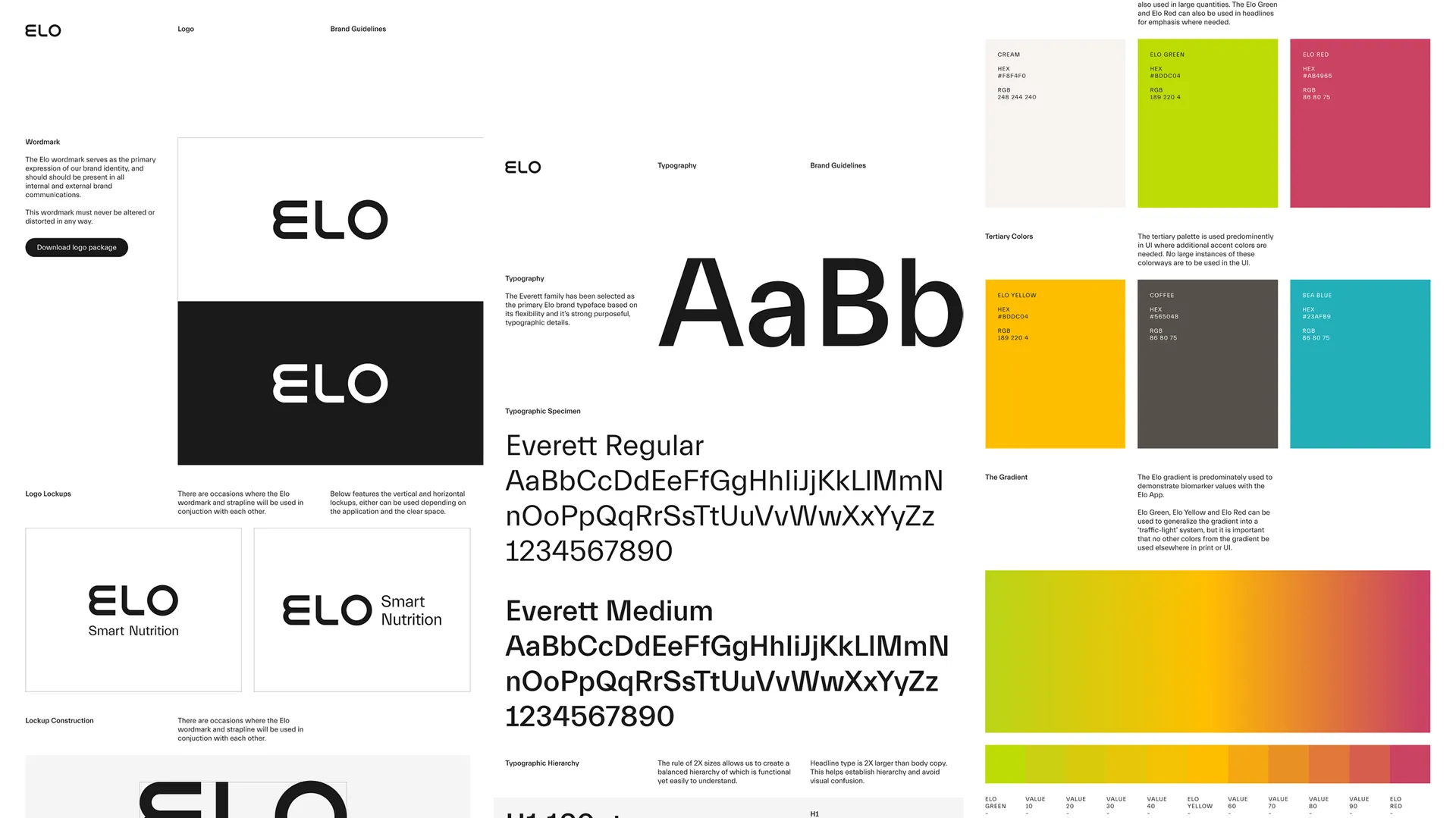
The most important creative task was to liberate our imagination, to envision a billion dollar brand creating a whole new category – smart nutrition. The proposition of Elo is futuristic, utopian almost: Nutrition precisely made to your needs. We wanted to position Elo as a scientific, utilitarian, cutting edge brand for health. A simple, geometric, bespoke wordmark communicates the simplicity and sophistication of the service.
The core colour way is a neutral grey punctuated with a green signifying vitality. A functional, forwards looking typeface, Everett, connects the whole identity system together. In 2020, Proxy was among the earlier users of Nolan Paparelli's now legendary typeface.


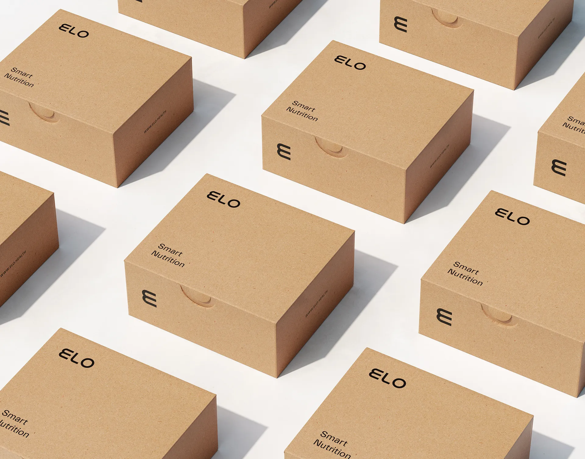
Proxy worked with Elo operations to design the shipping box for Elo supplements and biomarker collection. Intended not to go to the pantry, but to remain on a countertop, a warm, neutral colour paper stock with minimal graphics was chosen to fit US kitchen tops. Instead of a large printed logo, we opted for a subtle, debossed symbol.
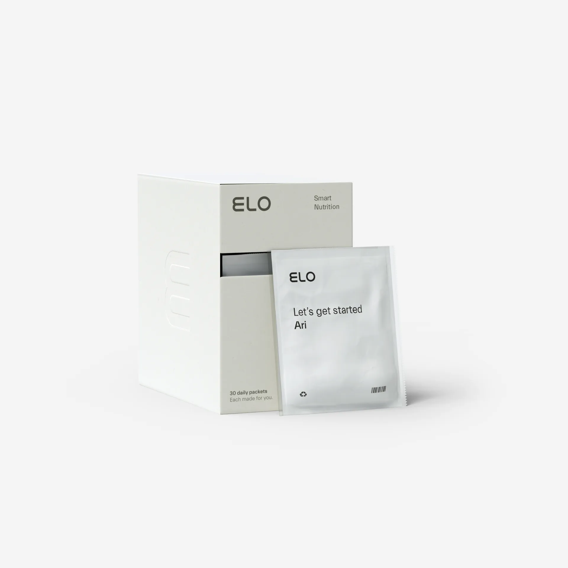
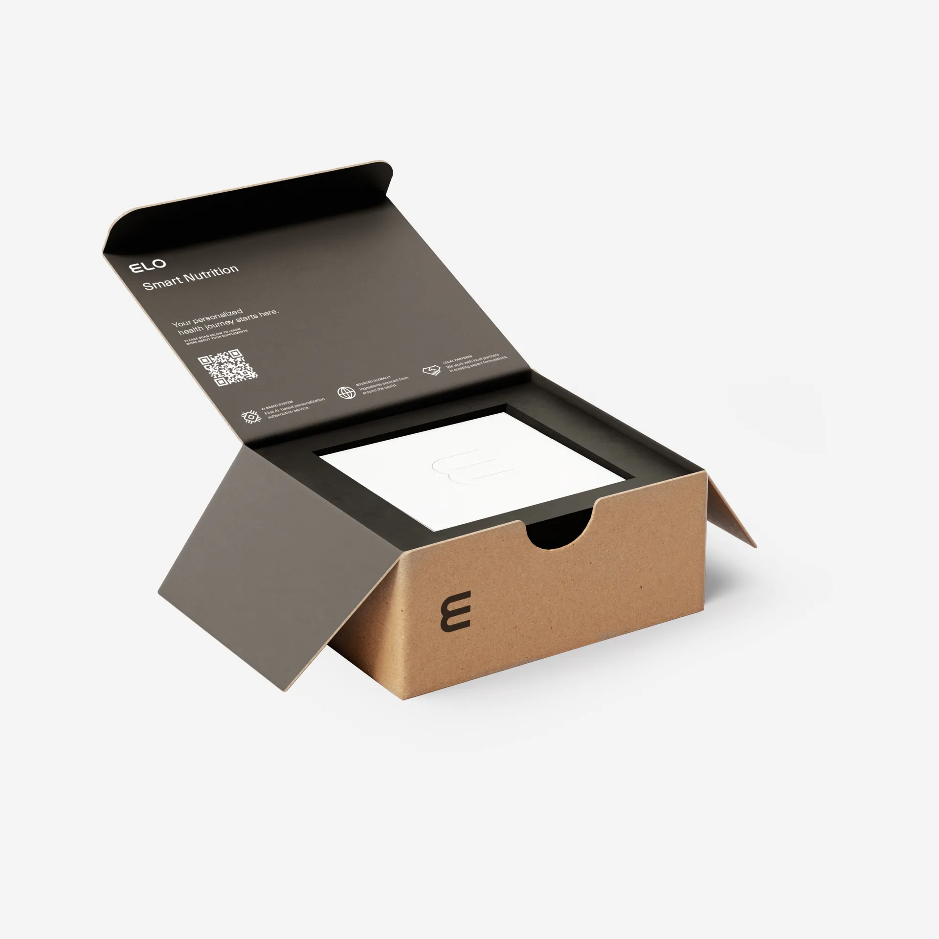
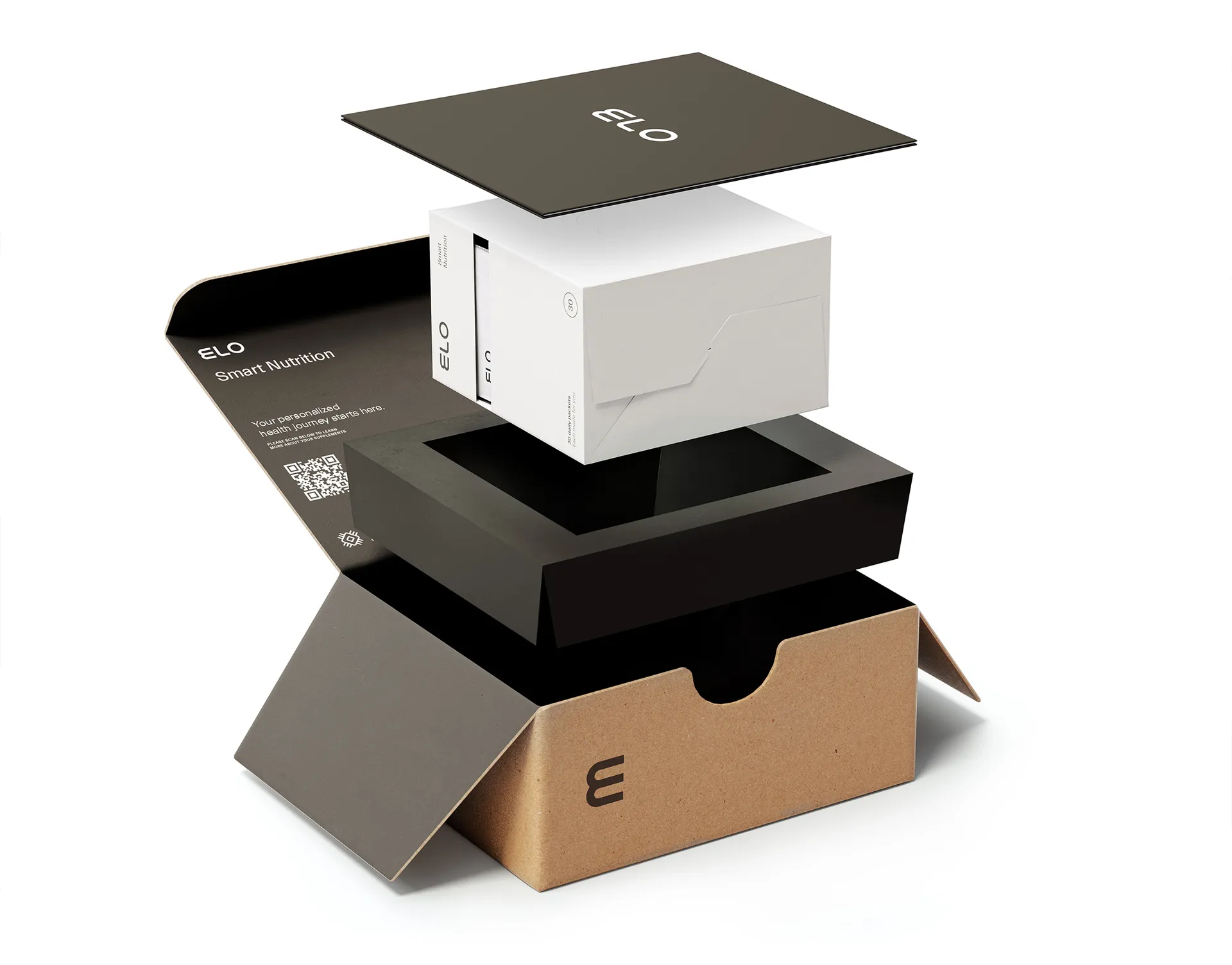
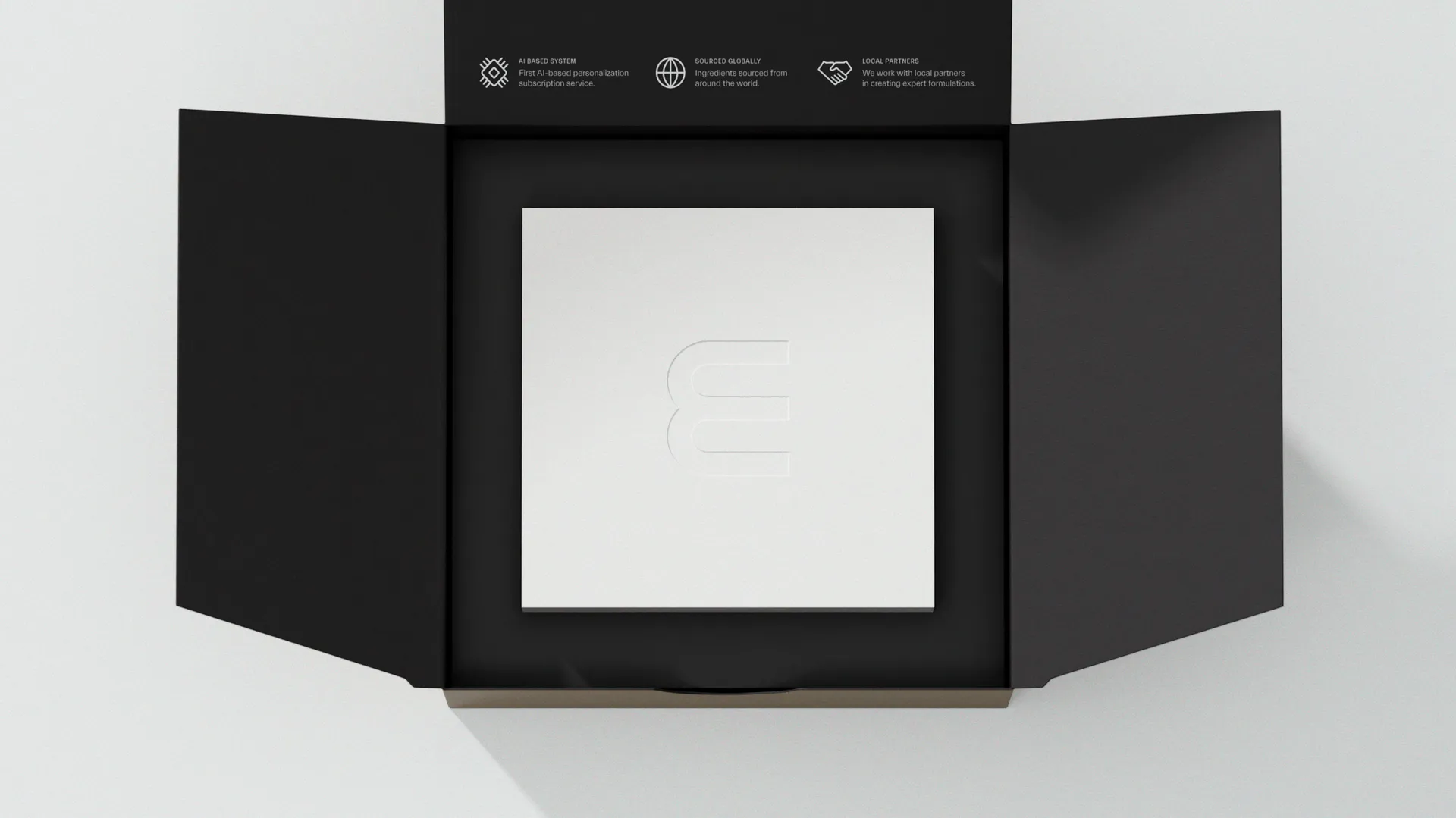
The unboxing experience is a key brand moment. The high contrast between the inside of the box and the dispenser box creates a moment of drama, while the high quality deboss elevates the brand experience in a subtle way.

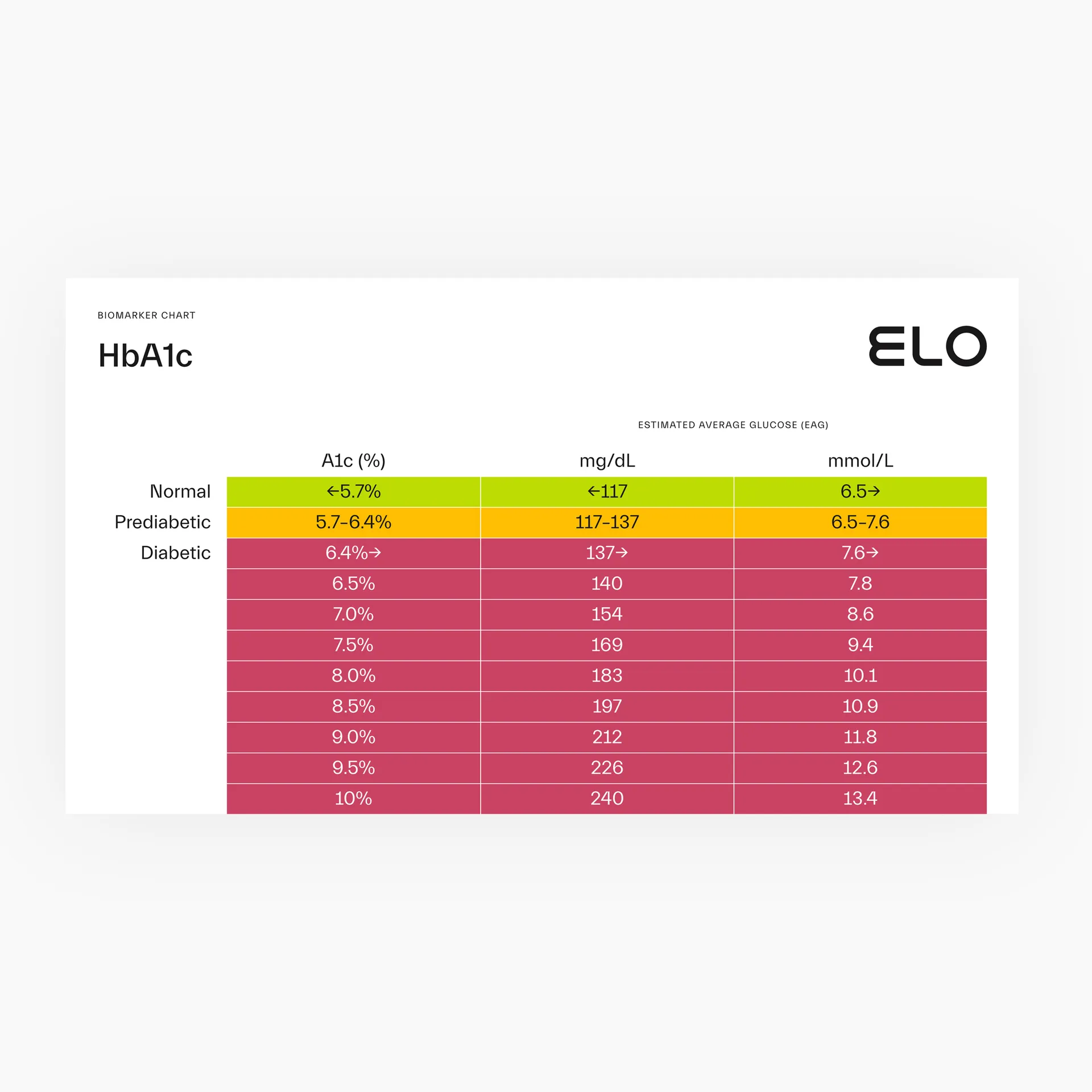
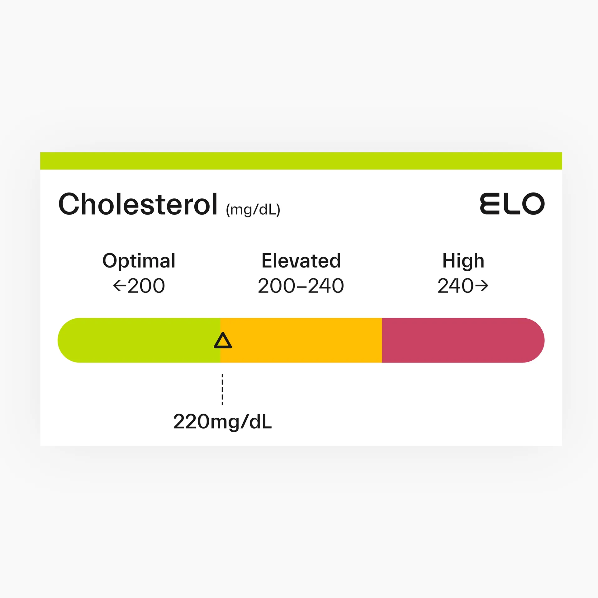
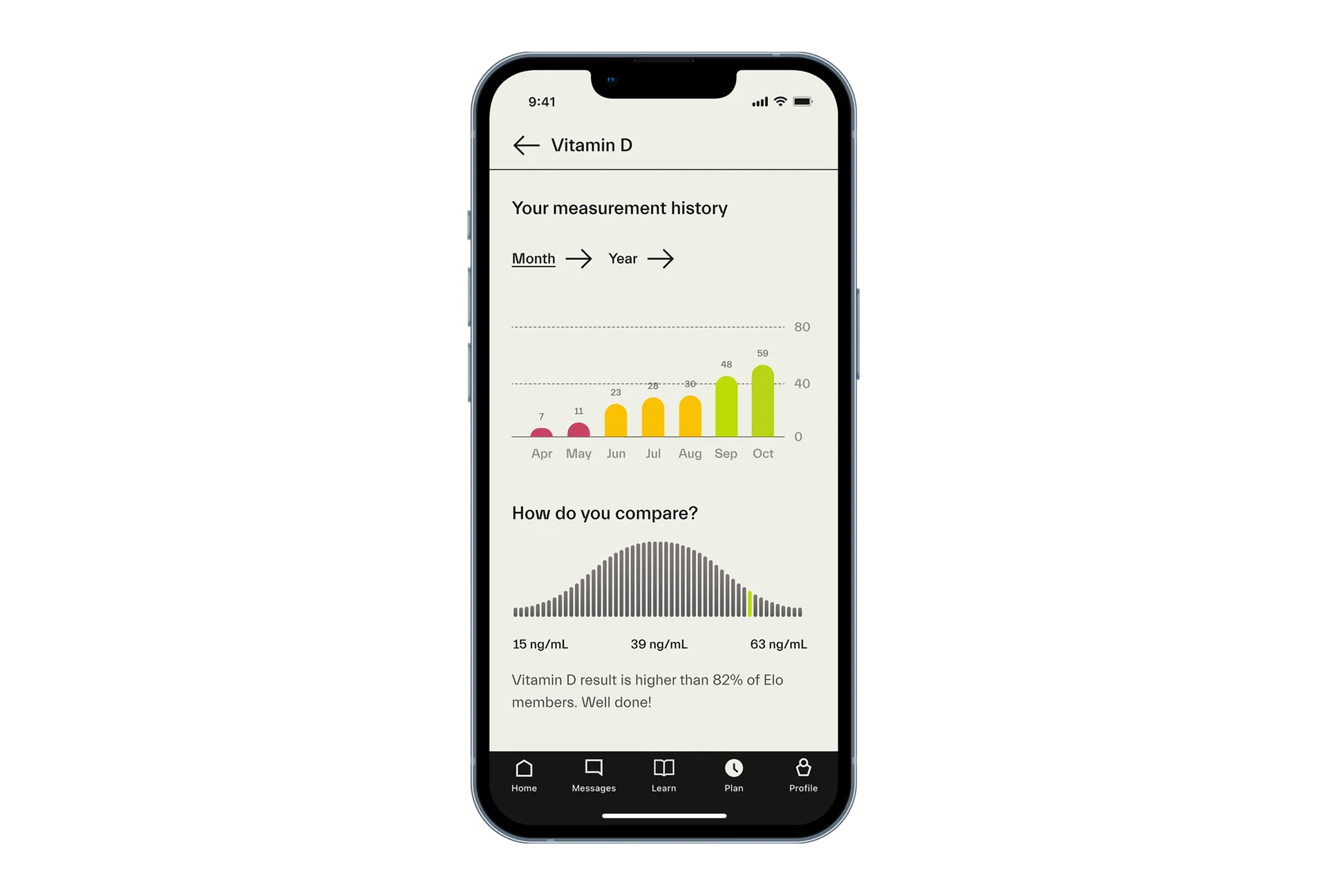
Creating an intuitively understandable design solution for a wide variety of biomarkers was a crucial challenge. Several modes of conveying the information – axis, colour and symbols – combined, for maximal accessibility.
We extended the geometric, rounded design language into a flexible toolkit for UI and content marketing infographics.
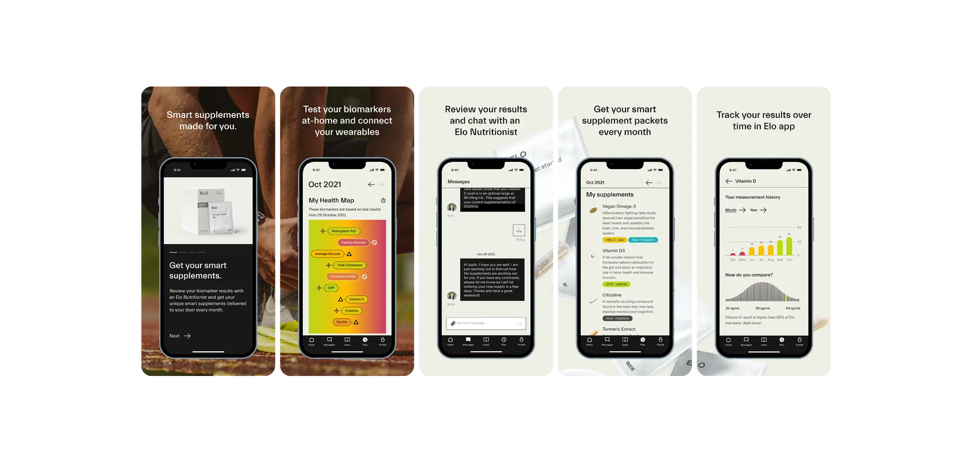
Content marketing is a crucial part of the Elo marketing engine. We worked closely with Elo content team to iterate a blog design and biomarker assets essential for strong SEO, and perfect for sharing.
We created a language for infographics that can be used to quickly explain a heterogeneous selection of biomarkers and their recommended ranges. The assets were optimised for image based searches, reflecting our habit to look for visual information first.