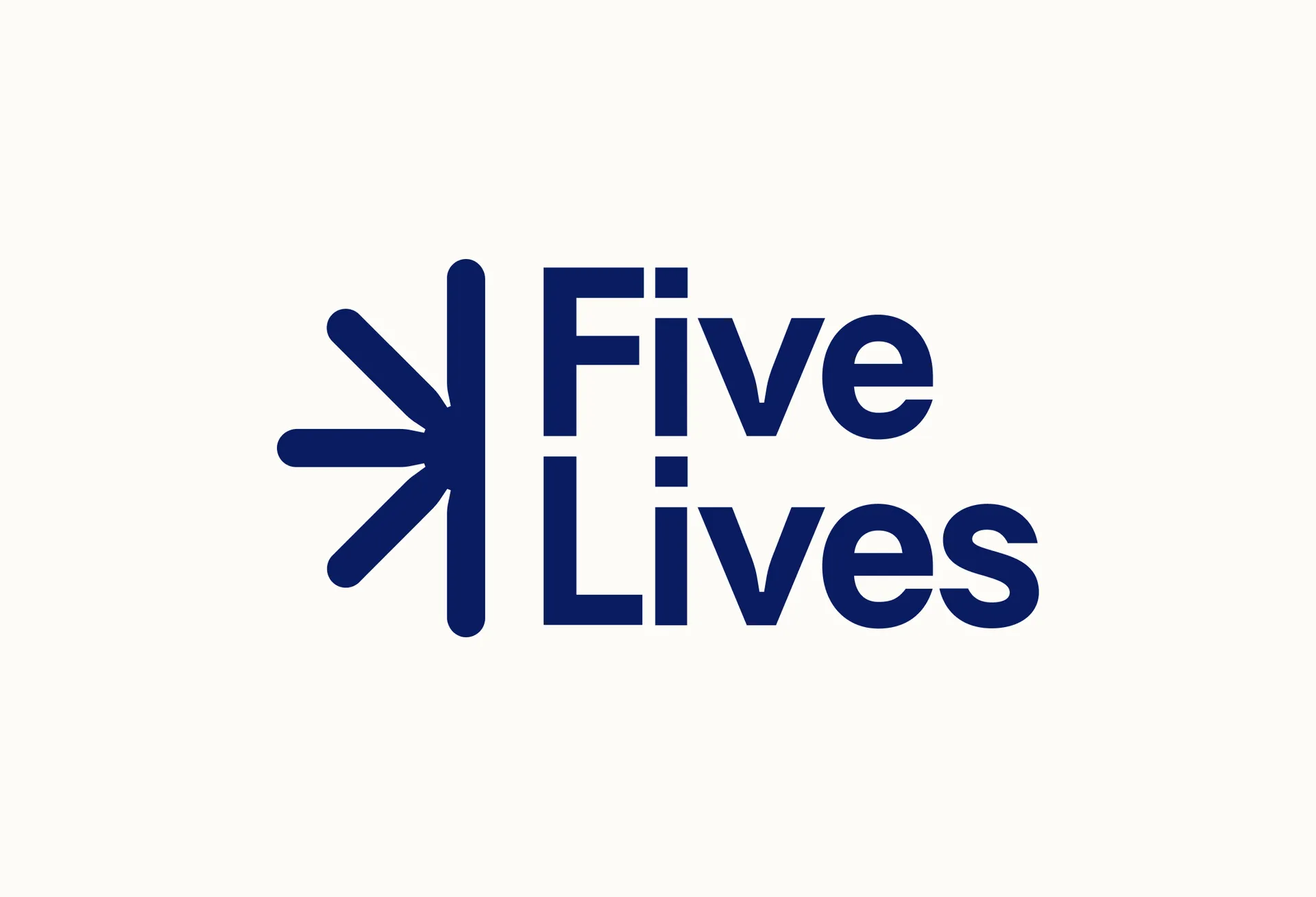
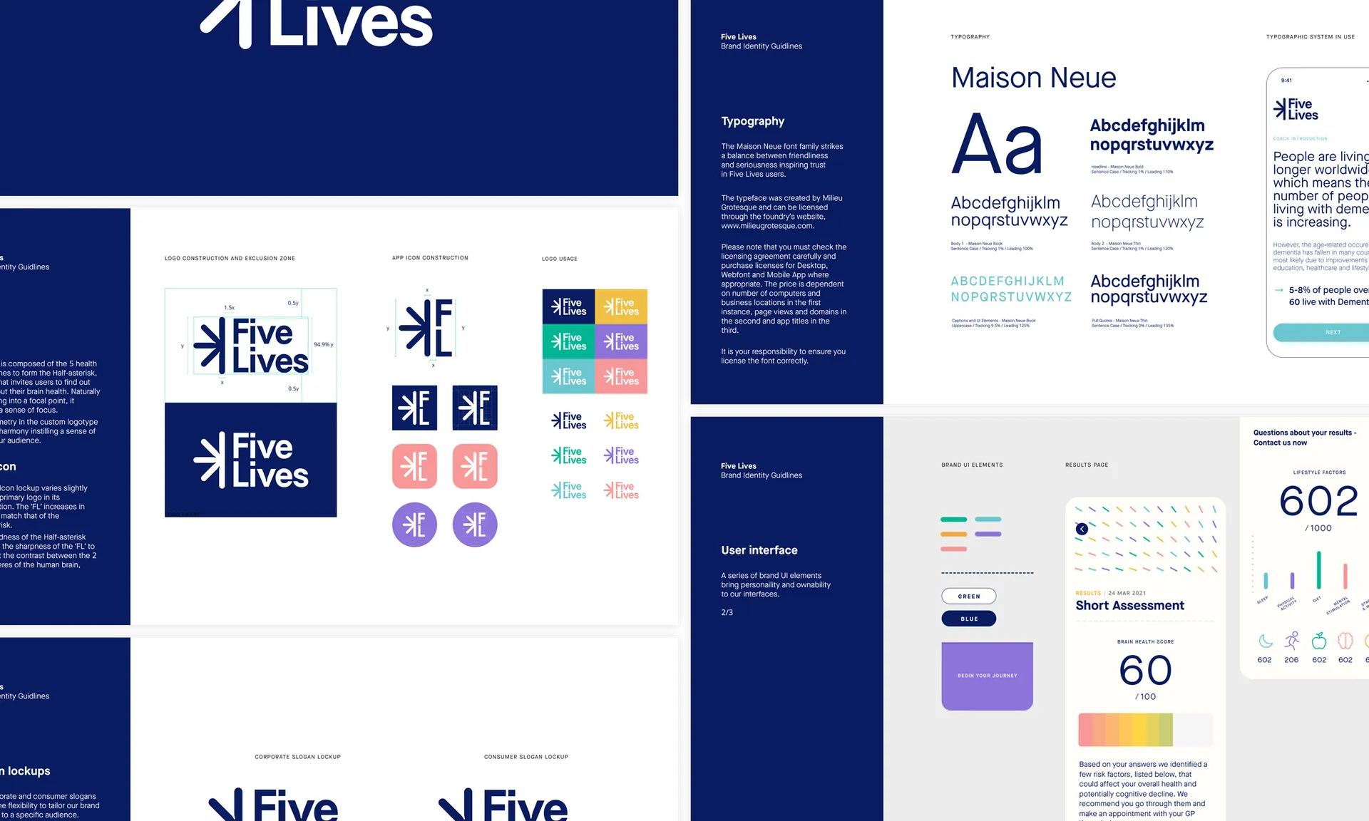
The logo strikes a balance between approachability and scientific authority. Bespoke lettering done at Proxy features quirky ink traps on the V letters, while the clean, straight lines elsewhere maintain a sense of seriousness, inspiring trust.
Locked up with the half asterisk shape, the F and L letters from the name allude to the shape of a brain. The asterisk is placed on the more analytical left side — just as asterisks are used in scientific texts to mark points where there is an expanded set of information provided by the author, here it references the wealth of scientific research behind Five Lives' program.
On the right side, the F and L almost mirror each other, however the second bar in the F disrupts the symmetry. This alludes to the more creative, less ordered right side of the brain, which is said to be the side that controls more artistic pursuits.

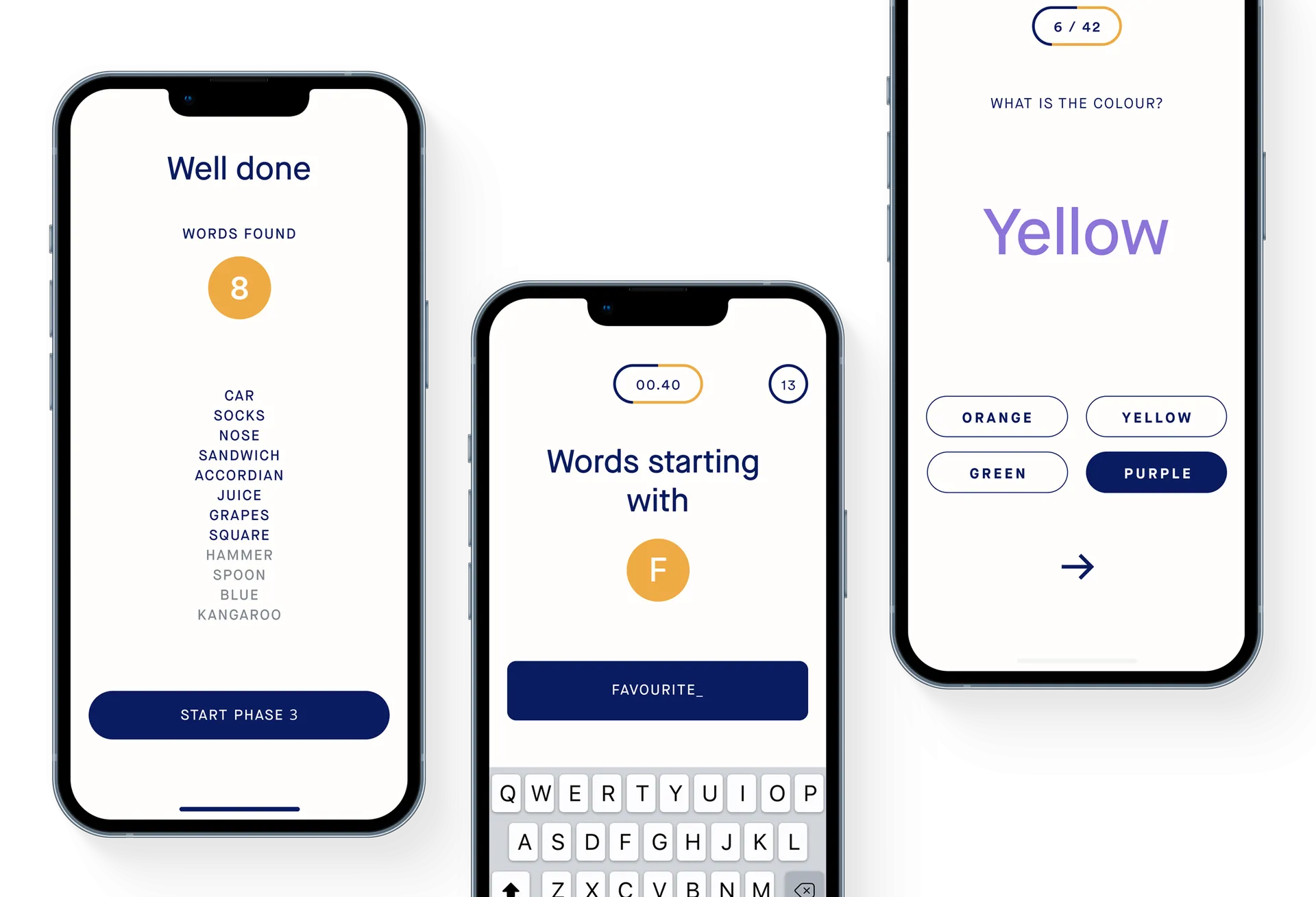
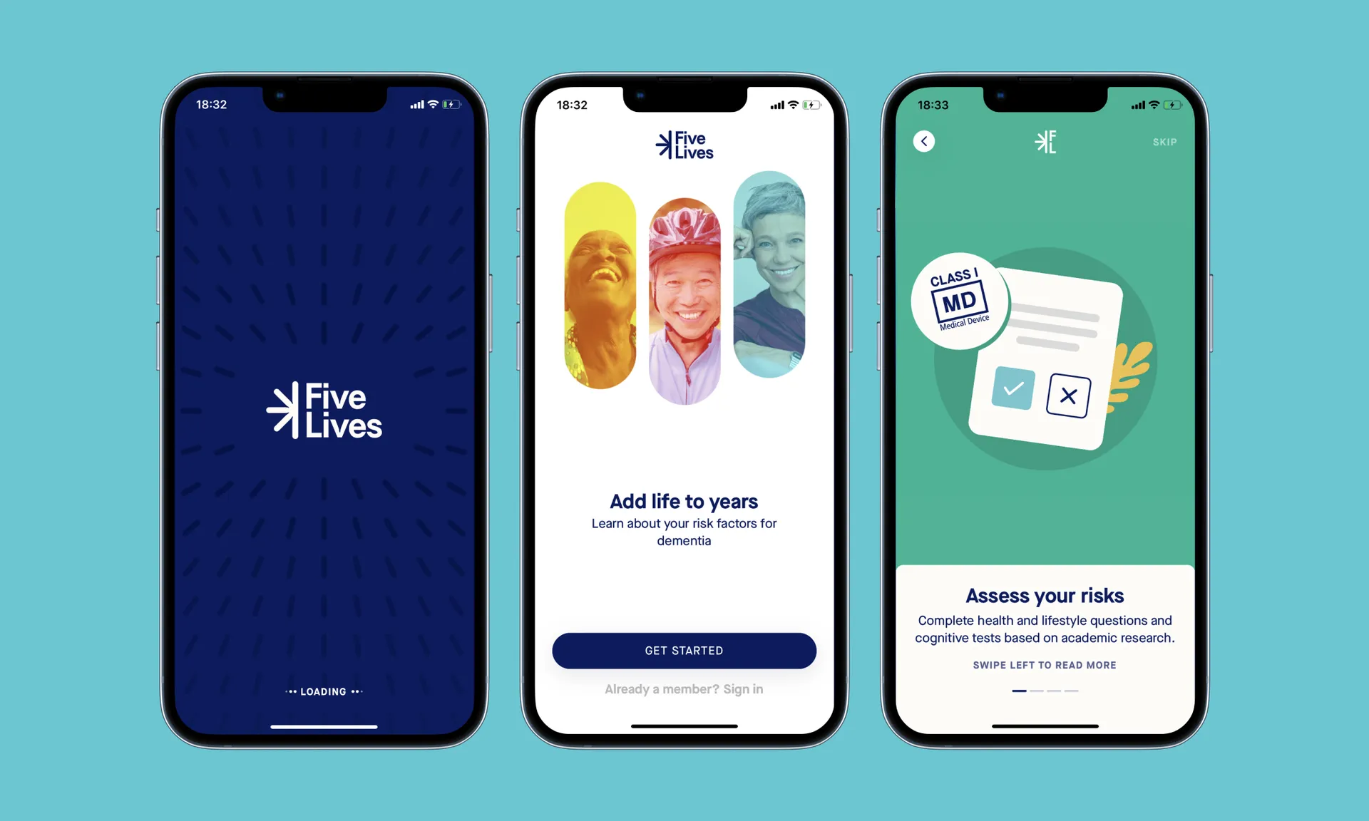
The starting point of all design work was the product itself. Developed in close collaboration with the in-house UI/UX team at Five Lives, the new brand identity became immediately useful for the product experience.
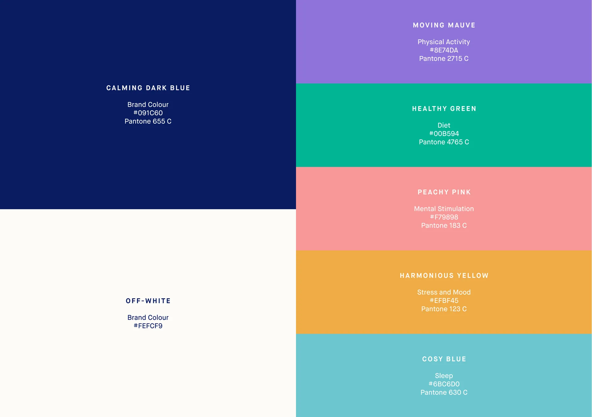
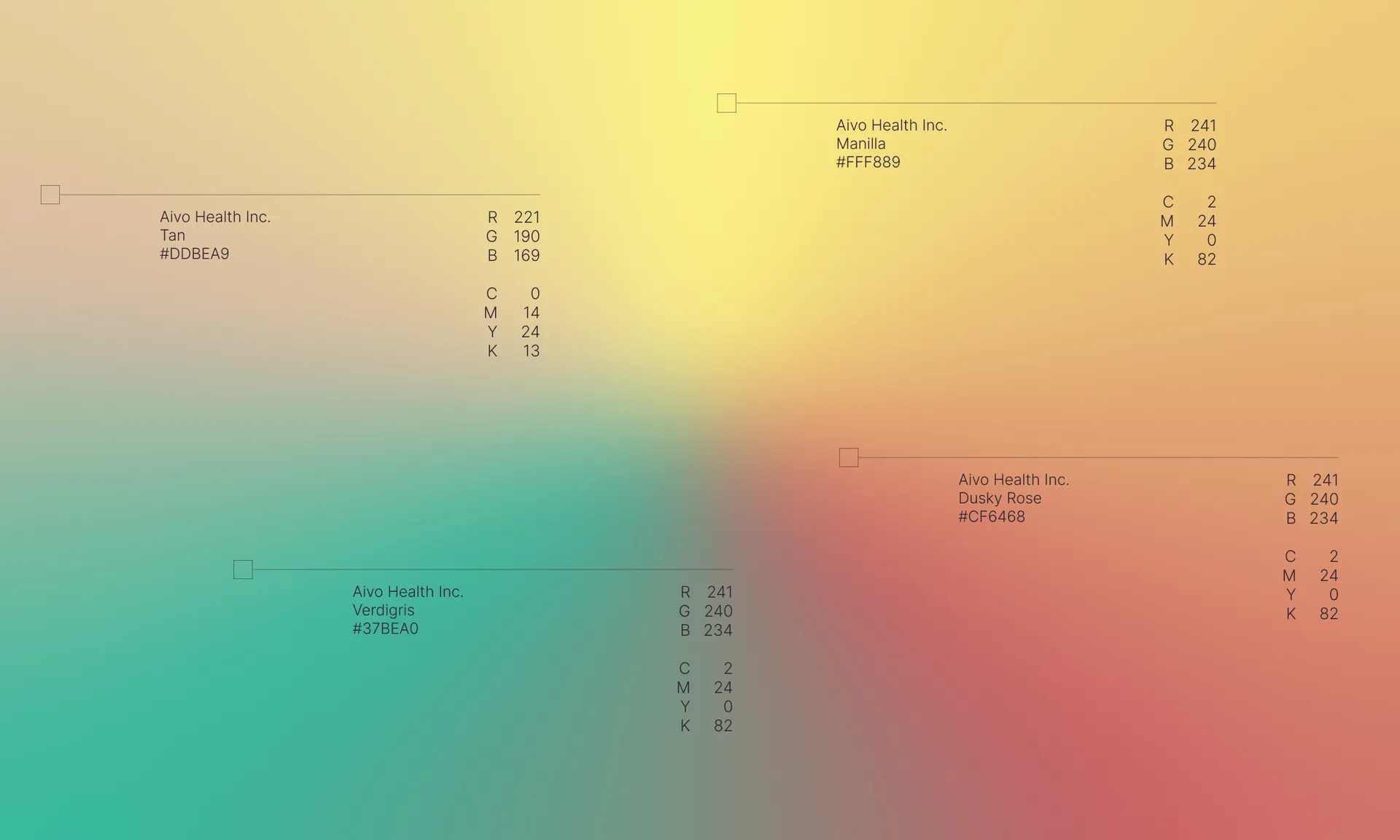
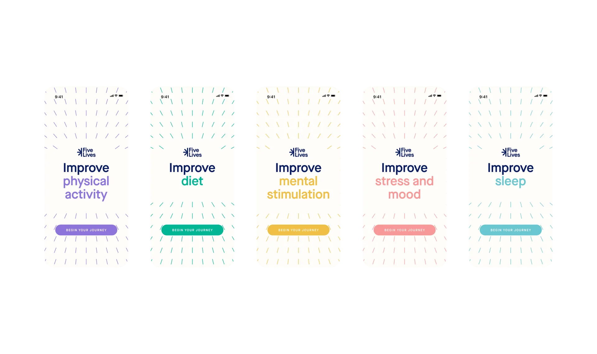
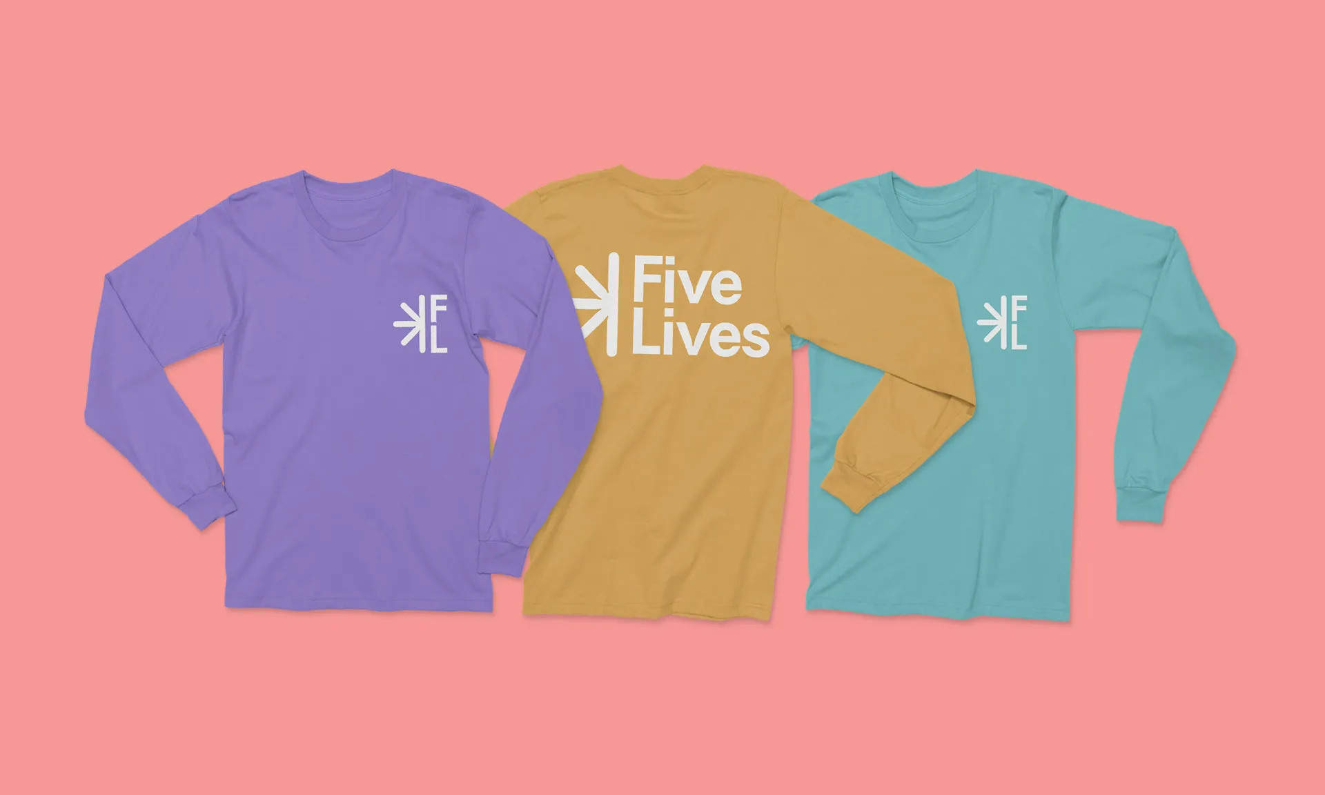
While the main brand colours are a calming blue and an off-white that aids reading in digital spaces, these are complemented with a more playful palette.
Representing the five pillars associated with maintaining cognitive health, the complimentary brand colours are used to signpost the brain health platform's various focuses.
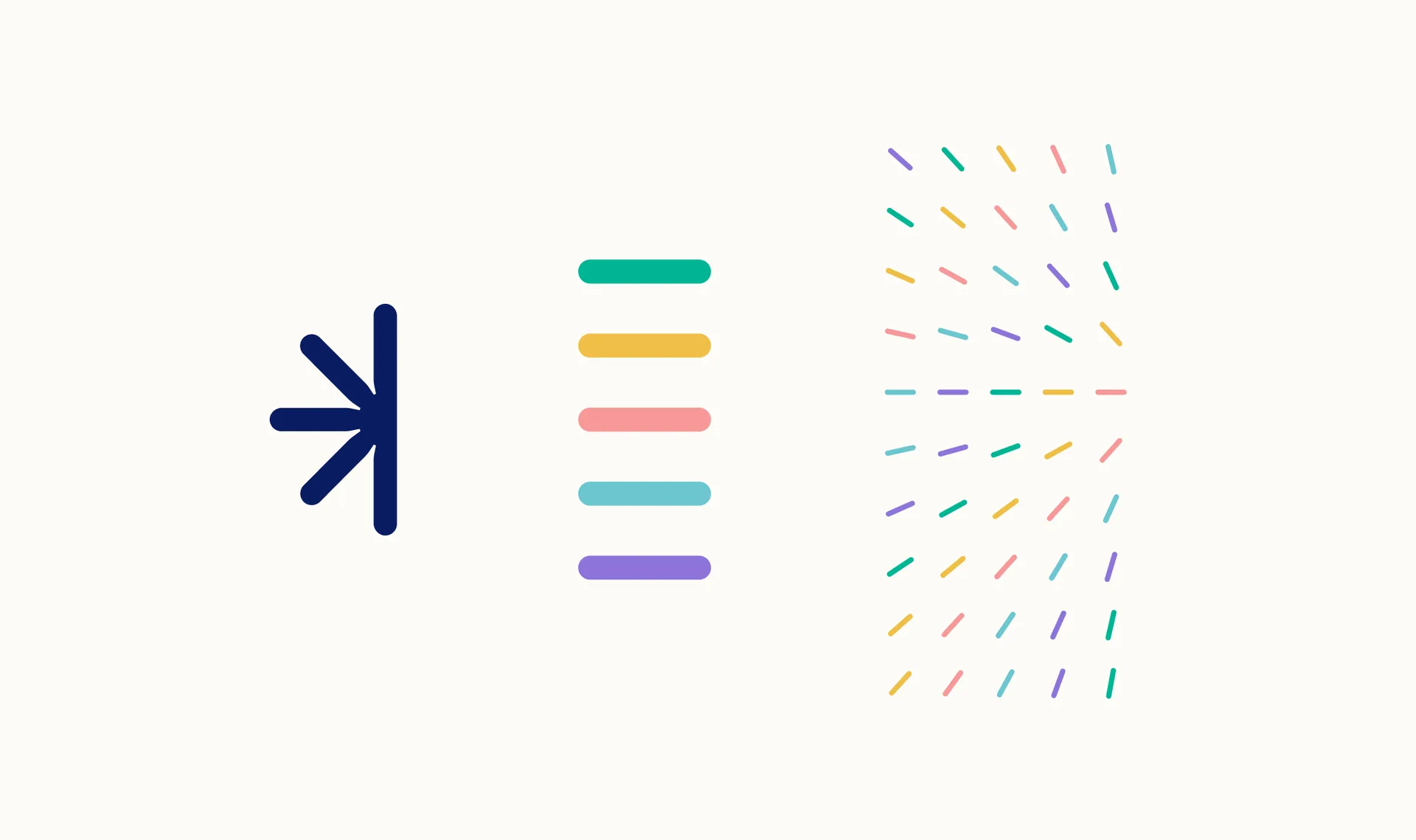
Based on the dashes that compose the brand mark, they move in unison, turning
to the same coordinate; creating movement and defining a focal point.
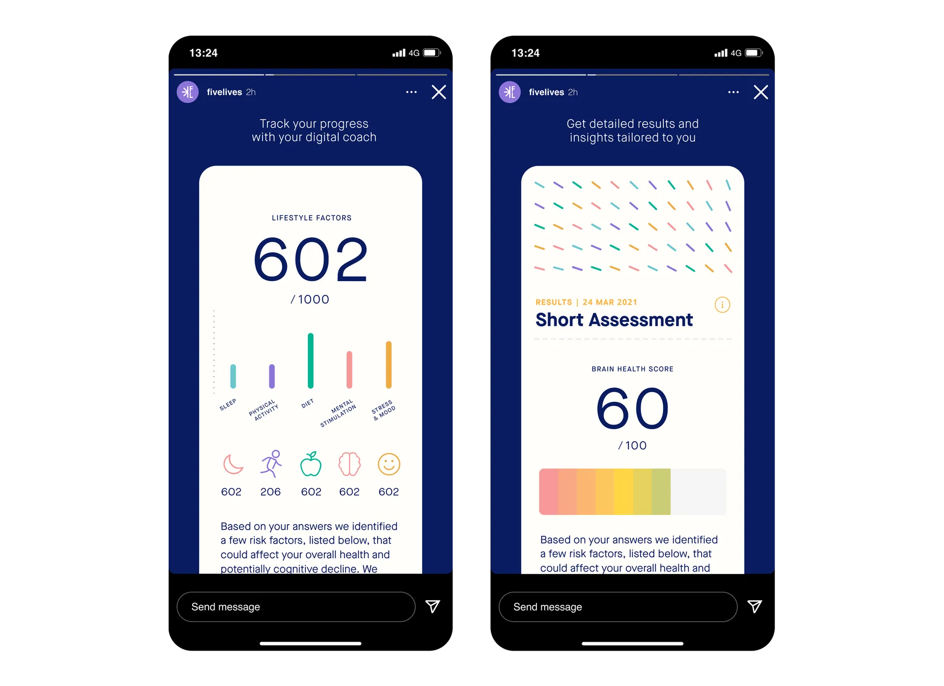
The elements of the brand identity combine to create clean, user-friendly assets and UI that are well suited to Five Lives' senior target audience.
Simple and functional typography combines with the colours and patterns to create accessible yet engaging touchpoints.