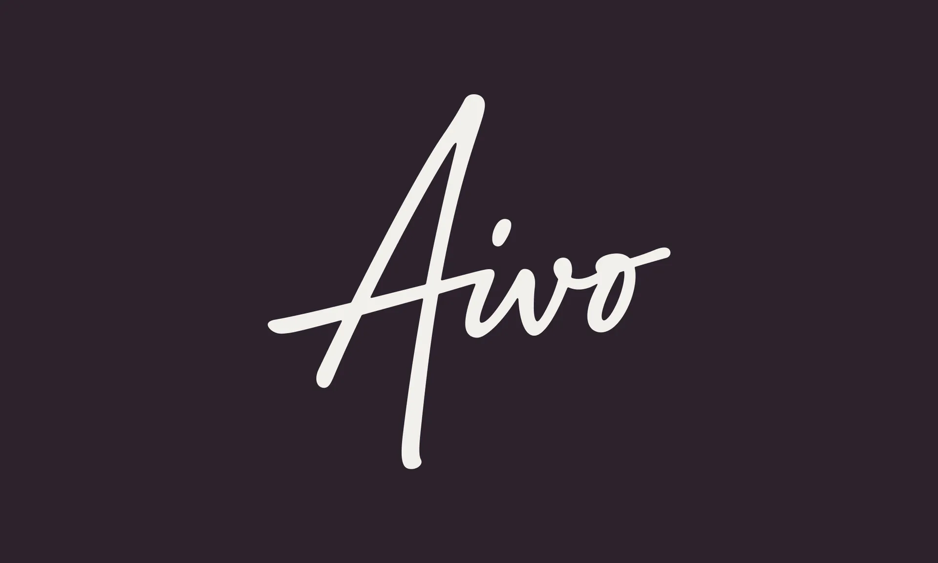
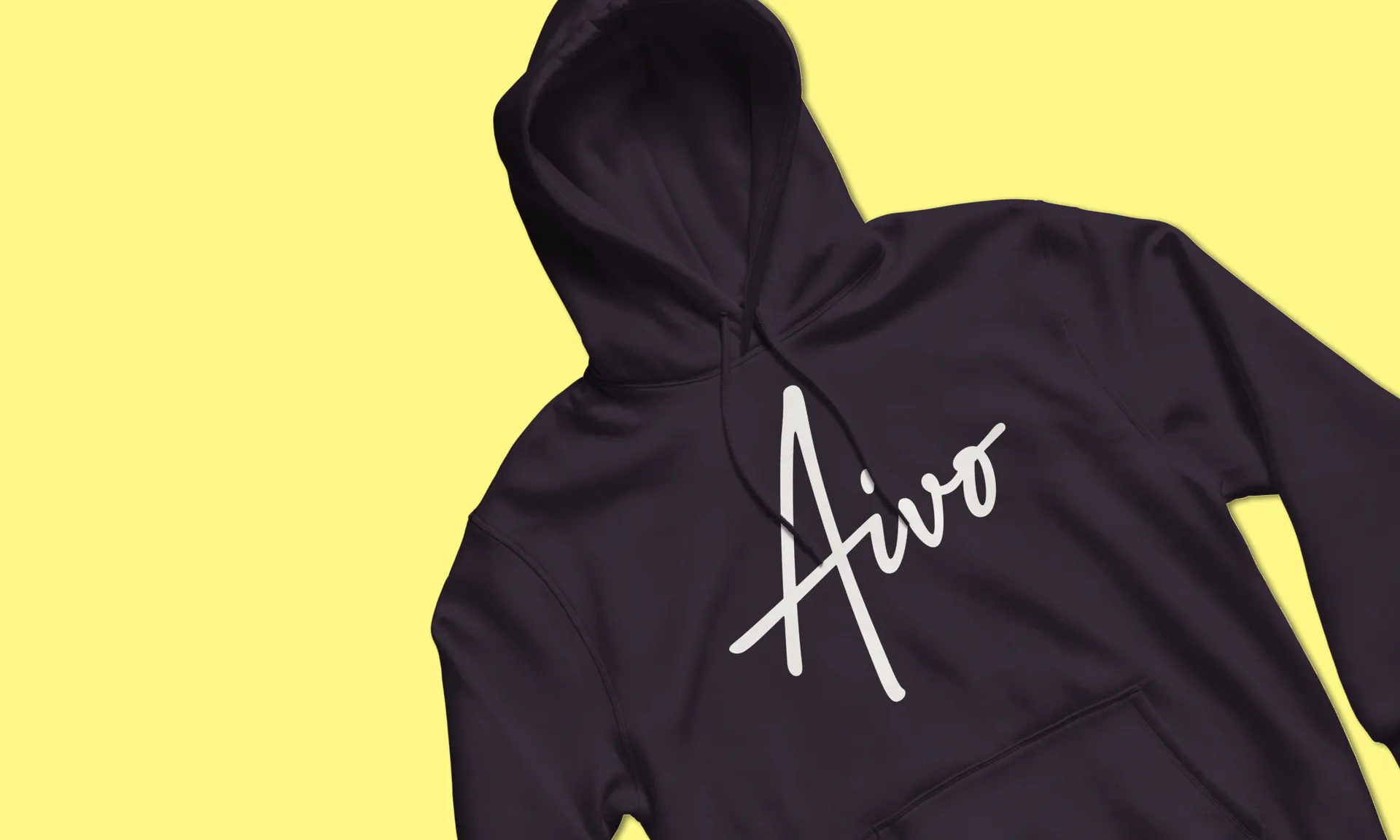
Pain is a deeply personal, unpleasant topic to discuss. As we explored various approaches to a logotype, we found that a human signature had the warmth and reassurance we wanted to communicate with the Aivo brand.
We worked with lettering artist Rob Clarke to develop the final form of the logotype. With an upwards movement and an appearance of written ink, the final logotype takes a differentiated, reassuringly relevant form.
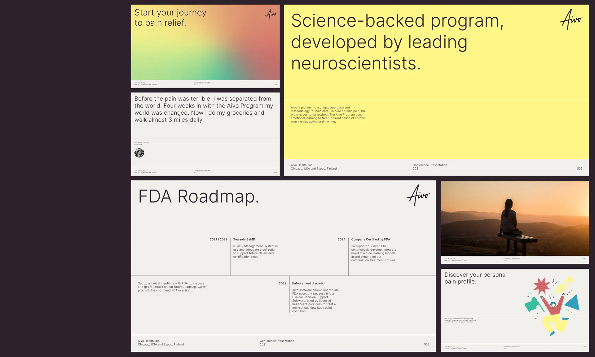
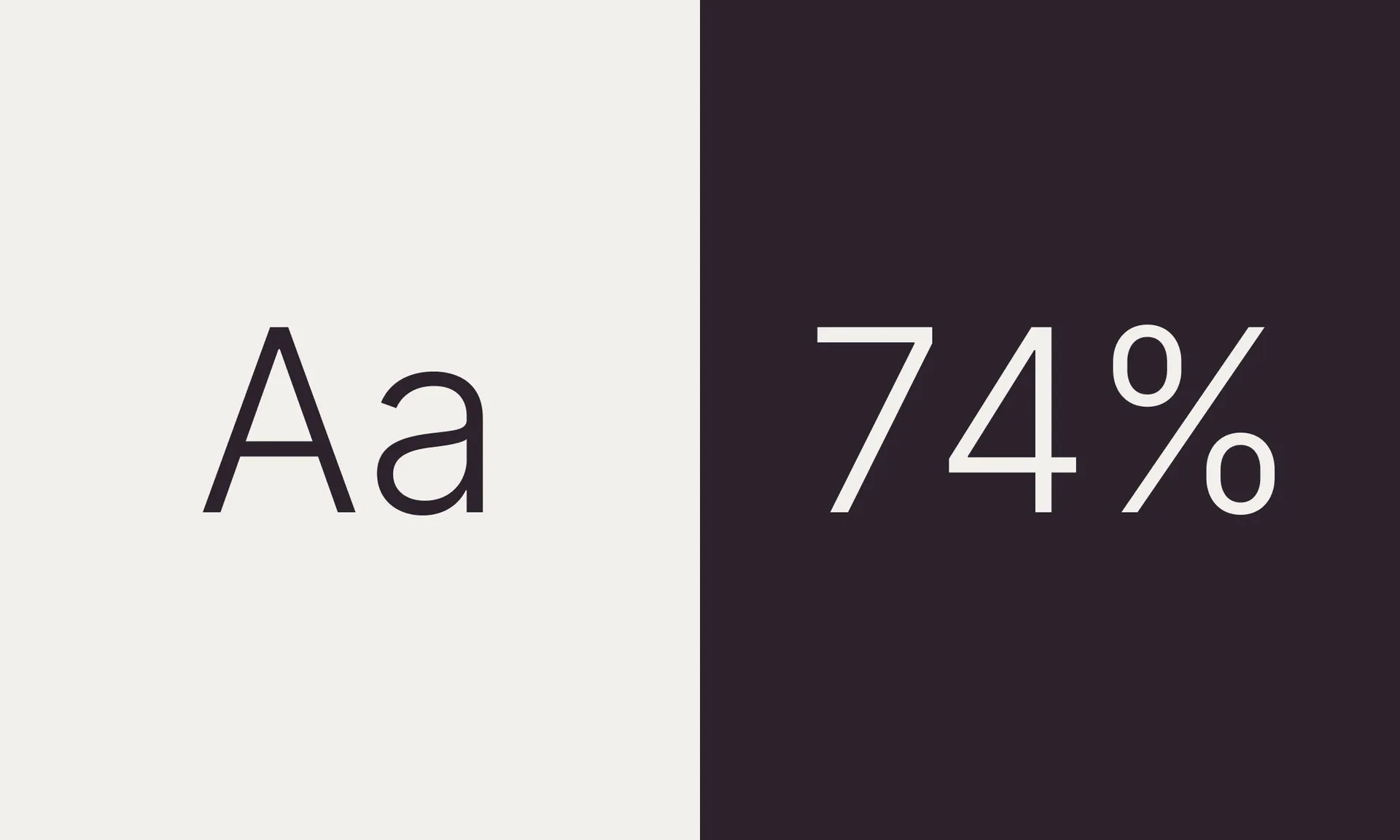
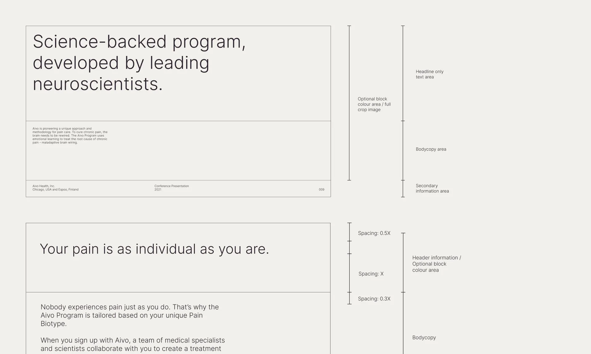
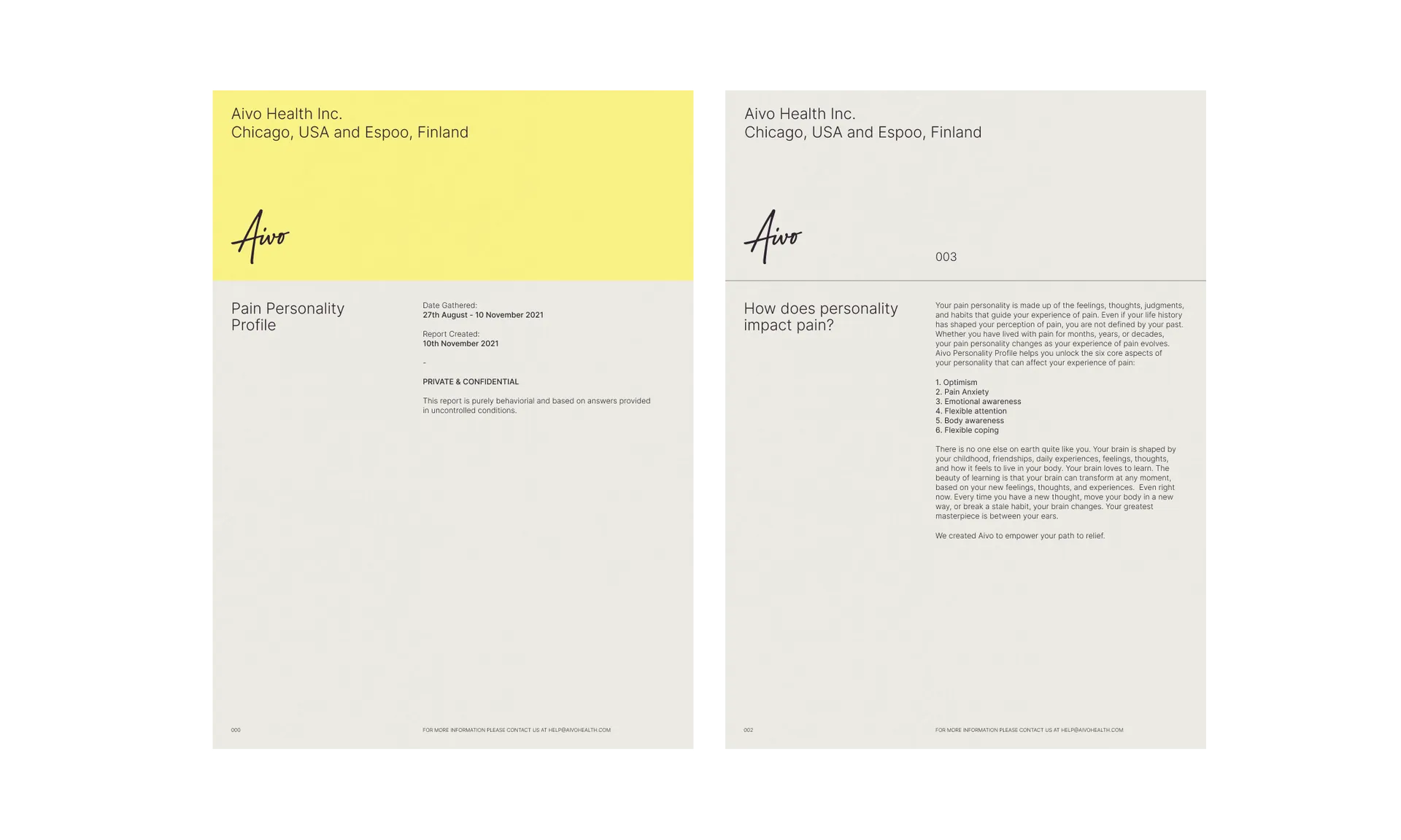
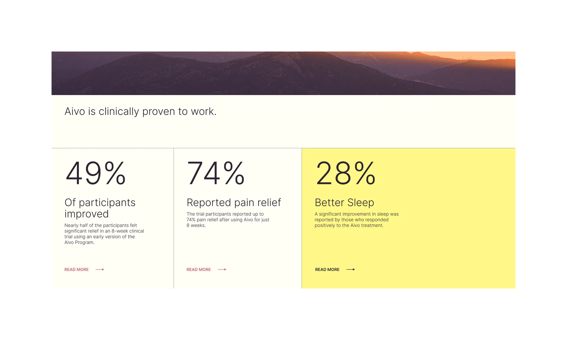
To balance the warm, human logotype, a strictly grid based, functional typographic system was developed. Left aligned type, a firm grid and a reduced number of type sizes evoke a scientific, medical impression.
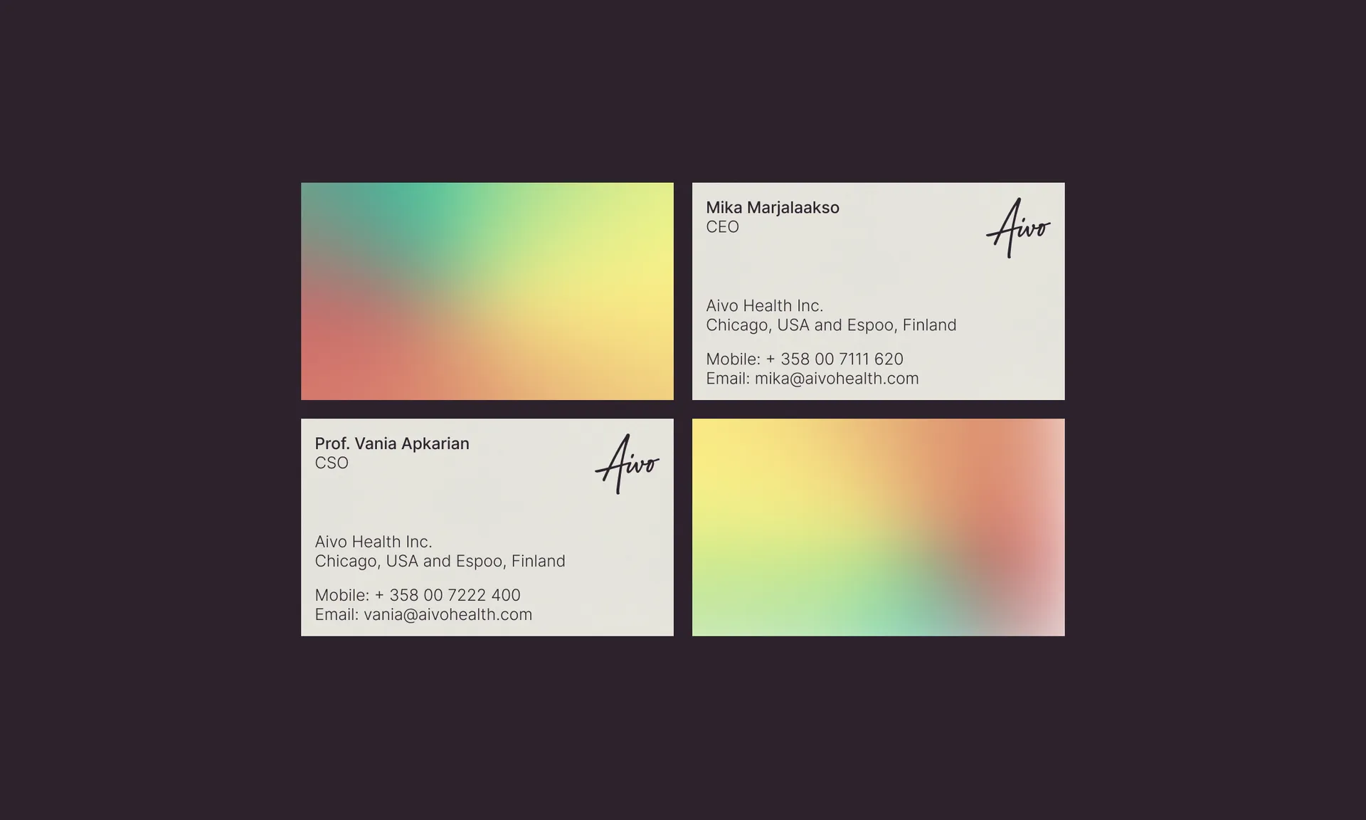
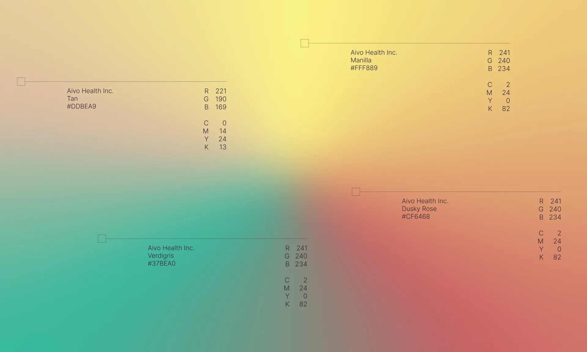
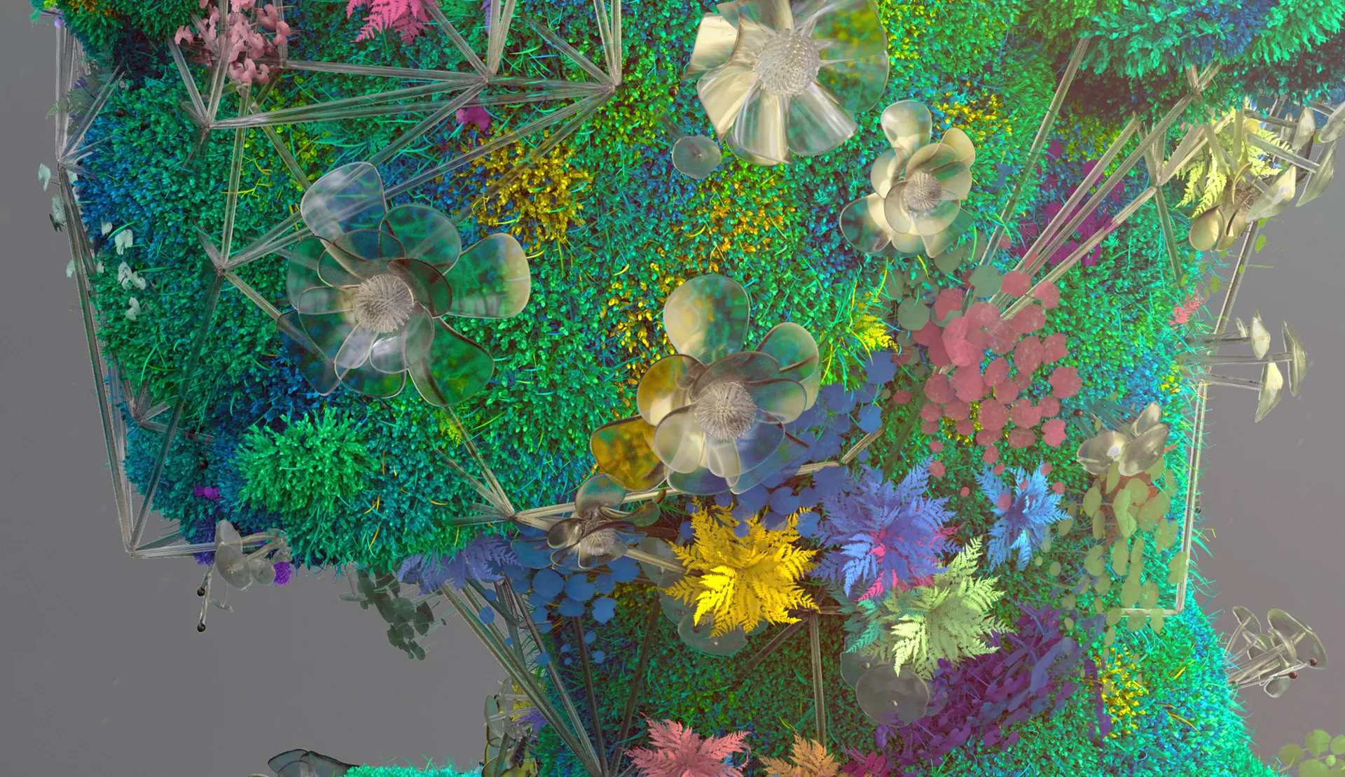
The dynamic, warm colour way is inspired by the patterns of pain signals travelling through the brain. With Aivo, sharp pain gives way to a pain free, optimistic existence. The gradient colour way was given a subtle animation, illustrating the journey.
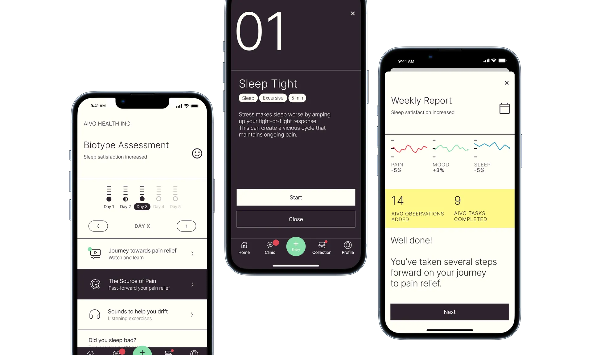
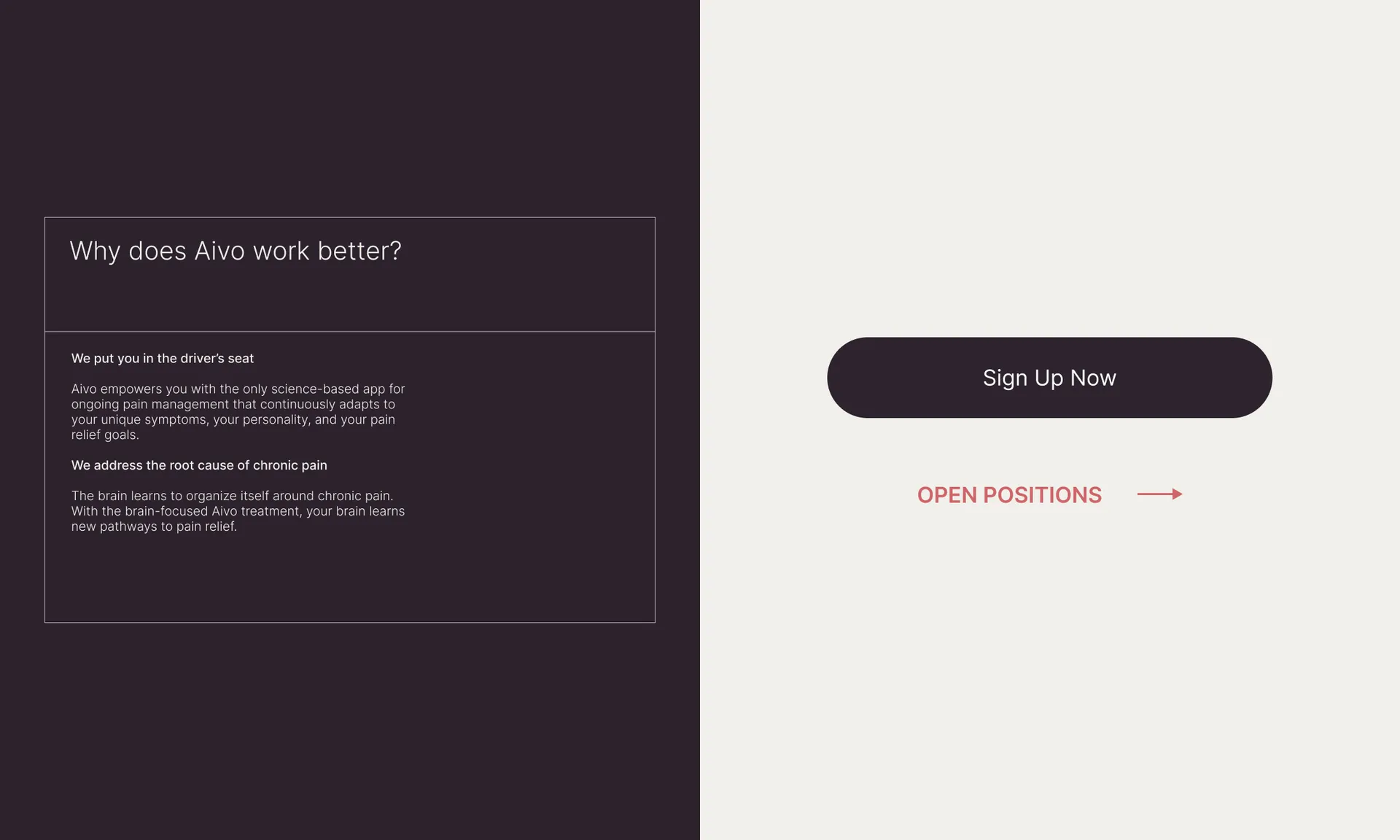
The Aivo identity system was developed with an appreciation of the app as the primary touchpoint. From a differentiated logo for the app icon, to a clear, high contrast UI, Aivo is meant to become a trusted daily companion.
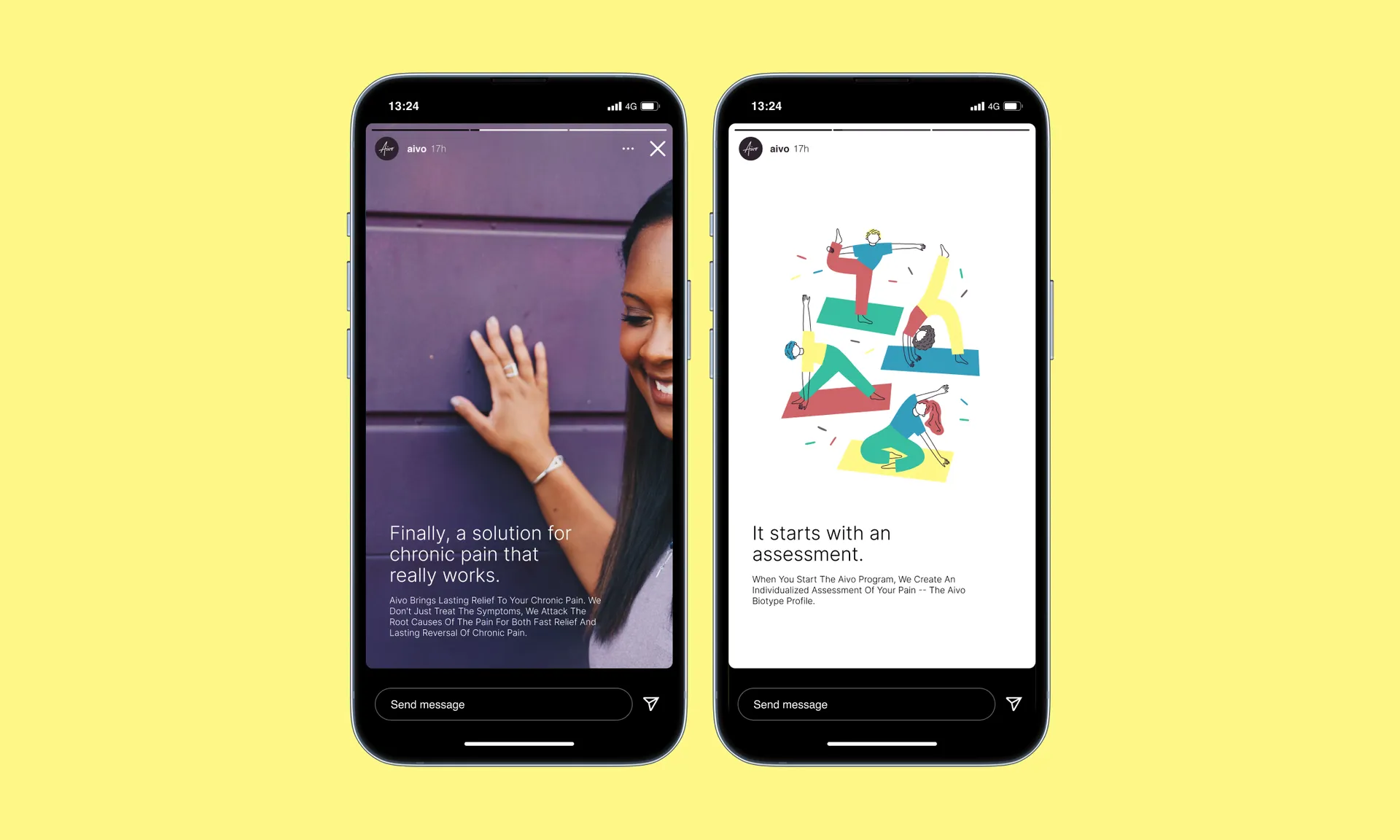
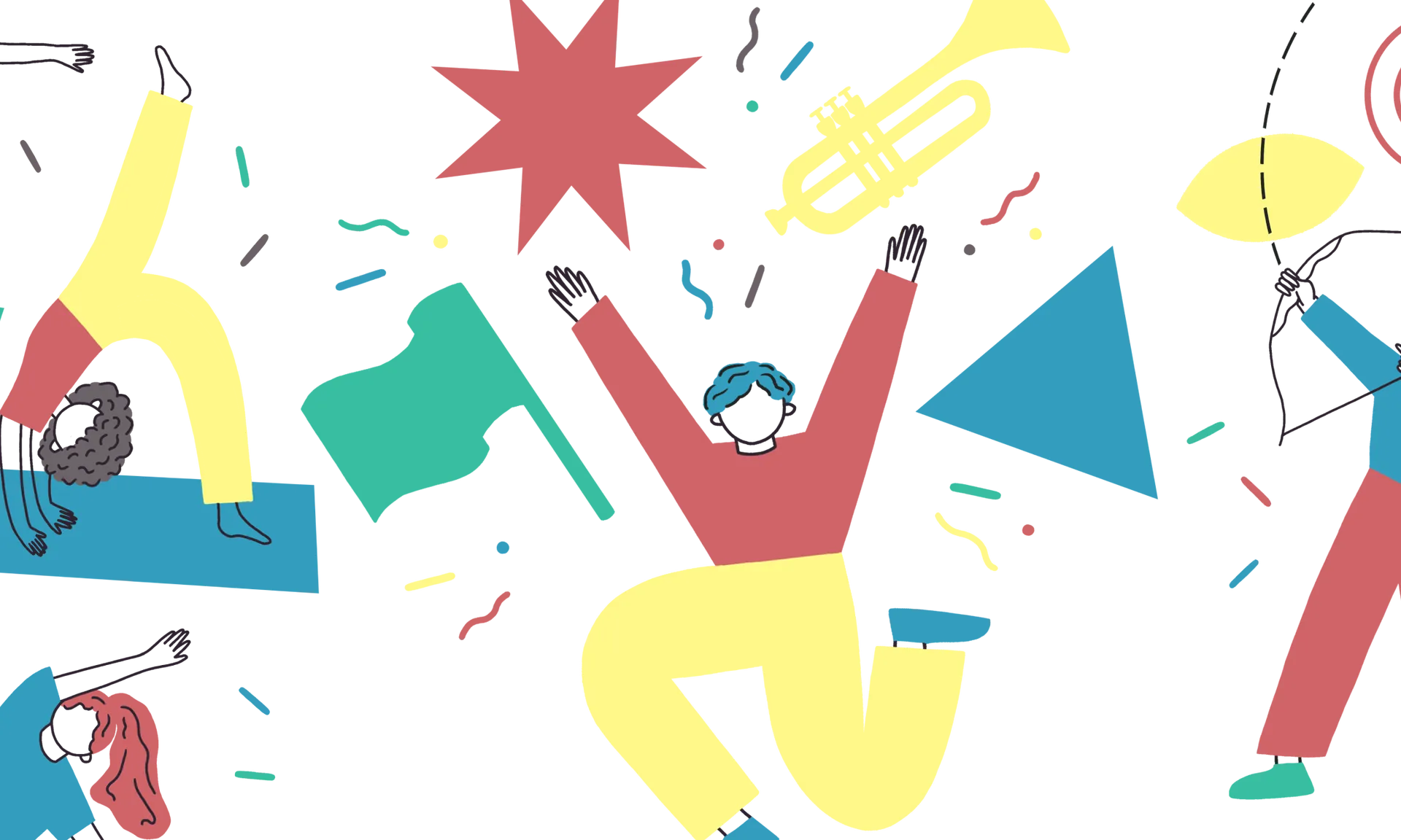
Illustrations lighten the app experience at key moments, and are useful in social media and presentations as well. An optimistic, bespoke illustration style was developed for Aivo with illustrator Esme Alice Mackey.
As Aivo begins its important mission to reverse chronic pain, the new brand gives the team a shape of things to come — a brand that uniquely combines human warmth with clinical trustworthiness to tackle a humanity scale problem.
