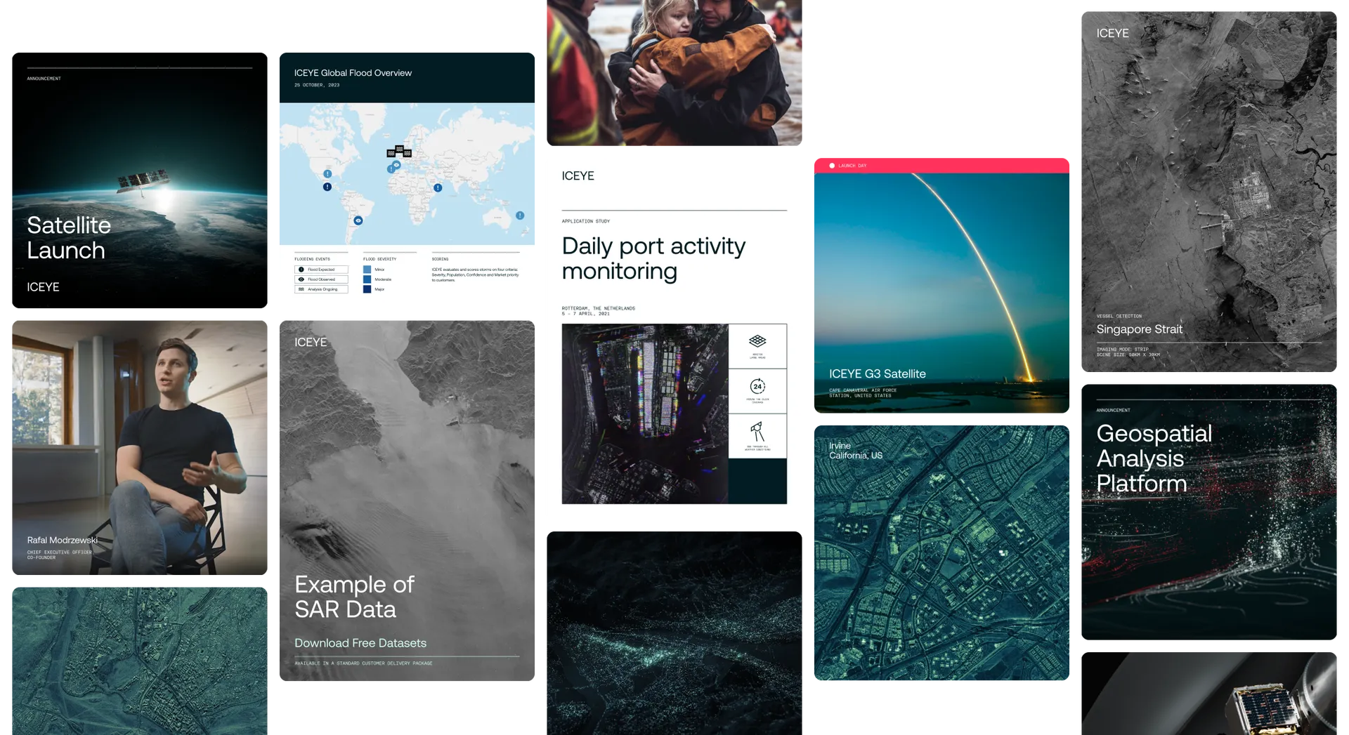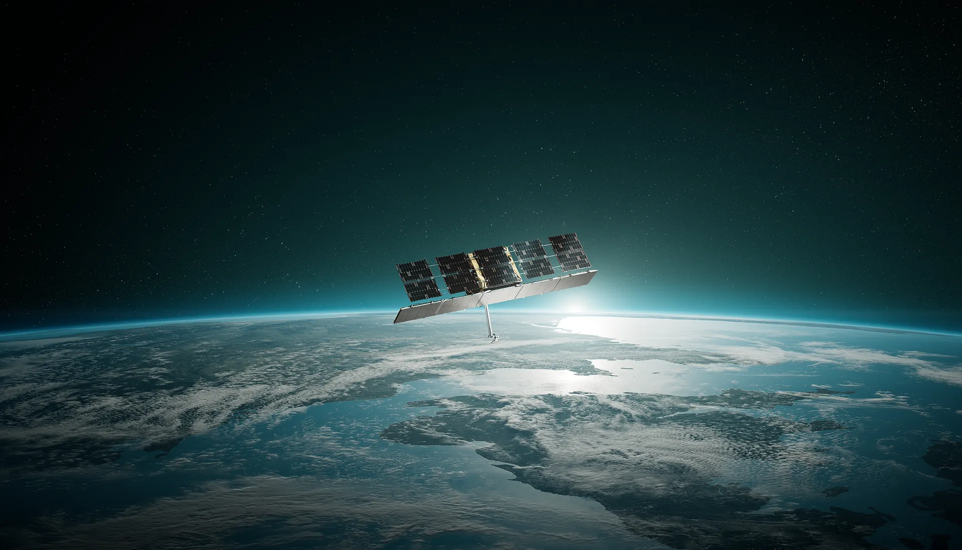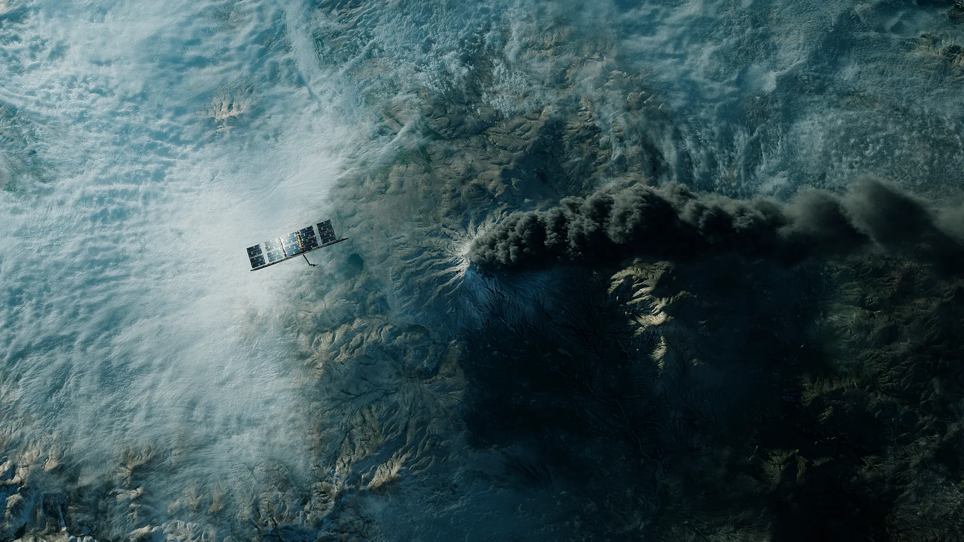
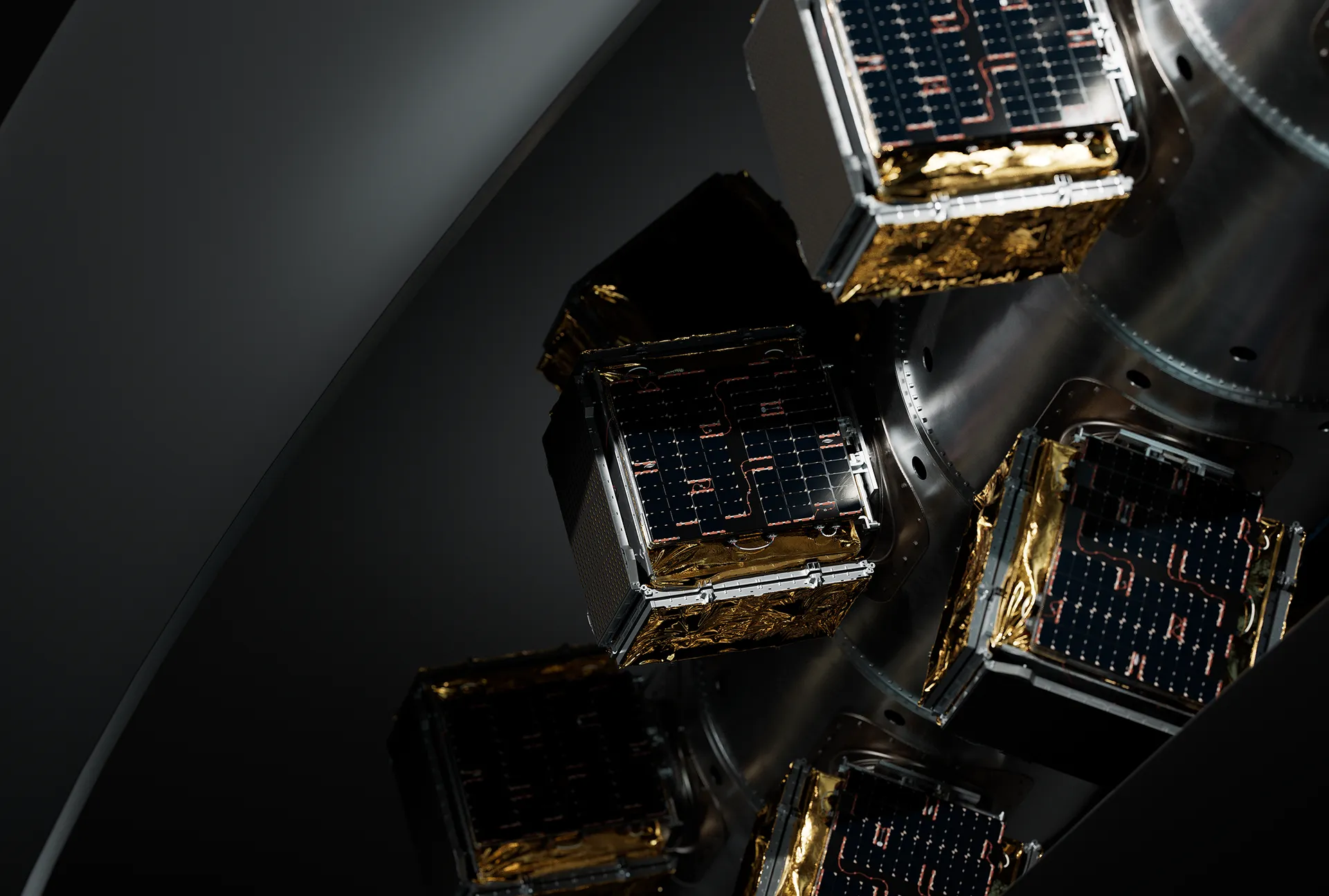
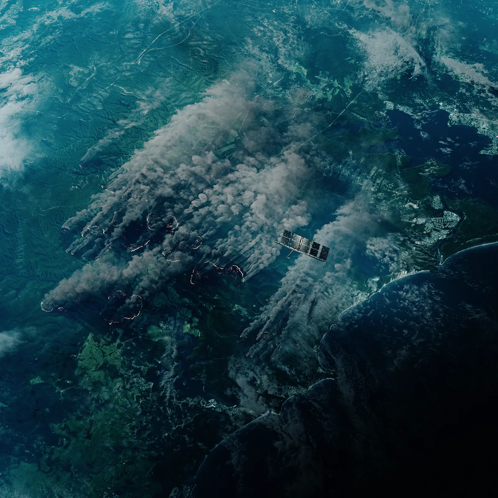
ICEYE’s futuristic technology is the shining heart of the new brand. Cinematic renders created in house at Proxy show satellites across their epic journey: gleaming and ready for deployment; gliding serenely over the earth; forming constellations that track a path toward the horizon. Marrying together the natural universe with ICEYE’s sophisticated machinery, this suite of imagery depicts a harmony between planet and humankind — one ICEYE facilitates as the neutral link between both parties.

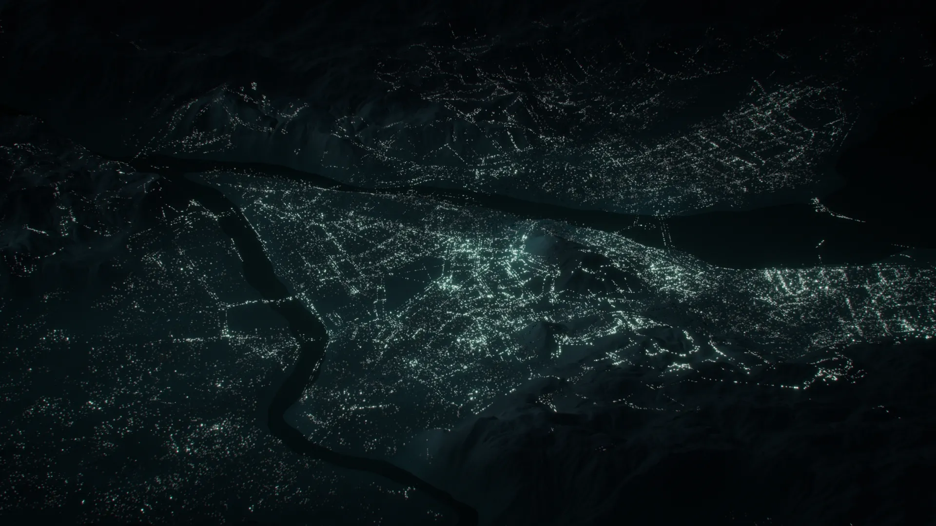
Alongside this product imagery is a more abstract set, one that illustrates the multitude of sources beyond satellites that ICEYE use to collect earth observation data. Points of light mark out the silhouettes of civilisation, as with cities seen from airplane windows at night. Each light point represents a datapoint sensed not from space but from here on earth. Animated, they rise in unison, creating clouds of particles in sequences that mark the gathering and transfer of information.
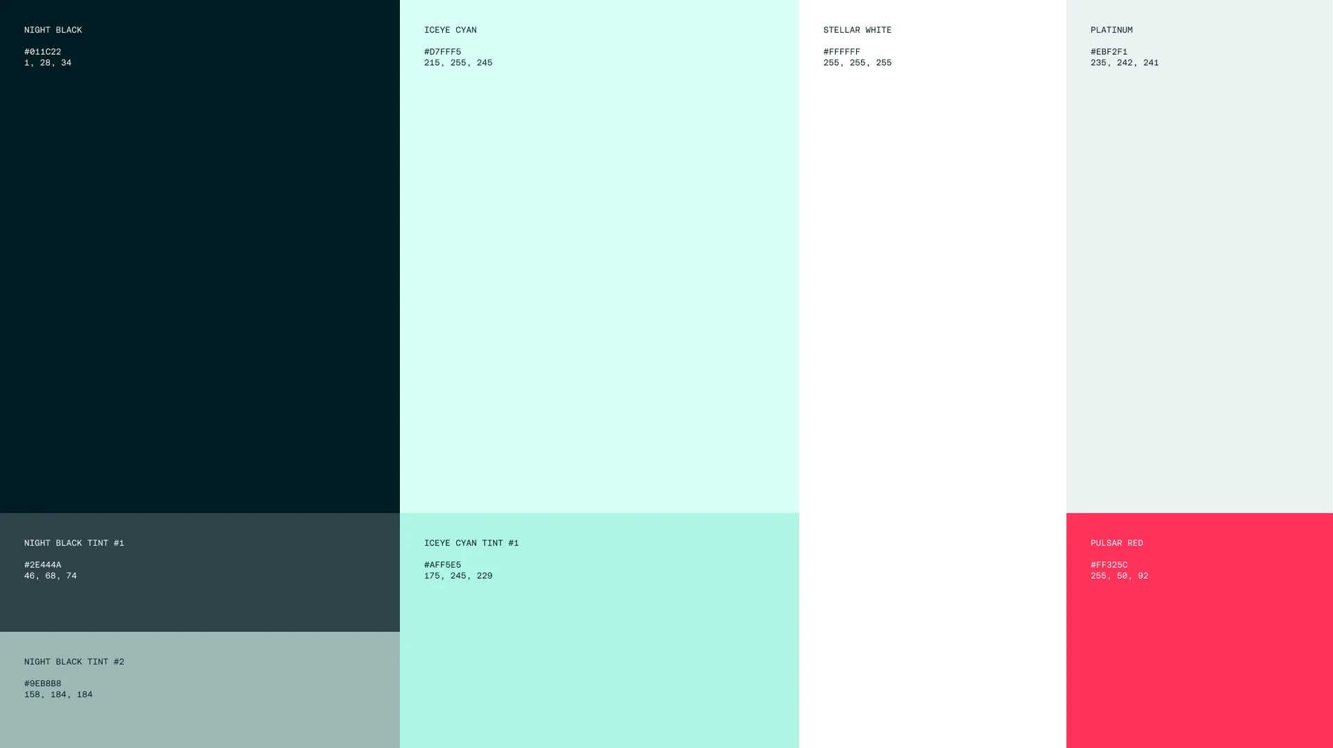
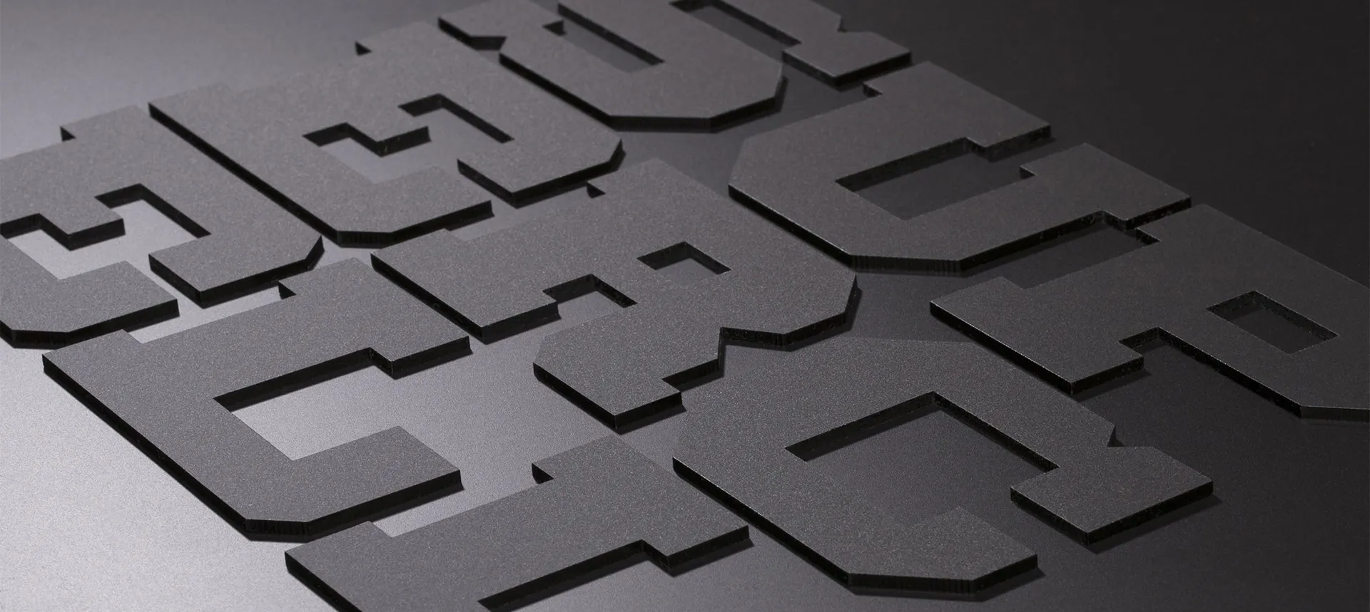
From this imagery a new colour palette is abstracted: spacey blues and starry white, punctuated with a live red that navigates one’s attention through ICEYE’s ever-growing output of information. The typography selection combines technical precision with warmth and idealism, for a distinctly optimistic, trusted brand.

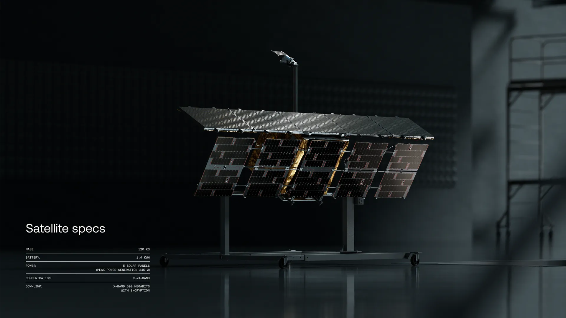
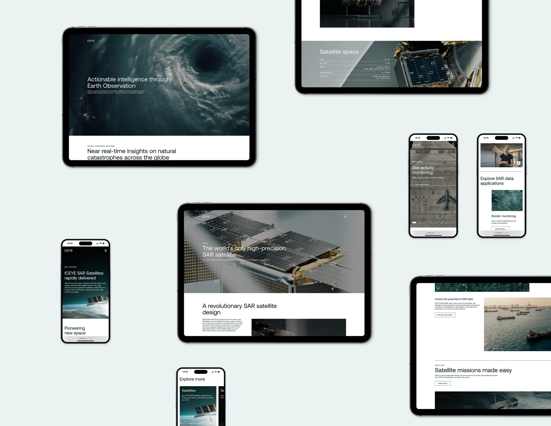
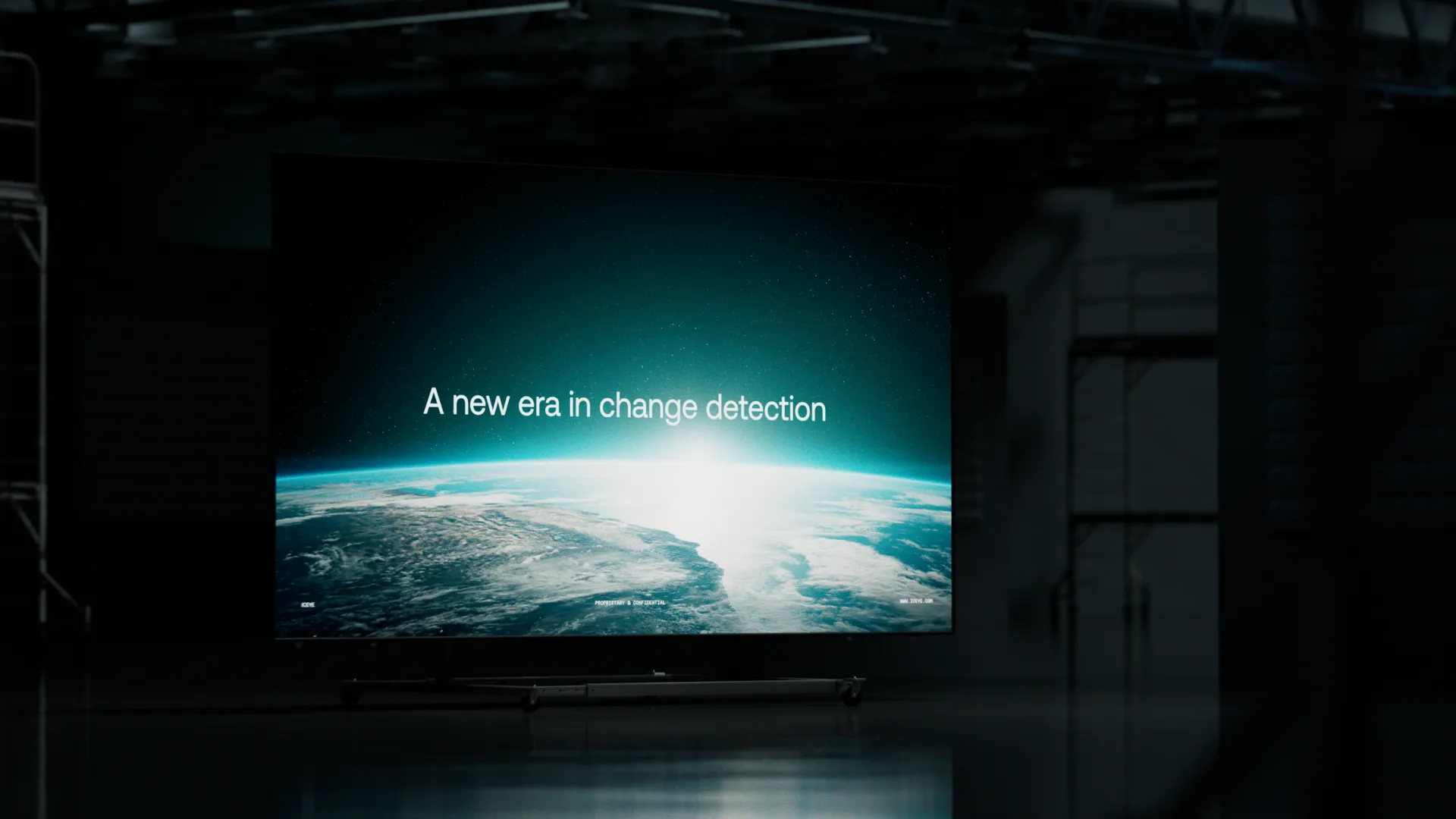
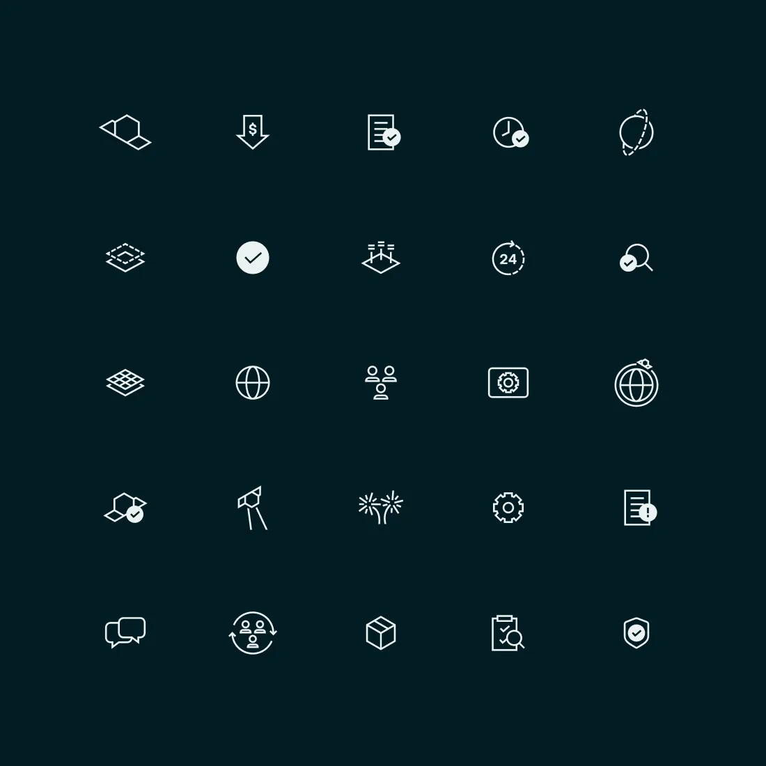
The new assets conspire to create a look and feel that is reassuring in its authority and yet decidedly human — it is, after all, mankind that ICEYE’s observation seeks to benefit. We designed a new website and art directed ICEYE’s team for a number of weeks as they rolled out the new brand across key assets. Clean and calm, the new brand is a reassuring presence even in the face of natural catastrophe, where ICEYE’s insights are used crucially to mitigate harm.
