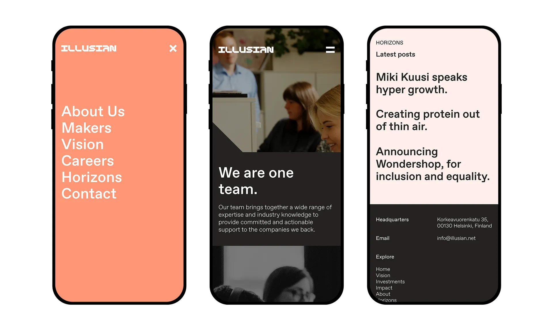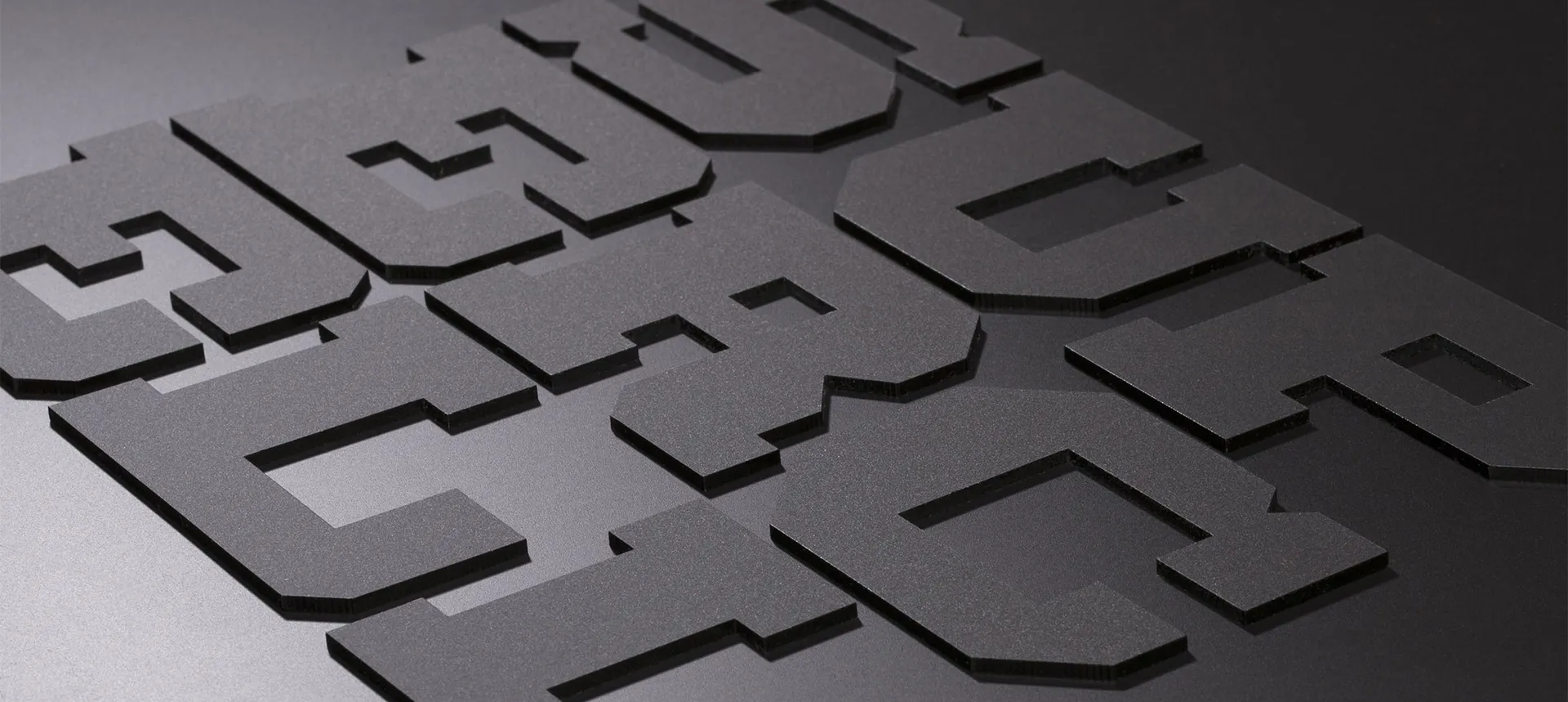
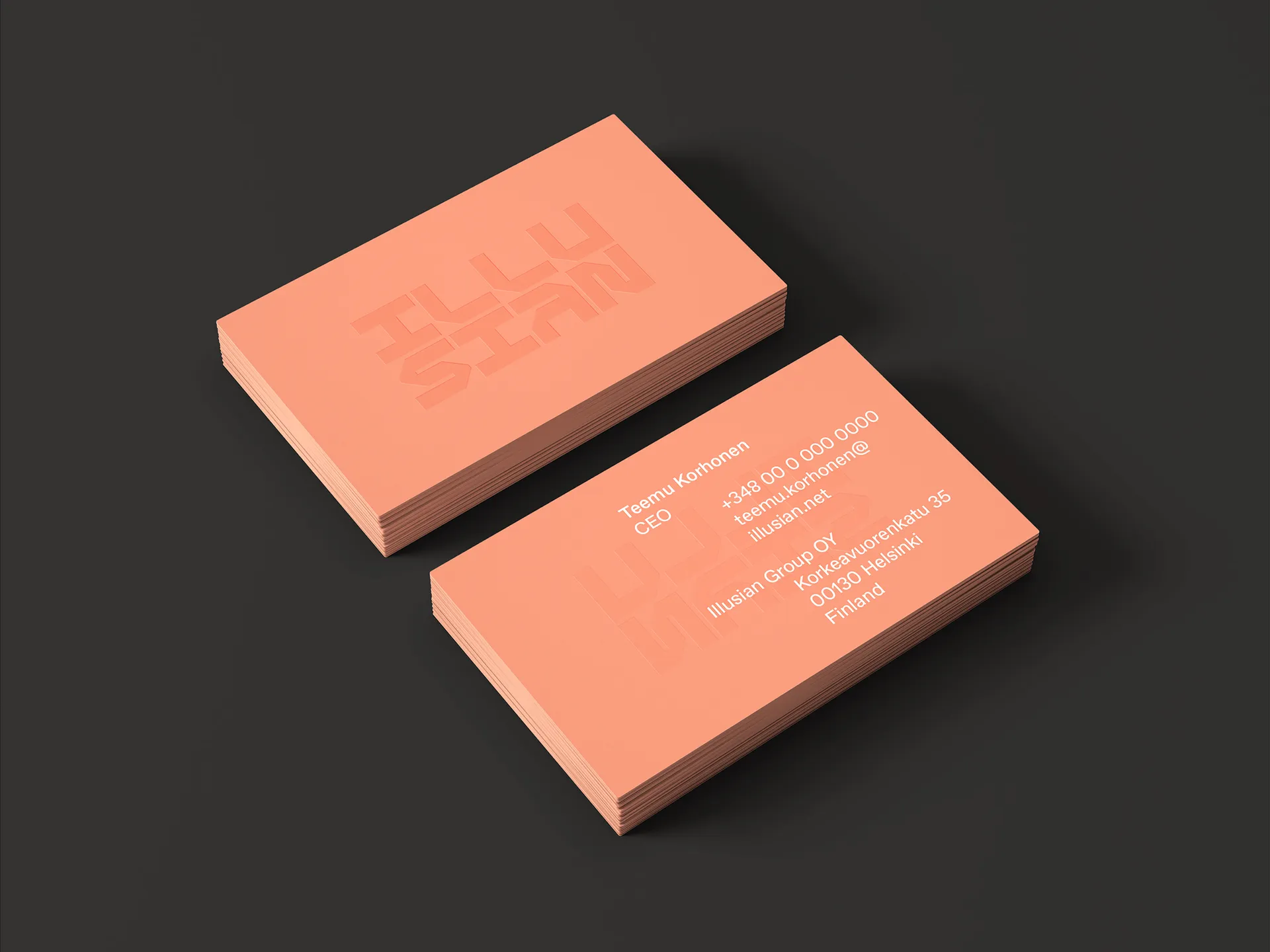
We created a confident yet playful identity to communicate the impact and the people-first values at the core of all Illusian's work. A grid system was designed to produce a typeface unique to Illusian. This was used to create a bold logotype with unusual and striking letter forms.

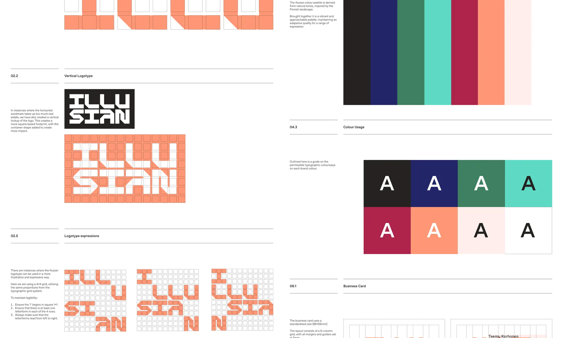
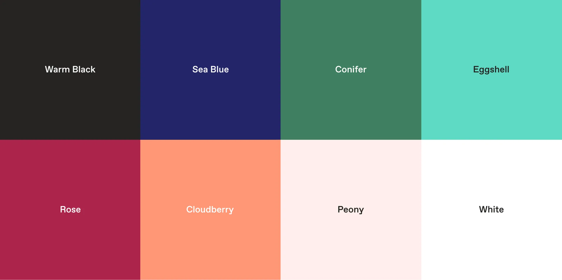
Inspired by the Finnish landscape, this broad colour palette lends Illusian a versatile brand able to sit alongside the variety of portfolio companies and initiatives the family office supports.
Warm tones are combined with naturally derived bright and bold shades to allow the brand to feel at once innovative and human.


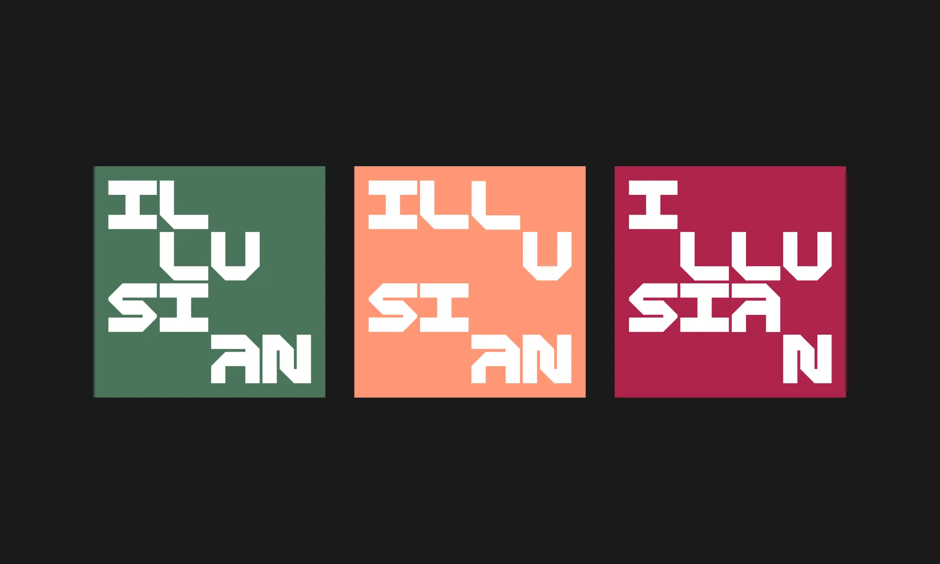
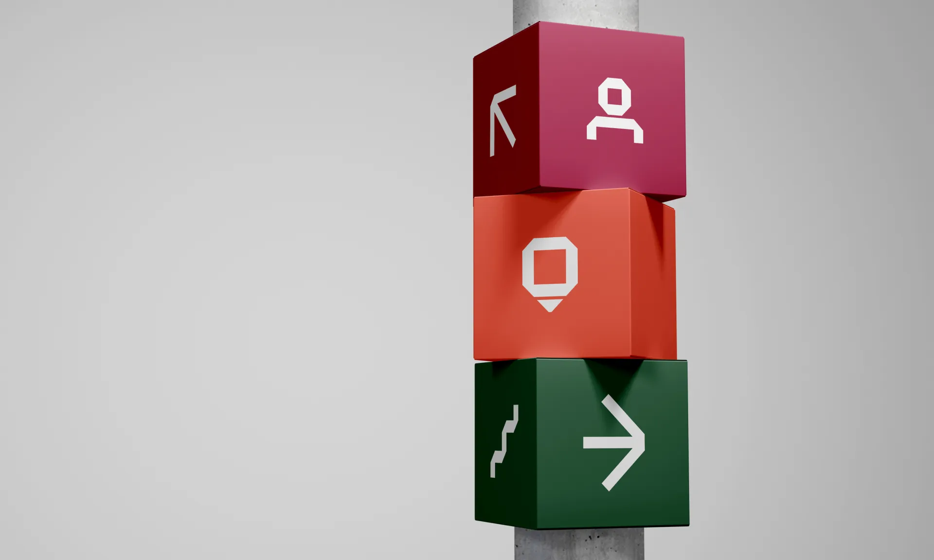
The same grid system used as a basis for the brand’s unique typeface also acted as a basis for extrapolating shapes for use as iconography and wayfinding systems.
