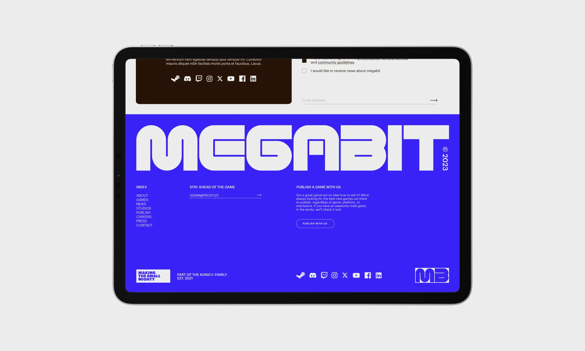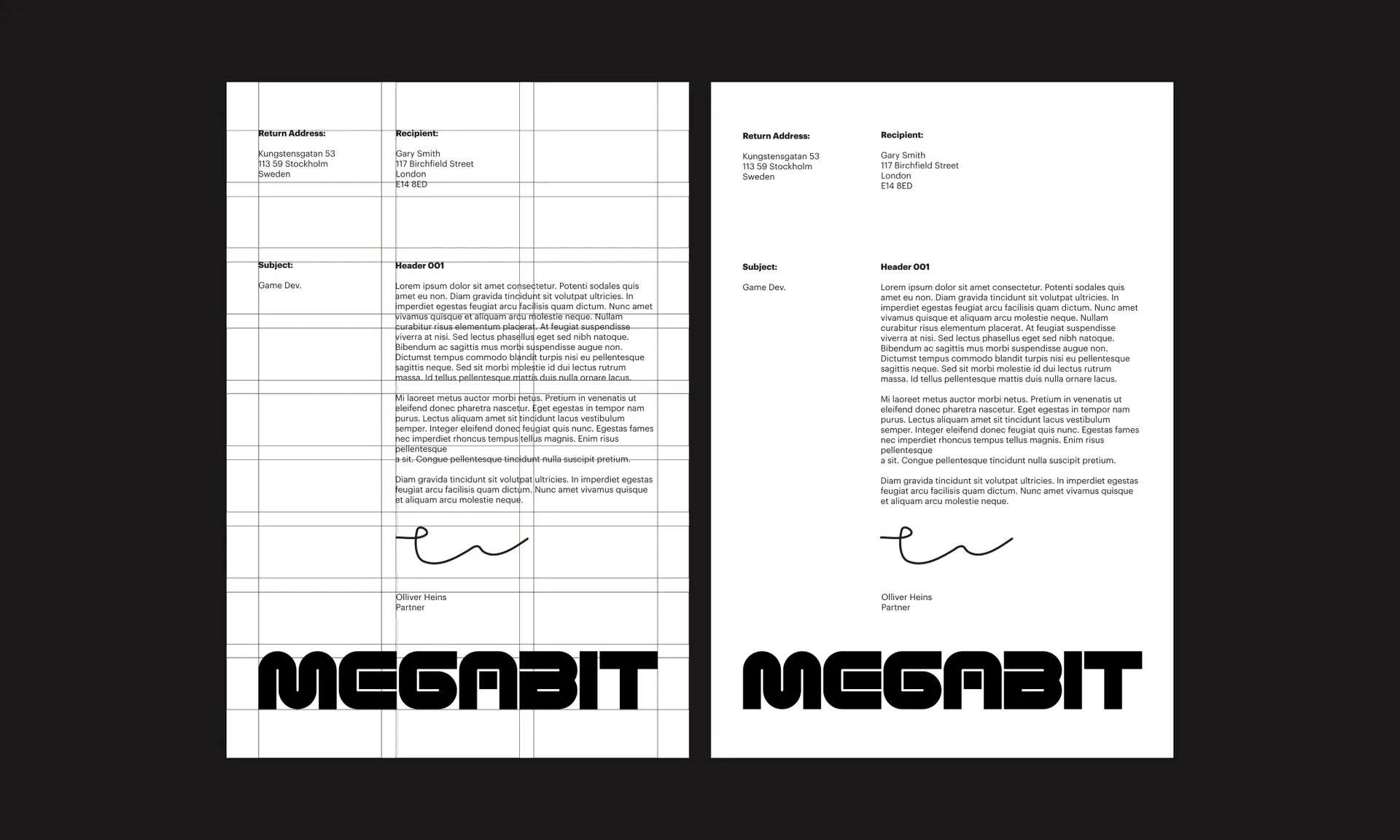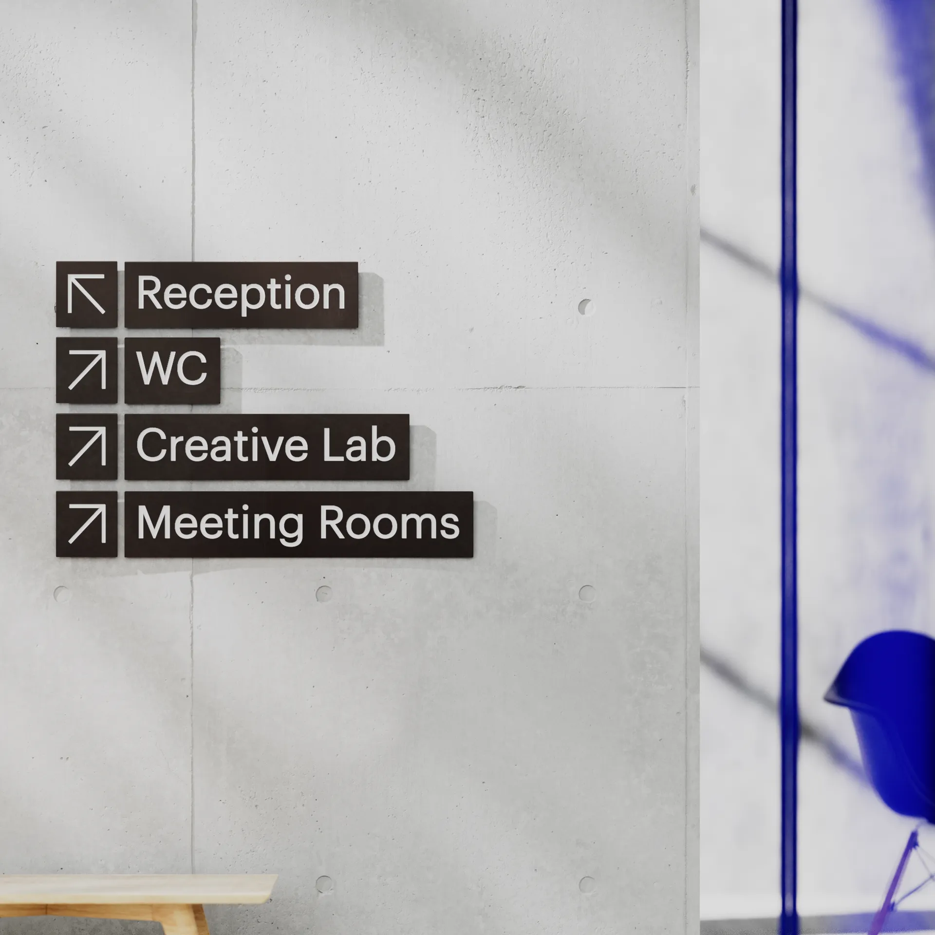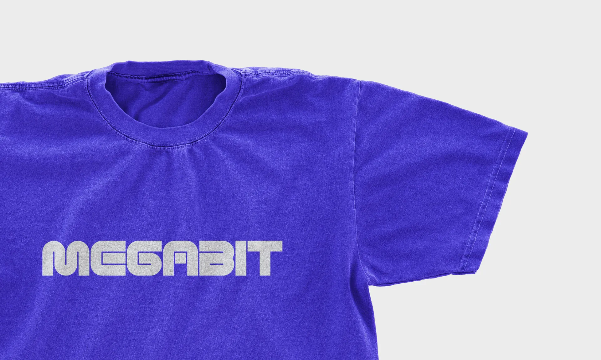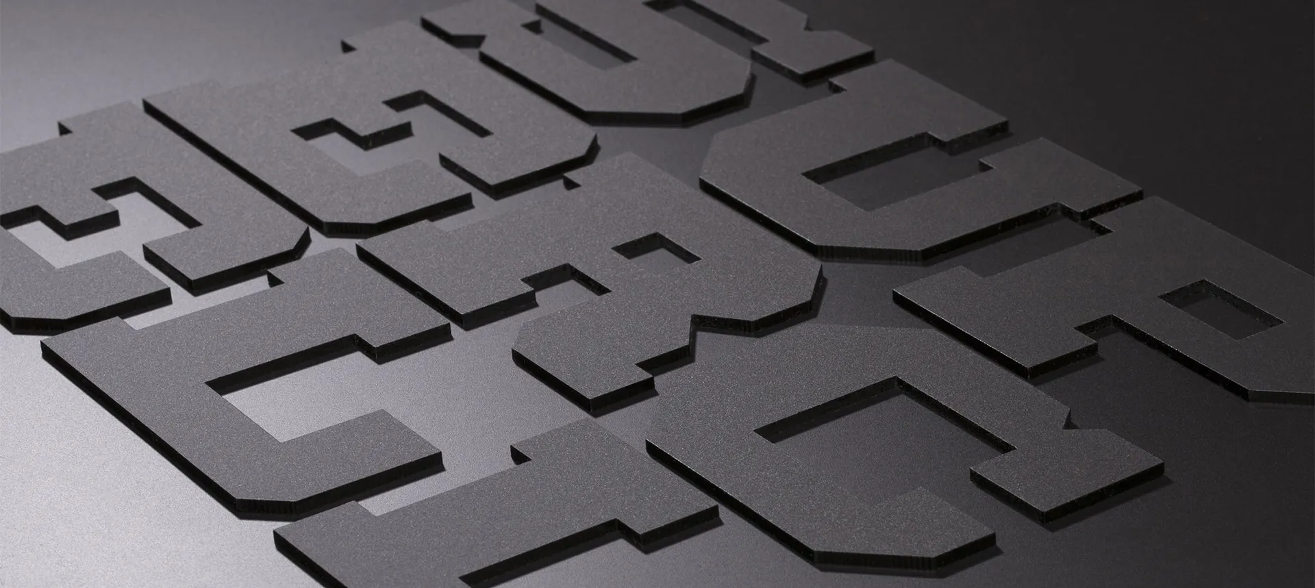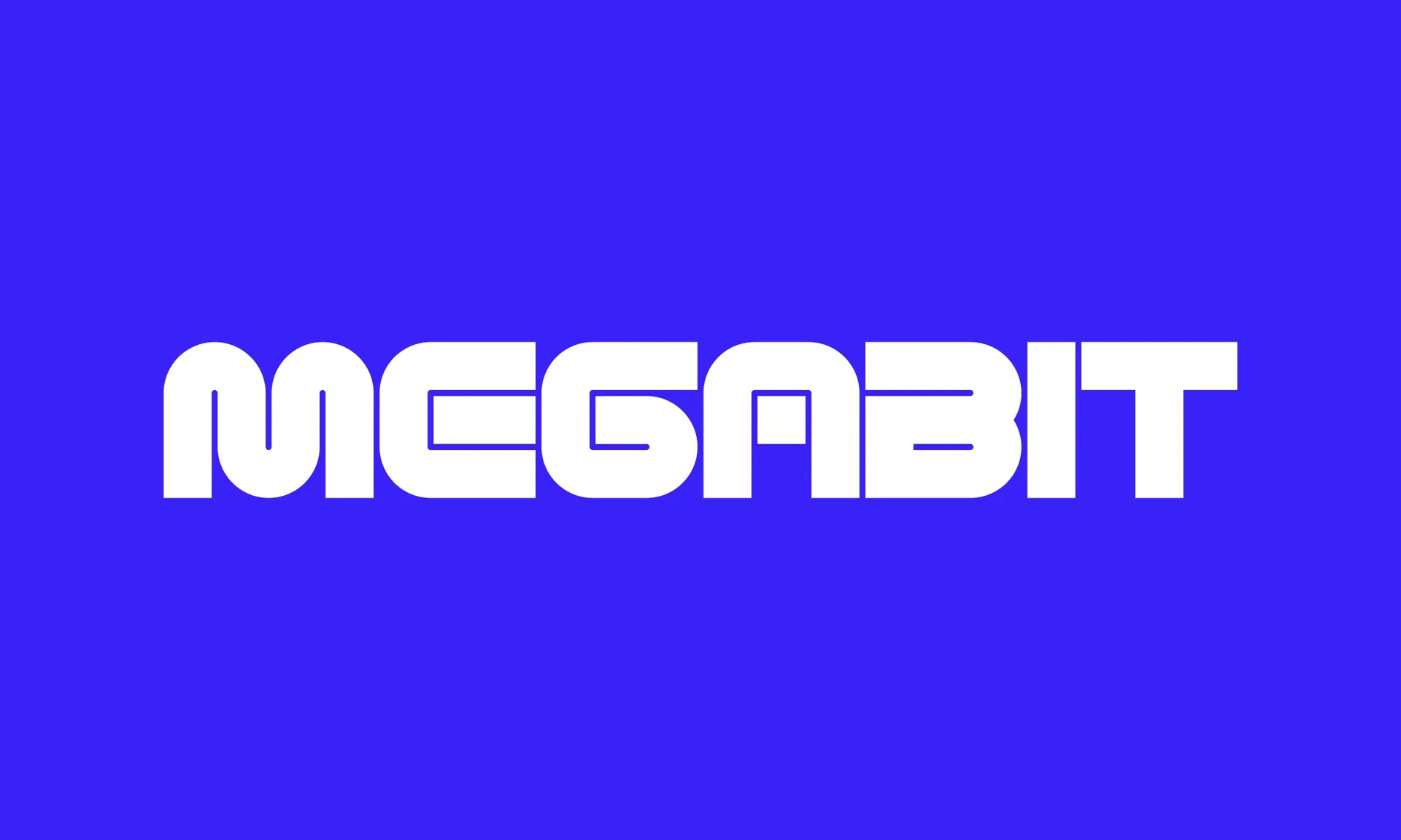

The core idea behind Megabit is to offer studios premium tech and tools whilst giving them creative autonomy; the Megabit brand is therefore playful whilst adhering to functional design principles. This balance is struck with a Wordmark that combines a series of connected ‘bits’, bringing connotations of building and creation.
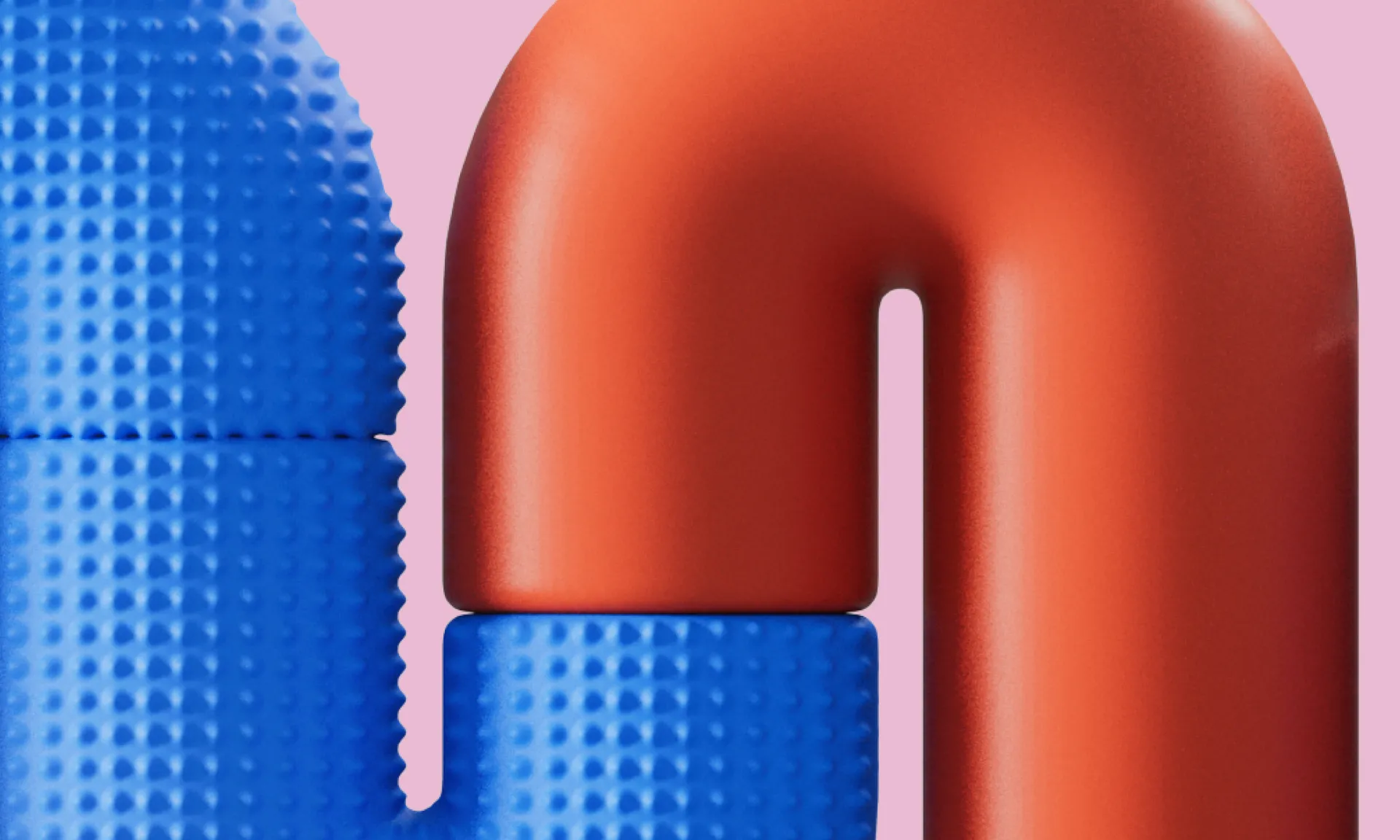
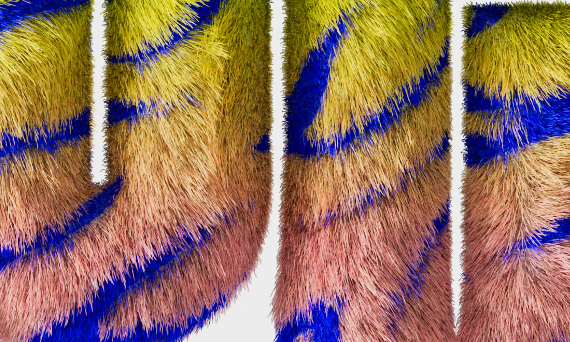
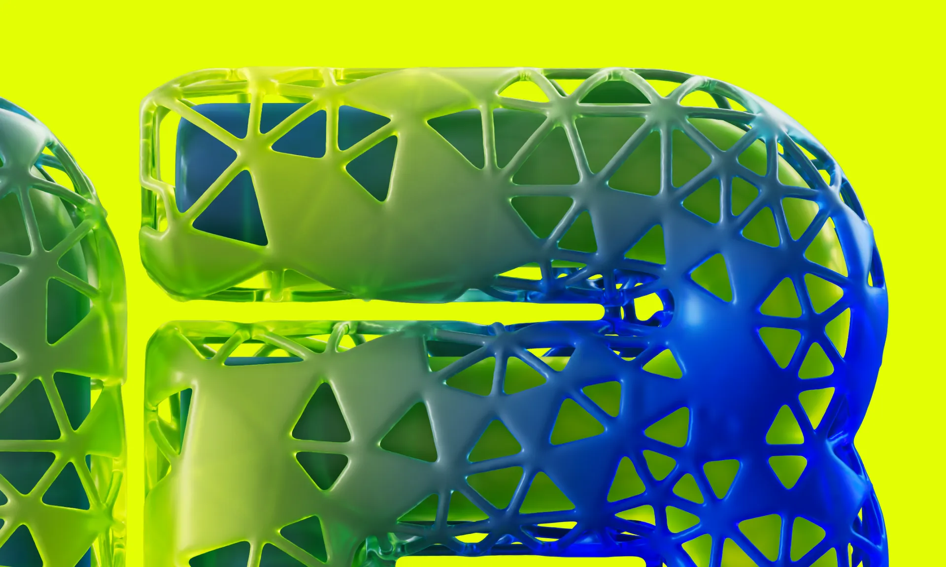
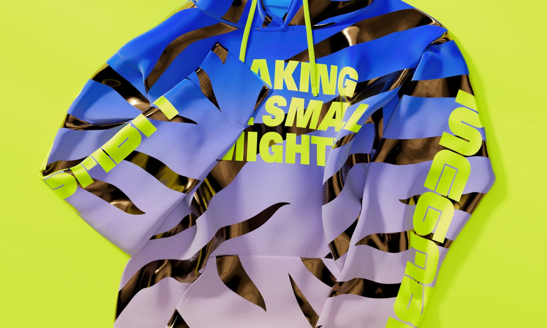
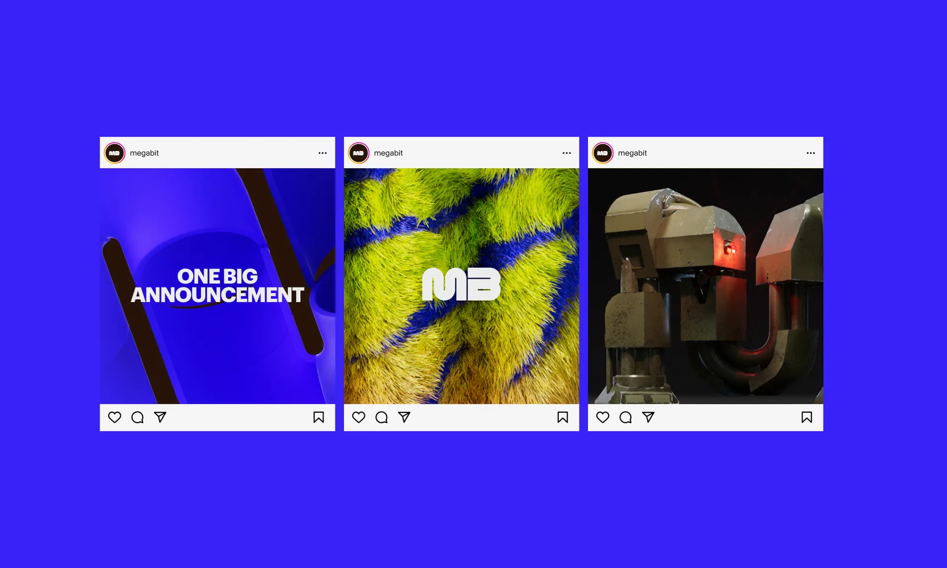
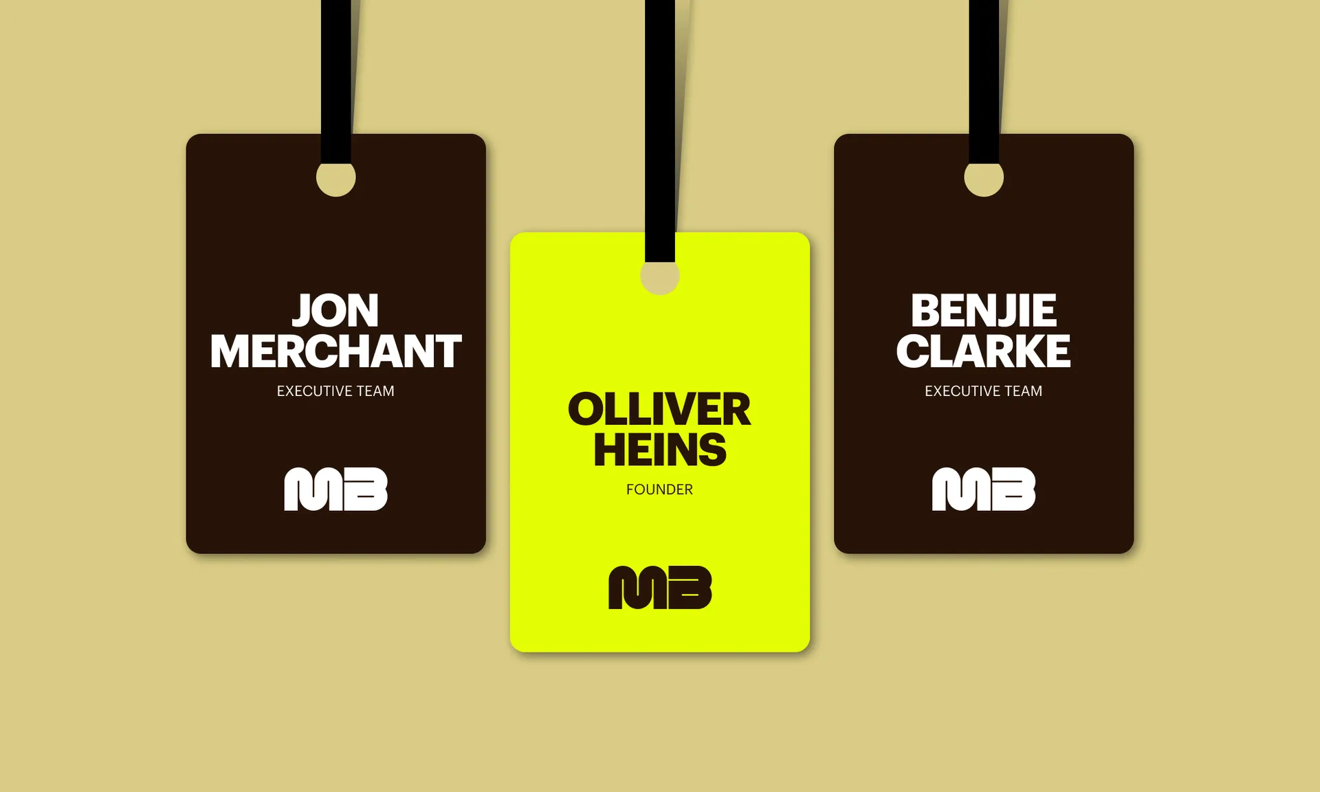
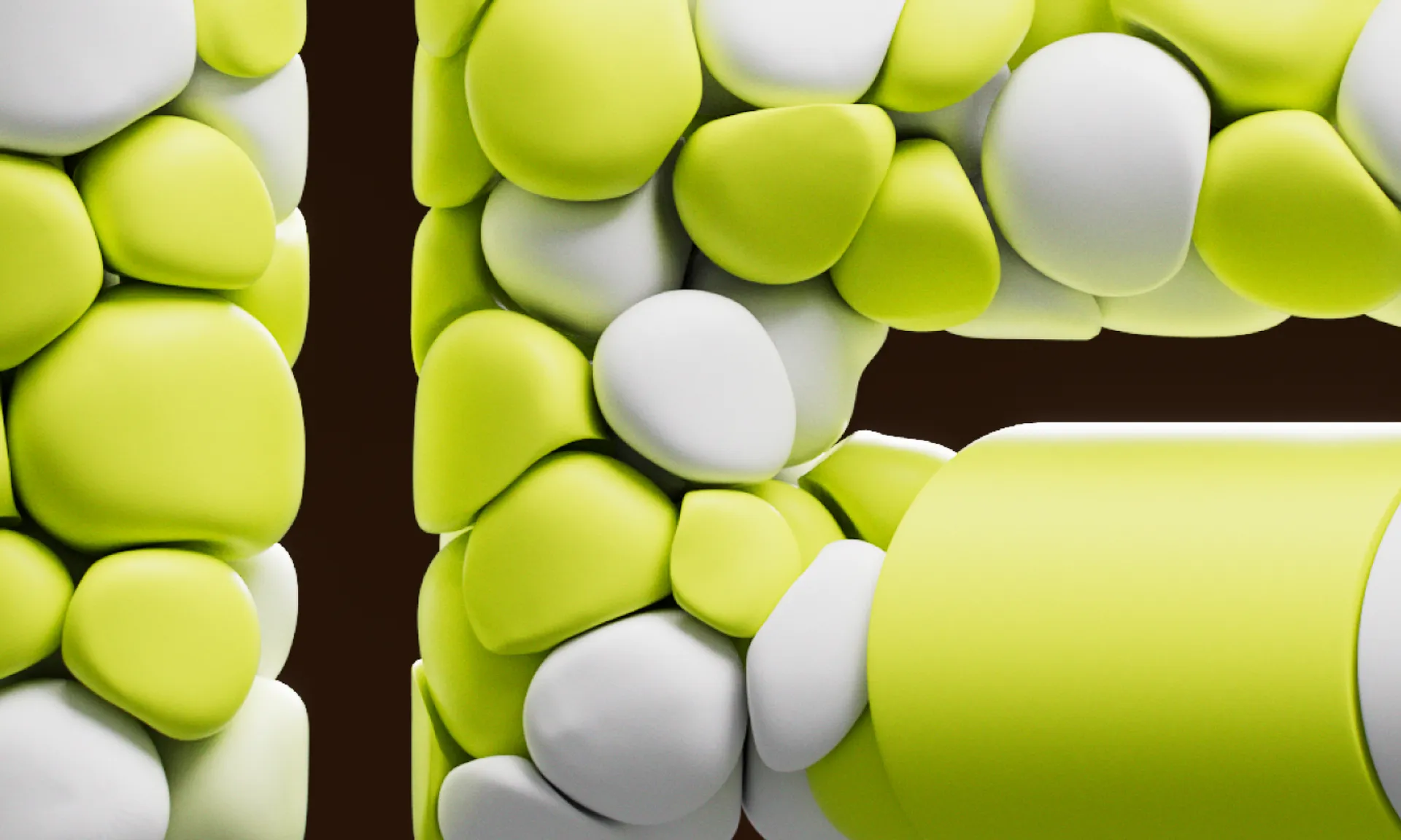
The brand icon — ‘MB’, an abbreviation of the wordmark — adapts to take different forms inspired by different game worlds. This makes it fun, delightful, yet always consistent. With the visual landscape across platform and genre so diverse, the aim here is to distil that essence into an identity that can literally change its skin. It has no fixed states, but rather serves to adapt to the games it represents, amplifying them and providing opportunities to tease new creations in an interesting way.
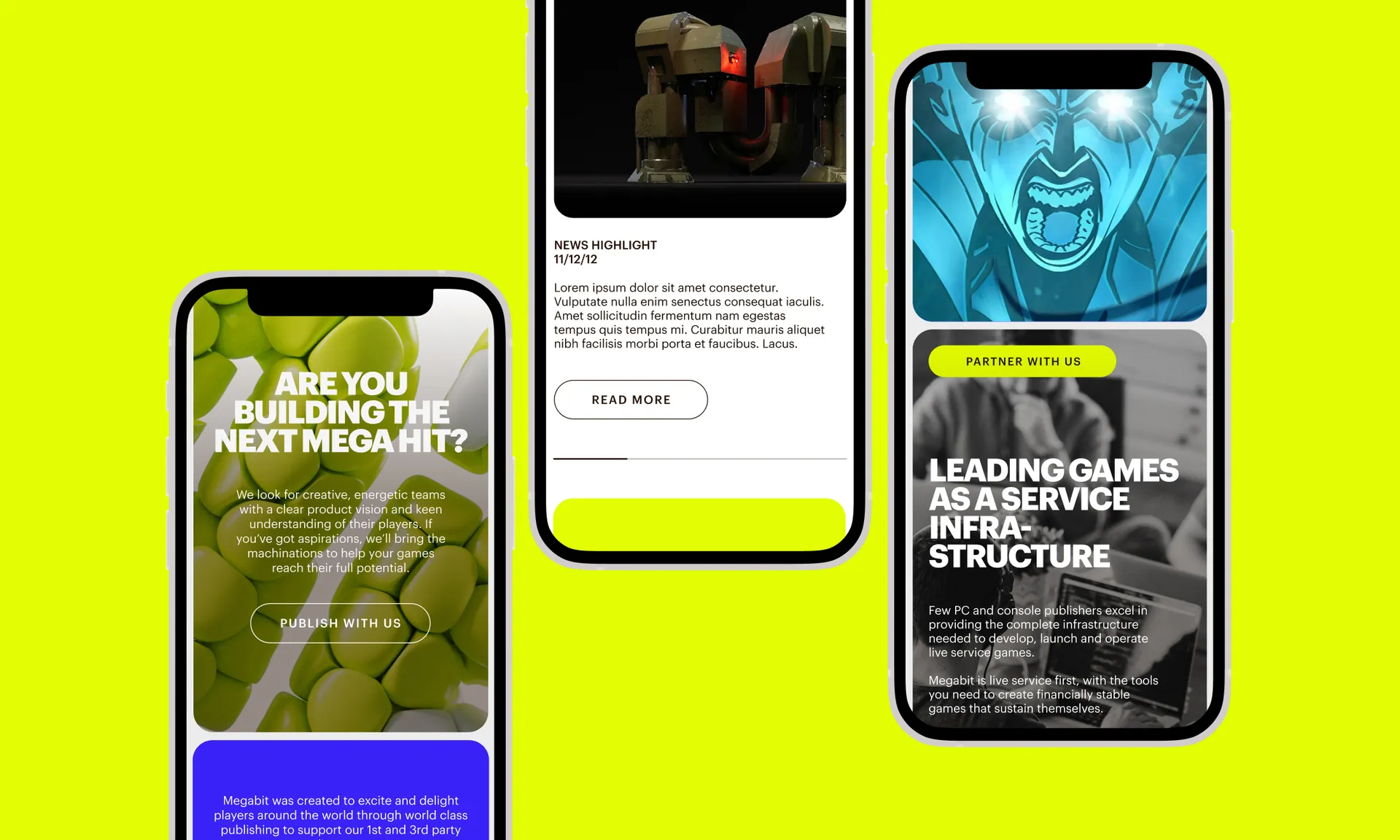
The result is a versatile brand designed to represent the brightest of imaginations. We applied it to Megabit’s new website, where it is loud and fun, with colours that can be dialled up or down for a level of expression appropriate for the content.

