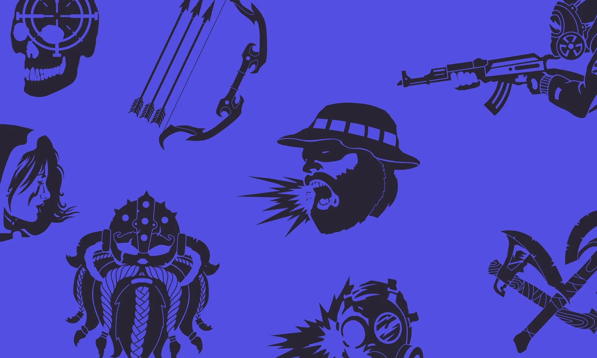
Based on a series of interviews, we uncovered a core philosophy of interactions being more important than any other aspect in gaming — both the immediate tactile joy of tapping, and the long term satisfaction of a meta game. This idea is encapsulated in the new brand name - Metacore.
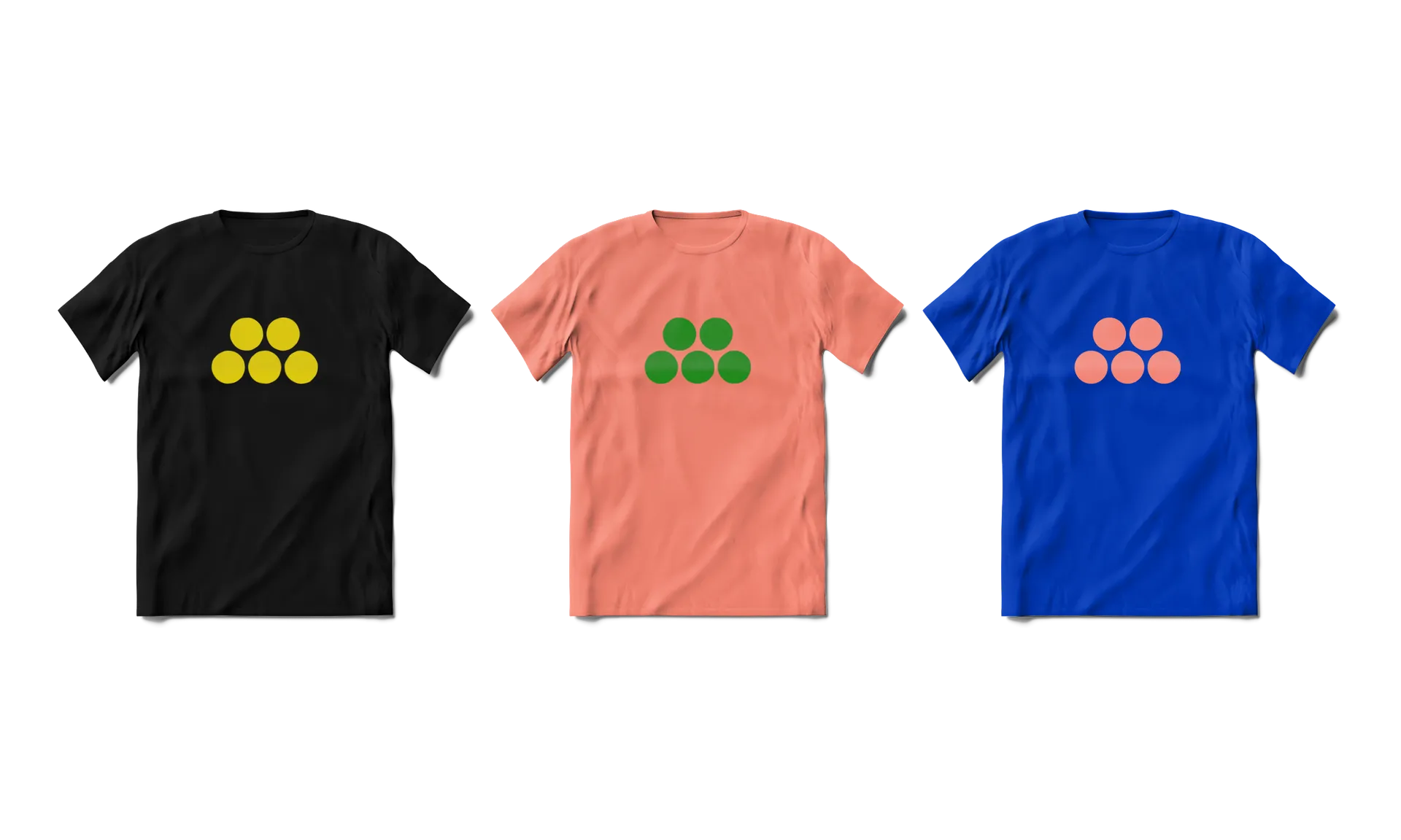
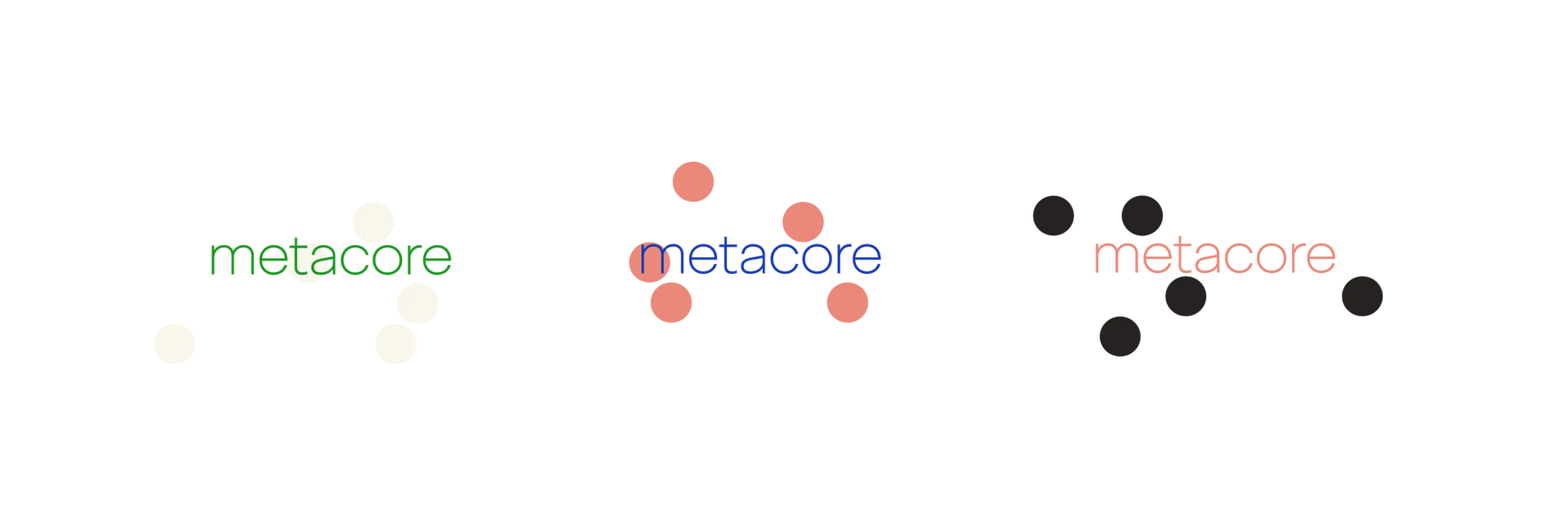
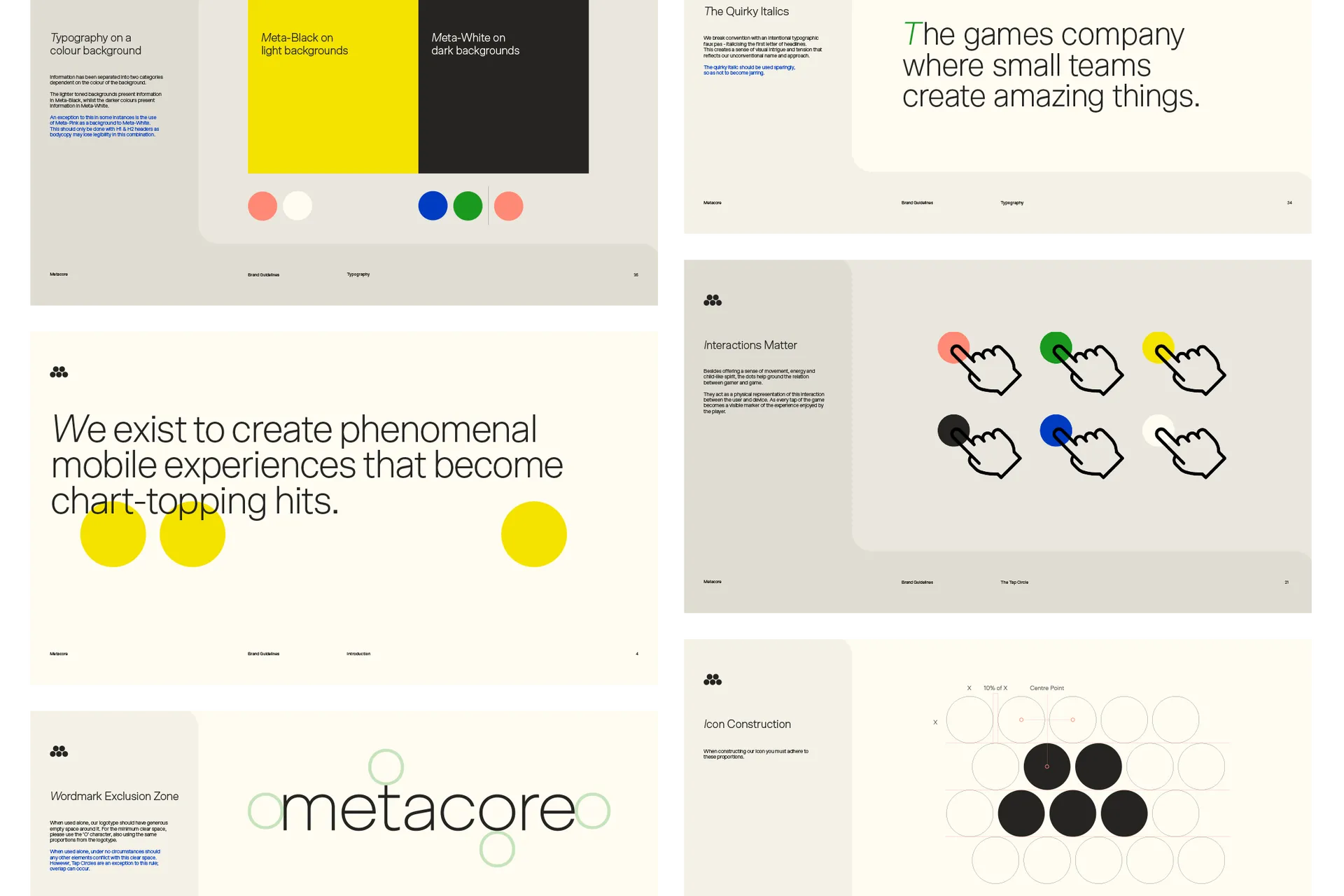
Tap circles for the basis of a circular grid, used to create all the manifestations of the brand graphics.
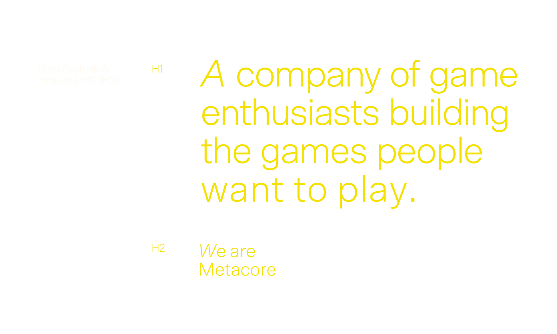
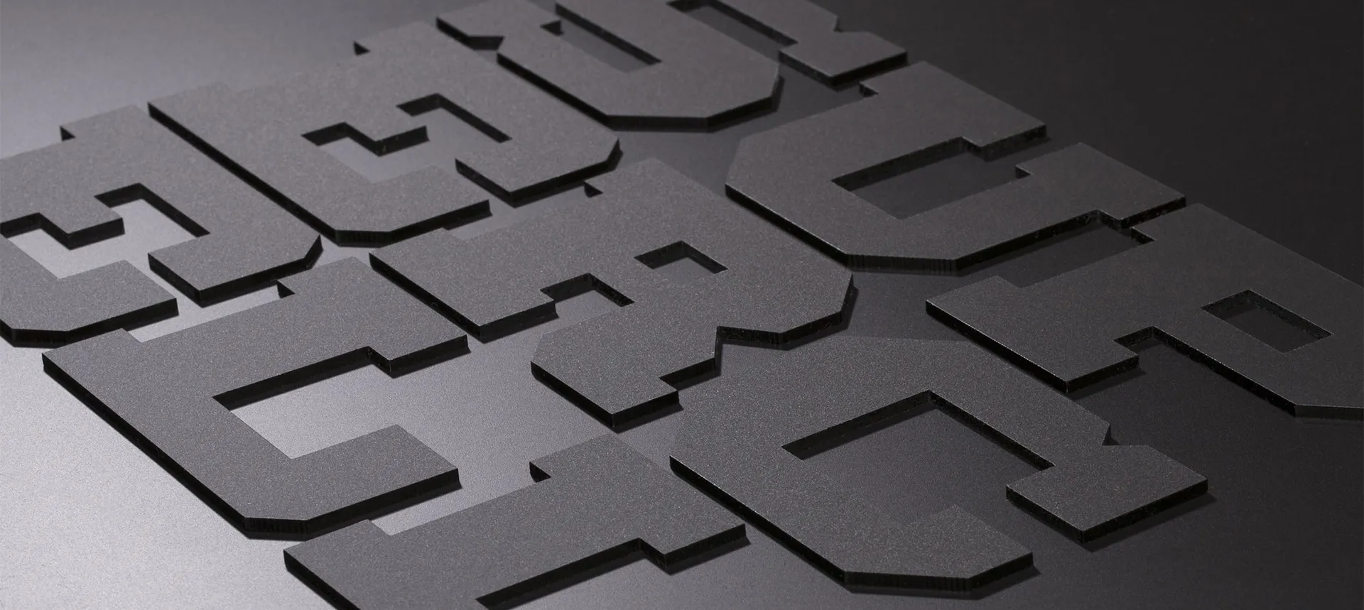
An unusual typographic expression with a sole italic, featuring Scto Grotesk from Schick Toikka.
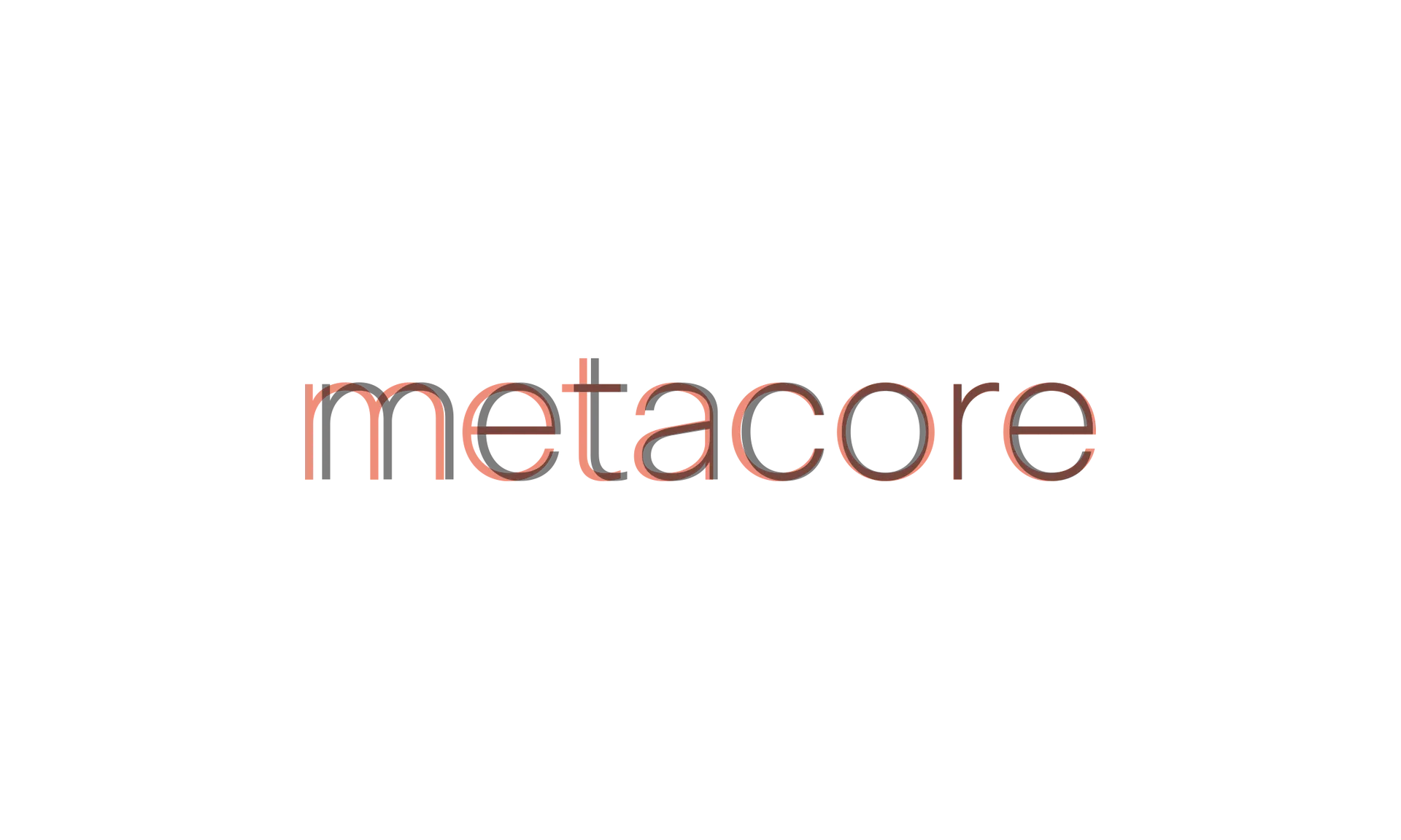
Every letter of the wordmark was redrawn and balanced by Dalton Maag to maintain familiarity with the brand typeface, but to also have cohesion with the circular grid system of the brand.
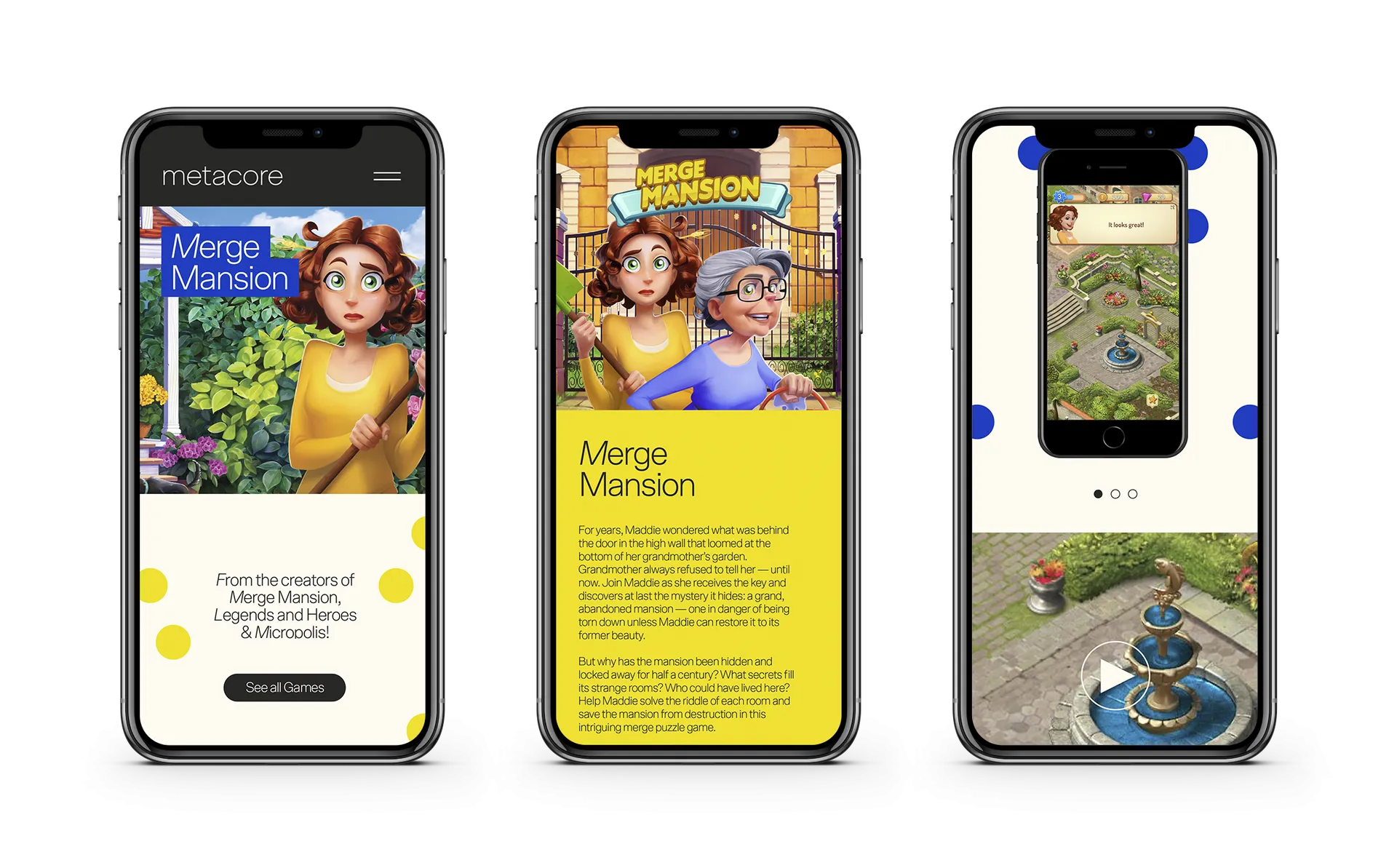
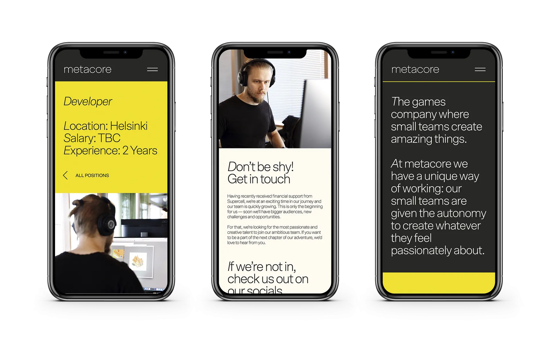
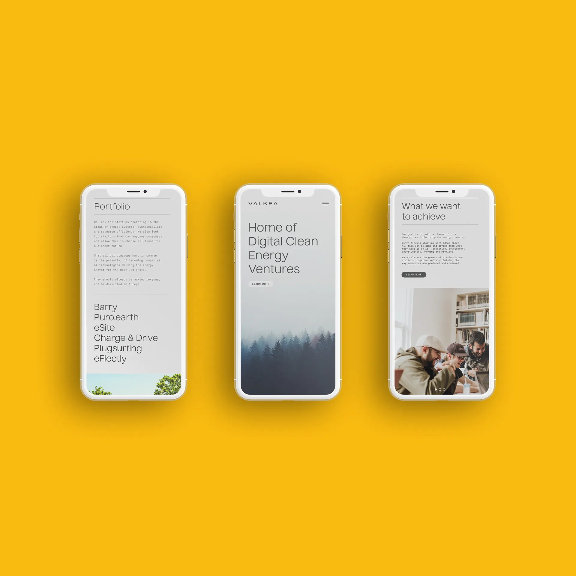
Building on the brand identity system, Helsinki-based Bou created a comprehensive website and launch PR for Metacore, coinciding with their announcement of a €150M funding round.