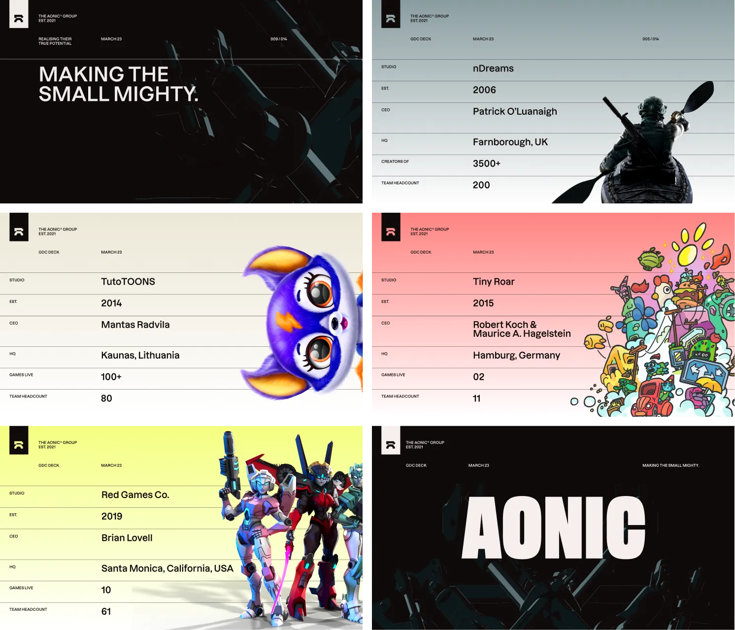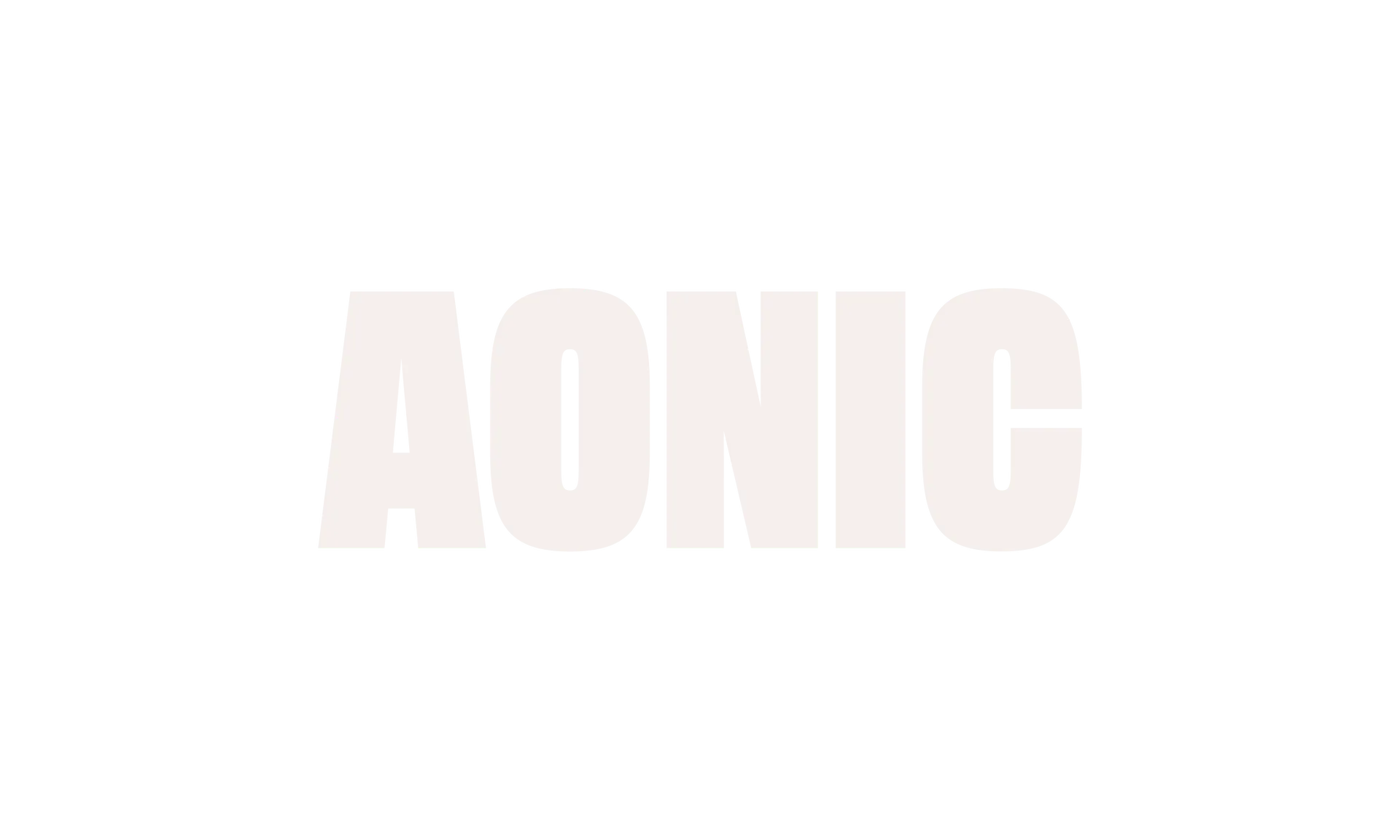
To differentiate itself among the many publishers and gaming venture funds in the world, Aonic needed a unique name that would point towards the future of gaming. Using the Proxy naming framework, we chose a distinctive five-letter name with high SEO and social media potential.
The made-up word "Aonic" evokes the concepts of "eons," "ions," and "sonic," giving it the feel of a word that has existed in the gaming lexicon forever.

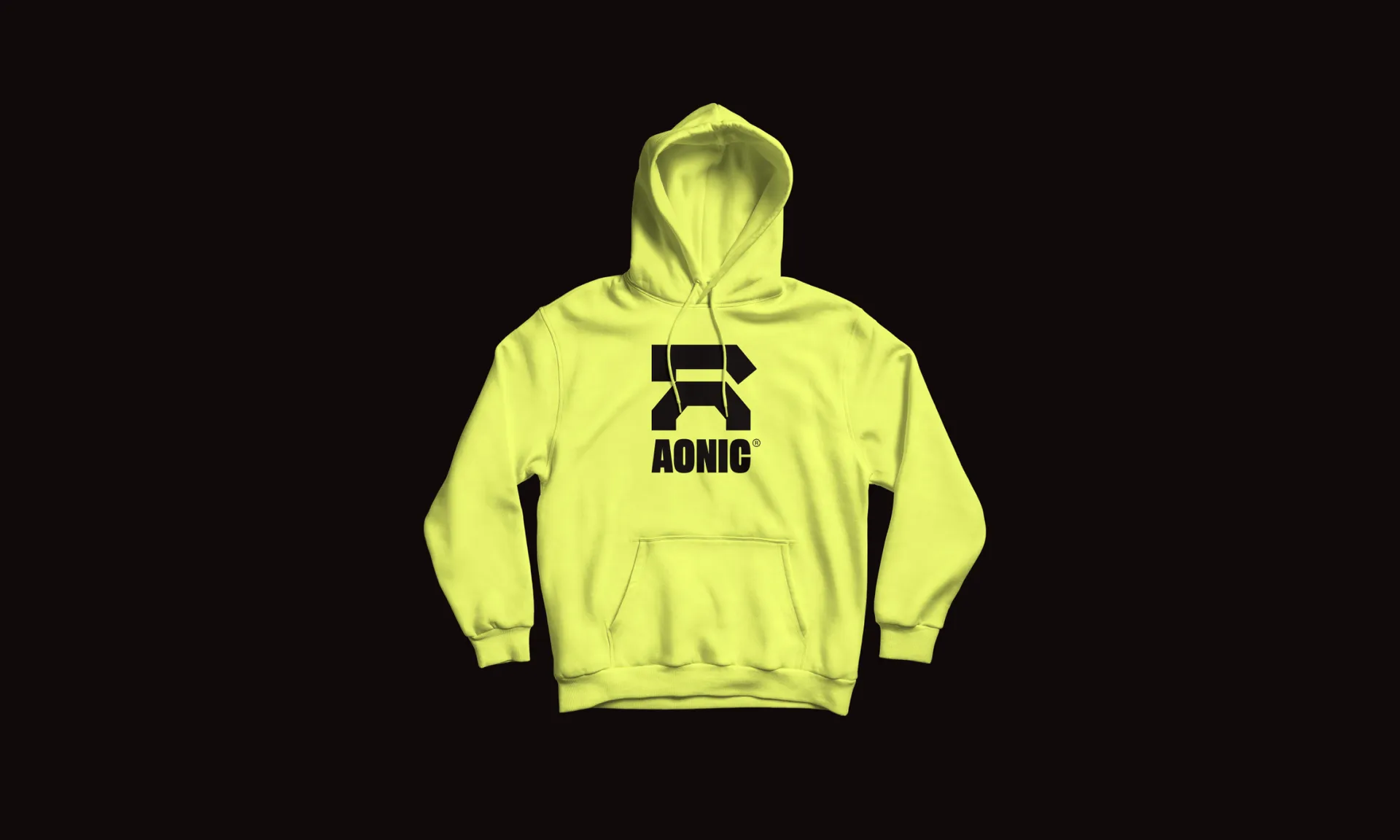
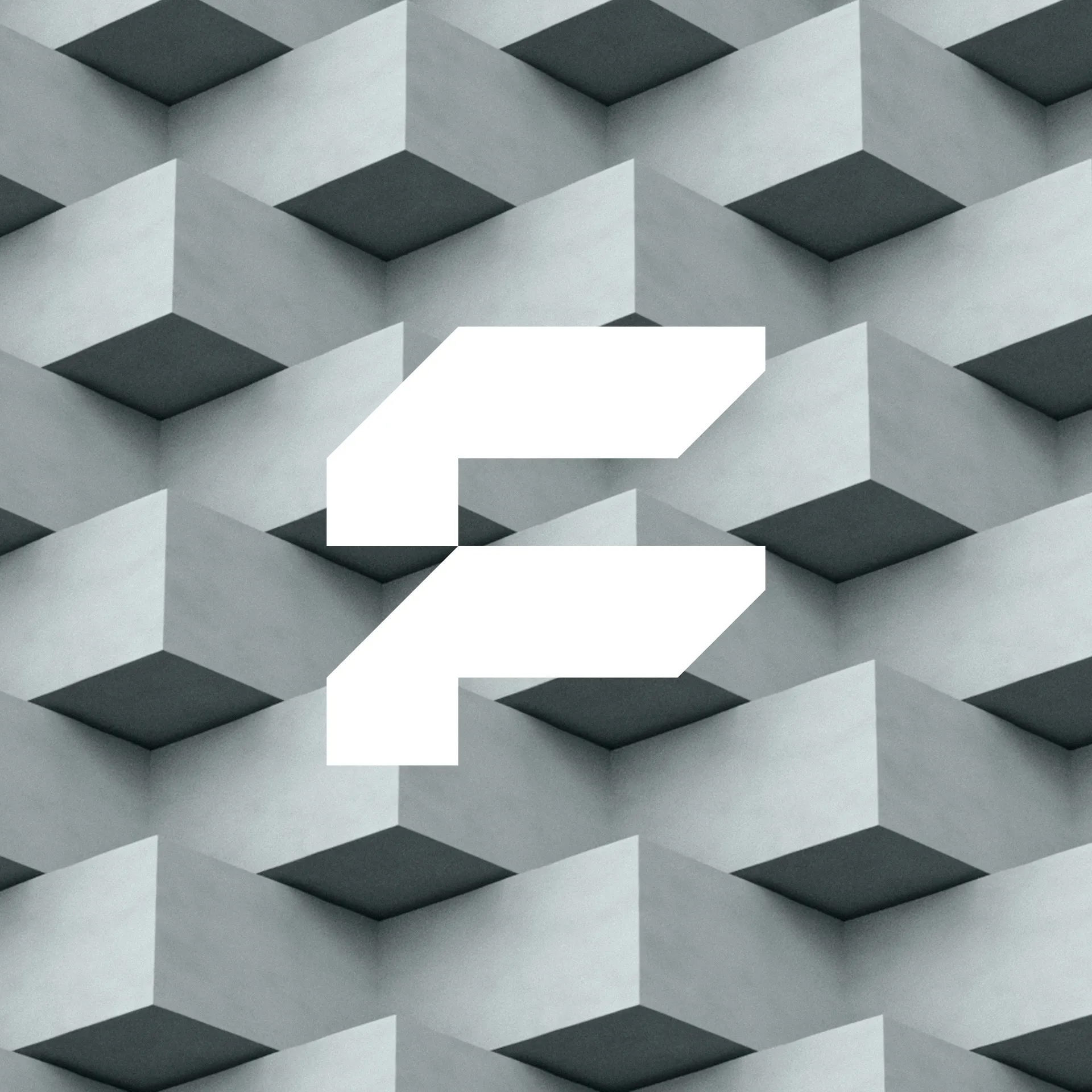
We created an abstract mark for Aonic that nods to the letter "A," with a forward-facing angle. The symbol is designed to evoke the feel of gaming and can be used either by itself or as a lockup.
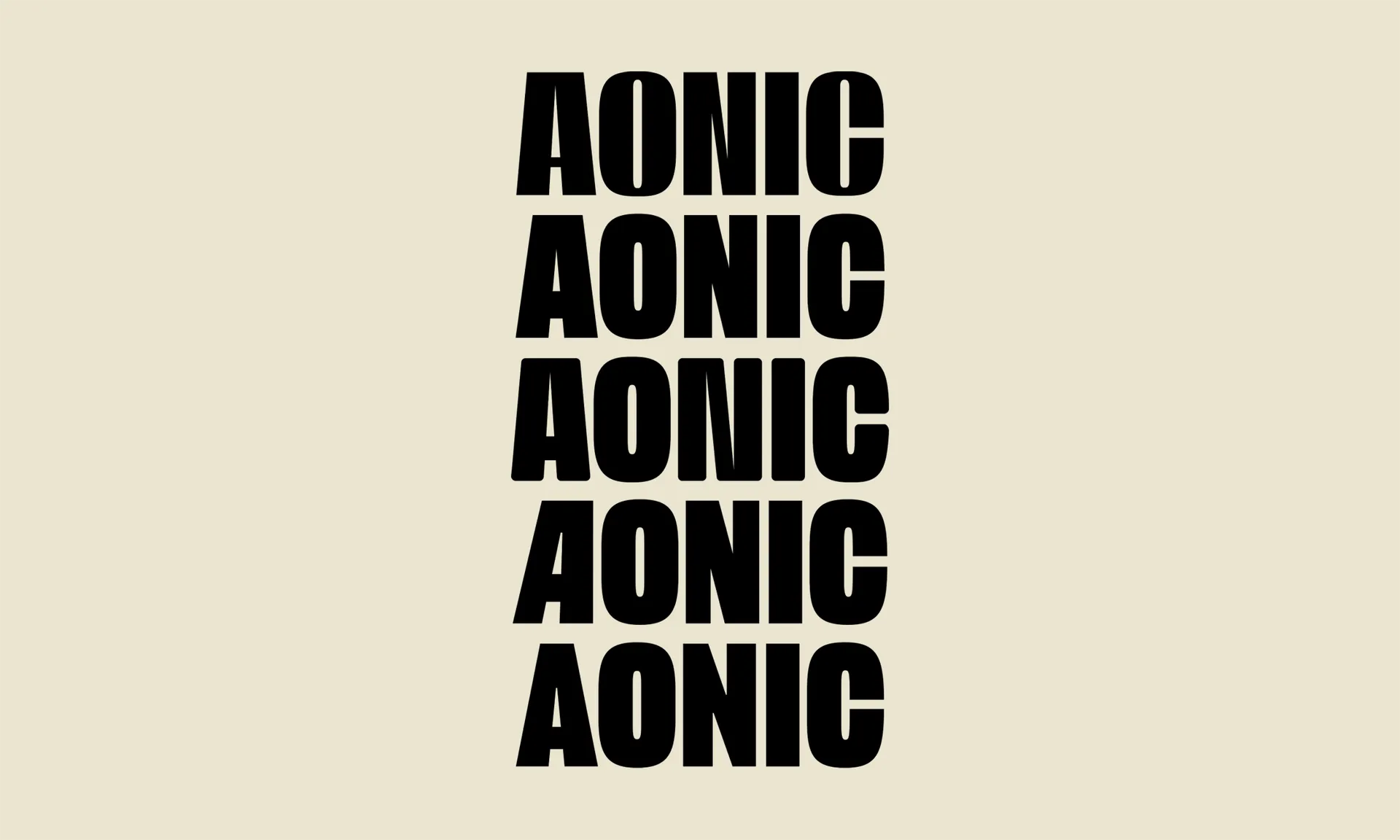
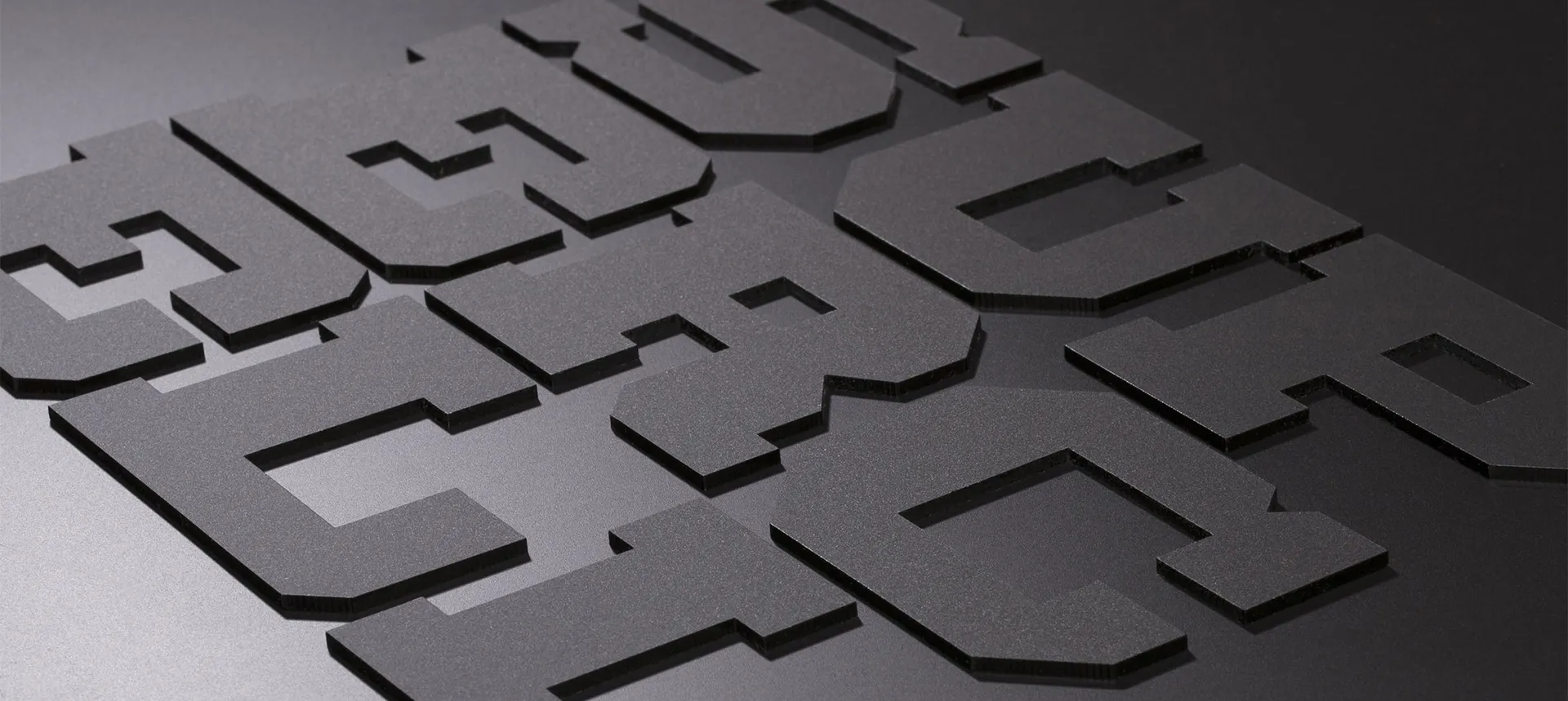
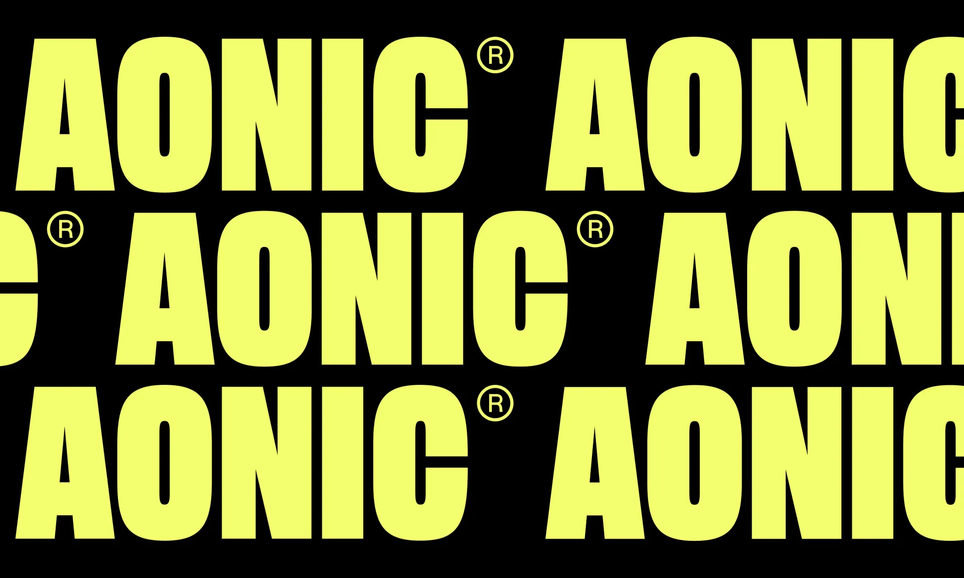
Often futuristic symbols are paired with a geometric typeface. To create a more distinct combination, we drew inspiration from Japanese anime typography, which often uses condensed sans serifs, such as those found in Akira and Neon Genesis Evangelion. We collaborated with Dalton Maag to create the custom wordmark.
The confident and imposing letters form a robust wordmark that can be used as a badge of honor alongside the brands of the individual studios that make up the group. The symbol derived from the first letter of the group's name, inspired by retro gaming culture, complements the wordmark.

To combine the energetic world of gaming with the trust required from an investment company, we chose an unexpected colorway that blends bright neons—red and yellow—with neutral metals like platinum, silver, and zirconium.
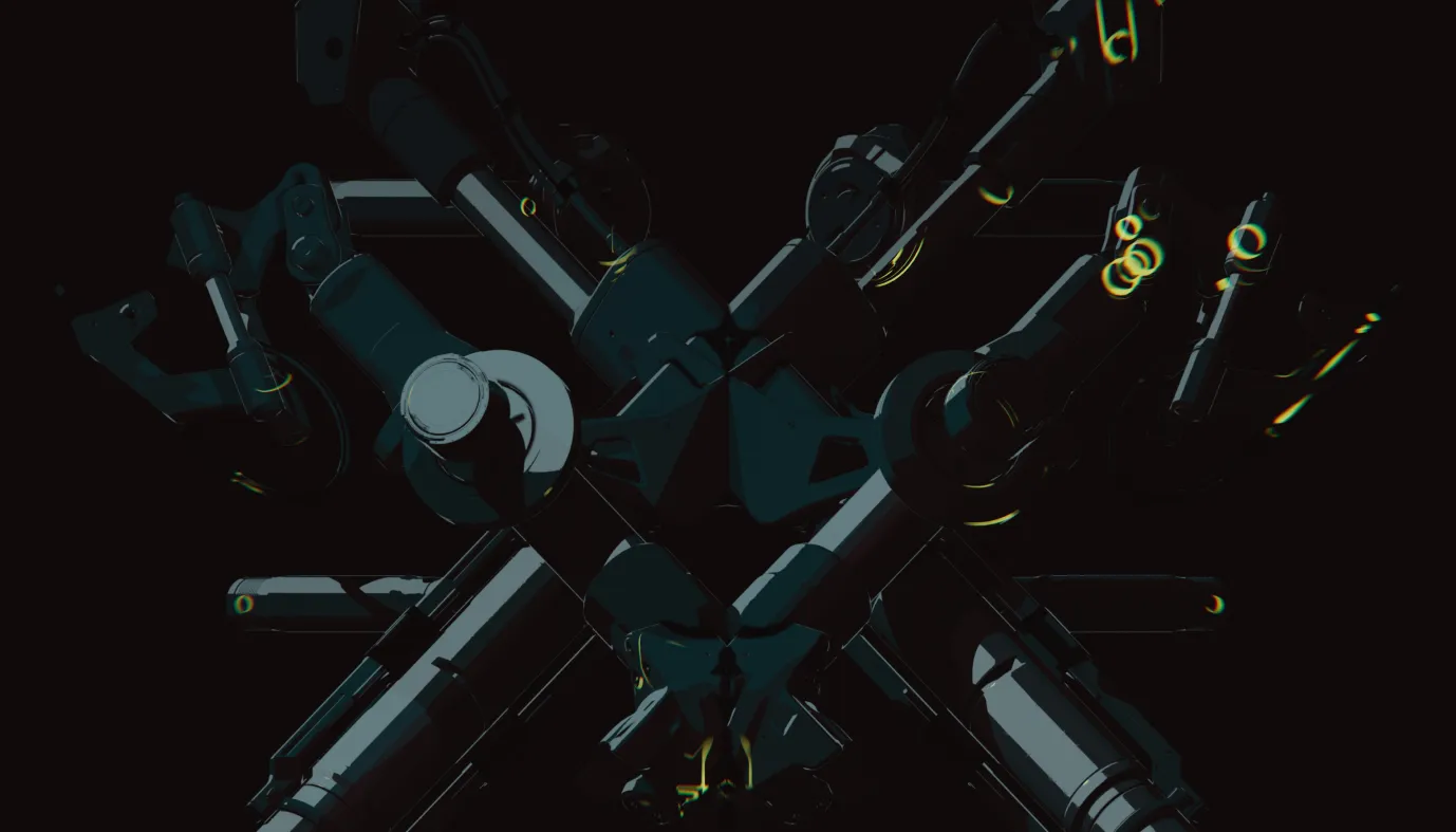
We also created a range of abstract imagery, both stills and motion, to convey a futuristic machine that is in constant motion, working to make the small mighty.
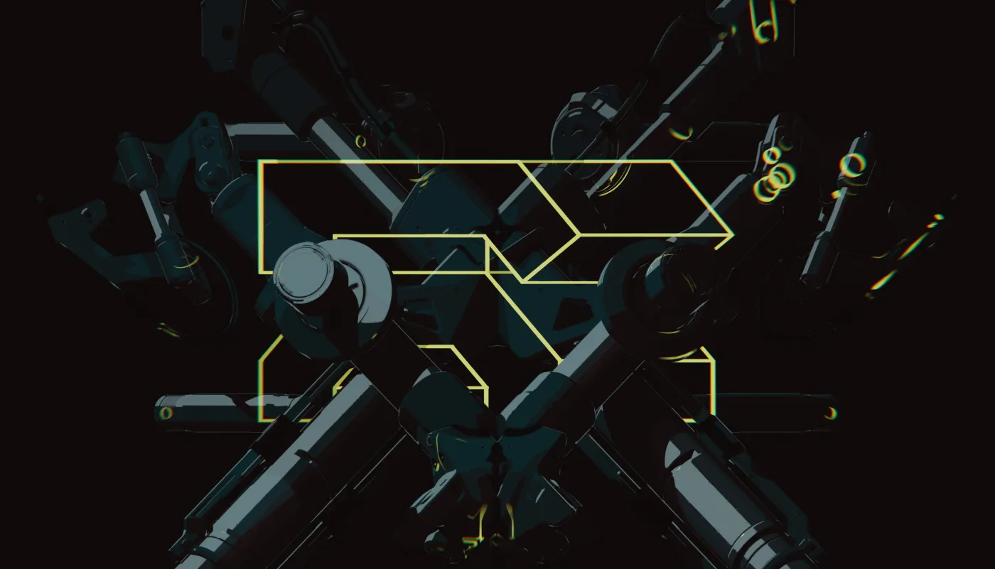
The unique name and identity system we developed for Aonic has enabled the company to create a broad and diverse range of visual assets for its website, social media channels, and industry communications. The visual system is flexible and allows for purely illustrated, typographic, or iconic executions, while pairing well with game art from all genres.
As with the logotype, we drew inspiration for the typography from classic mecha anime films. The genre features typography that is simultaneously familiar but also bizarrely otherworldly. We paired an unusual pixel serif with a functional sans-serif typeface to convey the idea of computer vision coming into detail.

