Could we create a monospace that remained true to its functional roots, but felt more human, more design-forward, and more naturally integrated into contemporary visual language? Could we build something that served both code and culture?
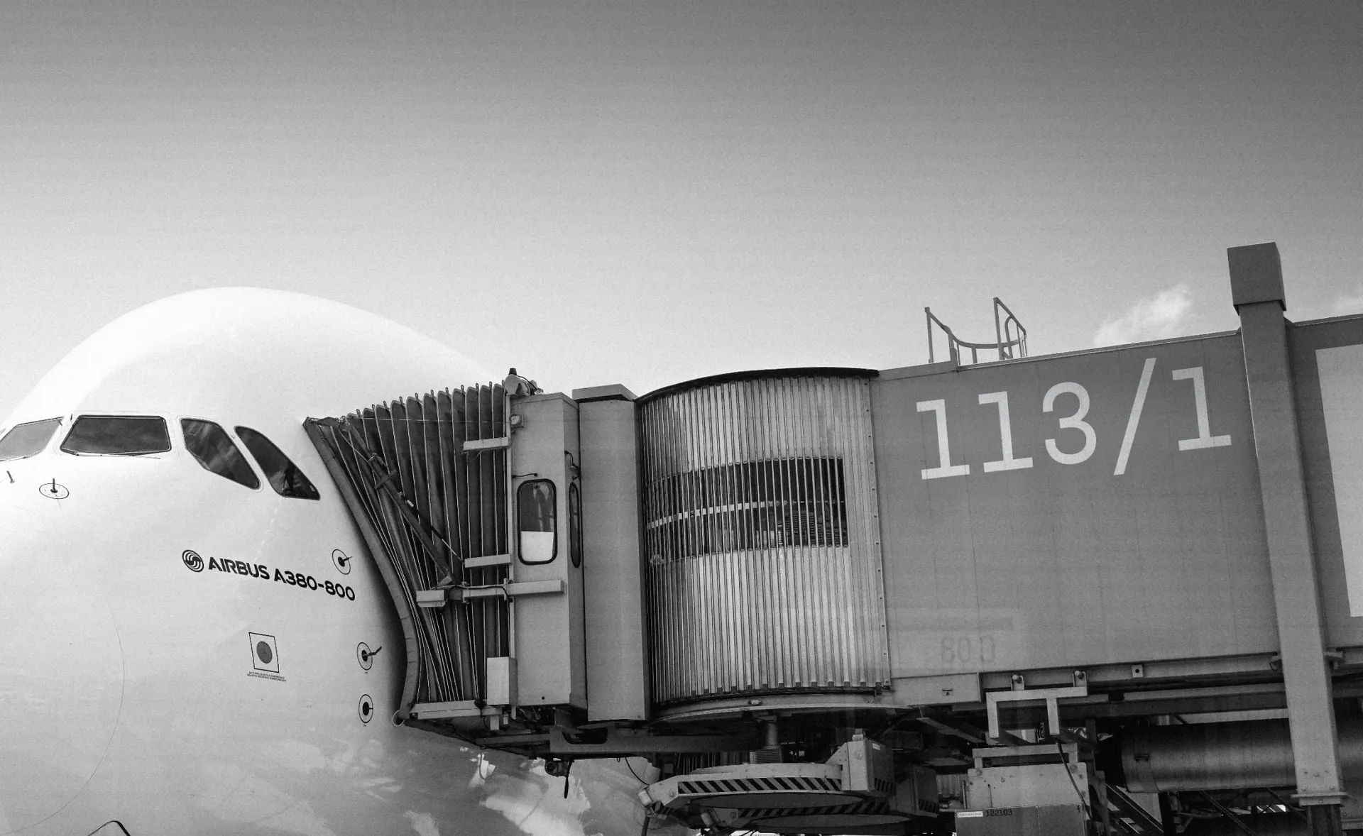
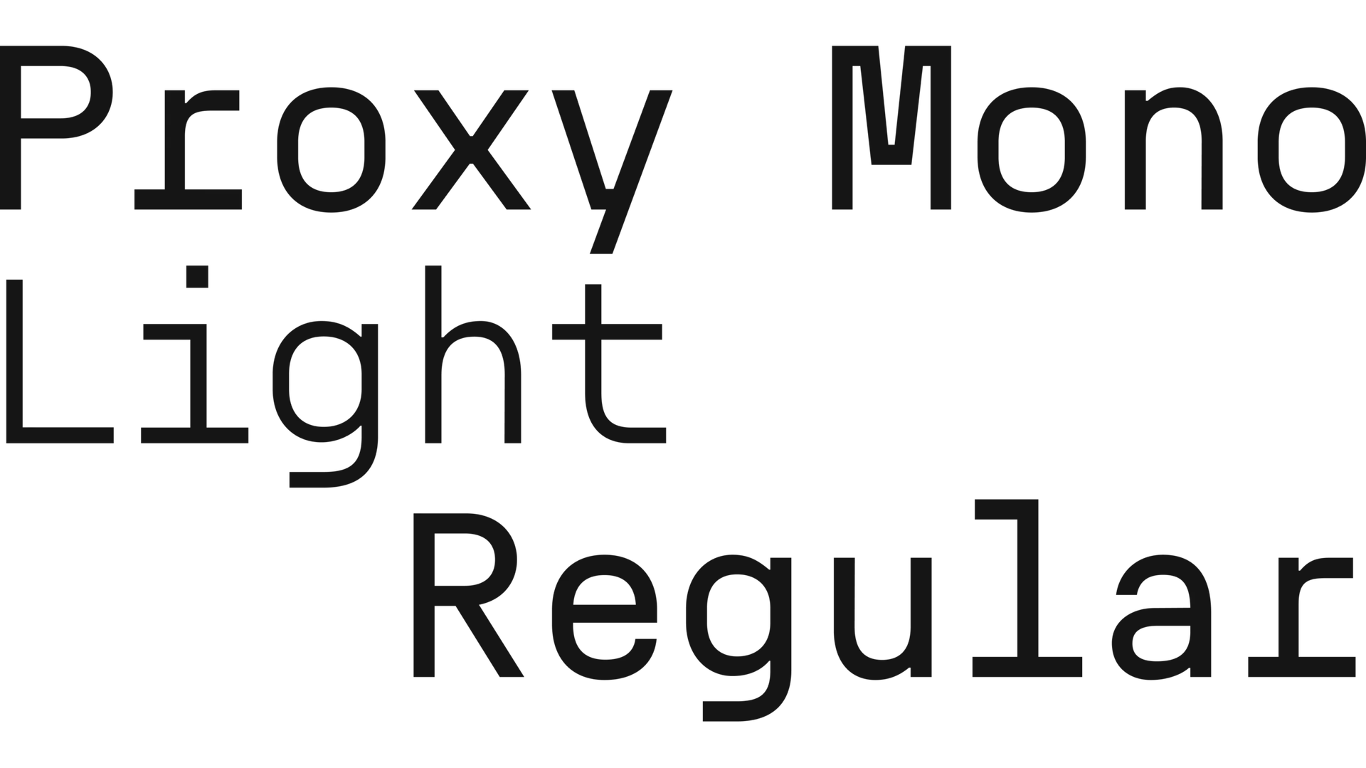
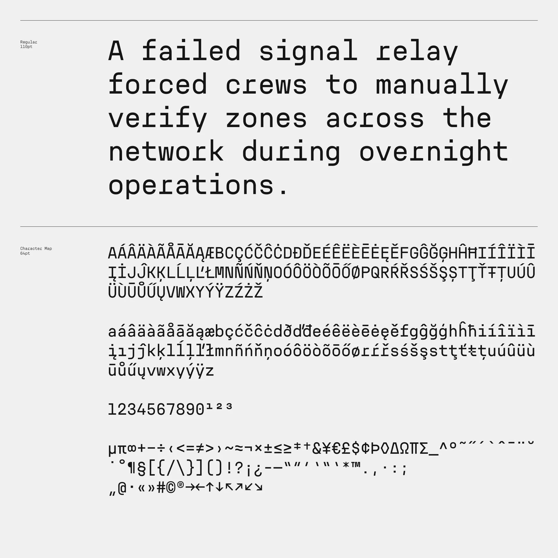
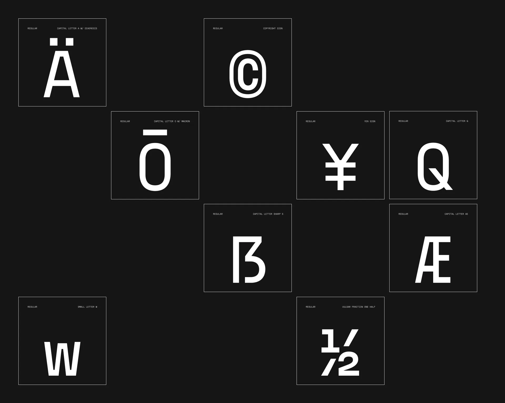
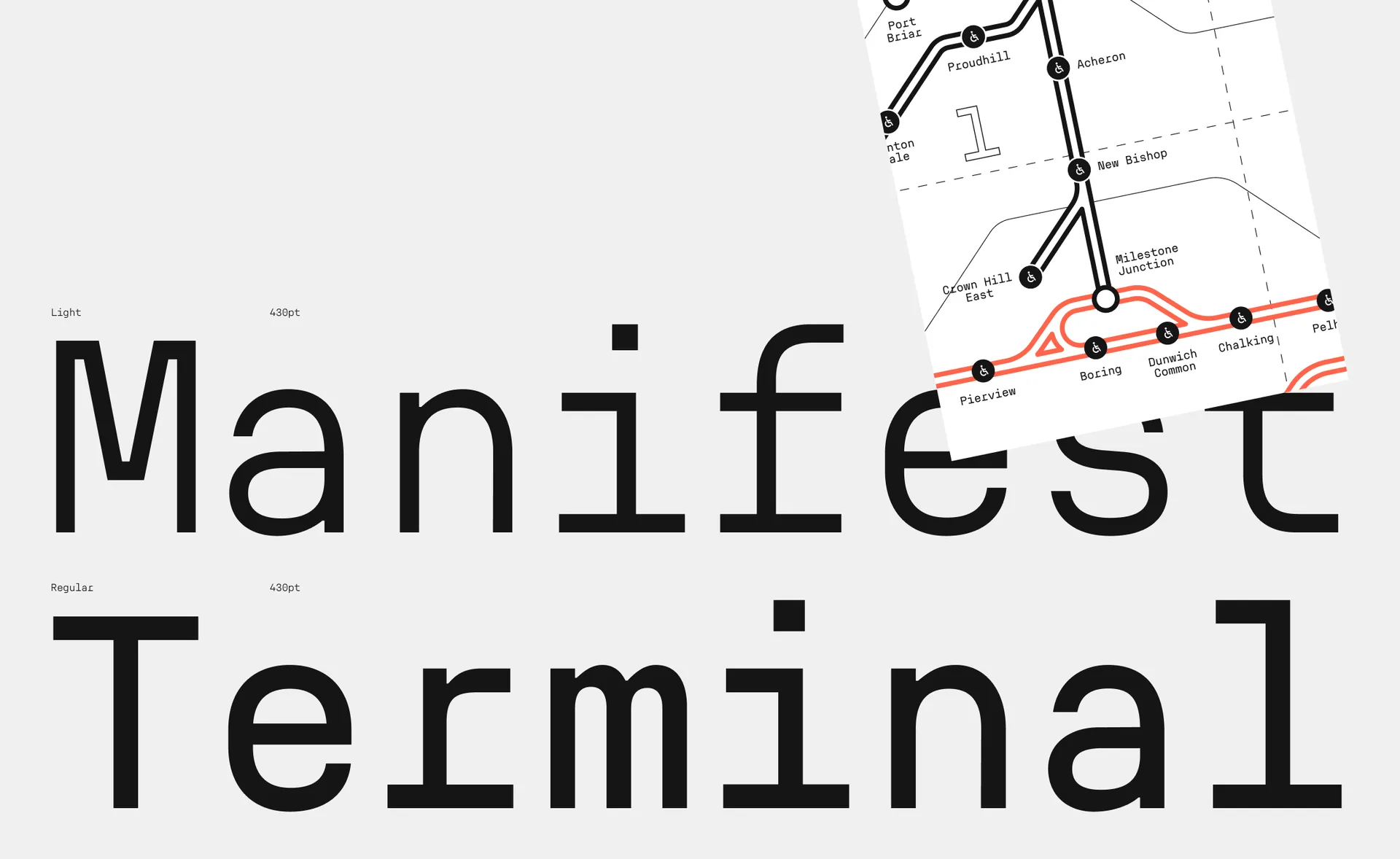
Each character is firmly grounded in the rules of monospace; every glyph aligned, every width identical. And yet, within this rigid grid, the font finds room for nuance. There’s a soft rhythm to the letterforms, drawing from proportional typography without ever fully stepping outside the grid. It’s this subtle duality that makes Proxy Mono feel as at home in a developer’s terminal as it does in a brand’s identity system.
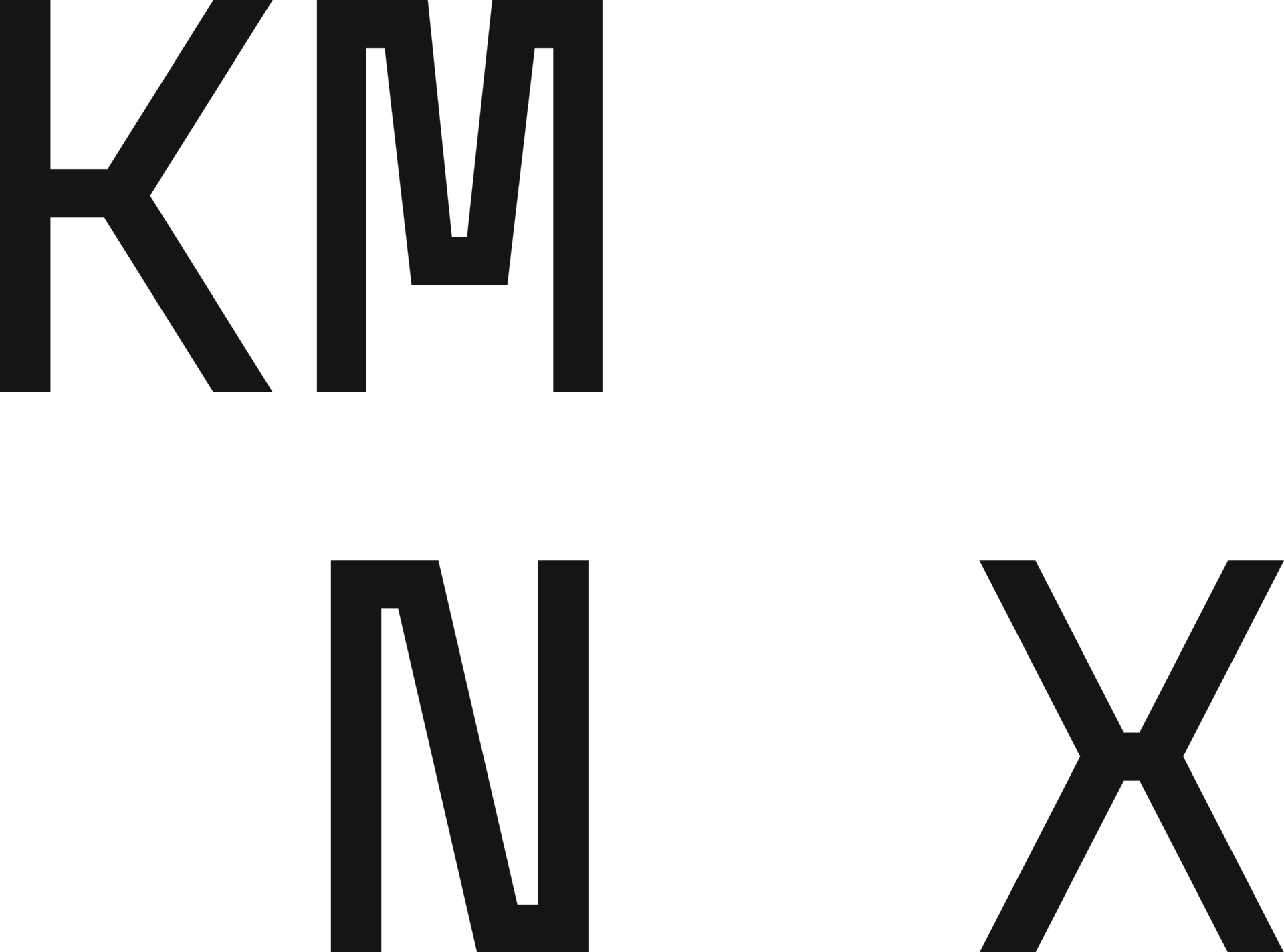
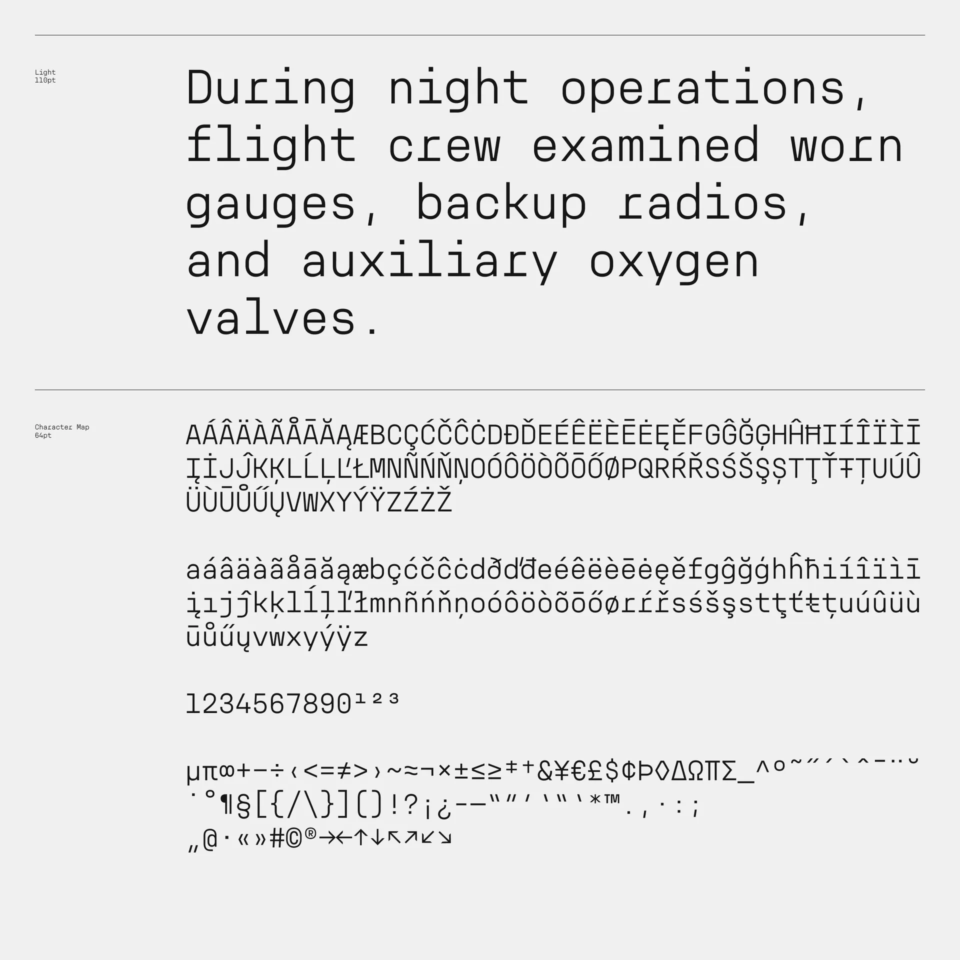
By taking influence from mechanical design, Proxy Mono also incorporates subtle and intriguing quirks, particularly in the unexpected horizontal lines within the ‘K’, ‘M’, ’N’, and even the ‘X.’ It’s clean, utilitarian aesthetic creates a distinct, futuristic leaning personality.

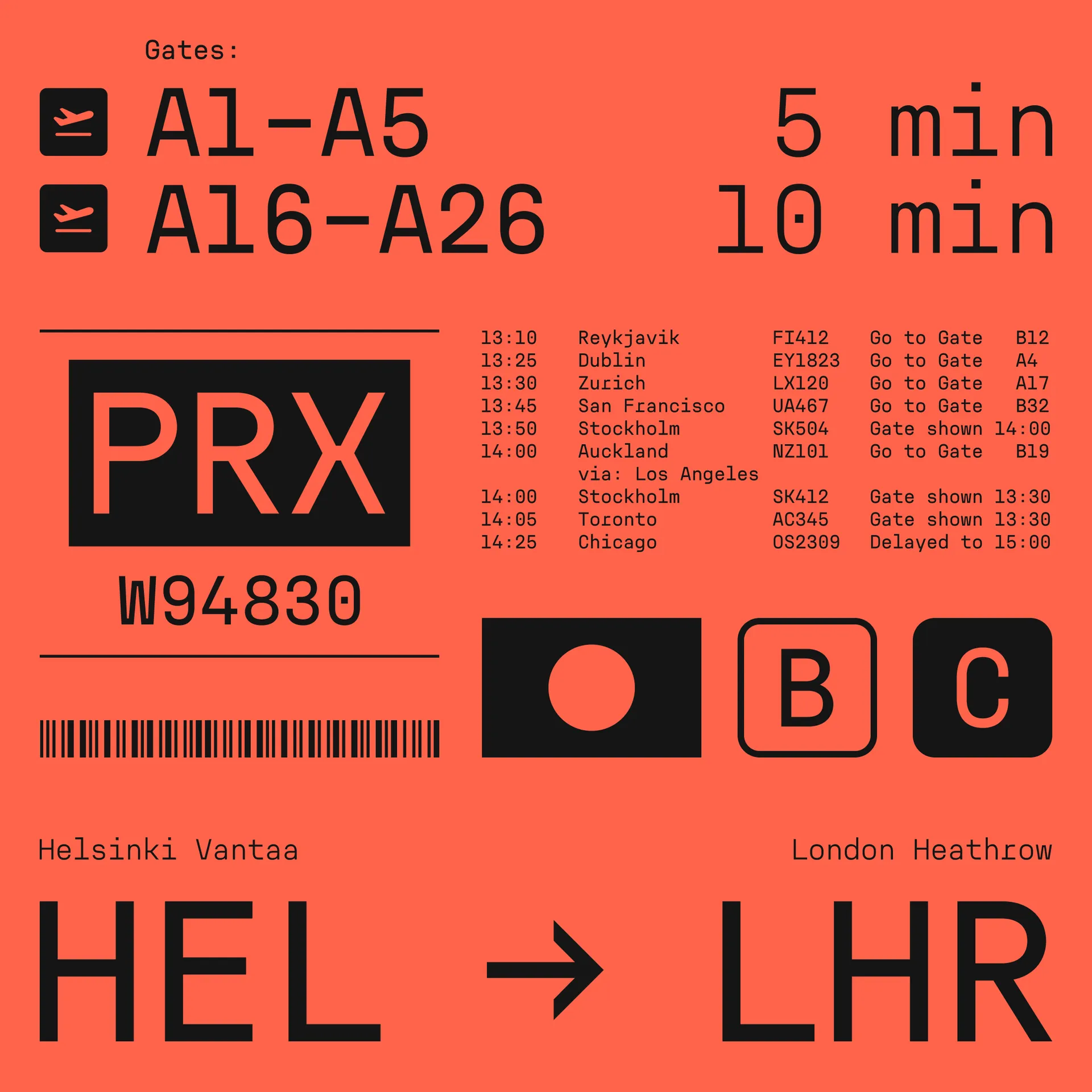
Working with clients building the future, we found ourselves reaching for a mono that didn’t yet exist. One that would be super clear and precise, friendly and easy to typeset. With personality, but not too much. Something that would be great for numbers, facts, specs and code. A typeface that has the gravitas of a structure that can not be seen, but is reassuringly felt in everything. When we couldn’t find it, we made it. Now we love using it. In fact, it became our go-to mono. As we continued to work with it, we found ourselves wanting more nuance. So we added a lighter weight and refined the core for consistency.
The result is a typeface that has become a trusted tool, built as much with character as with clarity in mind.