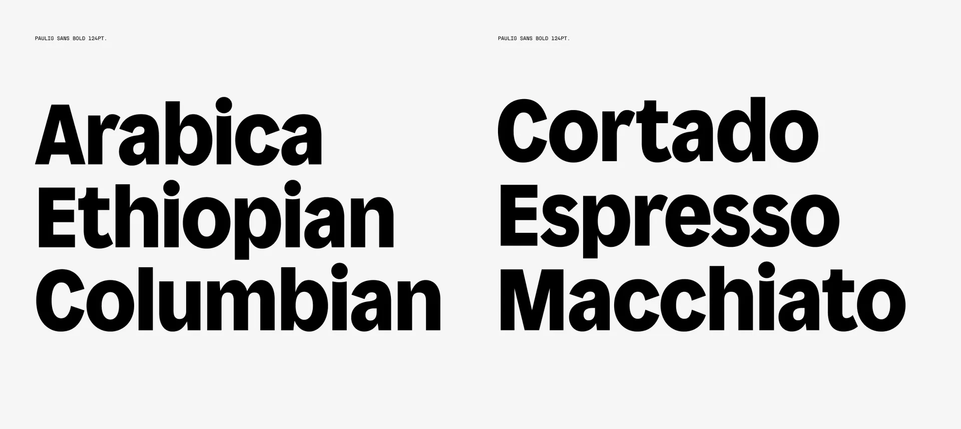
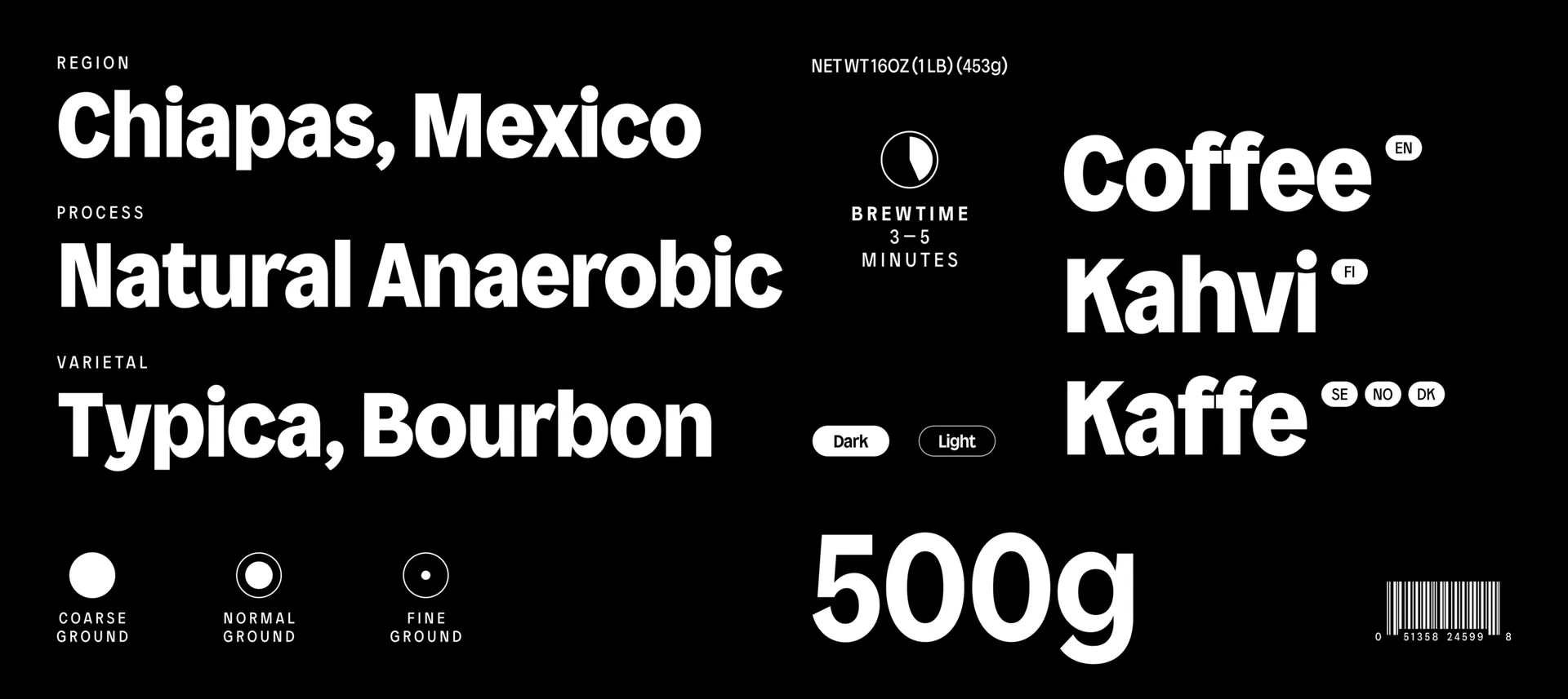
Our starting point was the aim to create a typeface that would act as a distinctive brand asset. In conversation with Brandon, another of Paulig's creative agency partners, the need arose for a bespoke font with enough of Paulig’s personality to be ownable. With unique details, it was to be distinctly Paulig off-pack on advertising, able to conjure the world of Paulig as a standalone asset, moving brand recognition beyond the logo. The world of Paulig turns around curiosity, innovation and uncompromising quality, all inside the number 1 coffee nation. This was to result in a typeface that balanced quirk with credibility; modernity with timelessness.
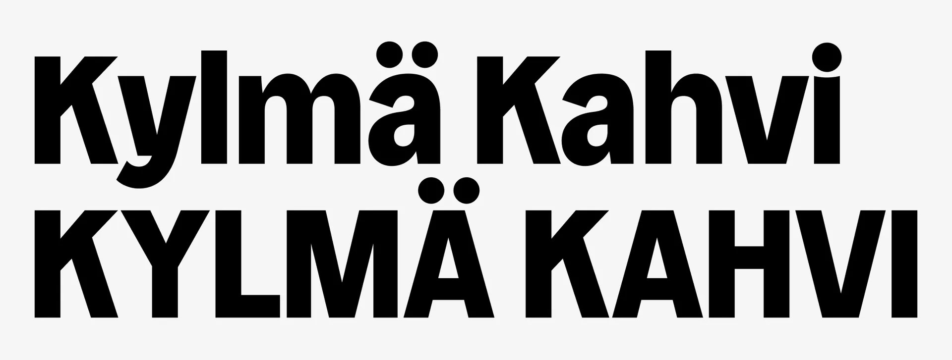


The homeland of the typeface set unique parameters that shaped the testing of it. Foremost of these was the possible length of Finnish words. No great obstacle for our resident welshman and type director, it was nevertheless a key consideration, giving an upper limit to the quirks that could appear in the letterforms before they became fatiguing to read. Another uniquely Finnish challenge was to bring lowercase to headlines — Finns are used to uppercase, with all road signage and most other wayfinding in all caps. Brandon suggested pioneering lowercase to give the brand a more human feel, showing how confidence could be communicated without capitals.
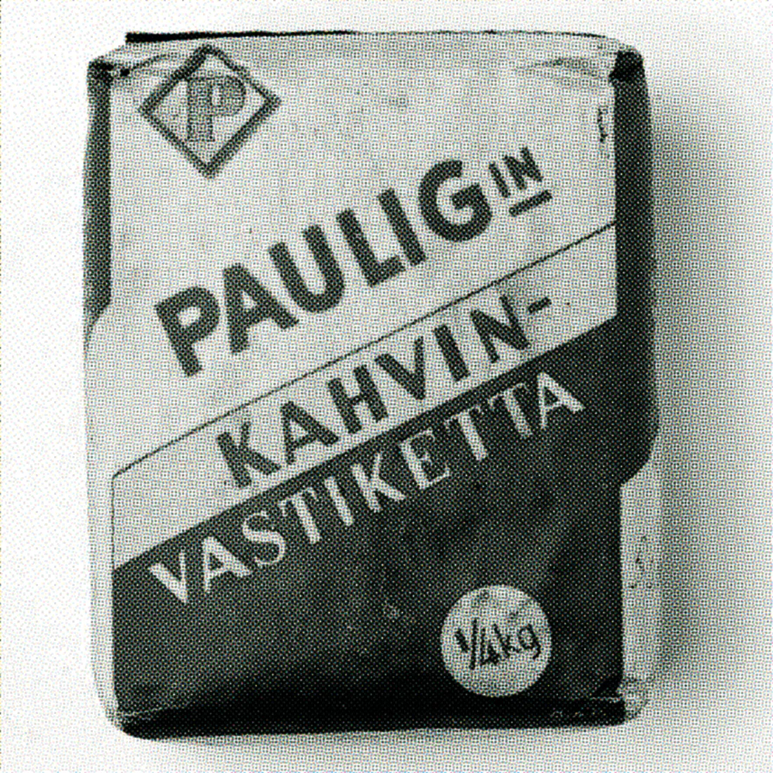
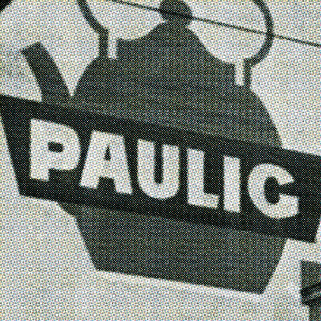

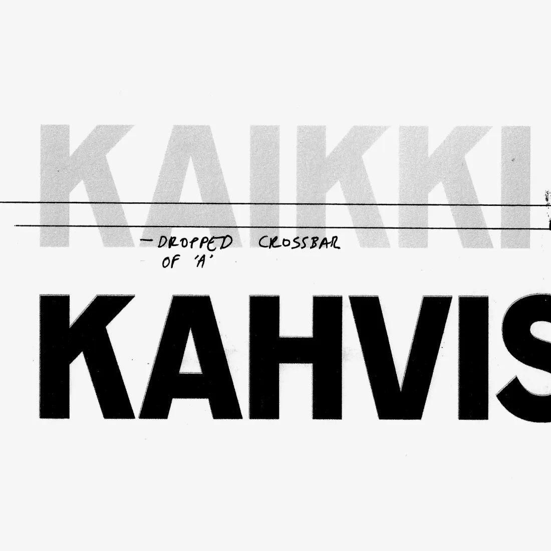
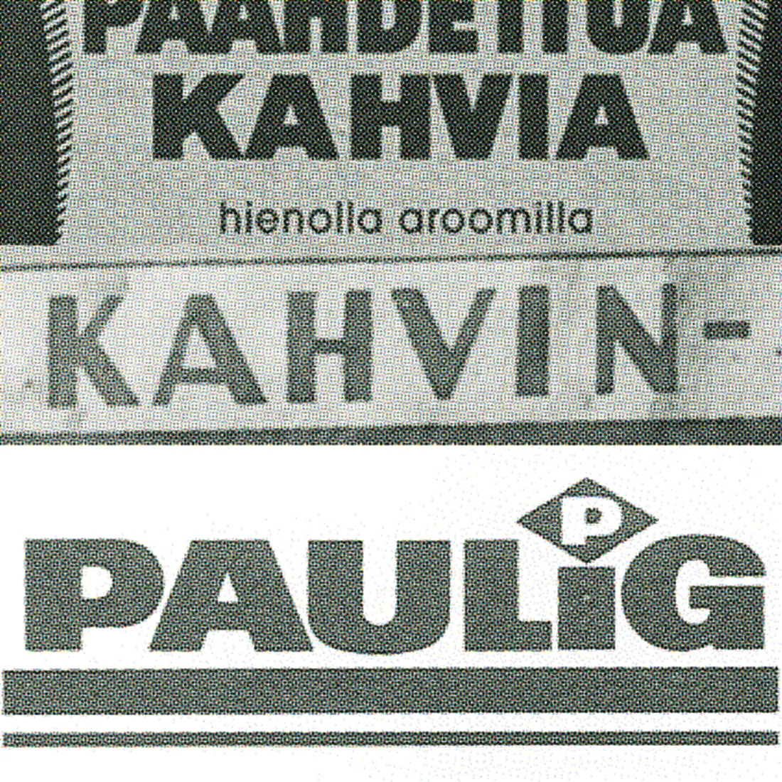
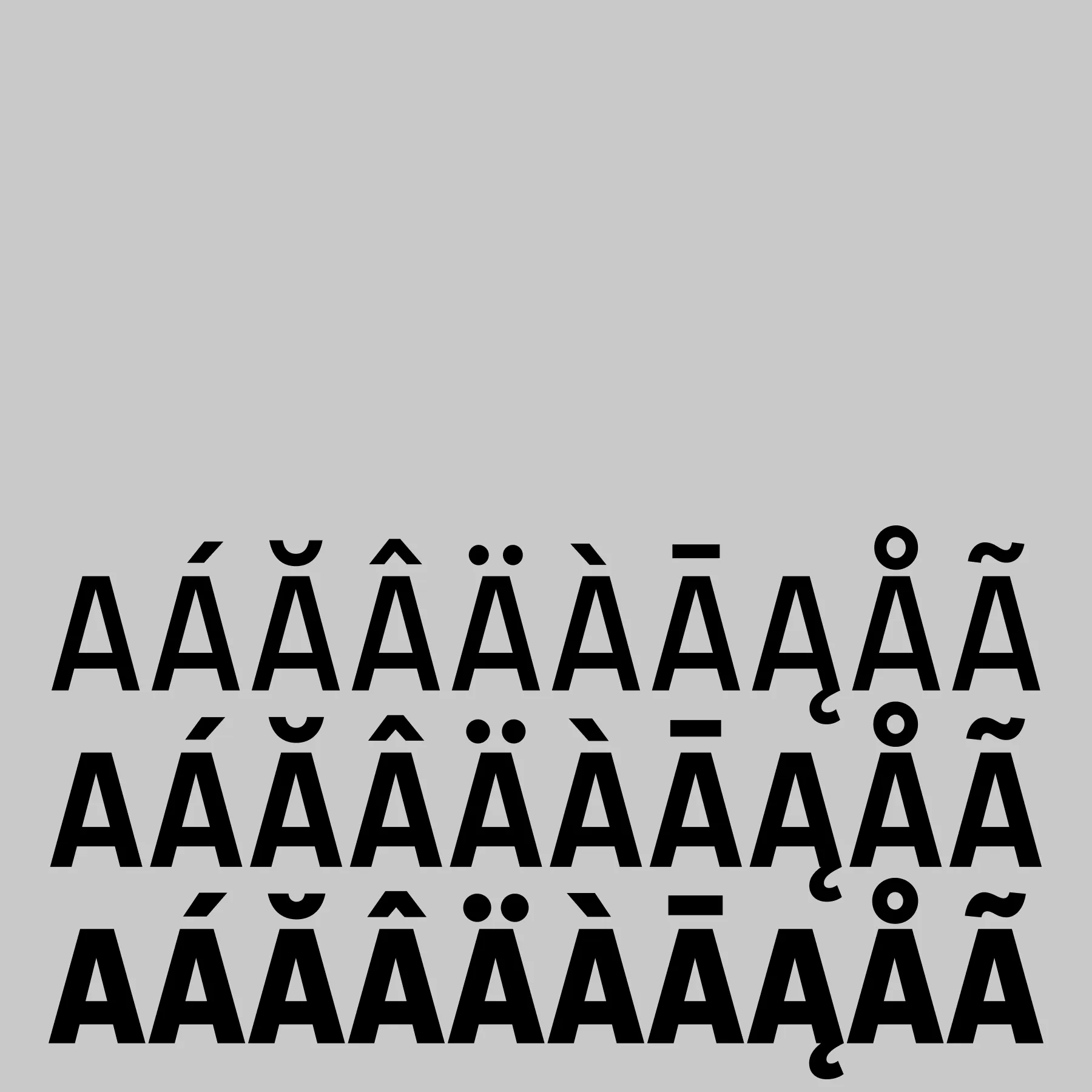
Drawing personality into the letterforms, we took cues from heritage packaging. Paulig’s archives map out 150 years of evolving semiotics, showing 20th century type whose personality was conveyed through unusually low crossbars, stroke modulation and wide tracking between letter forms. Paulig Display reinterprets these stylistic choices in a modern way, bringing back details from bygone letters, such as an angle in an uppercase G from a historic logotype. The heritage influence also carries through to the lowercase character set, where curves taper towards their ends. The result is a typeface that is friendly and unique, yet timeless.