Our work with Vaire began last November, when we received one of the most intriguing briefs ever to land in Proxy’s inbox. Our brand identity should be anchored in an alternate timeline, starting from a moment in the 1950s, it read. Instead of burning through the last decades of the 20th century with a wasteful history of progress in the form of chips getting bigger / faster / hotter, in this timeline chips run cool… our brand has a feeling that it inhabits a world somewhere along that alternate timeline… 1950s space age cars, 1960s psychedelia – our brand needs to be inspired by the compact, thermally efficient, hyperfast chips powering the technology of the (alternate) day. We gladly stepped into this timeline, and found ourselves for several months in weird and wonderful new territory.
Everything about Vaire seems too good to be true and yet is, delightfully, genuine. From their product, to the brief, to the team themselves, all of it felt anachronistic, in a way that seemed as though they really had materialised from another dimension. ‘Never assume I know better than you,’ their CEO told us on the first project call. ‘The customer is not always right. Bring your conviction — you do this all day. Never try to please me, I know nothing about this.’
Despite the team’s modesty, their sprawling imagination and taste for futuristic architecture, sci-fi concept art and 90s video games was a dream to work from. The challenge here wasn’t about encouraging the client to push limits, but about building a brand that accurately conveyed just how far beyond the limits the company already was.
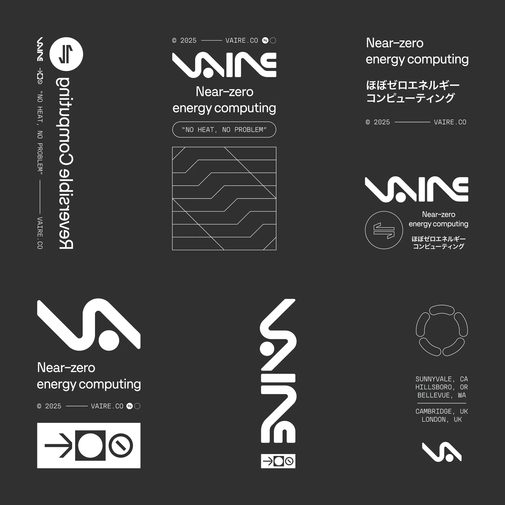
Capturing the perpetual flow of information within Vaire’s reversible chips, the brand mark’s sweeping curves are not bound too closely to traditional letter forms. Instead, the shapes create a pleasing harmony more befitting an alphabet from a future utopia.
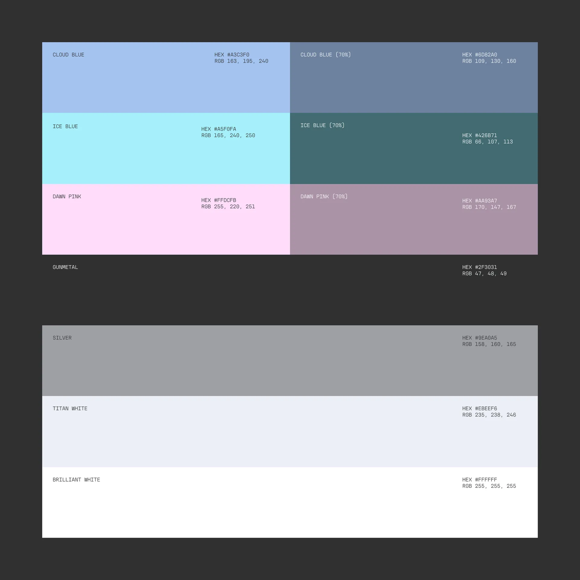
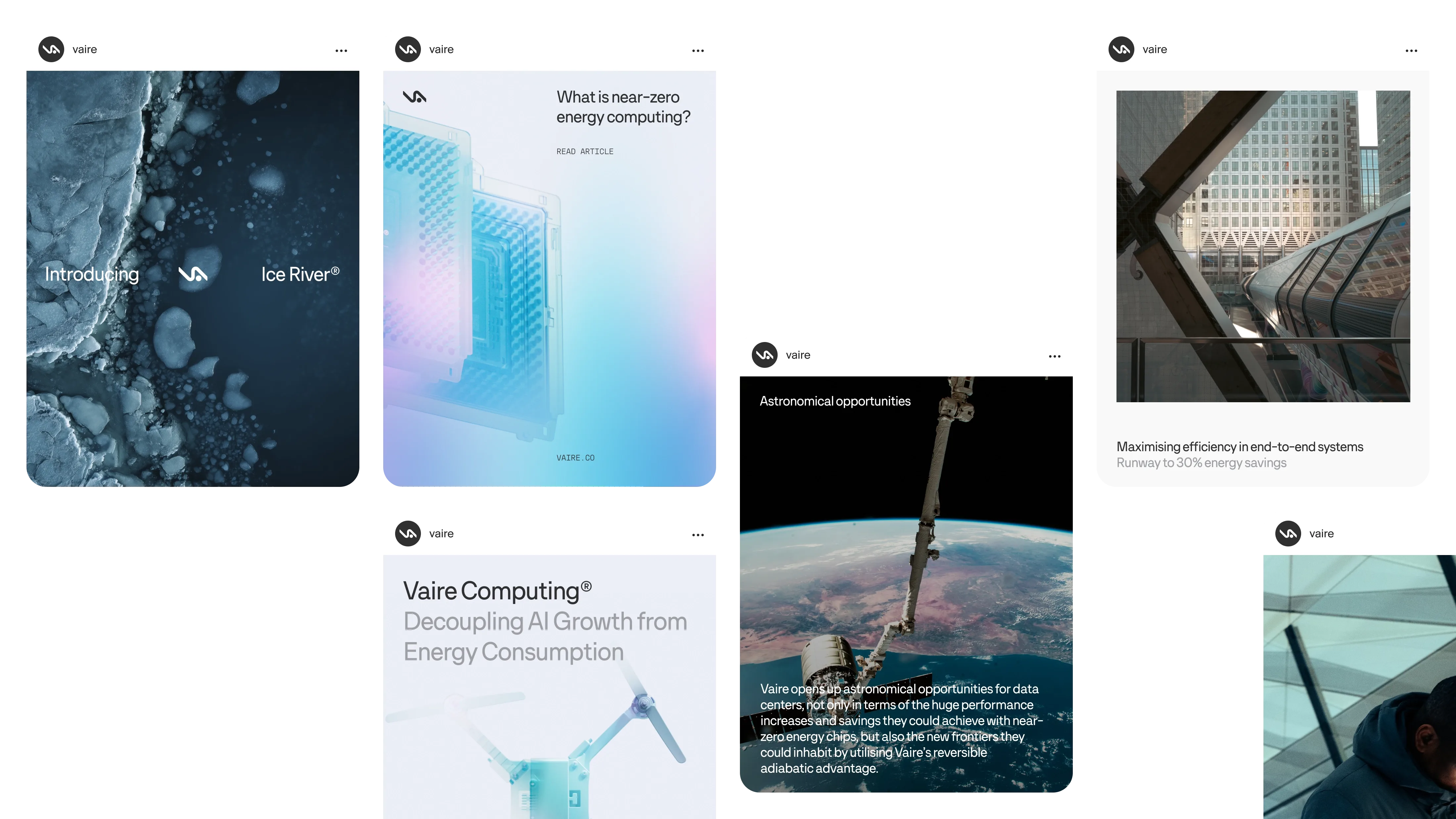
The colour palette favours clean and airy monochromatics, alongside a secondary selection of cool neutrals that correspond to the lower running temperatures of Vaire’s chips. Blending together in gradients, these pale pinks and blues play out in motion around product announcements. They reflect Vaire’s refreshingly light approach to the hardware space despite the industrial compute power they provide.

Despite working from decades old theory, Vaire are pioneering an approach to computing that has been little explored until now. With that in mind, we created animations to illustrate what reversible computing is as simply as possible. Taking cues from scientific papers and diagrams, these dynamic logic gate drawings take on a style that doesn’t interfere with the information being conveyed.
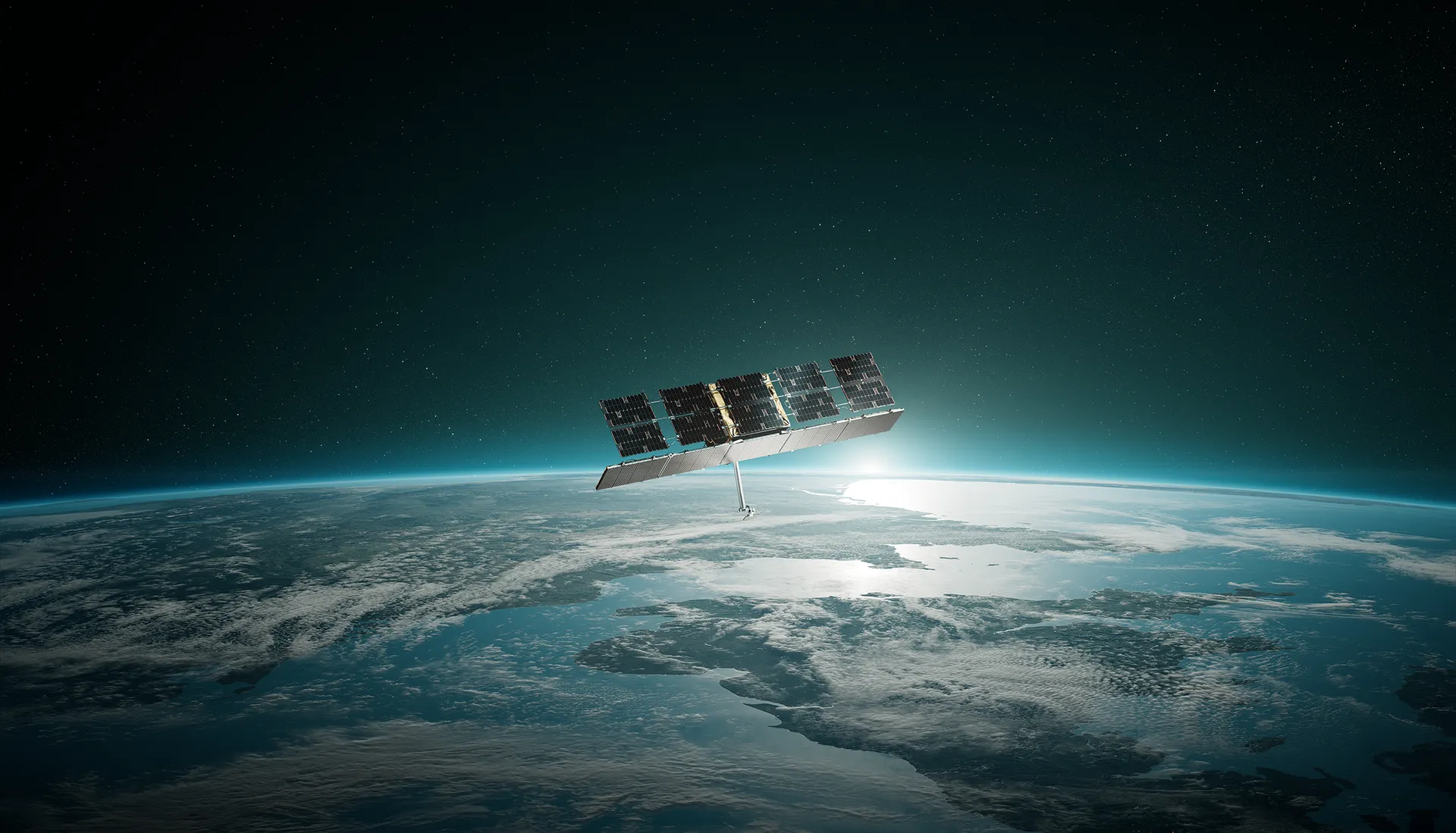
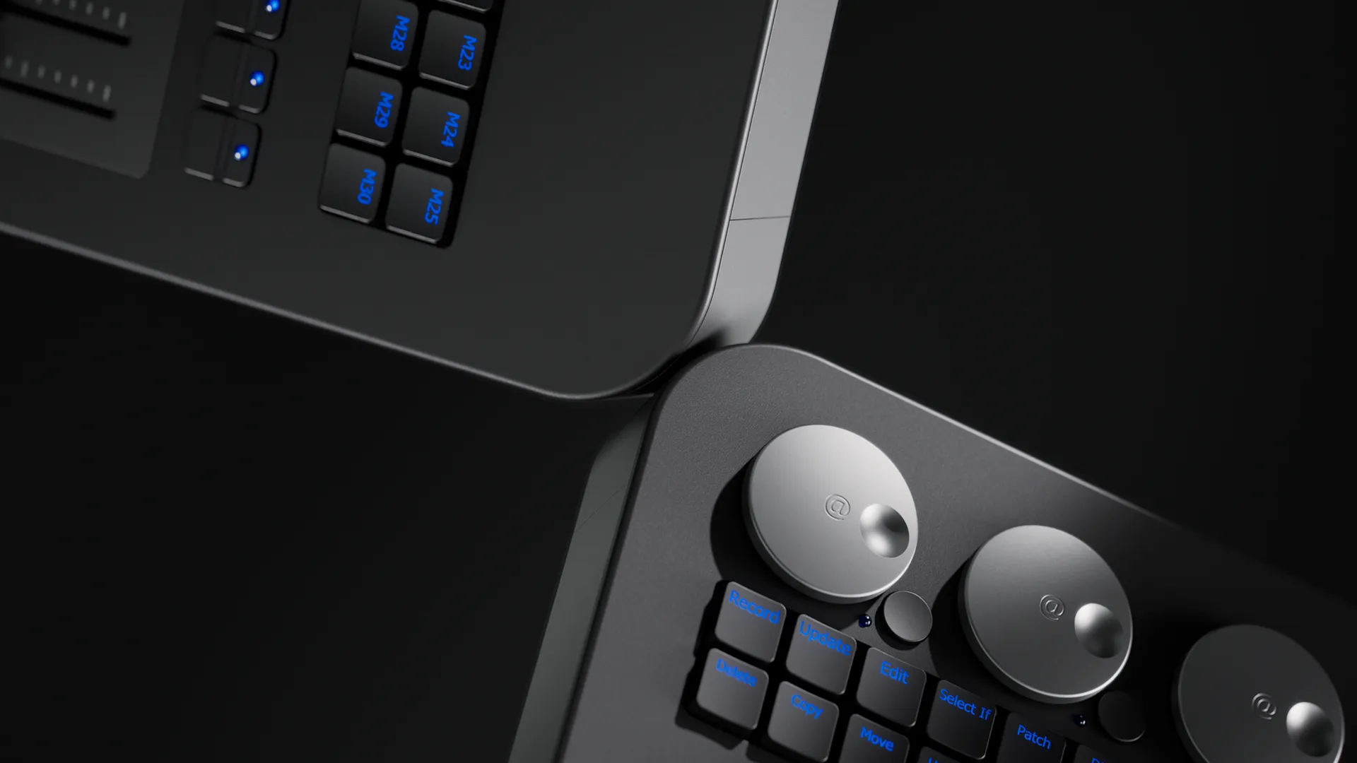
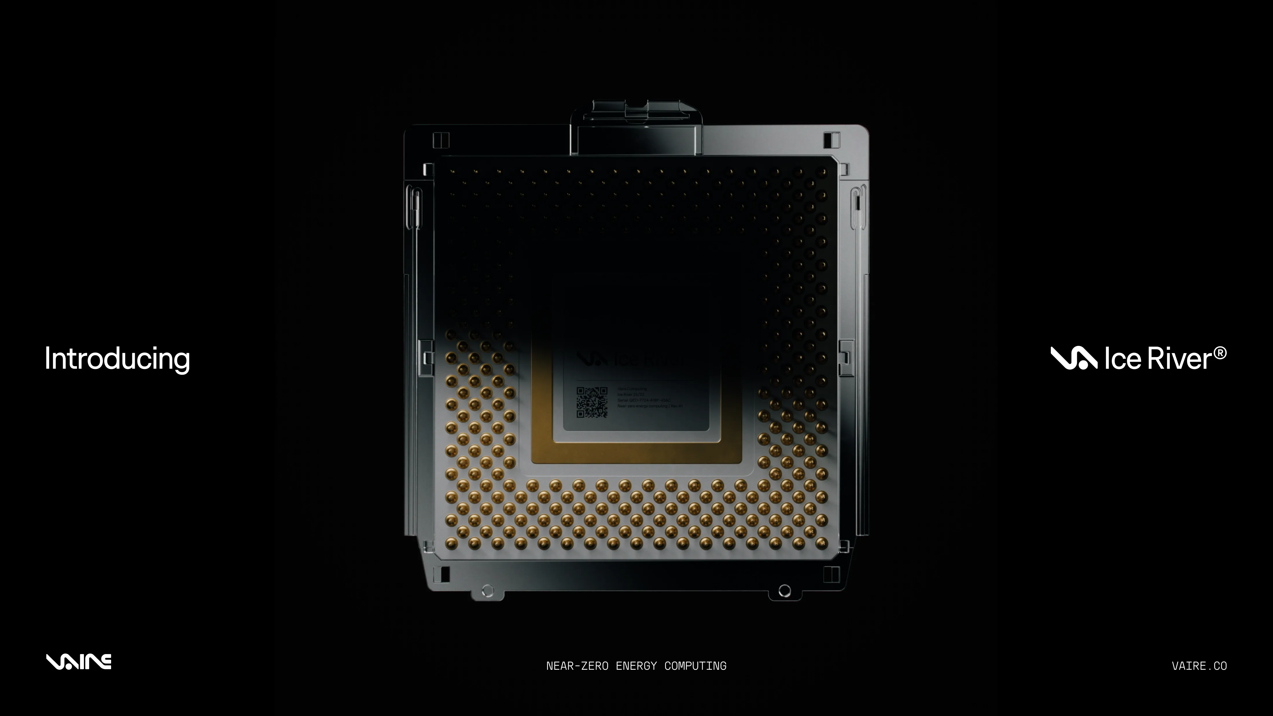
This is complemented by render imagery that has a ‘stealth mode’ feel, with crops and lighting designed to never reveal too much. The cool blues of the brand colours reflect across the chip’s surface, a calculated contrast to competitors using glowing light to signal their activity.
The system comes together in application to create a brand world that feels as futuristic and unusual as the idea behind it. A single scrolling page website introduces the concept of reversible computing to the world, positioning Vaire as thought leaders in the space and generating excitement about the possibilities generated by their technology. The brand signposts another reality — one that could be the future of this one, if only every company were committed to being as revolutionary as Vaire.