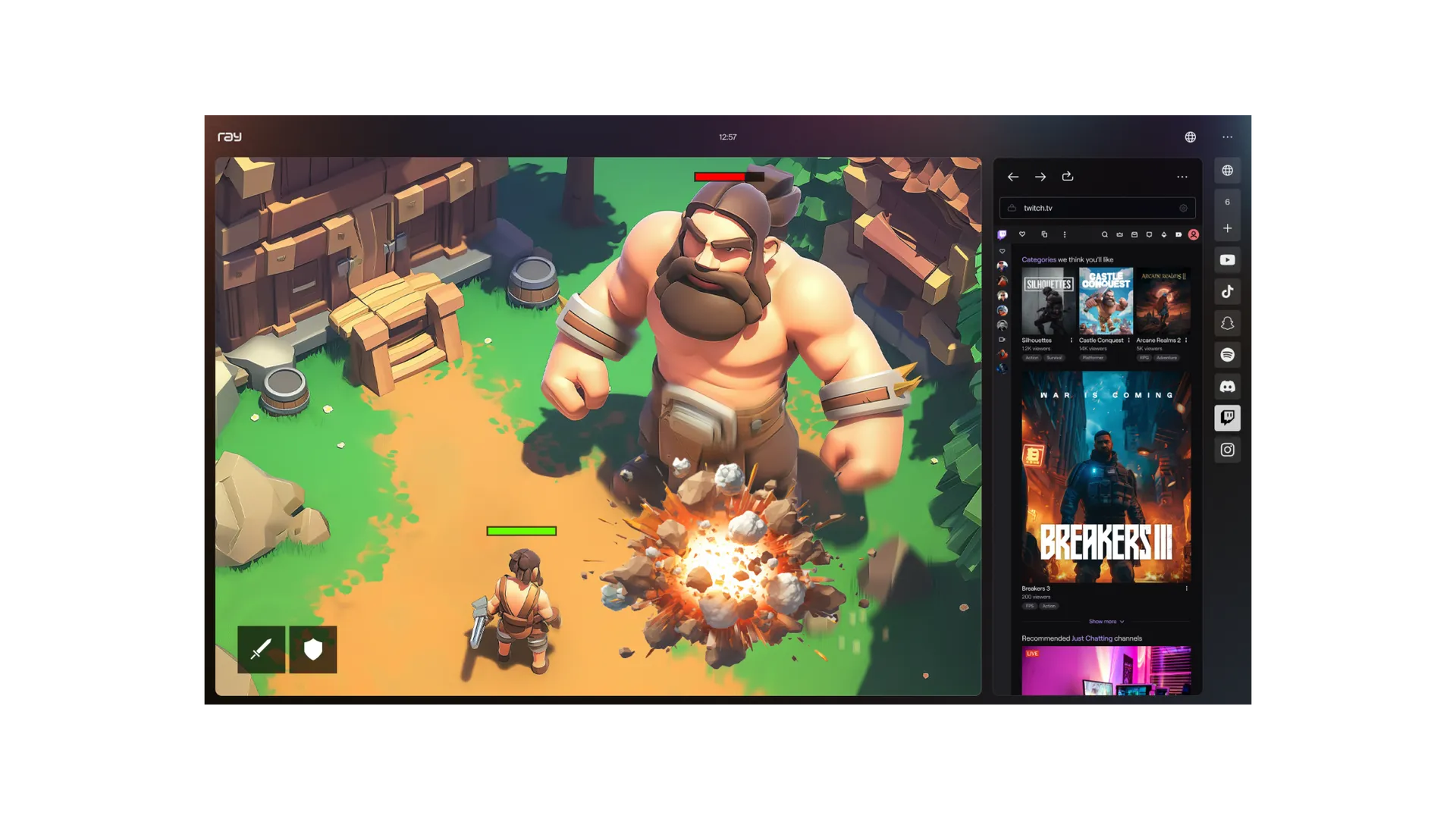
Now available for early adopters to download from Ray, the revolutionary gaming browser was still under development when we began working with Ray at the end of 2022. To help conceptualise the product, we wrote a vision memo of what the platform should be like, creating a mental model it could grow towards. This was built on two central tenets — fun and fluidity — which culminated in the central brand idea: Immediate Immersion. The seamless flow from the joy of one virtual world to another was the spirit of Ray; to be communicated with a friendly, rounded visual language, and animations equal parts mesmerising and playful.
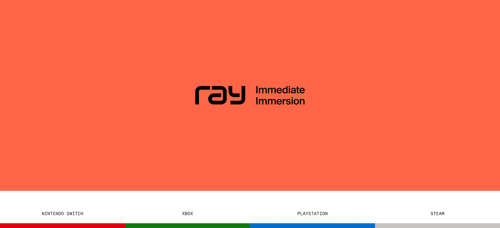
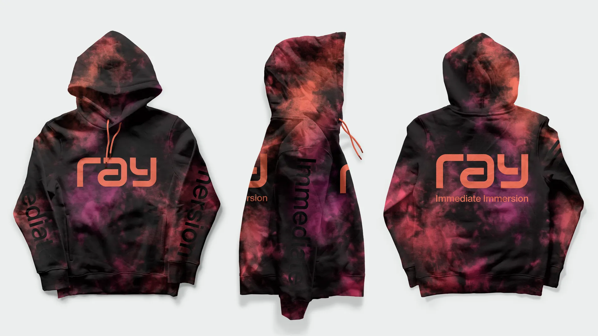
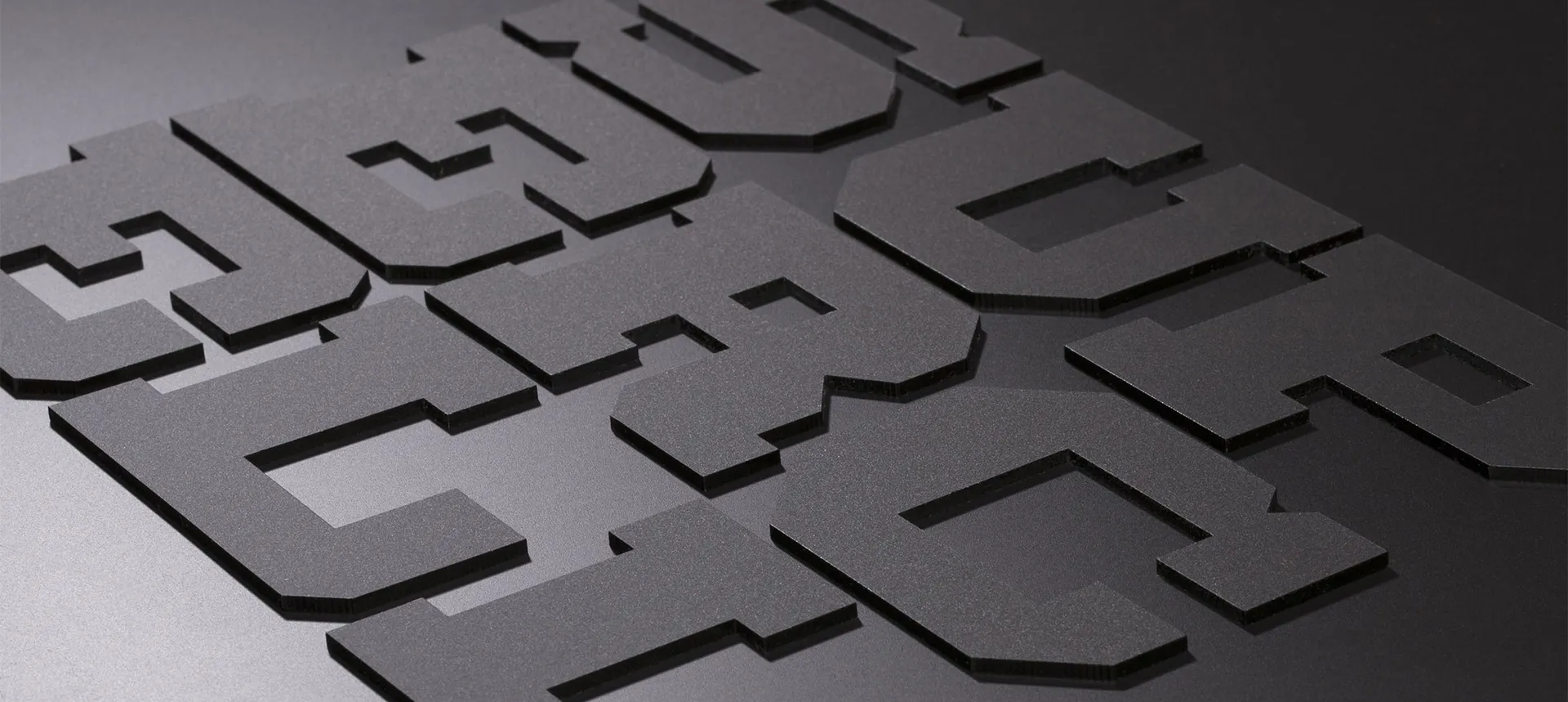
The joy and fluidity begins at the wordmark, where robust geometry is rounded for a friendly feel. Graphically expressive and yet easily legible, the mark connects Ray with the history of gaming while at the same time feeling futuristic, creating a loop of sentiment as infinite as the worlds Ray travels between. This was to be a timeless, quintessentially gaming platform brand, belonging to the lineage of Super Famicom, PlayStation, Xbox, Steam, Netflix and Spotify.
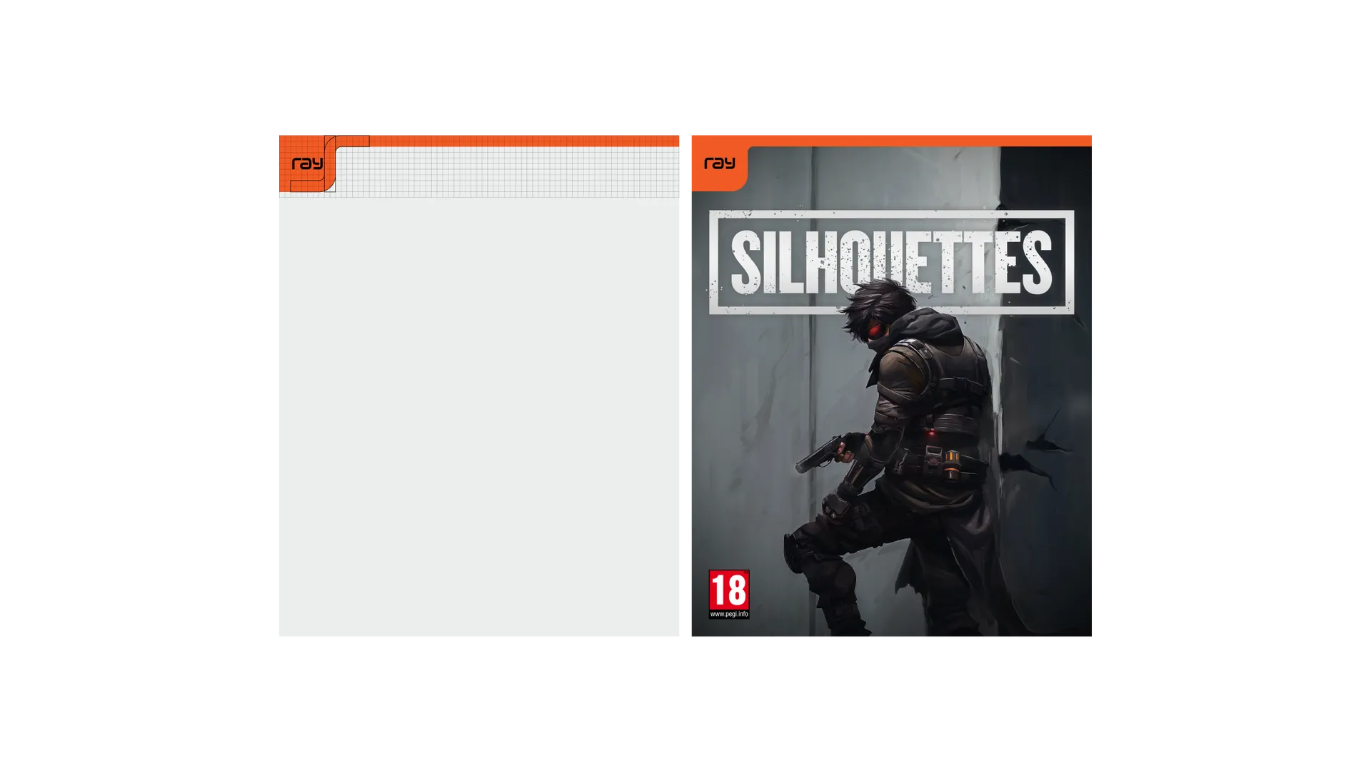

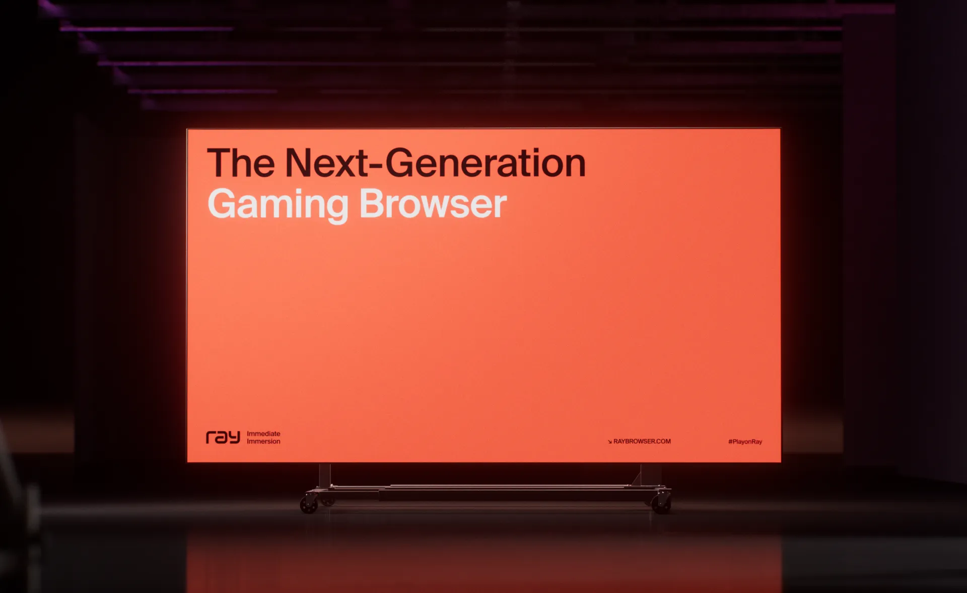
Setting Ray apart from other platforms is main brand colour — orange — the only colour on the rainbow not owned by other platforms. Moving away from the company brand and towards the product, a mostly monochrome palette lets game visuals punch through, with the Ray orange used sparingly as an accent.
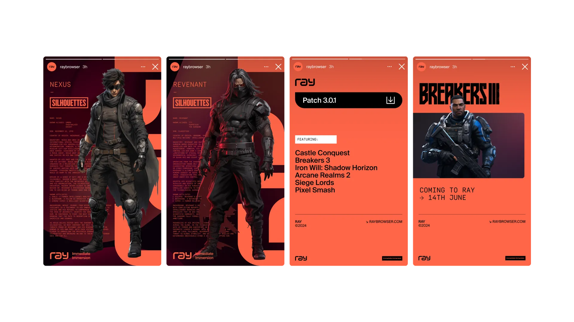
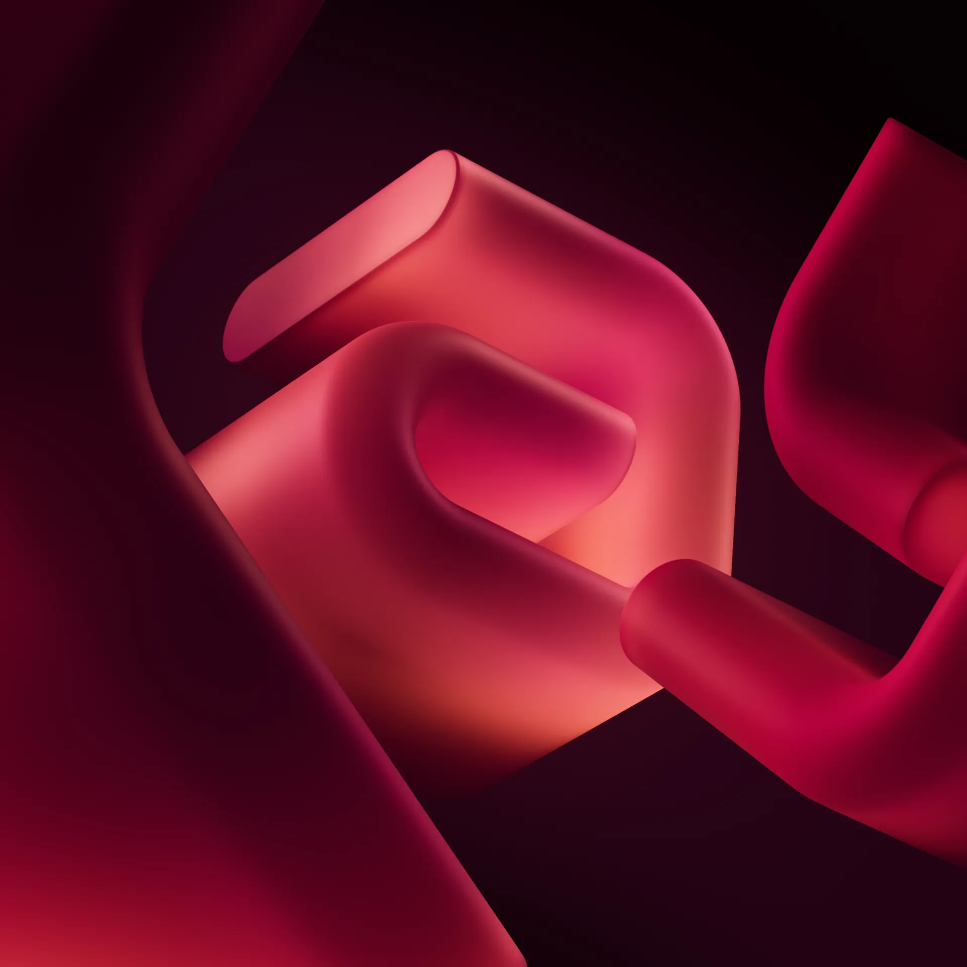
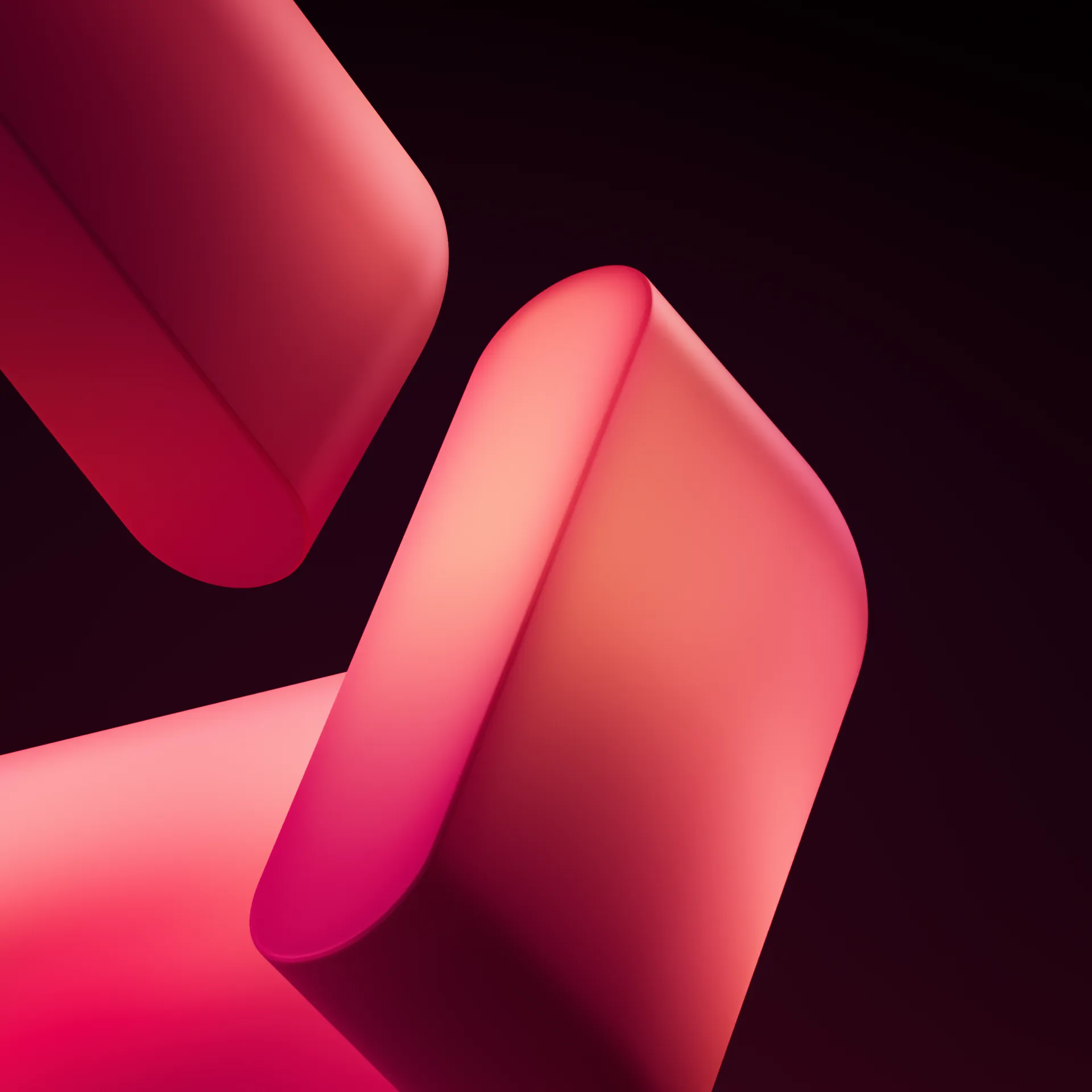
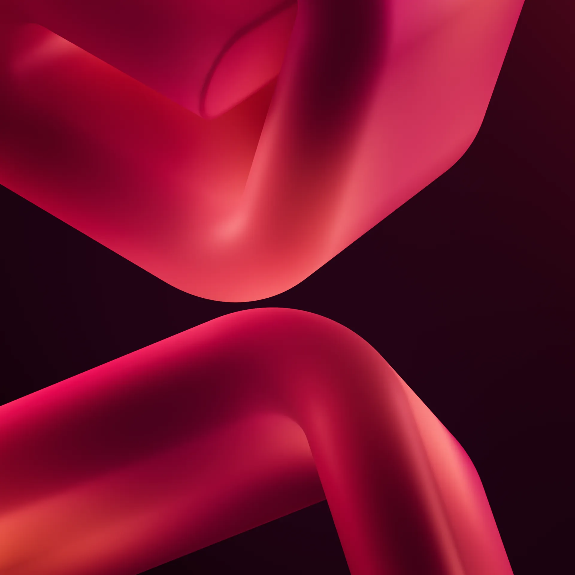
The colours are most often seen leaking into the darker tones of the palette together, sparking intrigue and mirroring the blurring between virtual spaces. Something fun is always around the corner, waiting to be explored.


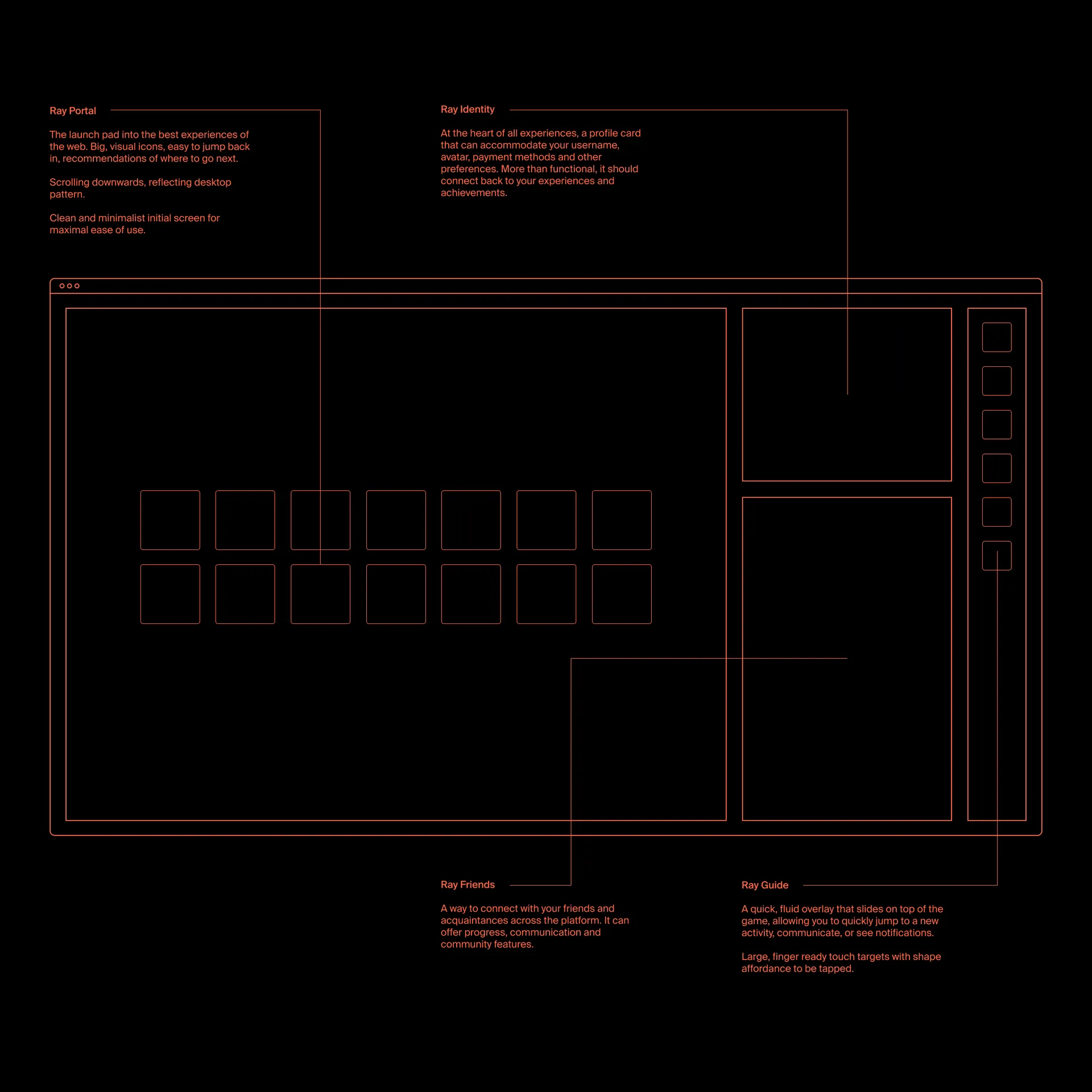
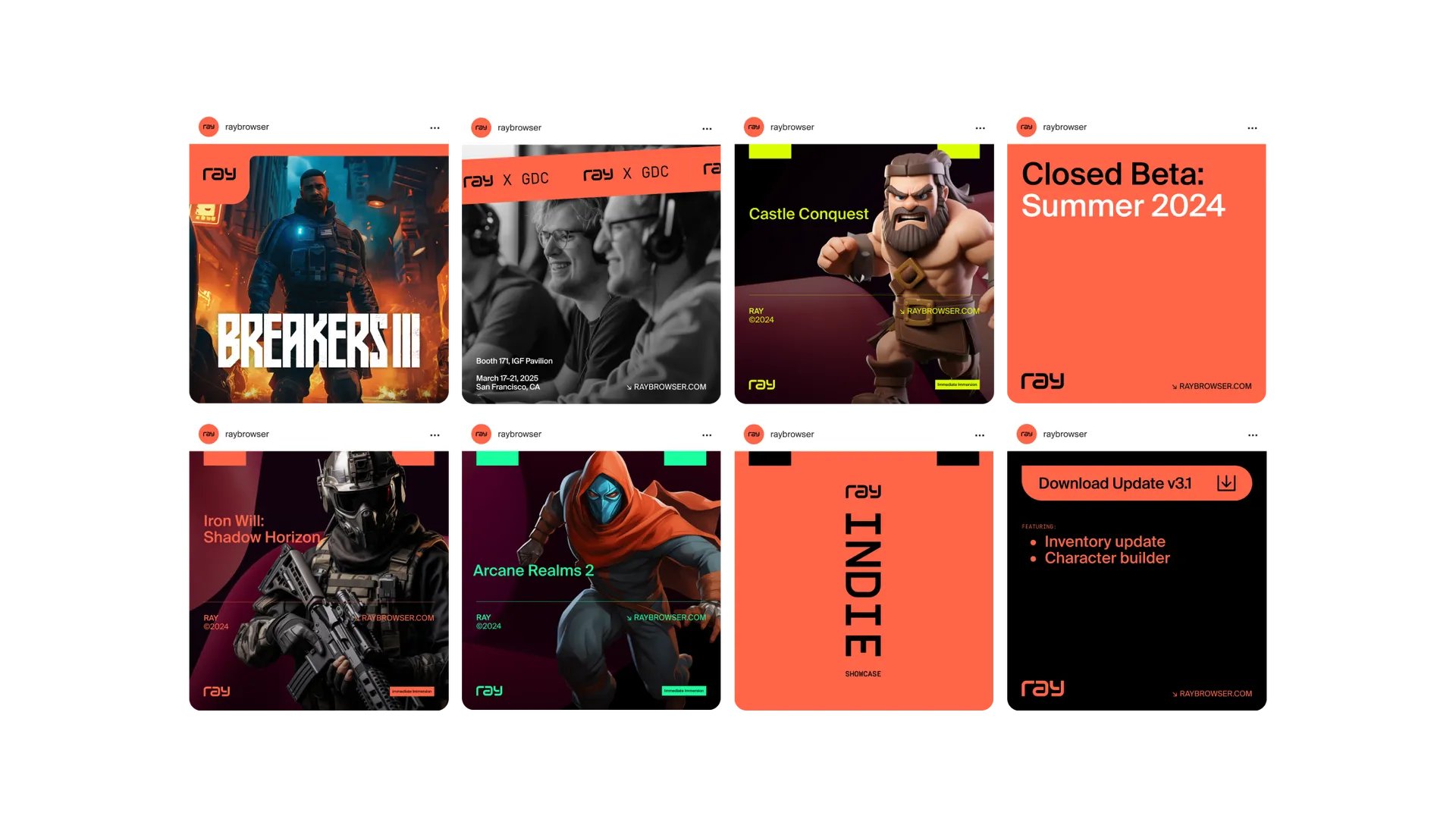
As with all Proxy brands, the Ray identity was designed from ground up to work on real brand assets — in Ray’s case UI components, social media marketing and game marketing. Here the orange and other accent colours act not so much as a call to action but a call to gaming, creating fun visuals that inspire play. We were delighted to once again collabroate with our friends at BBBLGM, who have been building the final app design with Ray.
It’s its native dimension — 3D — the brand manifests as a rich visual ident, communicating Ray’s superior responsiveness, graphics and fidelity. We created the launch animation as well as infinite loops that accompany beautiful transitions in the Ray journey.
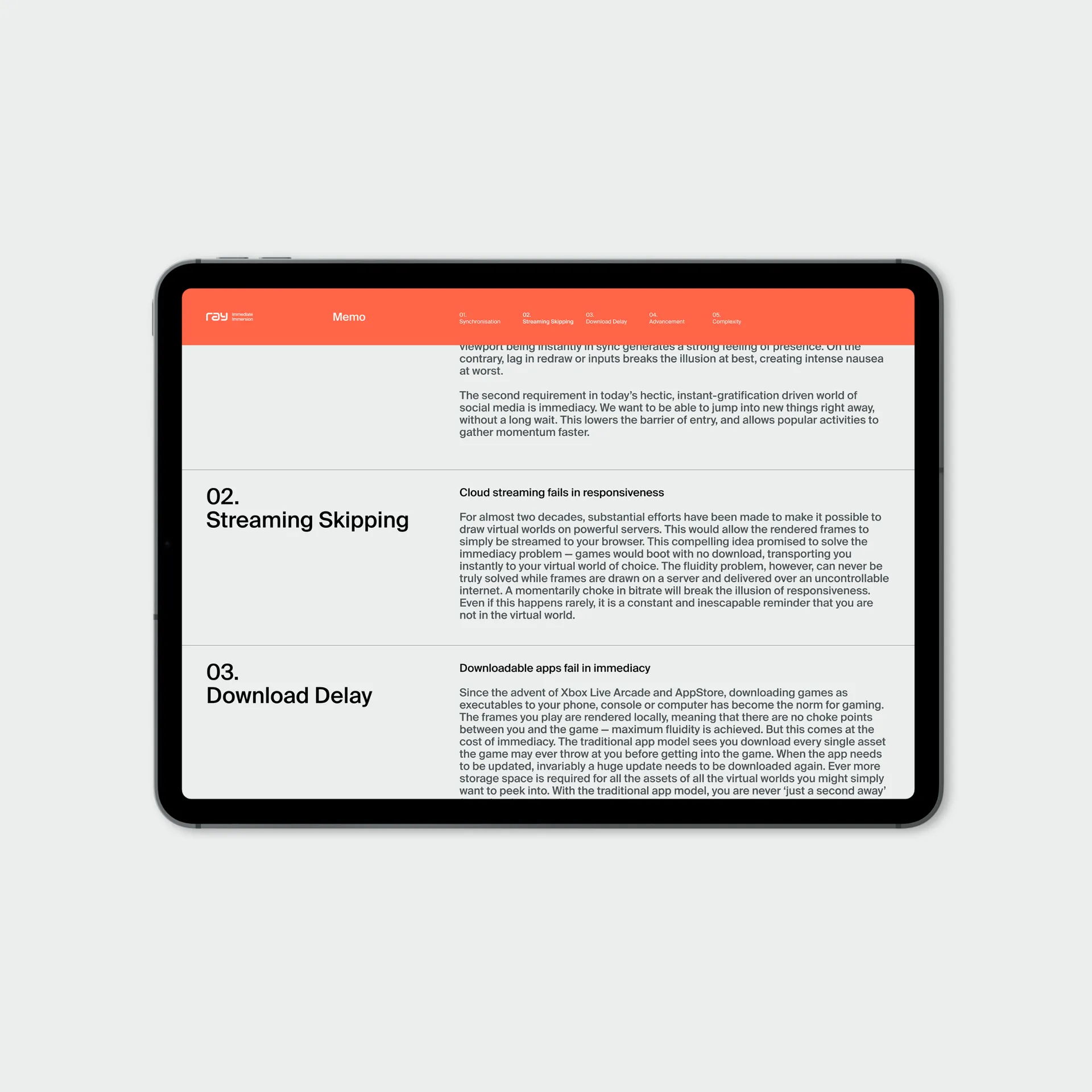
Outside of the browser itself the brand can pull back and become extremely functional, with a utilitarian feel, as though it were the brand for a team of engineers tasked to build a rocket to a distant planet. In a way, that’s exactly what Ray are doing, after all. Equally, it can be dialled up again to feel super playful in line with the product experience — showing again the fluidity at the heart of the brand.