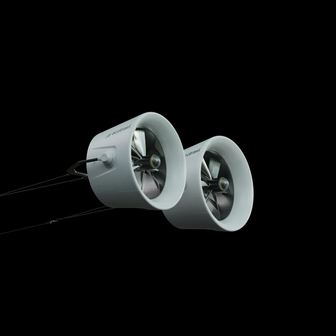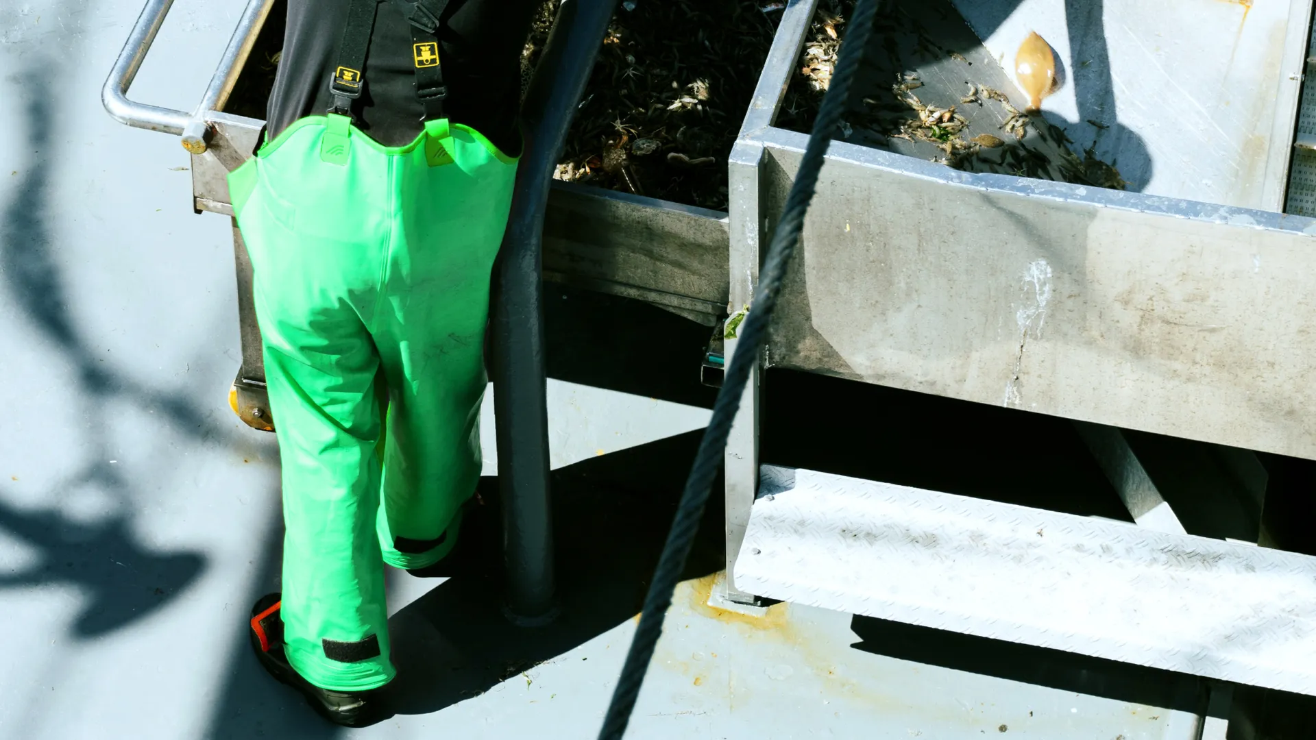
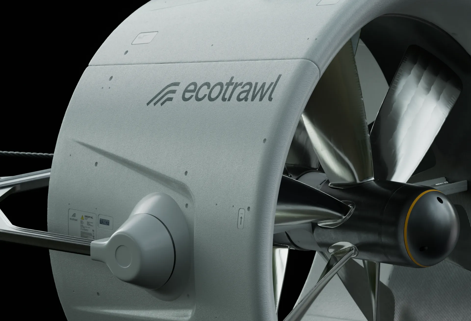
At first glance Ecotrawl’s very name may seem a paradox, implying as it does a trawl that does not harm the environment. Breaking paradoxes requires a paradigm shifting creation; one that makes the previously unthinkable possible. Enter the underwater drones of Ecotrawl, a seeming paradox themselves due to a foreboding size and weight at odds with the grace and precision of their movements. No more blind scraping of the seabed. Descending, controlled, to the darkness at the depths of the ocean, Ecotrawl’s drones allow sight in a previously unseen world. We created render imagery of this key component of Ecotrawl’s technology, illustrating the innovation whose beauty lies in its very simplicity.
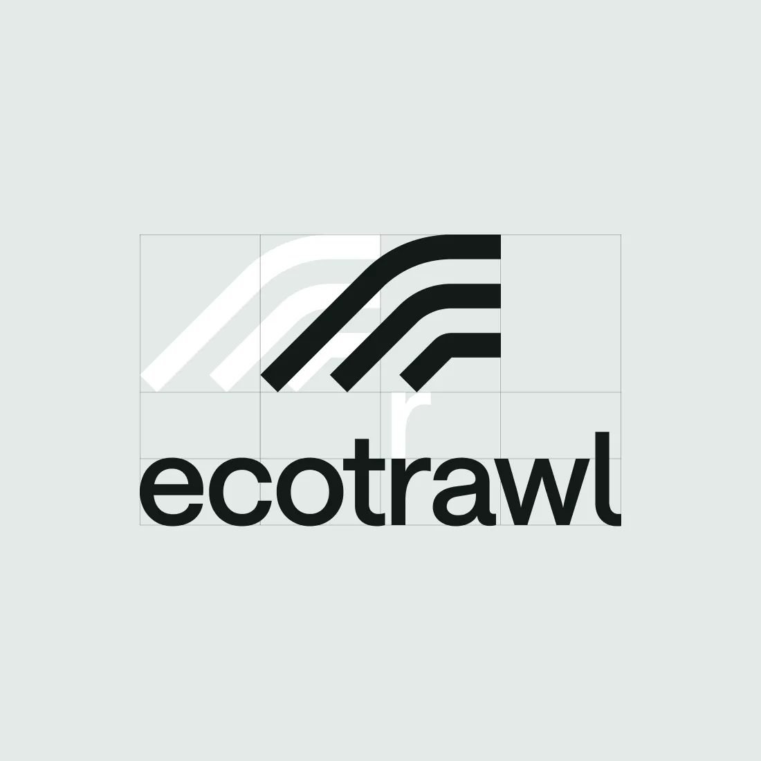
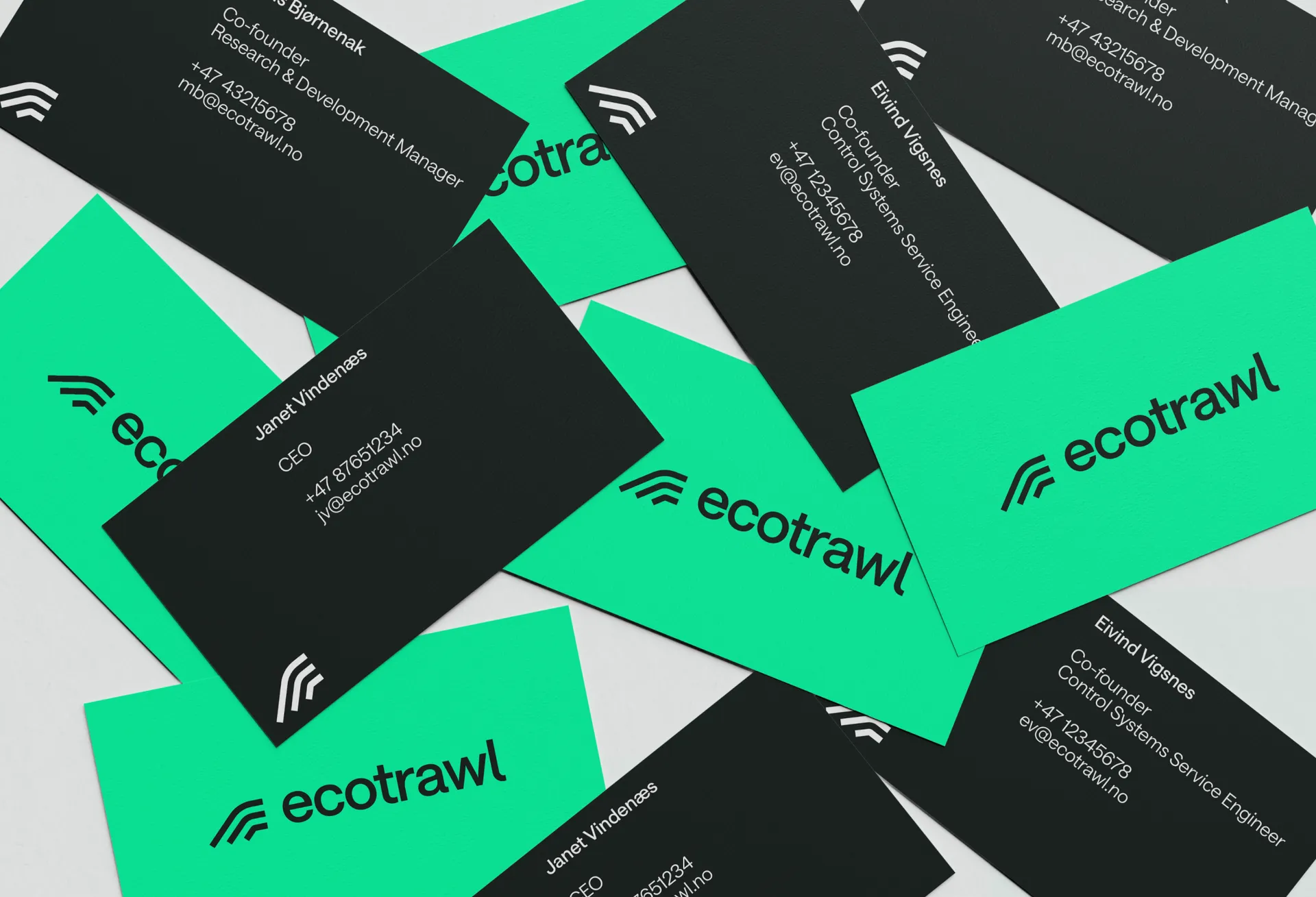
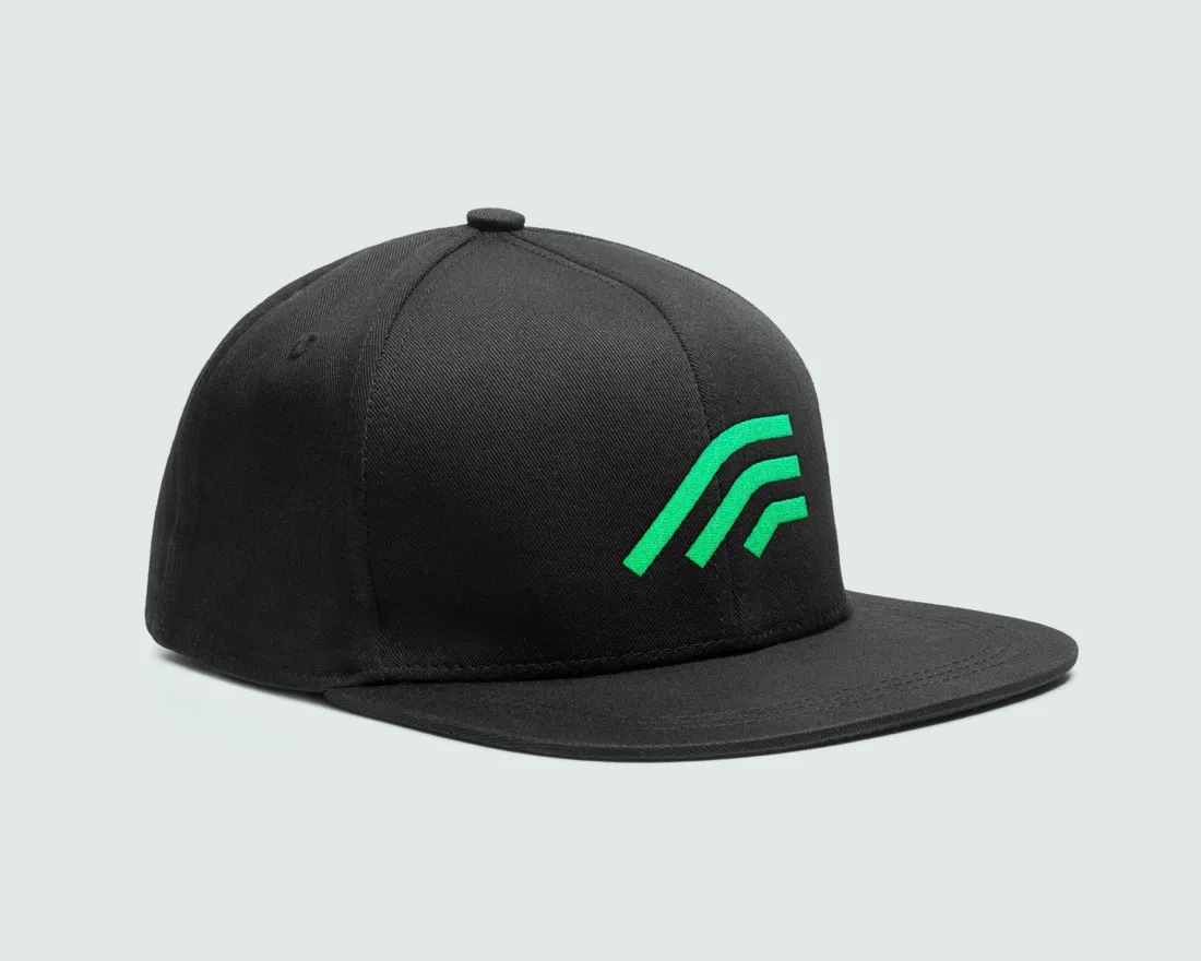
Summarising these themes of grace, precision and innovation in a mark, we landed on a simple logo made up of a trio of lines. These create a sense of motion, mimicking the descent and ascent of the drones as they move through the water towards the catch and up again at a speed that ensures its revolutionary freshness. Smooth curves marry together with straight lines to mirror Ecotrawl’s cutting edge yet graceful technology. This is paired with a lowercase wordmark for an informality that points towards a straightforward, practical brand.
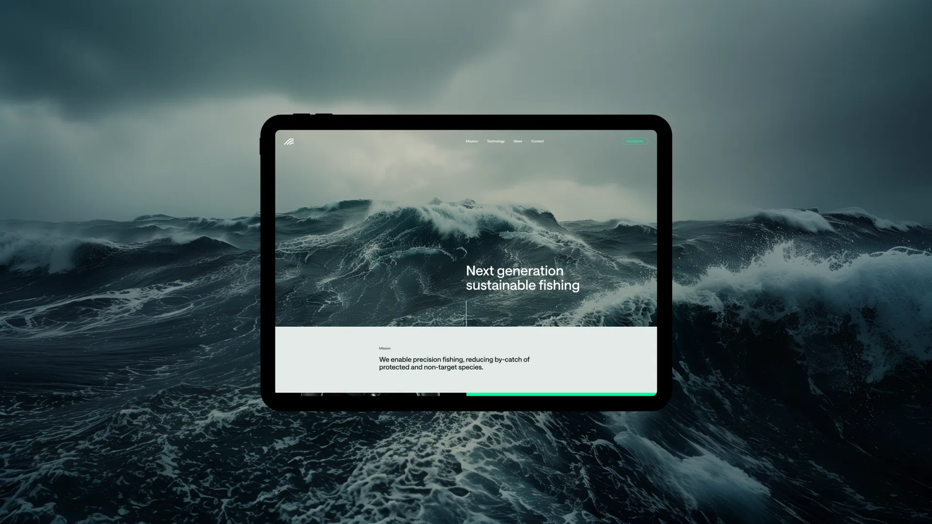
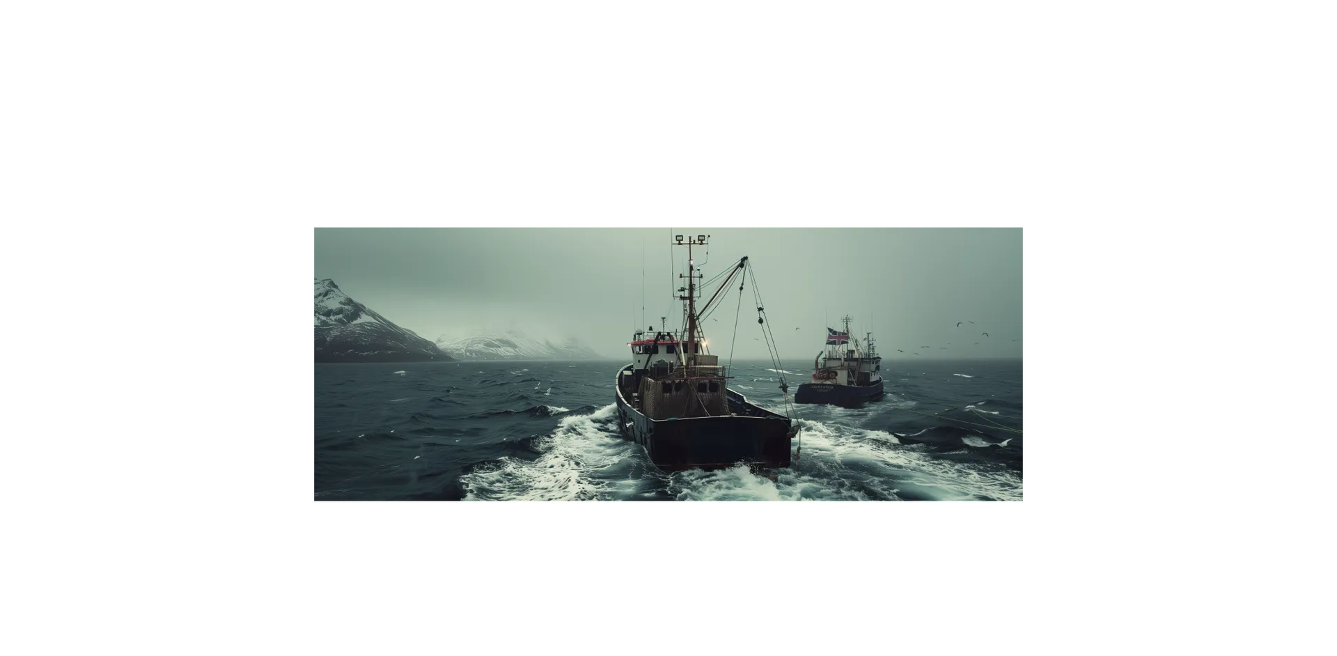
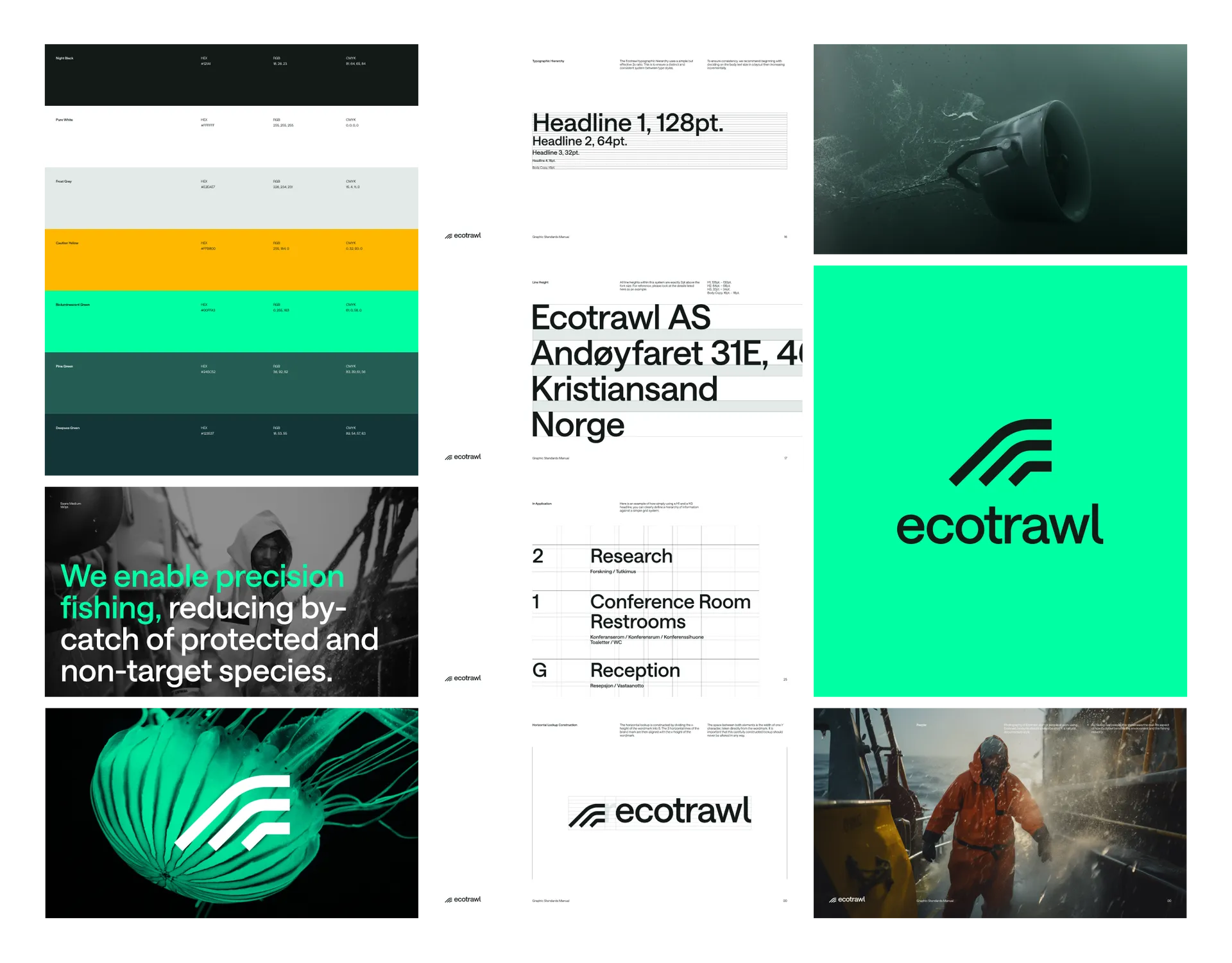
Inspired by the element in which Ecotrawl operates, the brand colour palette leans towards sea-greens, favouring these over blues to signpost the company’s environment saving goals. The palette is punctuated by neons, both a nod to the bioluminescent creatures found at the seabed and a segue to the brand’s super-digital presence, where its software will allow unprecedented monitoring of the day’s catch.
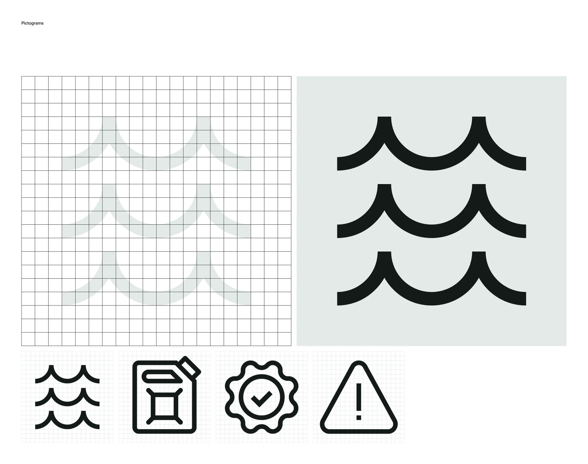
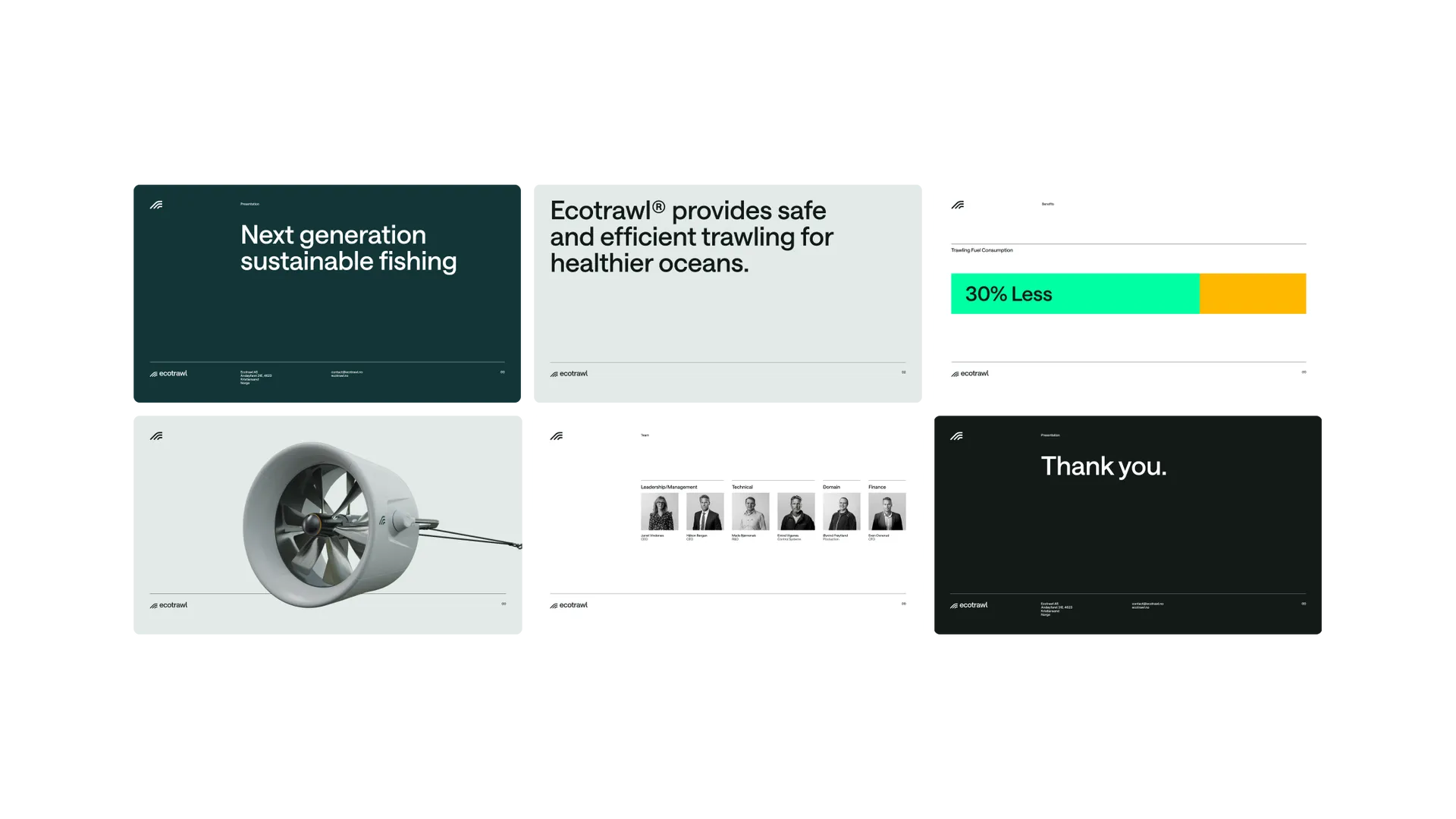
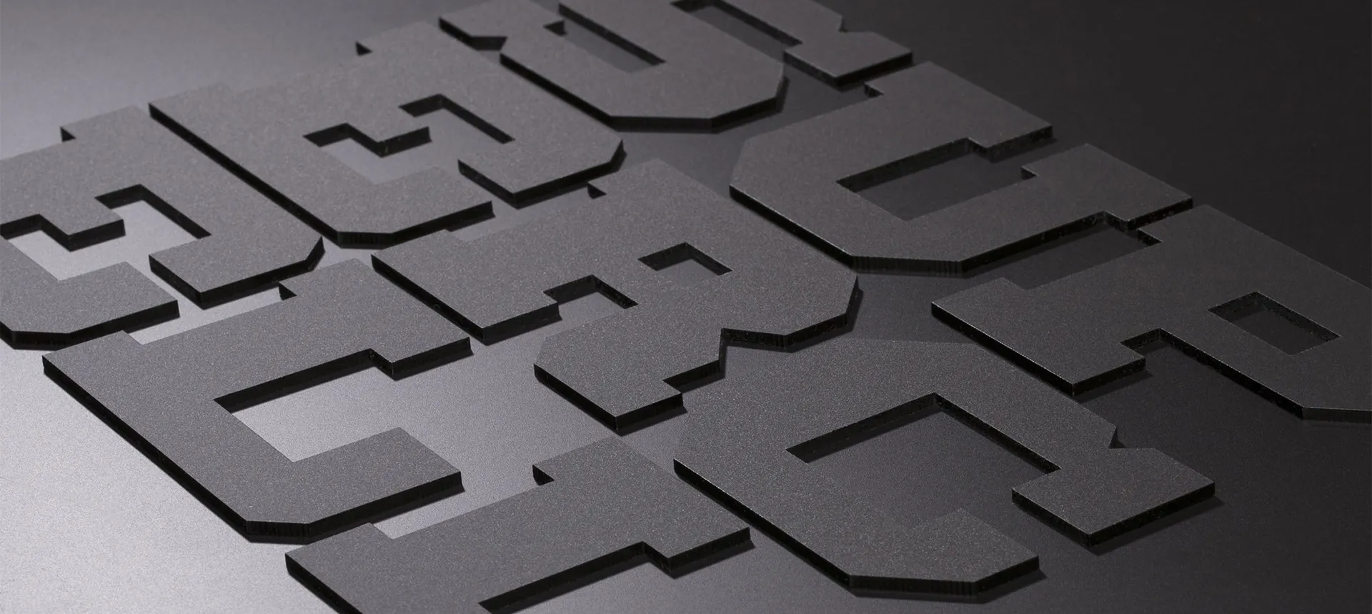
Utilitarian principles are at the forefront of the typography selection, with a Swiss inspired, neutral typeface called Saans by Displaay Type Foundry. This combines with grid layouts and friendly iconography to create brand assets that are as elegant in their simplicity as Ecotrawl’s technology.
