Gixon Header Top 2200x1320

Book an artist straight to your front door.

Gixon
Gixon is a new app that lets you book an artist straight to your front door. Browse musicians, check their availability and have your favourite play whenever you want, wherever you want. Gixon’s business is at once disruptive and old school. By shaking up dated methods of booking live music, Gixon has radically changed who is able to do so, and how and why live music is performed. The brand needed to bring the timeless, inherently offline spirit of gigs to a digital context — cutting through the dated booking systems while calling to mind the atmosphere of live music. It required a range of expression to work with the diversity of musical styles and artists Gixon represents.
  • Discipline
  • Brand Identity
  • Brand Imagery
  • Brand Guidelines
  • Brand Typography
  • Brand Photography
  • Contributors
  • Dalton Maag
  • Evan Weselmann
Crescendo

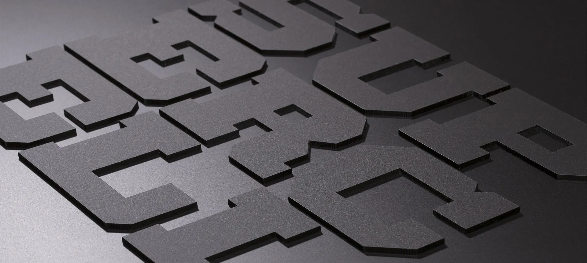
The logo was created with movement in mind to build the basis of a dynamic brand. Inspired by the sheet music notation for a crescendo, an increase in sound, it grows in size from left to right. To achieve the desired perspective, the word mark was refined by lettering artists at Dalton Maag.

Gixon Giant Typography 2 2200x1320
Gixon Typography 2200x1320
Typography

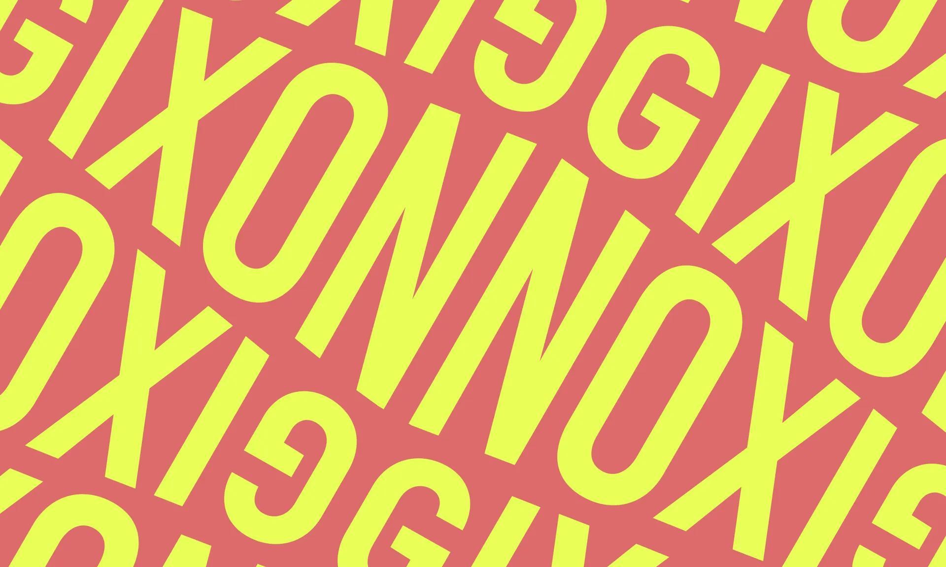
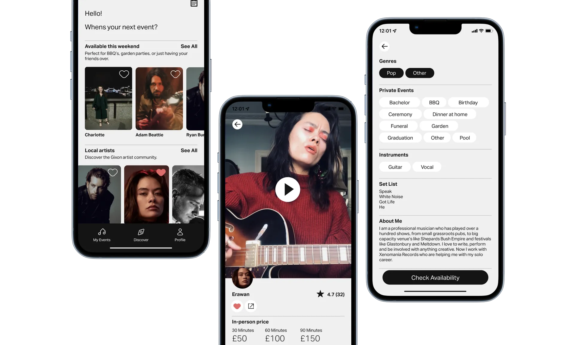
Grenette Pro was chosen as the brand’s headline typeface. With its intentional asymmetry and subtle quirks, its personality exudes warmth and lends the brand a human feel. This is paired with the functional feeling Aktiv Grotesk for body copy and user interface.

Gixon Characrters 2200x1320
46110035
Stickers

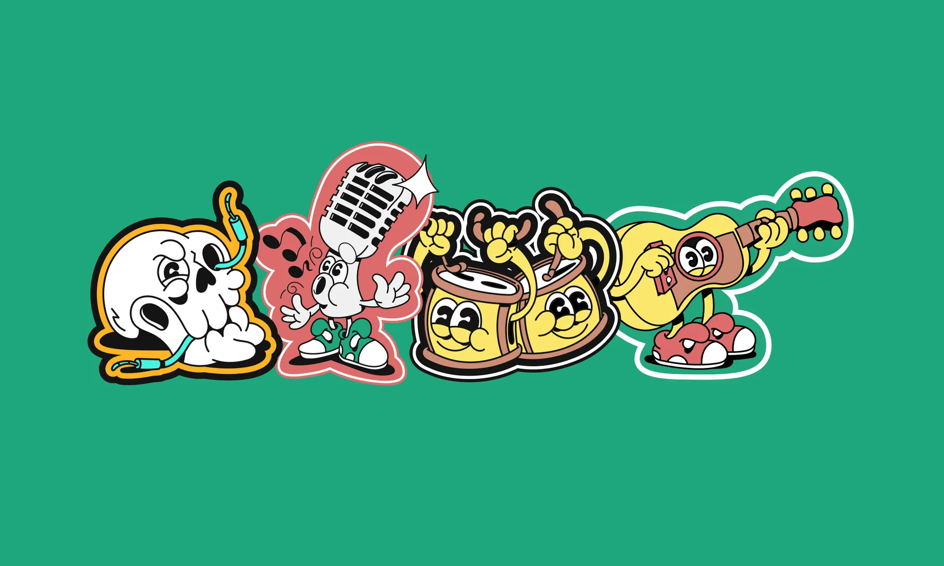
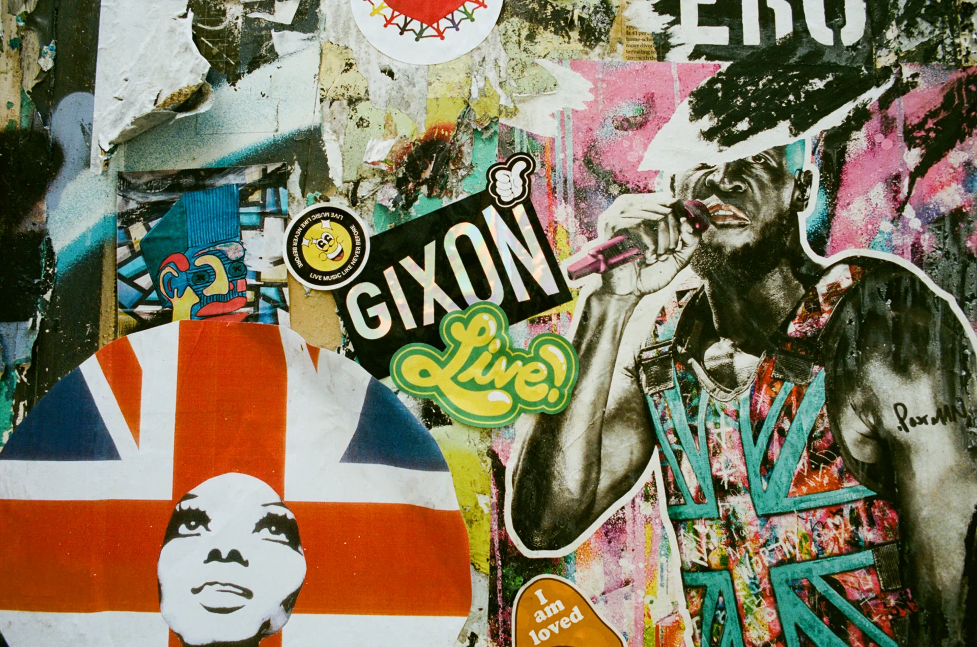
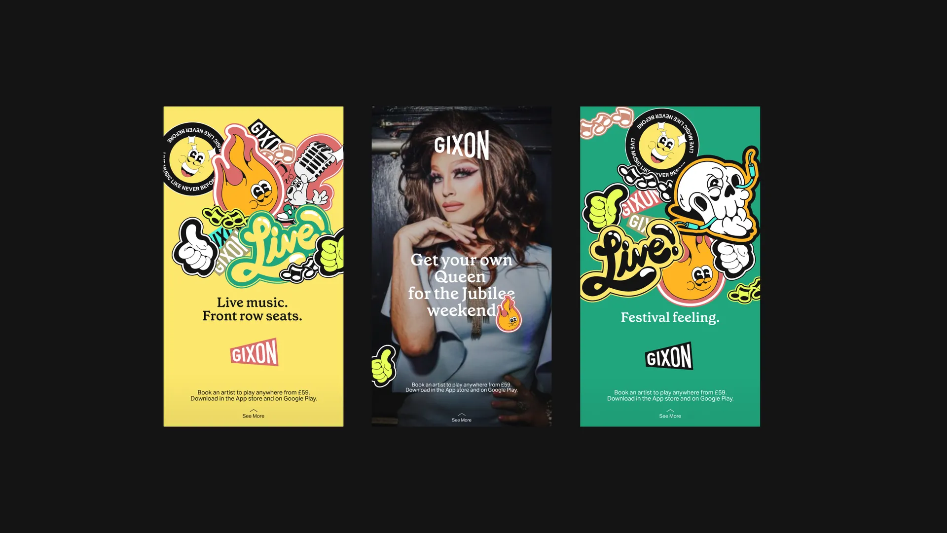
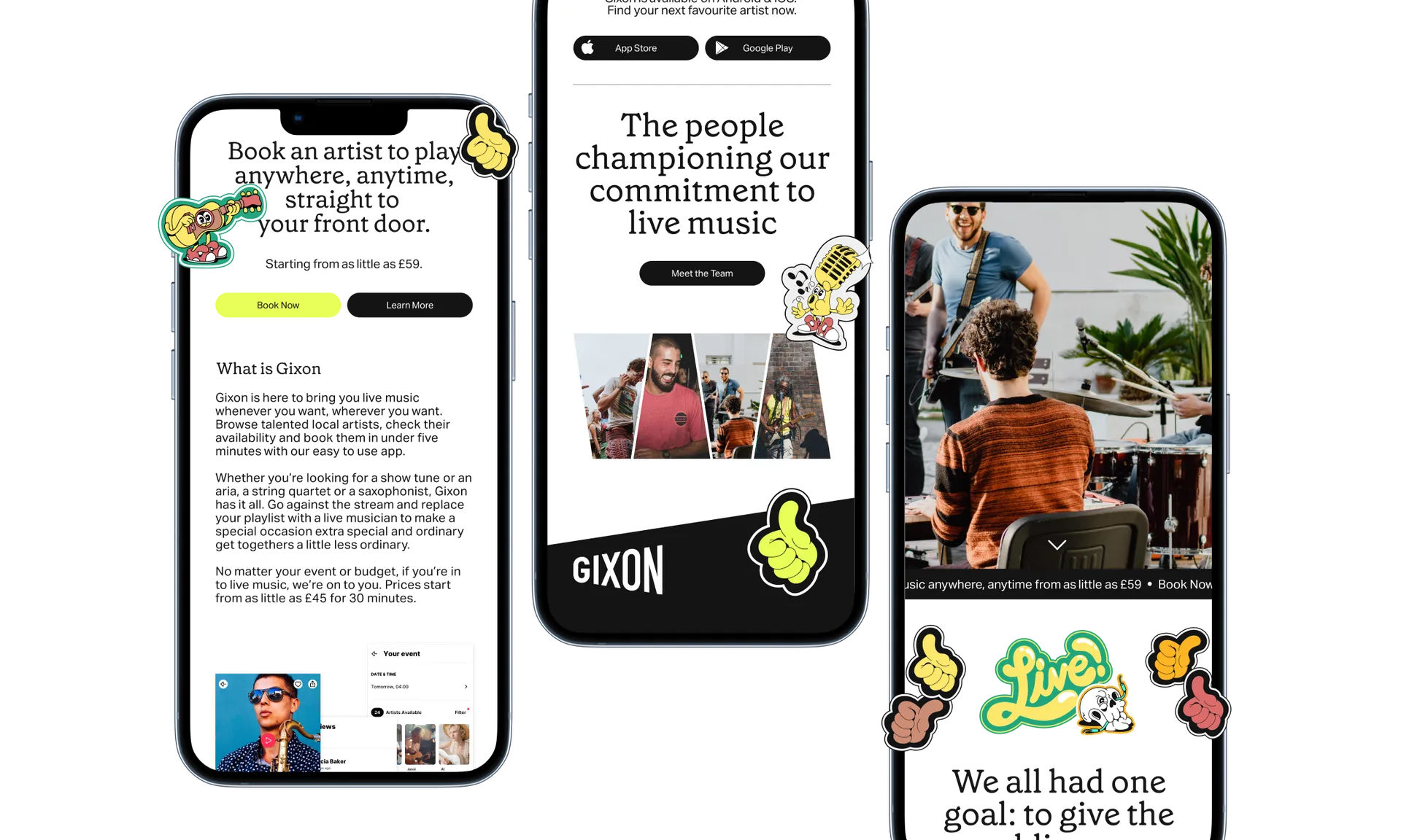
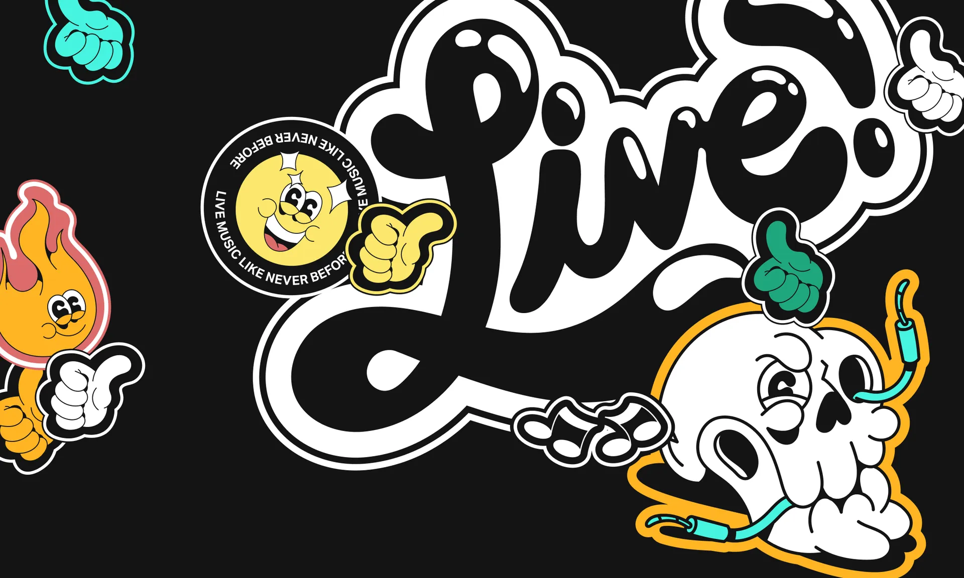
Created to live on the gig, we commissioned sticker designs from US based illustrator Evan Weselmann. The result is a set of versatile brand elements at home both online and off, found everywhere from Facebook marketing ads to guitar cases; the bathroom stalls of iconic gig venues to the walls of London’s most colourful streets.

Gixon Posters 2200x1320
Gixon Biz Cards 2200x1320
The Palette

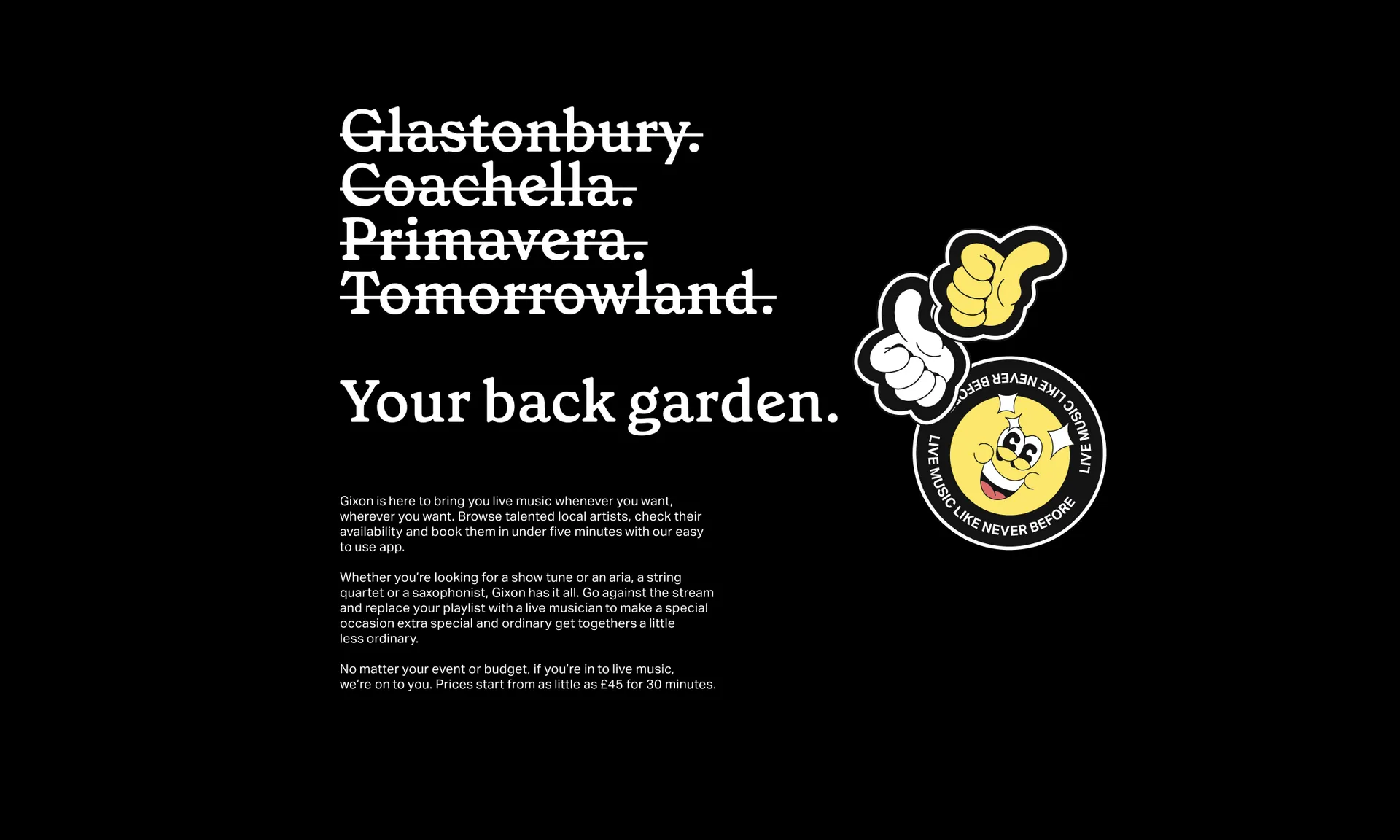
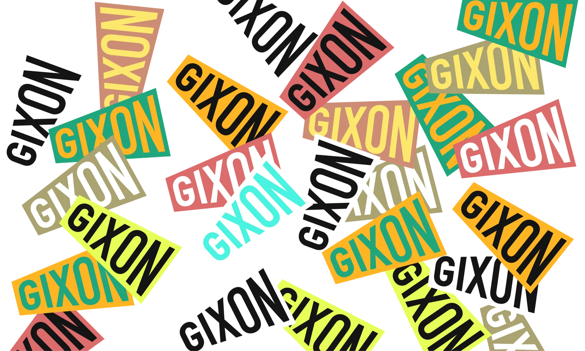
The colour palette consists of a range of both earthy tones as well as brighter neons. This combination encapsulates Gixon’s disruptive, digital, yet very human approach, allowing for a dynamic use of colour across the range of stickers as well as key marketing assets.

Gixon Black 2200x1320
Gixon UI 2200x1320
46110022
Photography

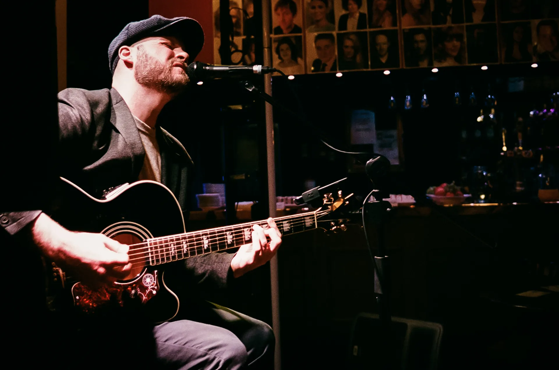
Photography brings a human face to the brand, championing the artists Gixon seeks to put back in control of their careers. Candid images illustrate the genuine joy experienced at live music events; whether that be listening to Jazz in your backgarden or a rock band at a venue. These avoid over saturation or treatment to remain as true to the scene as possible.

Gixon jubilee Case Study
Gixon Web Mobile 3 2200x1320
Oxidane
Solving humanity scale challenges at sea.
Oxidane Header 2200x1306

View Project →

Valkea
Building an optimistic brand for Fortum's clean future.
Valkea Cover 2200x2200px

View Project →

Supercell
Branding Europe's first decacorn.
Supercell_Hero_Image_2200x985px

View Project →

Metacore
The next mobile gaming powerhouse.
Metacore Hero

View Project →

FusionLayer
Redefining trust in automation.
FUS Cover 2200x2200px

View Project →