Originally called AddApptr, the challenges of this name were twofold: it struggled to stand out among competitors also using ‘ad’ in their names, and the missing vowels meant the spelling was not intuitive. With much of their sales carried out through conversation, they needed a name people would remember after hearing it spoken.
We created the name Gravite using our proven process. To start with, we constructed a framework to establish phonetic, semantic, strategic and technical goals for the new name. We had two creative springboards to inspire our search for a name. The first of these was ‘Harvest’, with the concept derived from what the company does — extracts value from real estate. The second was ‘Future / Scientific’ — we looked for a name related to growth or gold, which would sound like an elemental particle, a material, or a scientific property. These semantic properties would convey the company’s highly sophisticated technical offering.
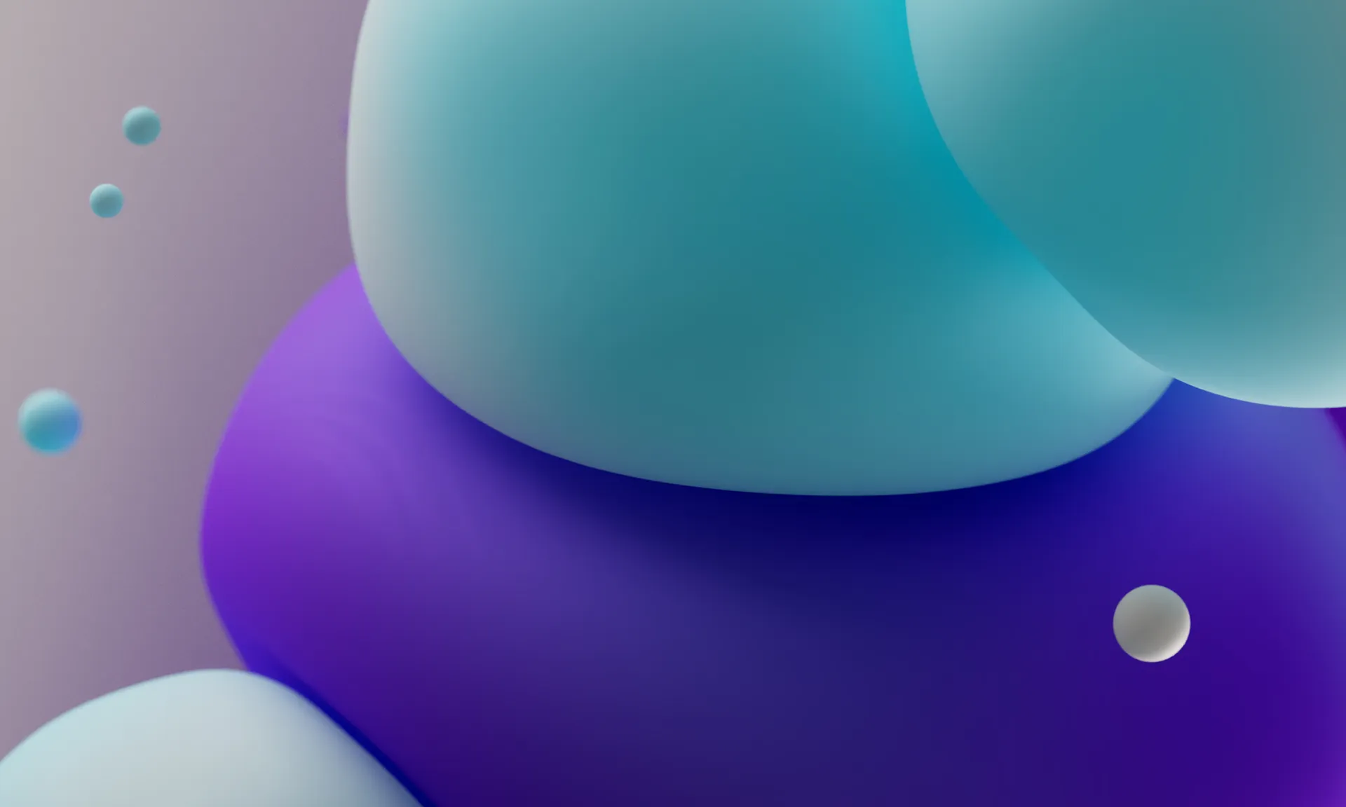
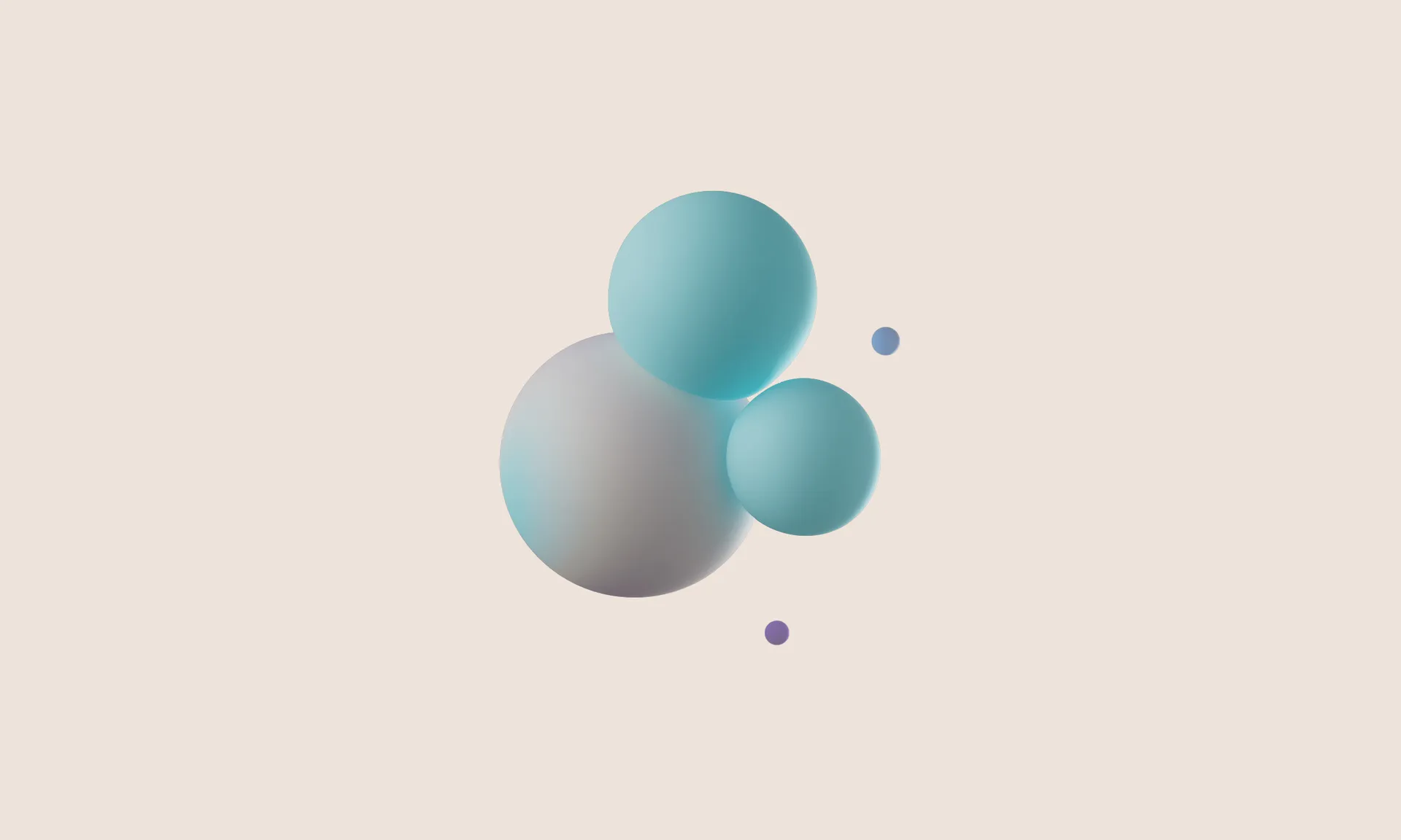
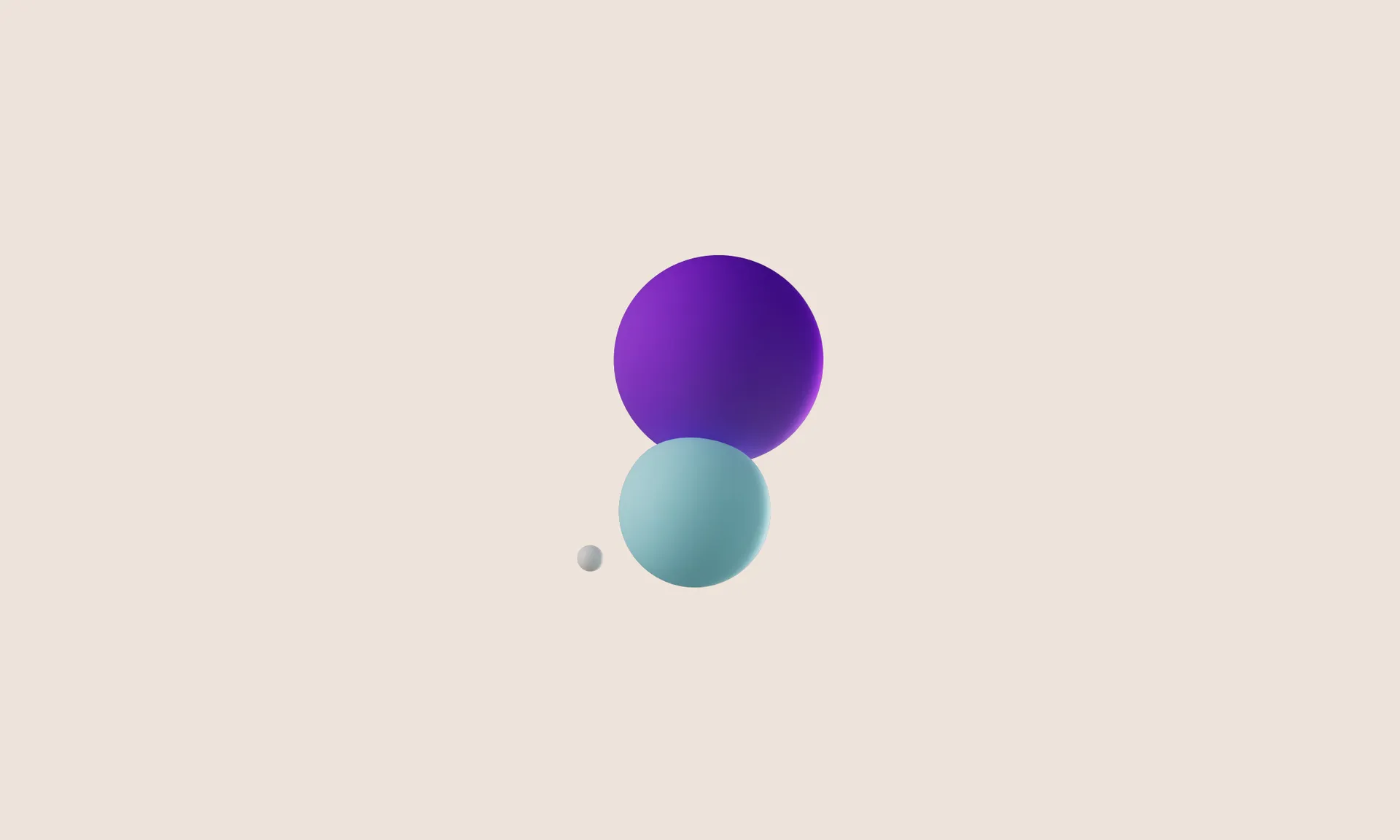
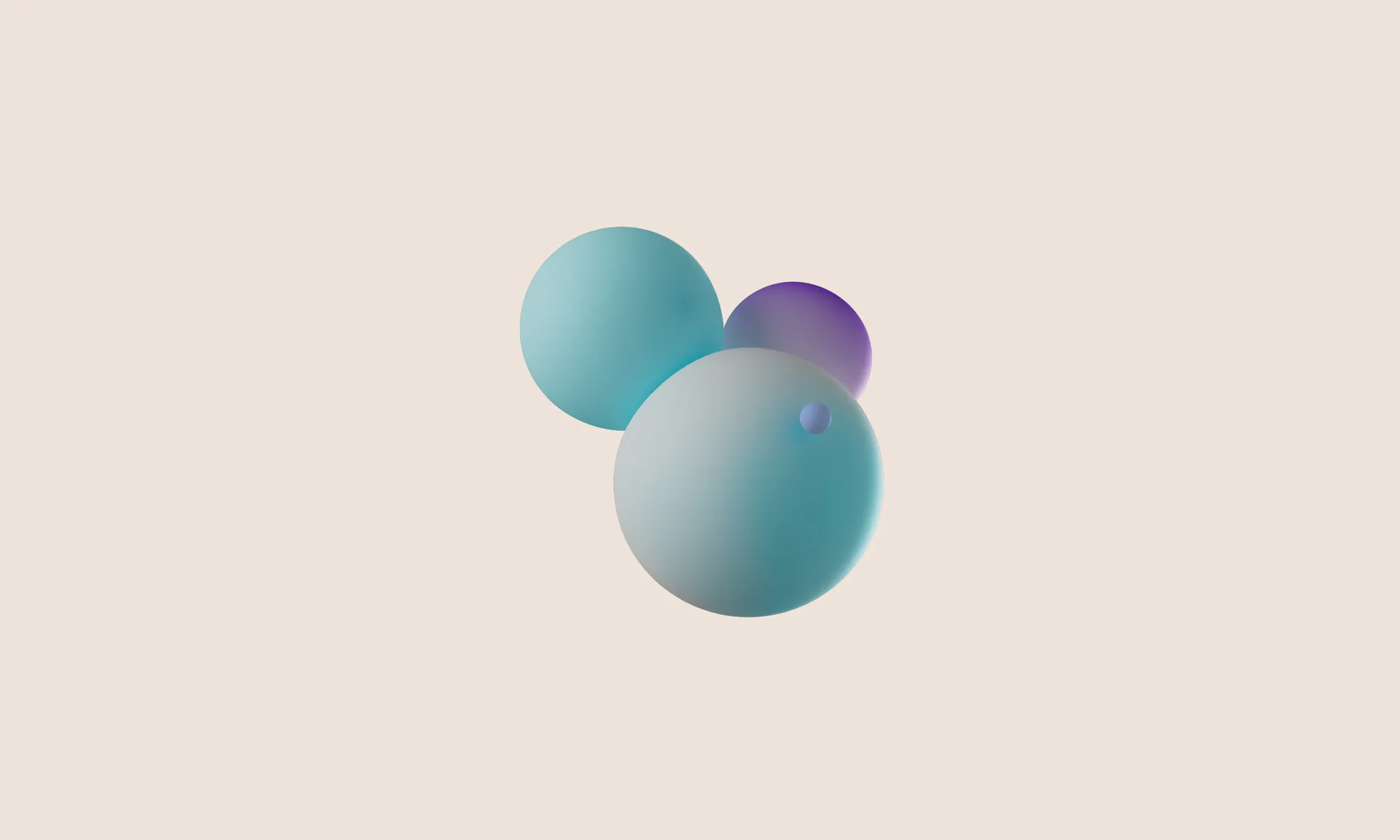
The name Gravite emerged from the second field of exploration. Coined from gravity, the name speaks to the company’s technology which is like an unseen force drawing revenue towards the apps it is employed within. The name also has associations with graphite, a solid mineral, bringing connotations of strength and reliability. The scientific sounding name firmly positions the business as a tech company. With just two syllables and pronunciation accessible worldwide, the name’s phonetic qualities make it well suited to a global company.
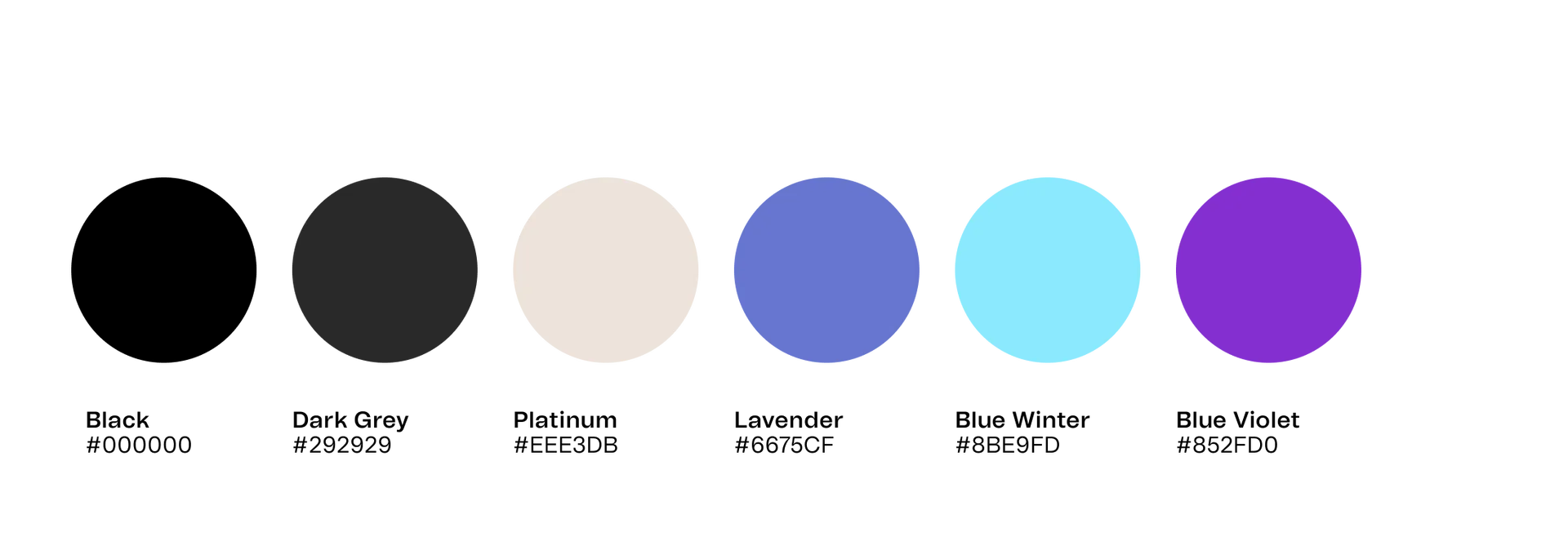
With the new name conveying the company’s technical offering, we needed to create an identity that balanced this, evoking the warmth and friendliness of the personalised customer service that sets Gravite apart from competition.
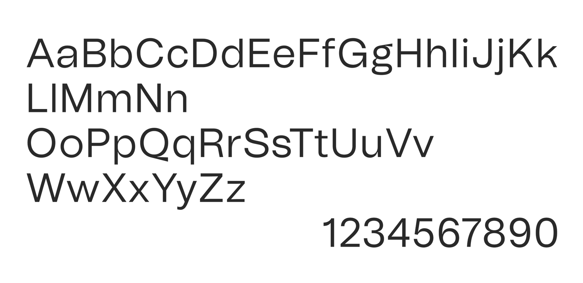
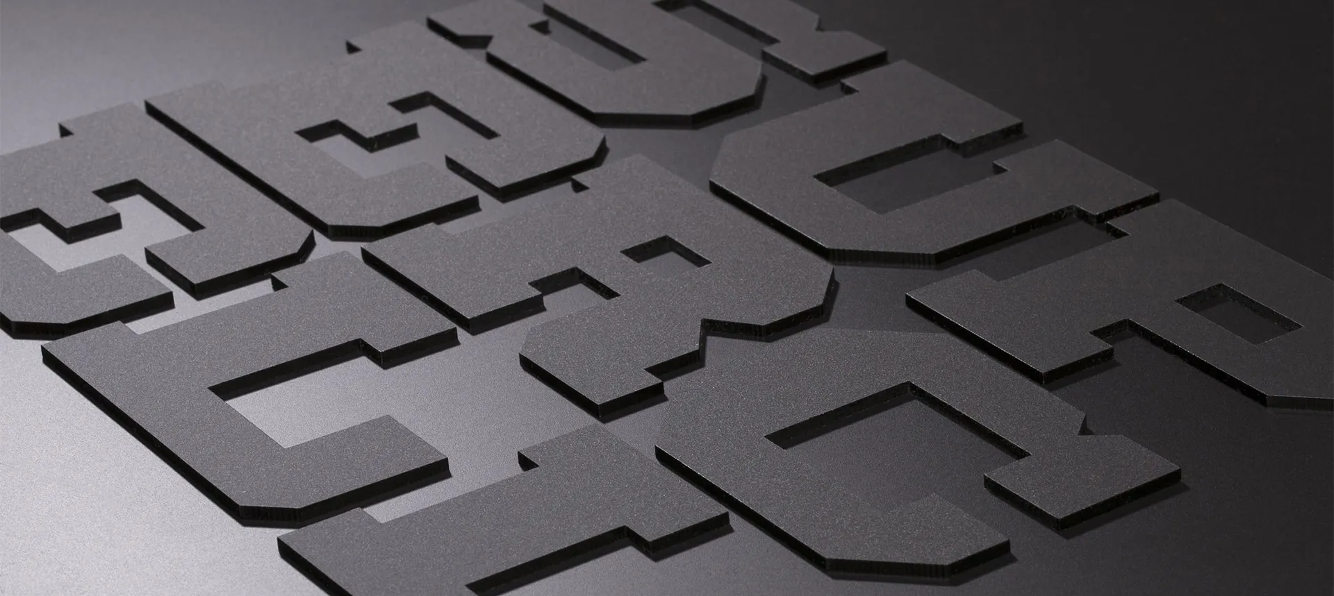
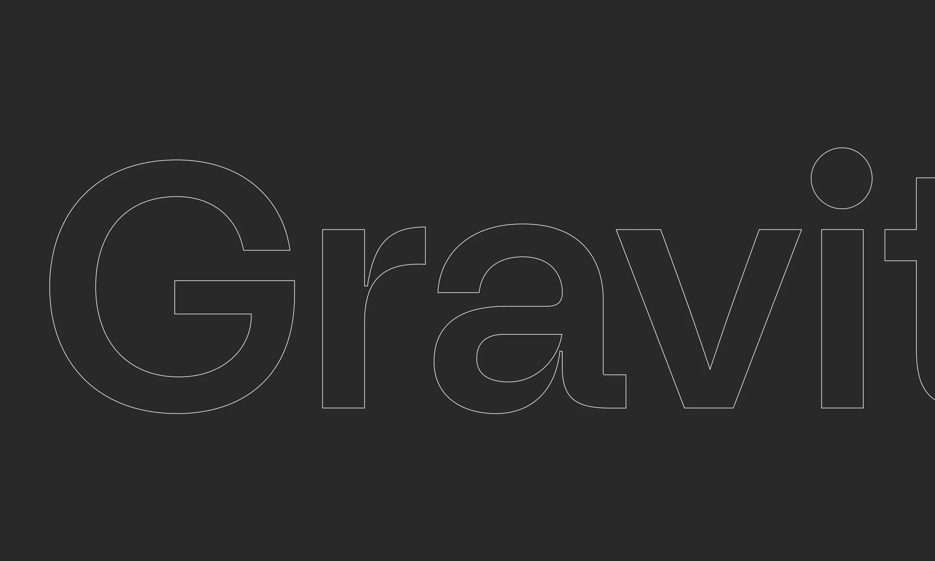
Clear and modern geometric typography is laid out on a comprehensive grid system to allow for consistent yet adaptable layouts. The logo was hand drawn by Hot Type. A modern, trustworthy grotesk, it establishes Gravite as a market leader. Accentuated ink traps bring contrast and personality.
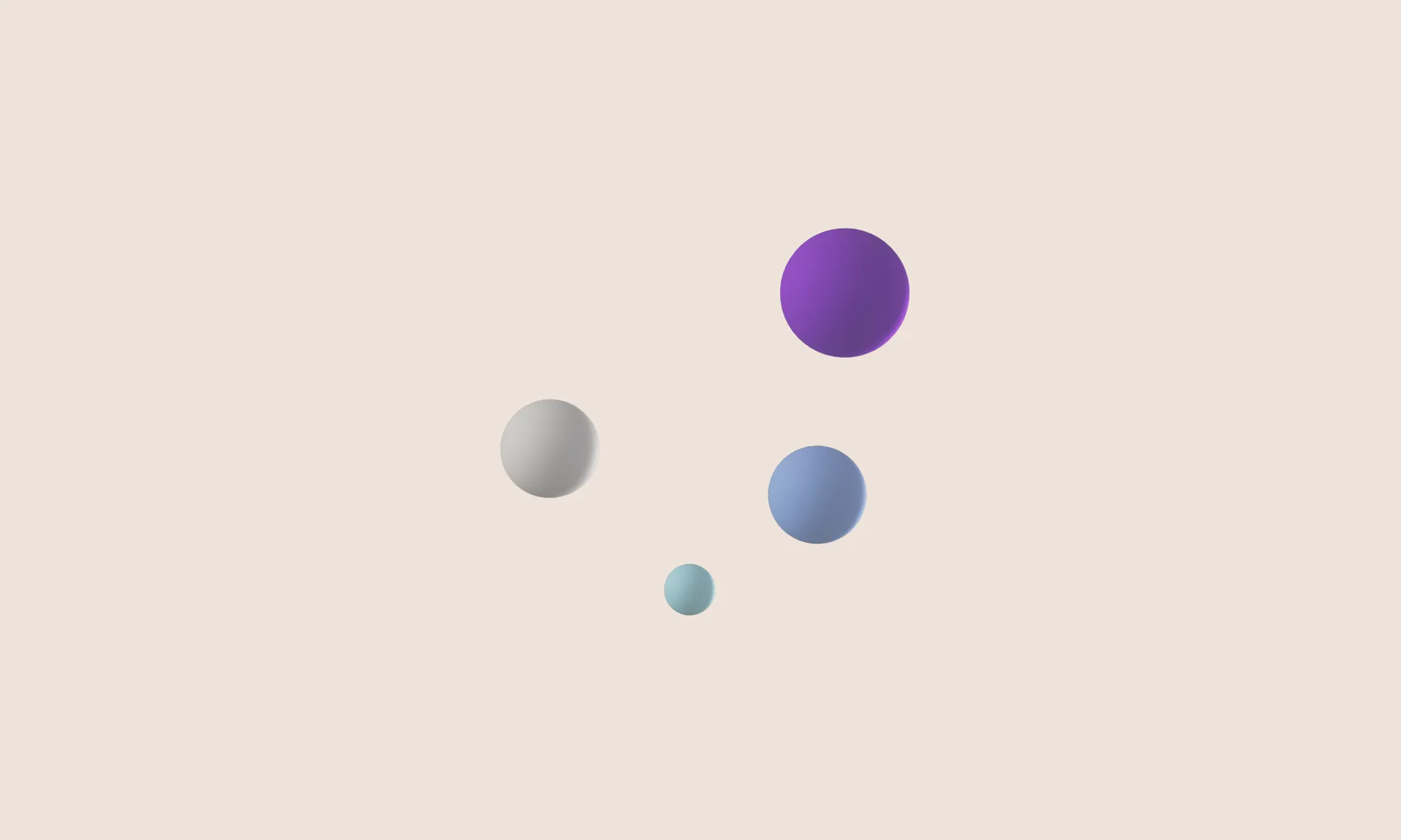
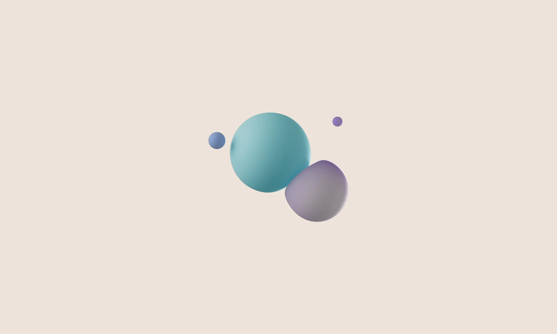
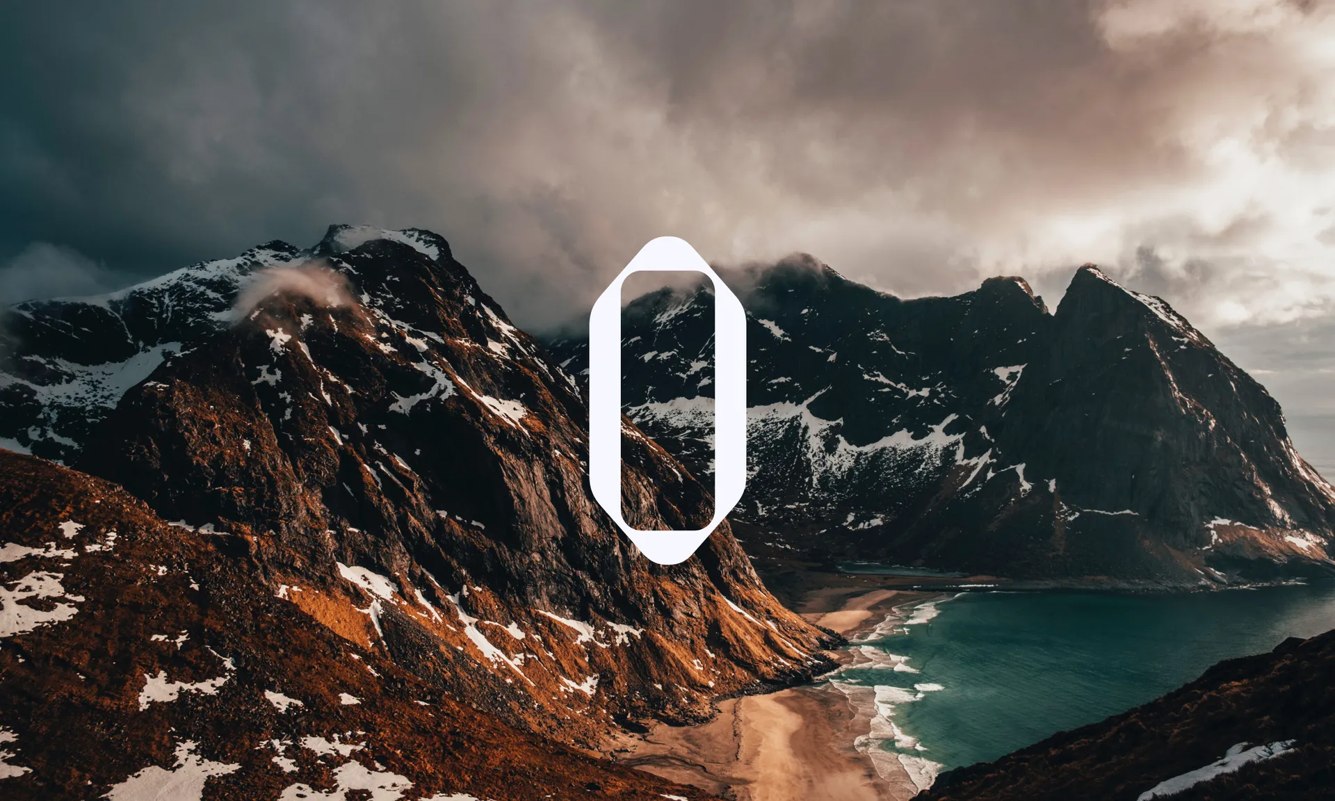
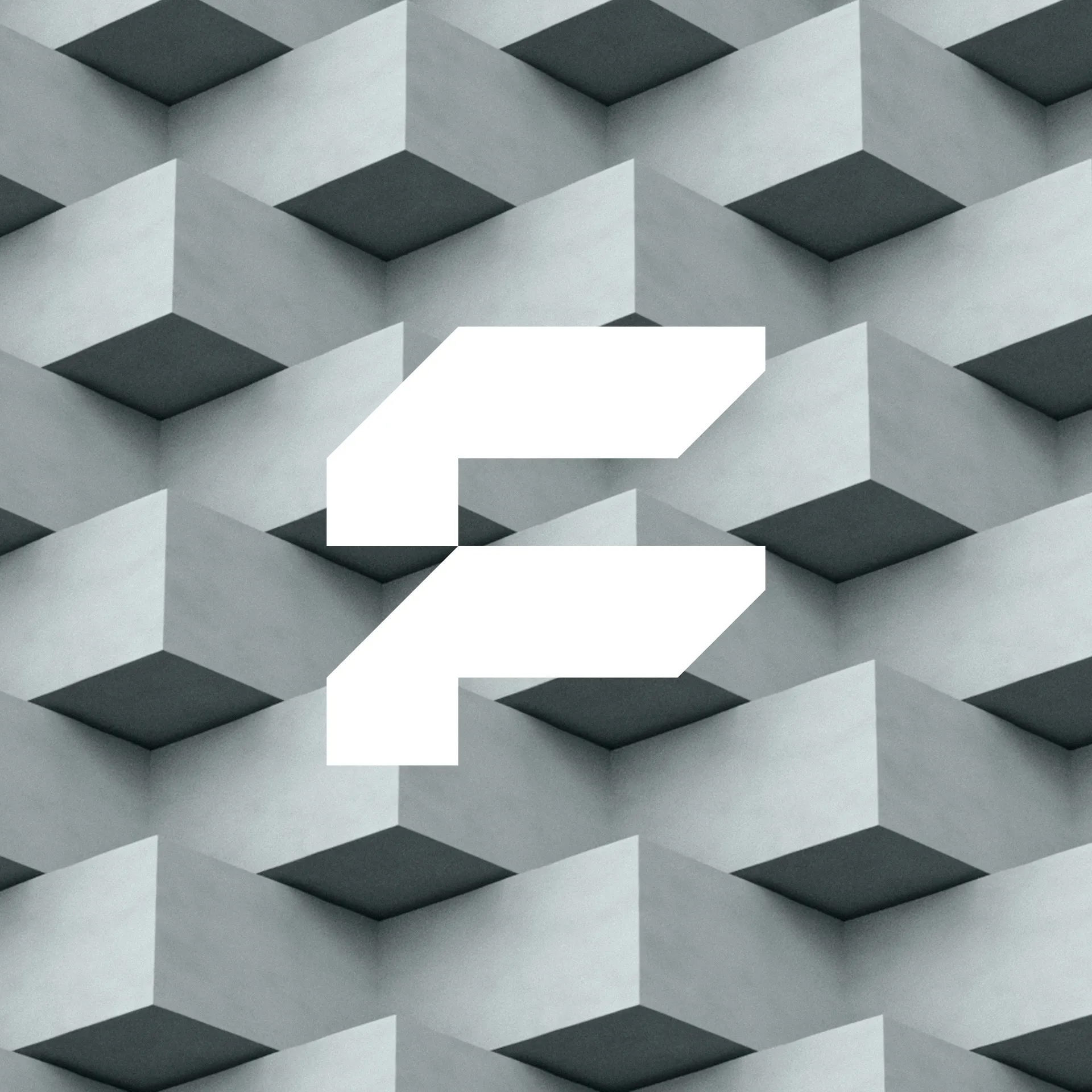
A strong and impactful geometric mark, the icon alludes to a magnetic force drawing parts together, as well as resulting in a stylized ‘G’ glyph. It illustrates Gravite as an essential building block of apps.