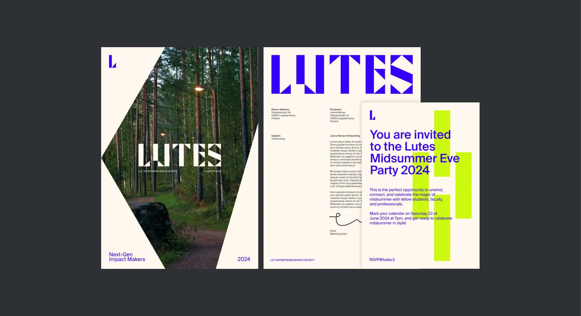
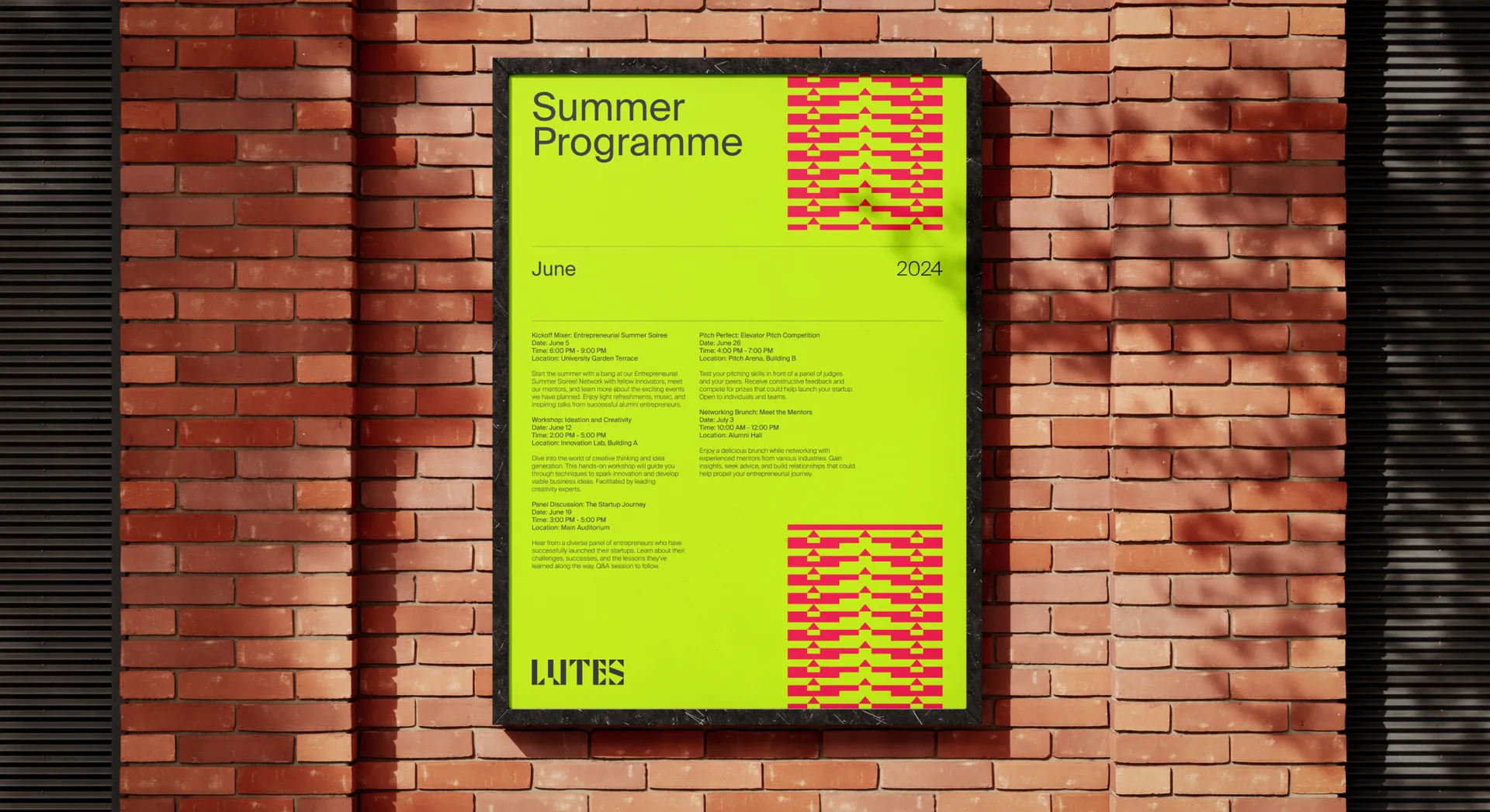
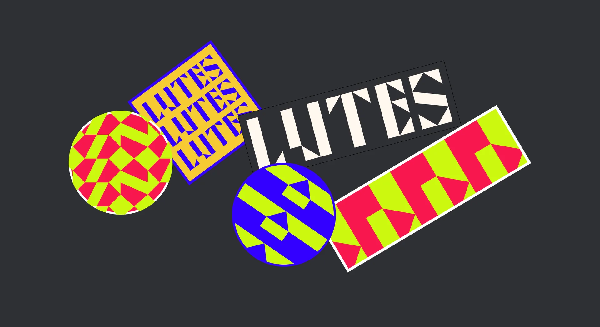
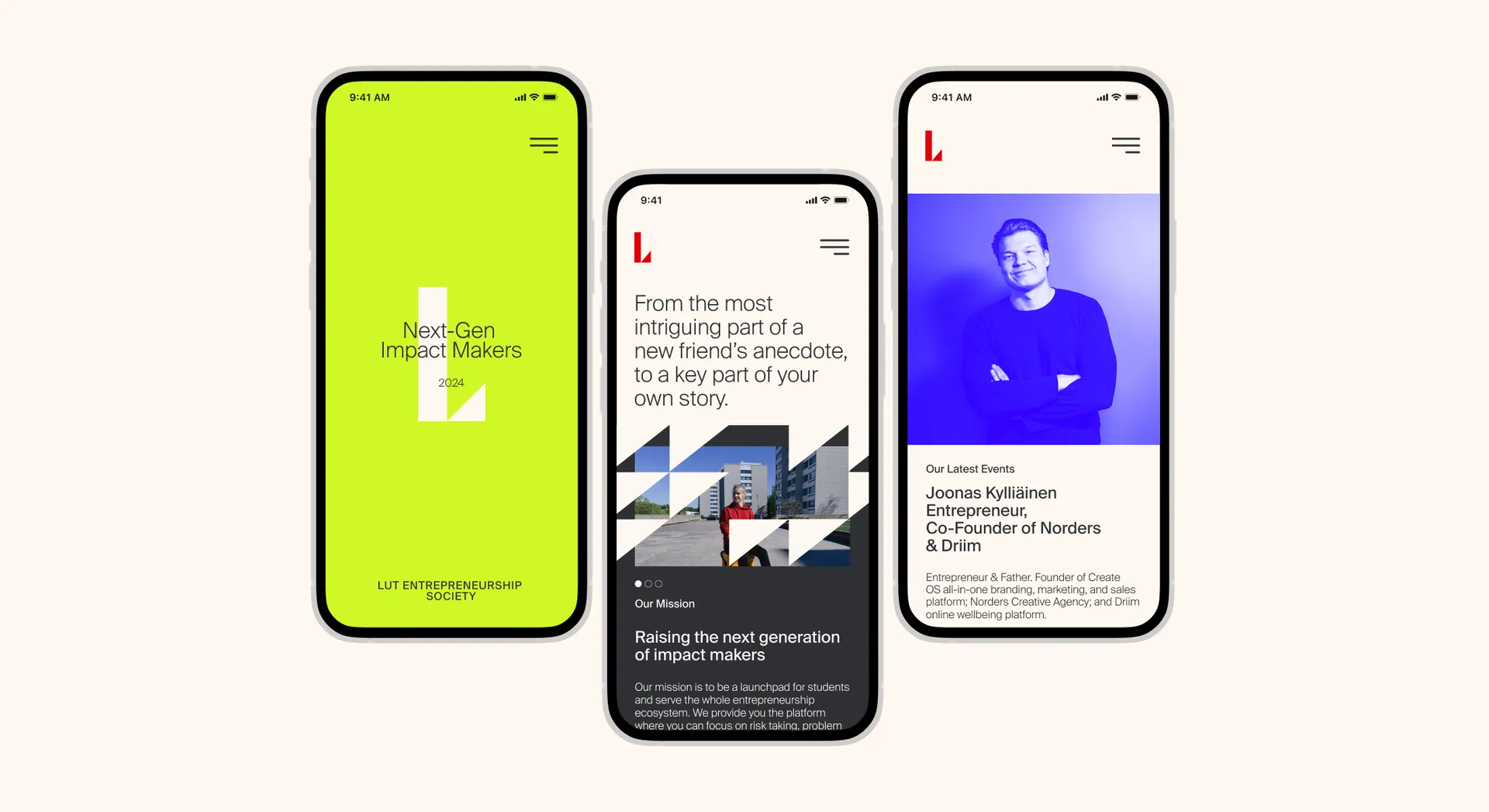
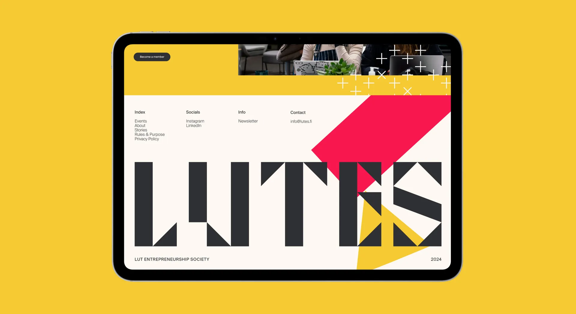
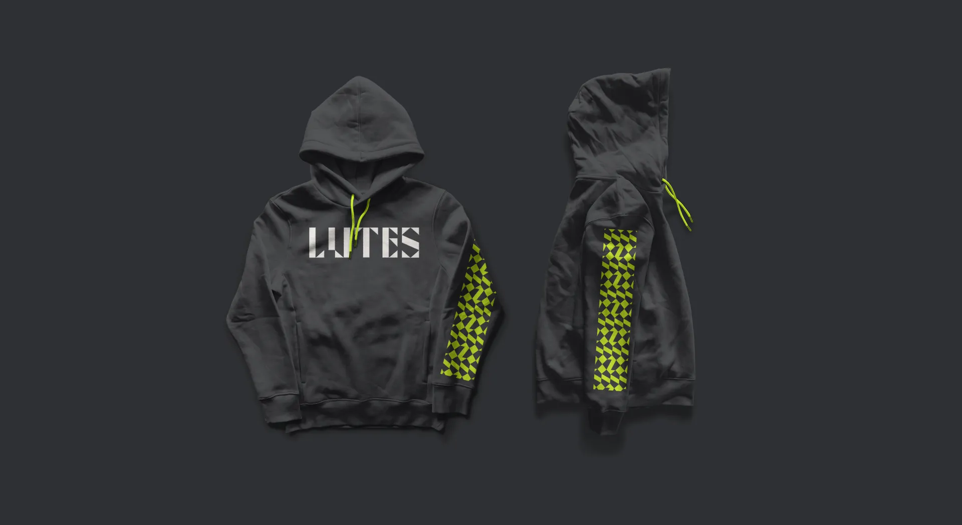
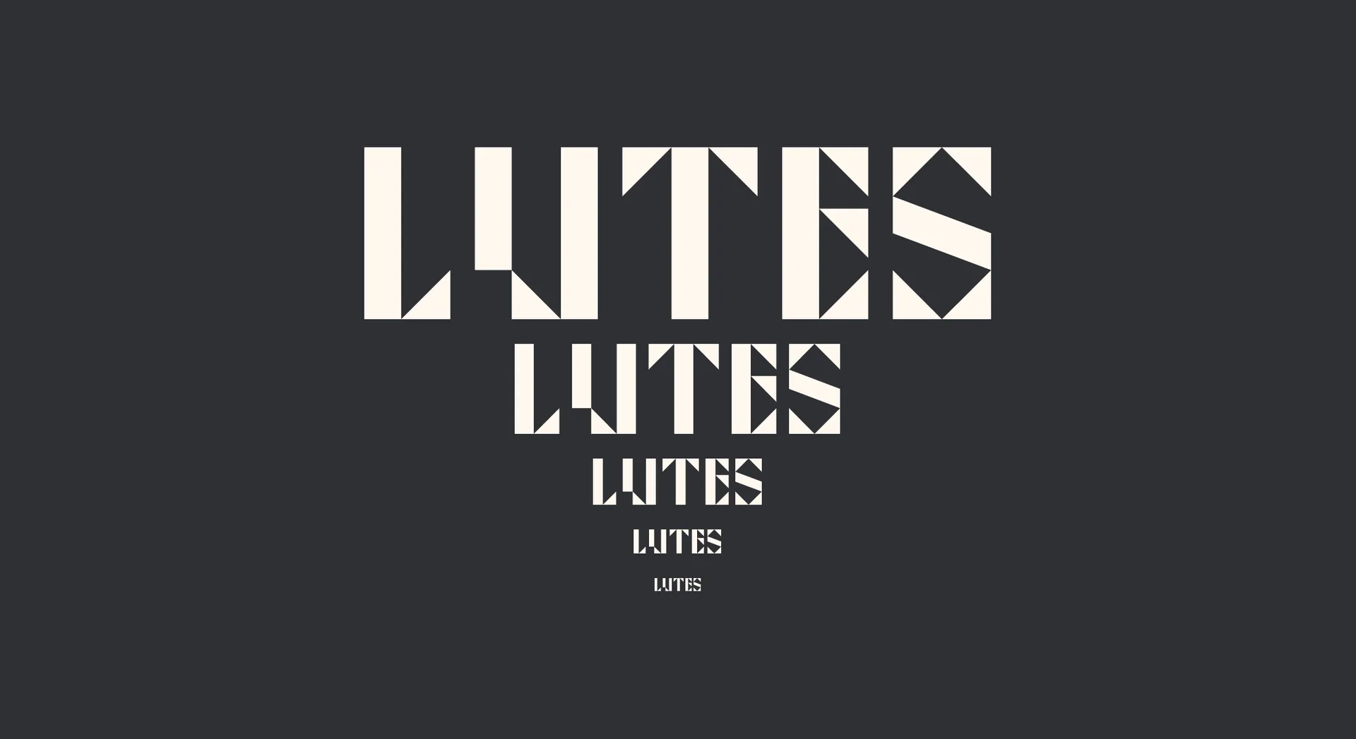
Given that LUTES is neither a company nor an institution, the brand didn’t need to play safe or be constrained by commercial ends. This gave us freedom to create an eccentric wordmark from the brand shapes, balanced by a practical Swiss typeface for clear communication.
The resulting identity is as bold and fun as the entrepreneurs it represents, with a youthful spirit and energy that reflects the timeless appeal of coming together to create new things.
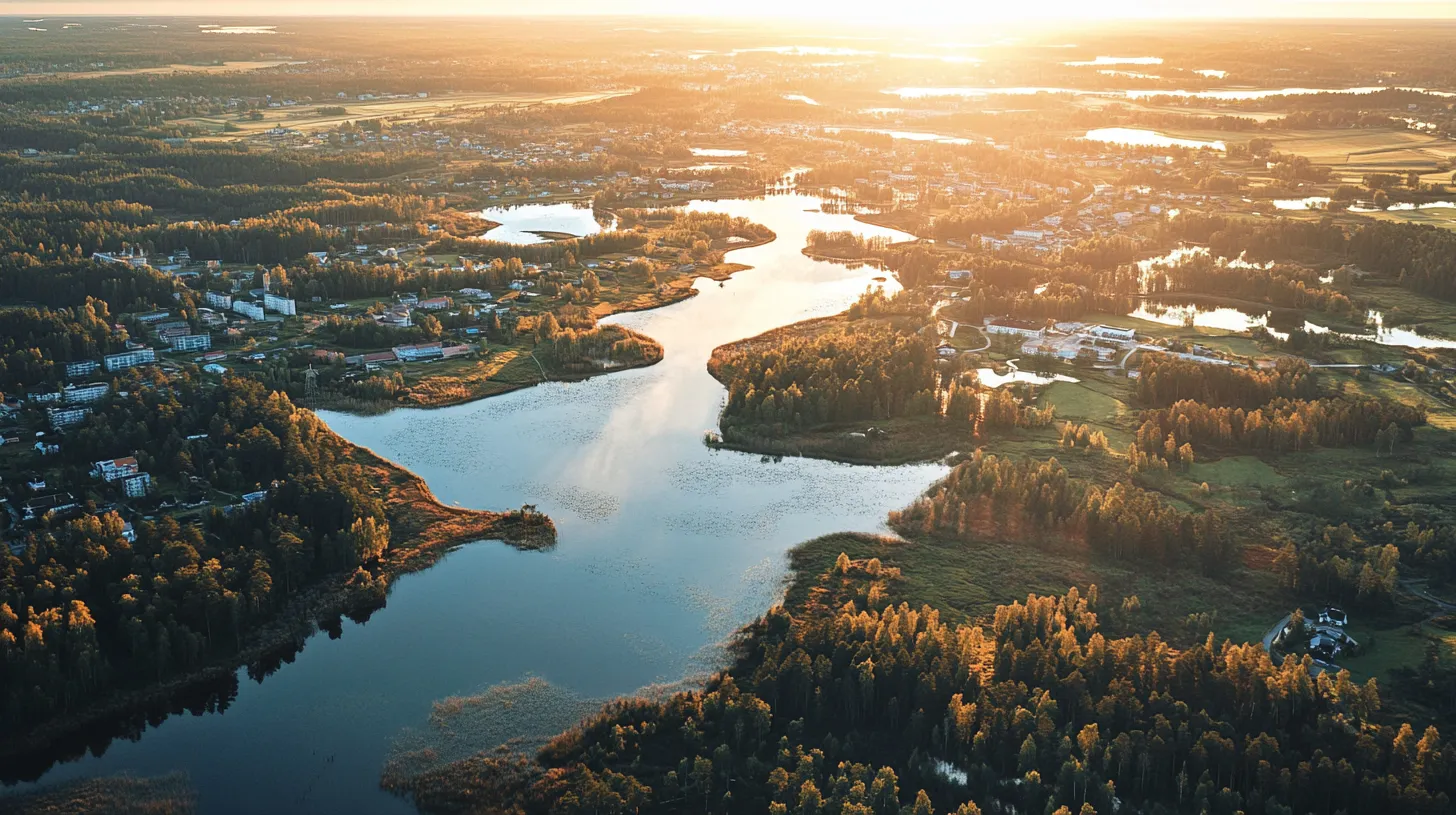
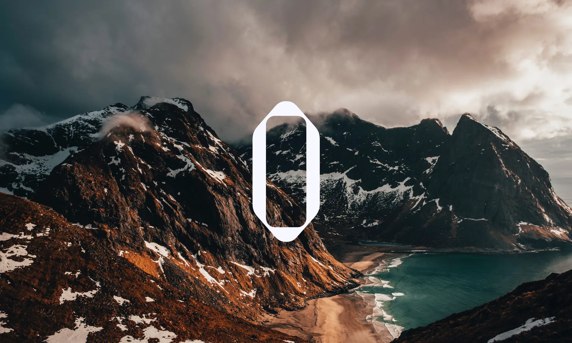
One look at LUTES’ existing marketing materials showed us the diversity of entrepreneurs in the group. Students hail not only from Finland and the Nordics, but from all around the globe — Spain, the US, Kosovo, Russia, Indonesia, Morocco, Italy, and Nepal, for example. These had been drawn to study in Finland due to the impressive startup culture and the country’s unique charm — it therefore felt important we capture these qualities and manifest them across the LUTES brand. To do this we focused on three distinctly Finnish areas of creativity, taking visual motifs associated with each to use as starting points for the LUTES brand.
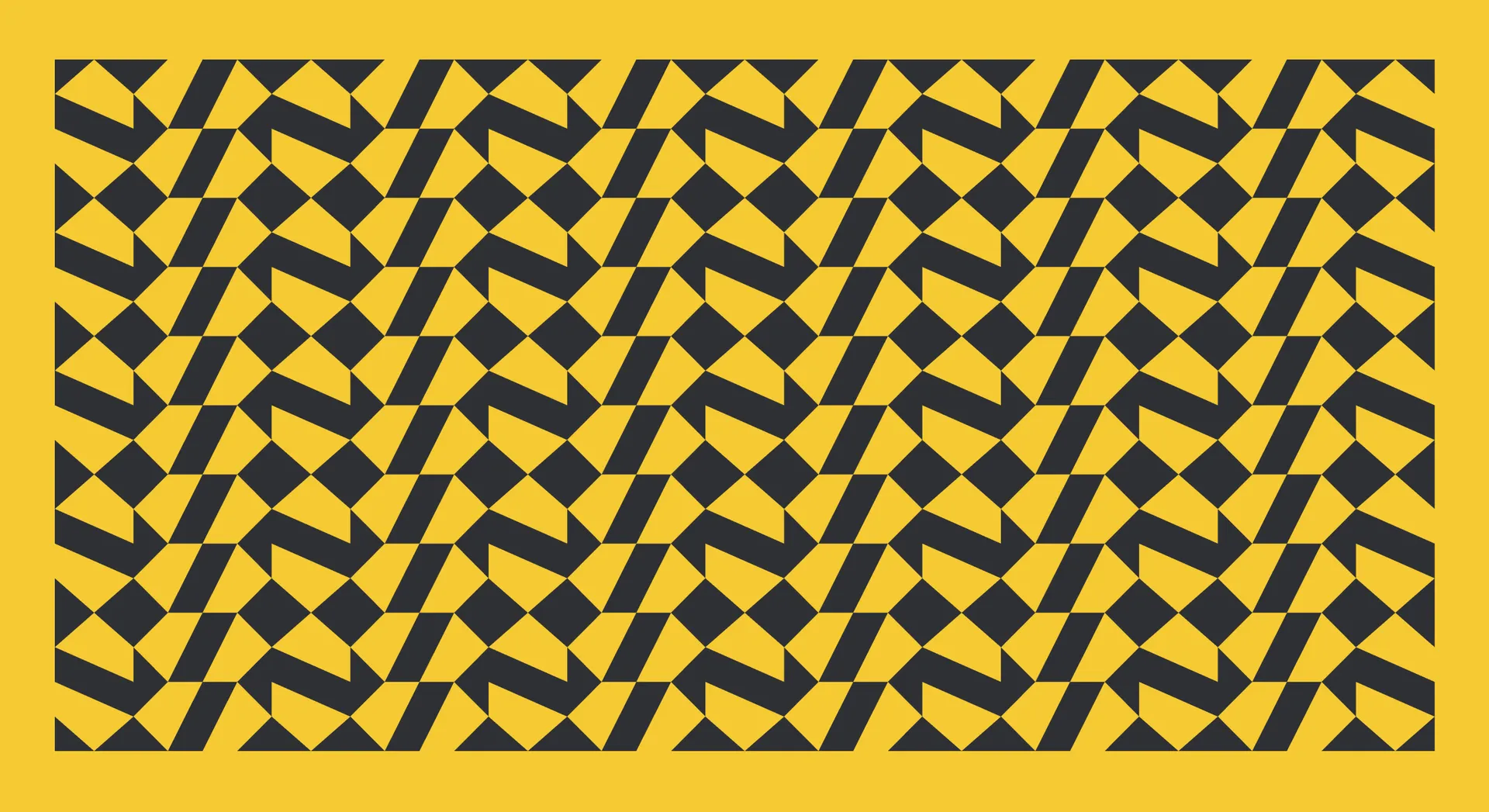
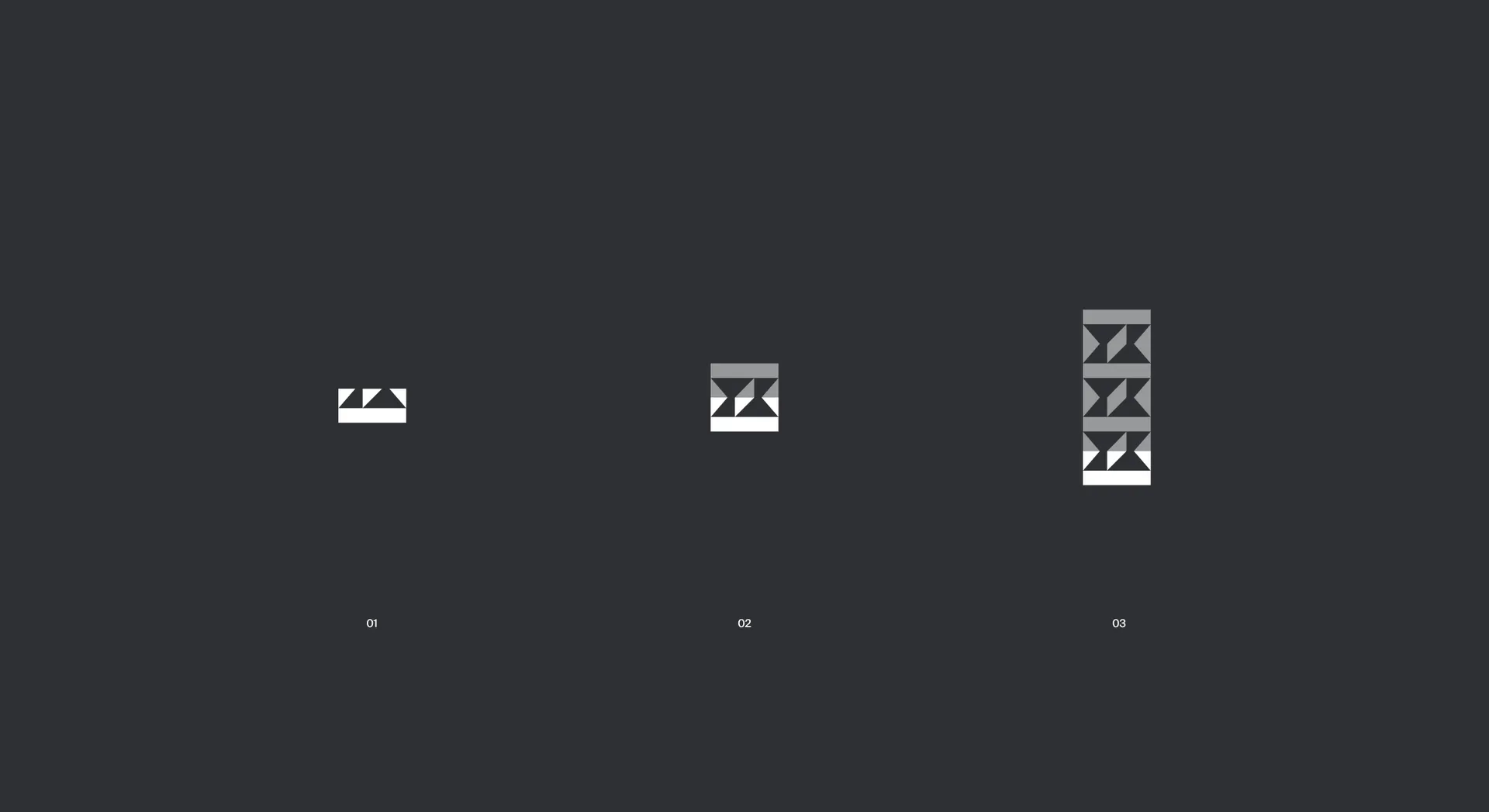
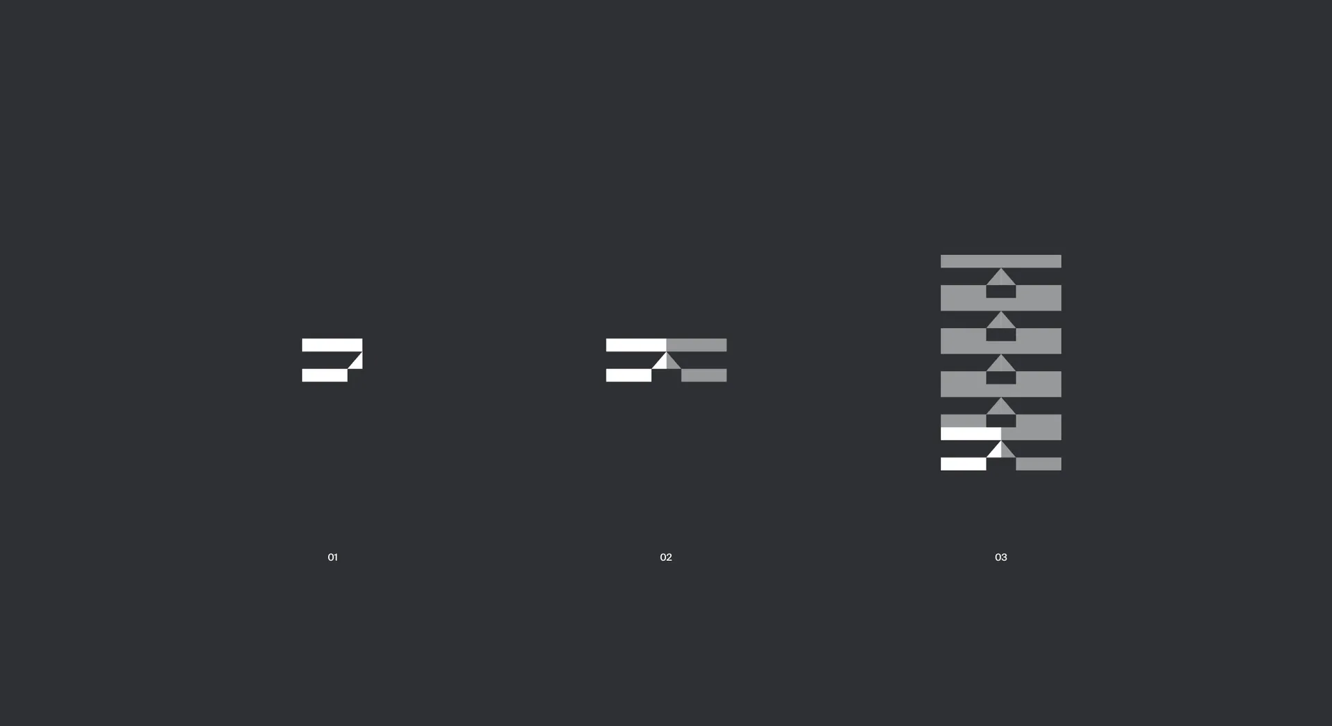
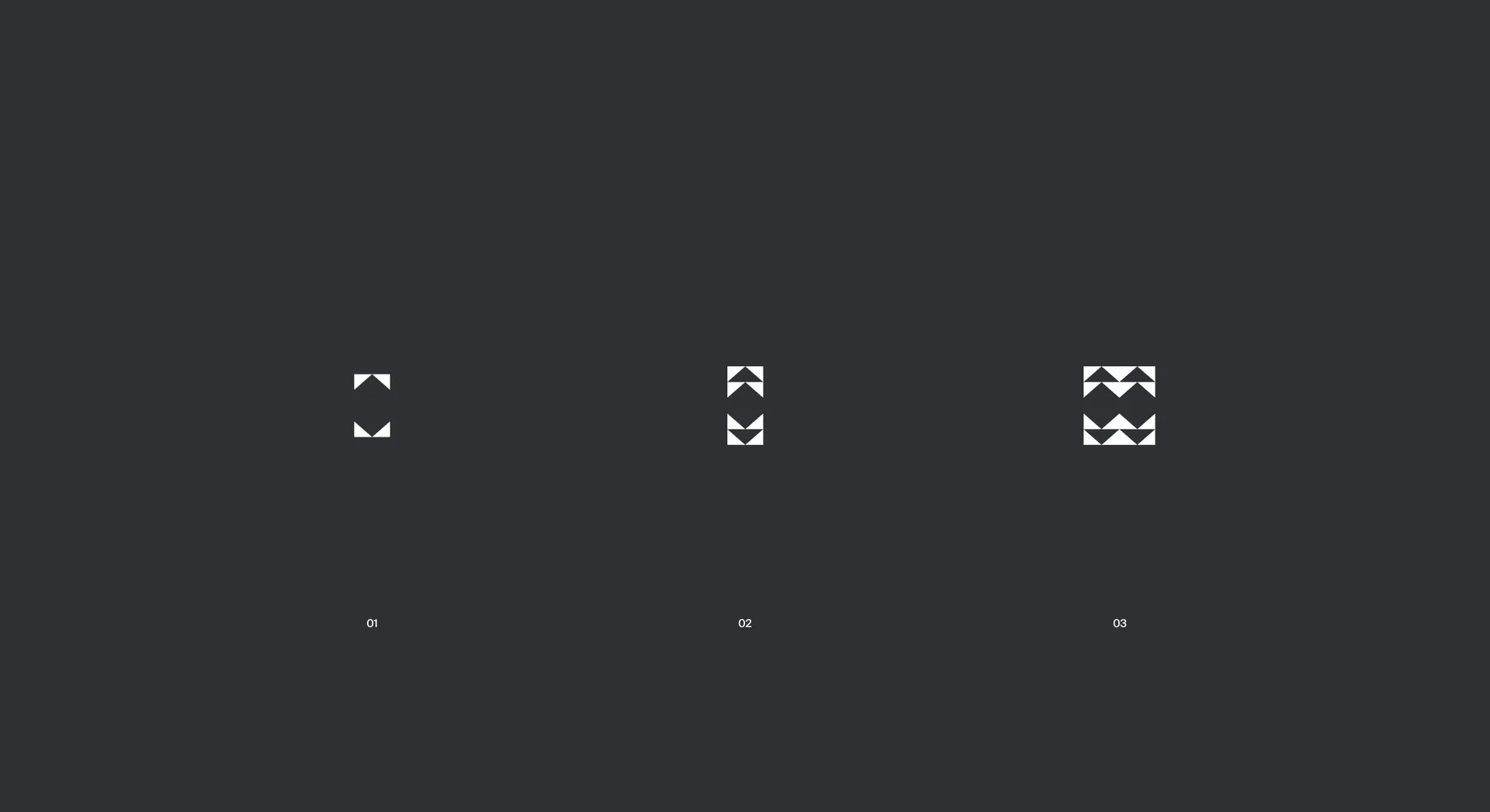
First, we looked at Finnish metal or rock artists, whose raw energy, conviction and fearlessness is reflected in the bold spirit of entrepreneurs everywhere. Next, we looked at Finnish handcraft tradition, where diligence, skill and passion is needed to arrive at being an artisan — just as it is needed to build a company. Finally, we looked at the cutting-edge technology which has been coming out of Finland for the past decades, born from the visionary imagination and future oriented thinking shared by LUT & LAB students. Shapes relating to these were abstracted to become the building blocks of the LUTES brand — the elemental qualities which LUTES members are using to construct the future.
Use of primary colours in the palette continues this theme of elementalism: a toolkit of basics that can be combined in endless varieties. This was especially important for a society whose leadership changes every year — the tools give each new team the creative freedom to build the identity according to their own vision, while staying recognisable enough to grow recognition and credibility year on year. The versatility of the brand also allows it to flex across LUTES’ many programs and events, reinforcing the LUTES’ value proposition while adapting in unique ways to suit the content.