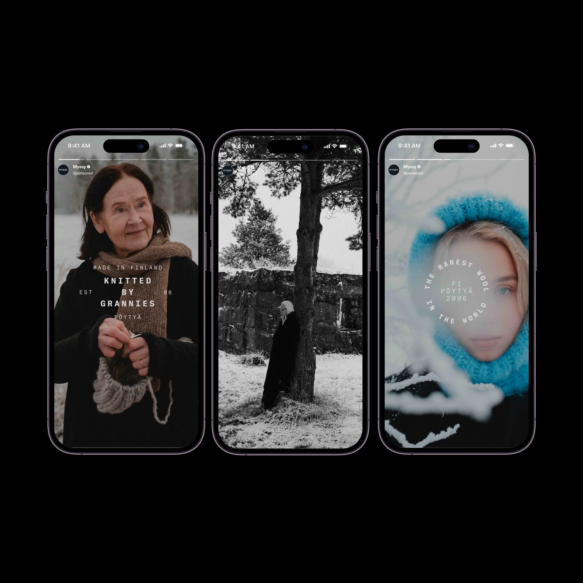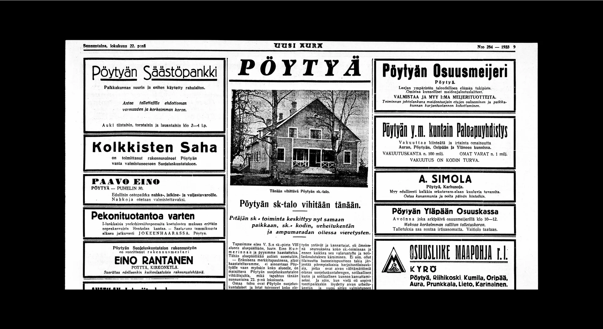
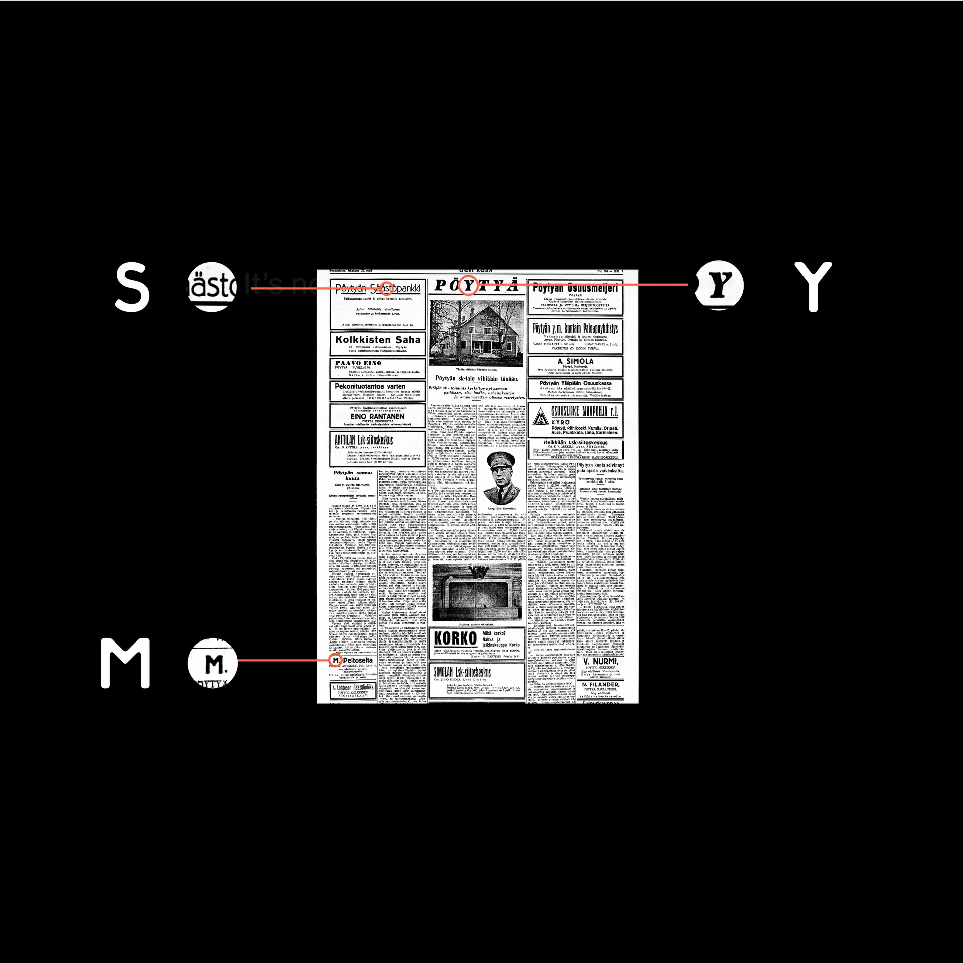
"It felt right to begin with. This is us, this is Myssy. It was an incredible coincidence to see in the presentation a copy of an old local paper with a story of the opening ceremonies of a club house that my grandfather gave a speech at - and that we had just chosen as our next photoshooting venue. Proxy had done a stunning job, it just all made sense."


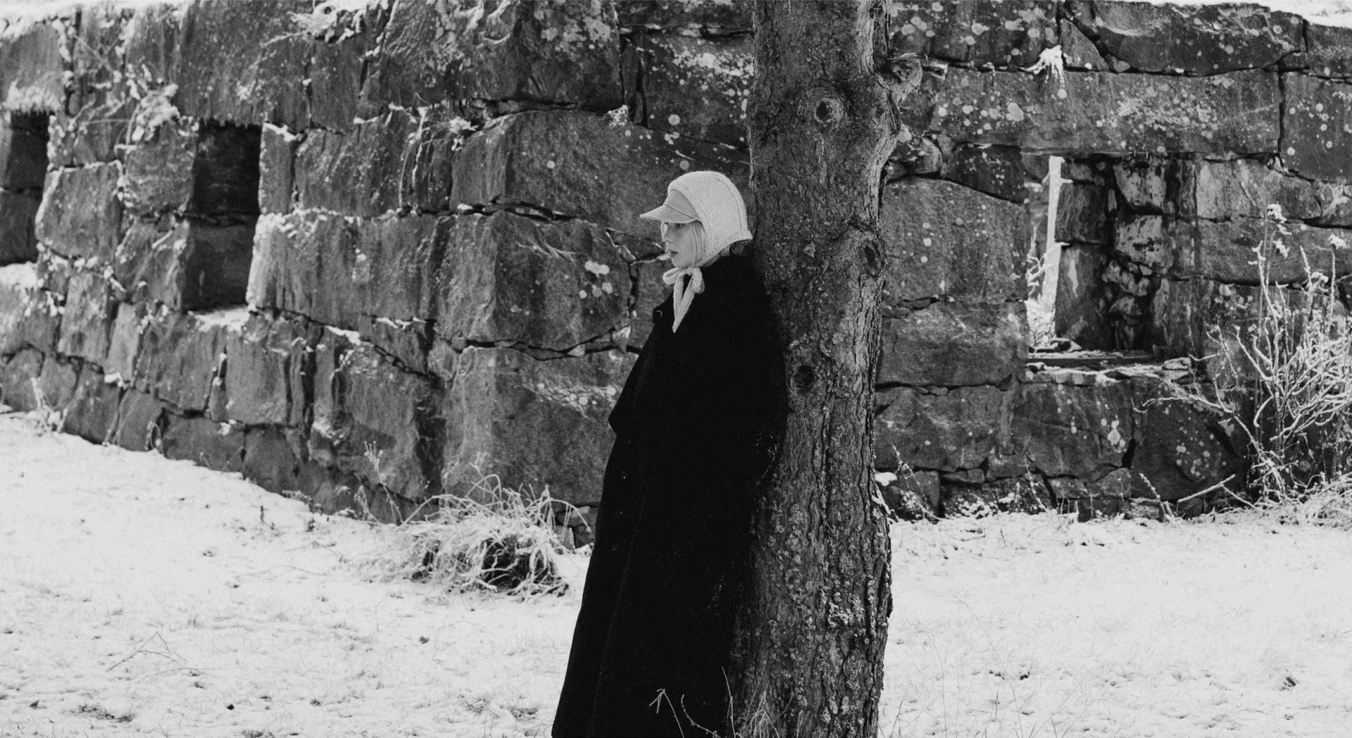
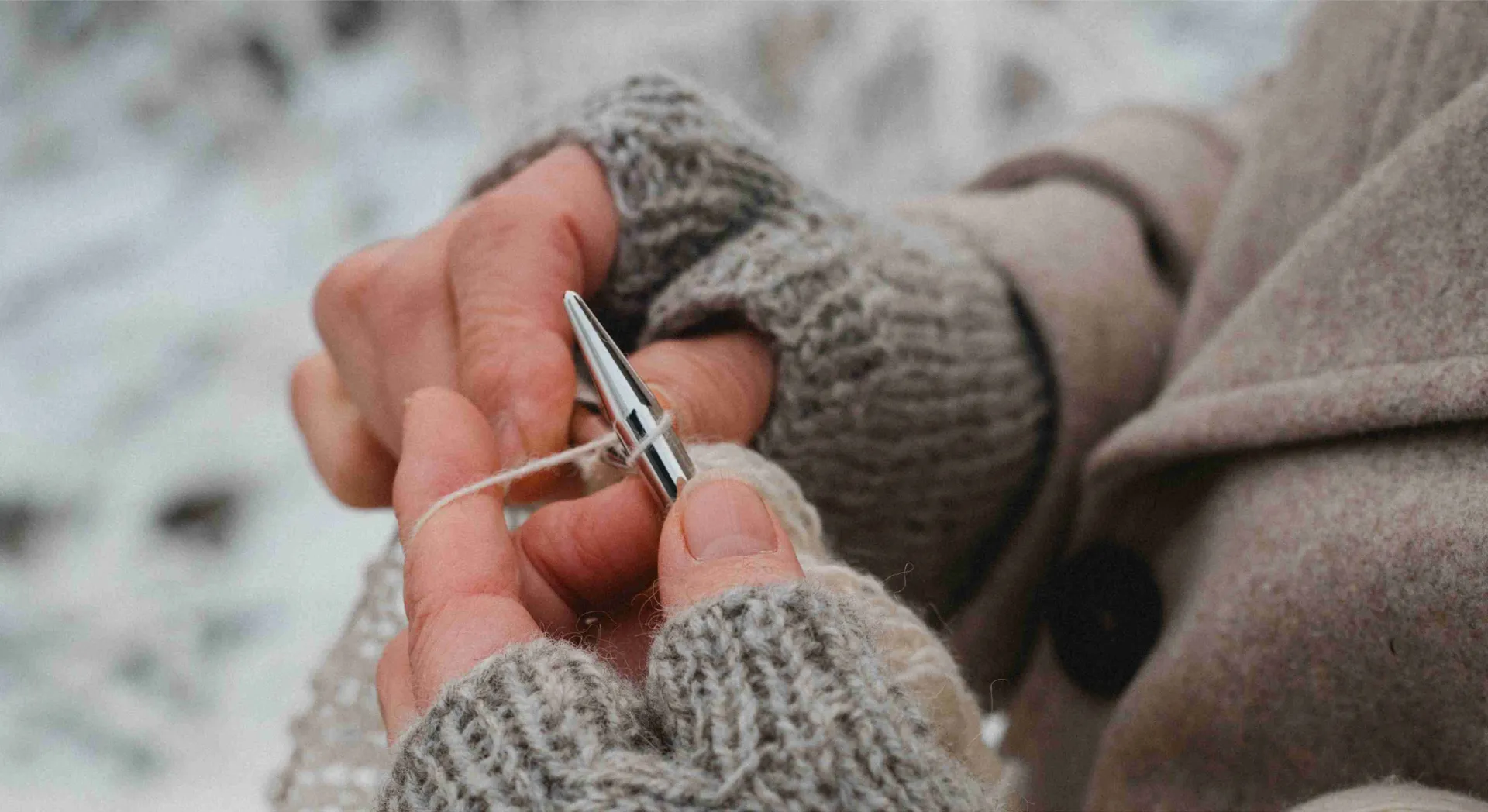
The challenge was to craft a global mark that somehow preserved the brand’s very particular provinciality. At Myssy, it’s not just the grannies behind the products that are local. All wool used is shorn from the resident sheep, then dyed using produce from the area’s farms. Catalogue photography features Myssy’s team and neighbours across Pöytyä’s striking landscape. Who else would be willing to have their picture taken reclining against a bank of snow, torso deep in icy water? Despite or perhaps because of the narrow parameters, this hyper local brand manages to look truly world class, all while never sacrificing its authenticity.
A large part of this authenticity is the commitment to nonconformity. Myssy’s tagline ‘It’s not cool, it’s warm’ articulates this, generated by a team of proud misfits whose unusual perspective and sense of humour can be felt across the brand. In our early logo exploration we tried to inject this through bold letterforms and container shapes at odd angles, and yet none of the resulting marks felt quite right for Myssy.
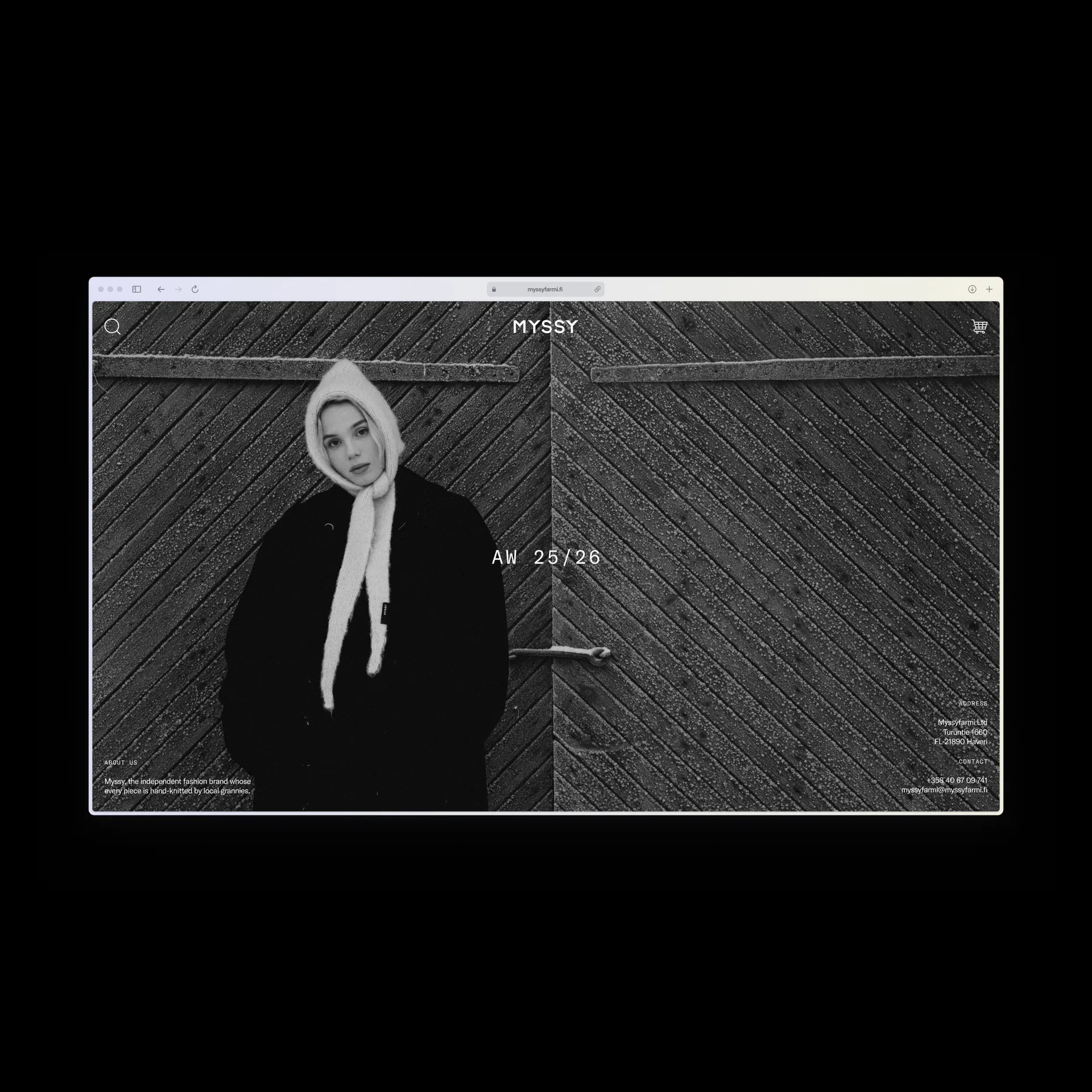
On the product, the logo sits off centre on the label, another nod to the brand’s outsider spirit. To accompany the logo, we created a range of typographic stamps to proudly draw attention to the brand’s heritage and unique production approach.