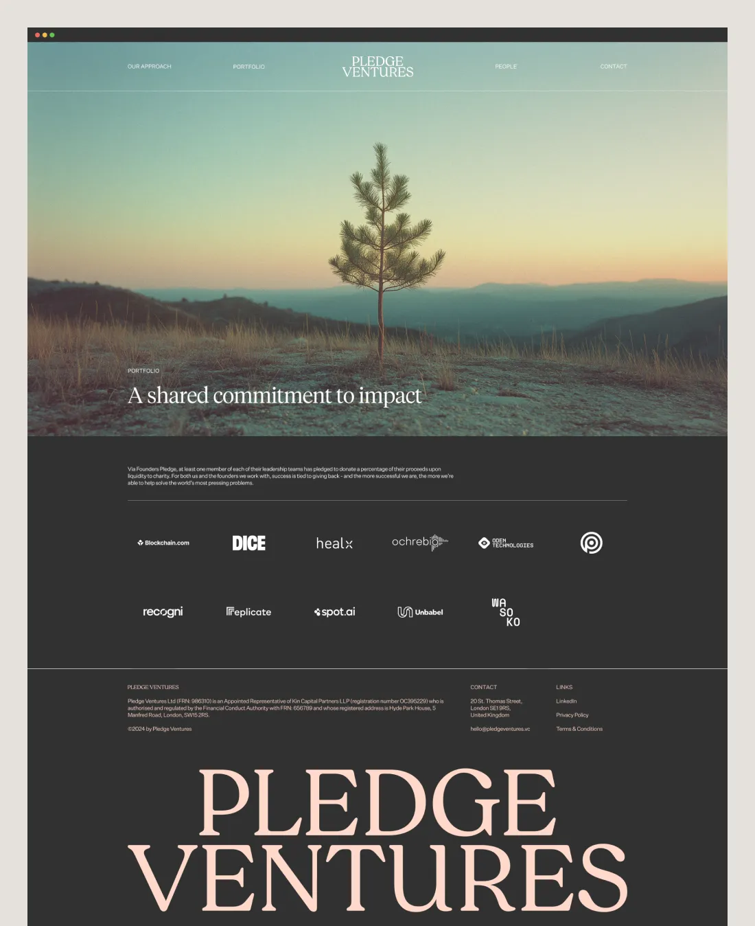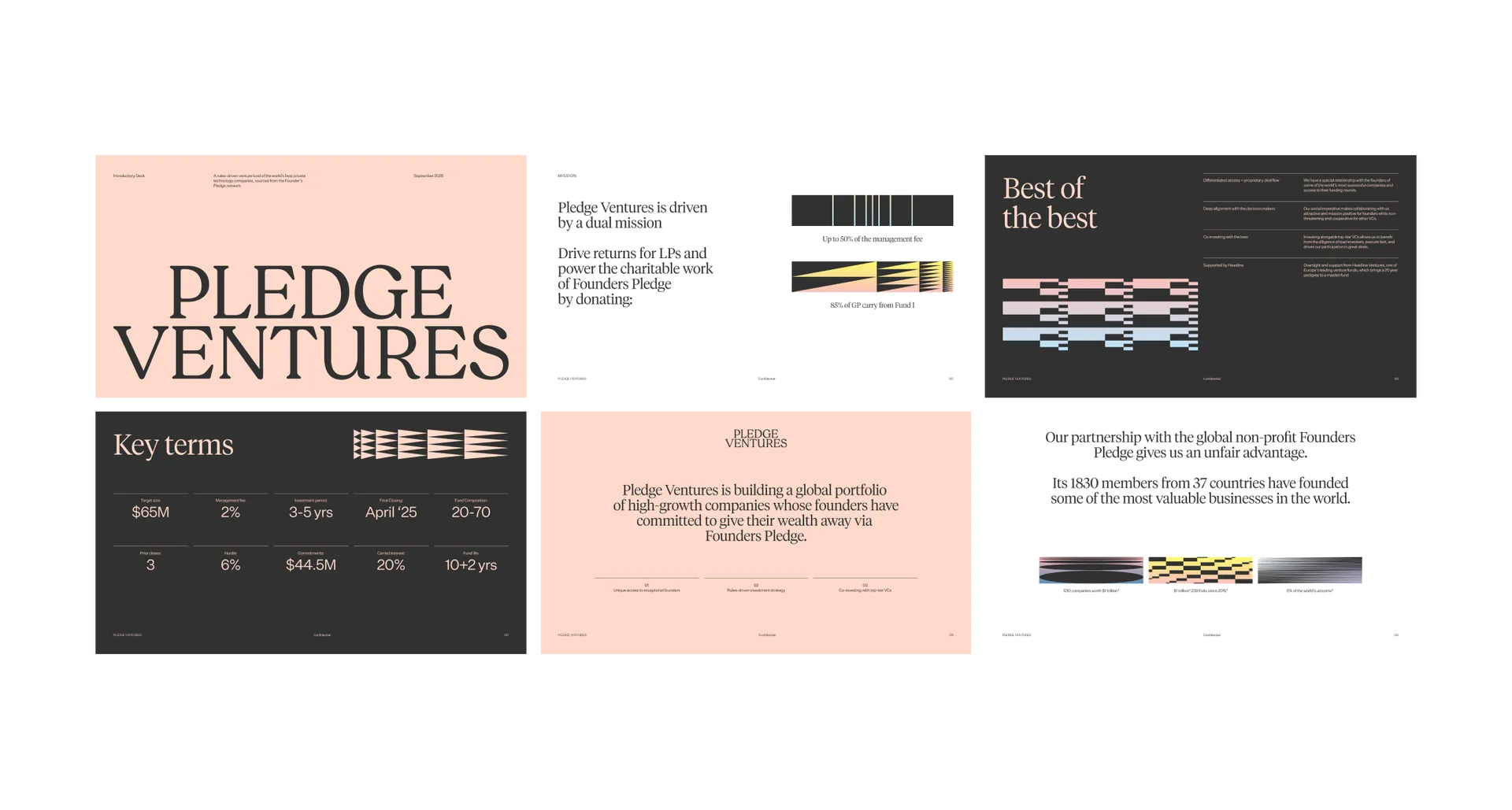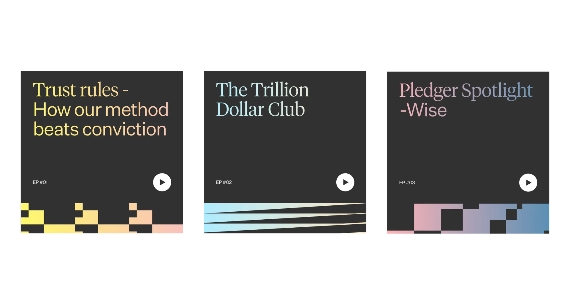
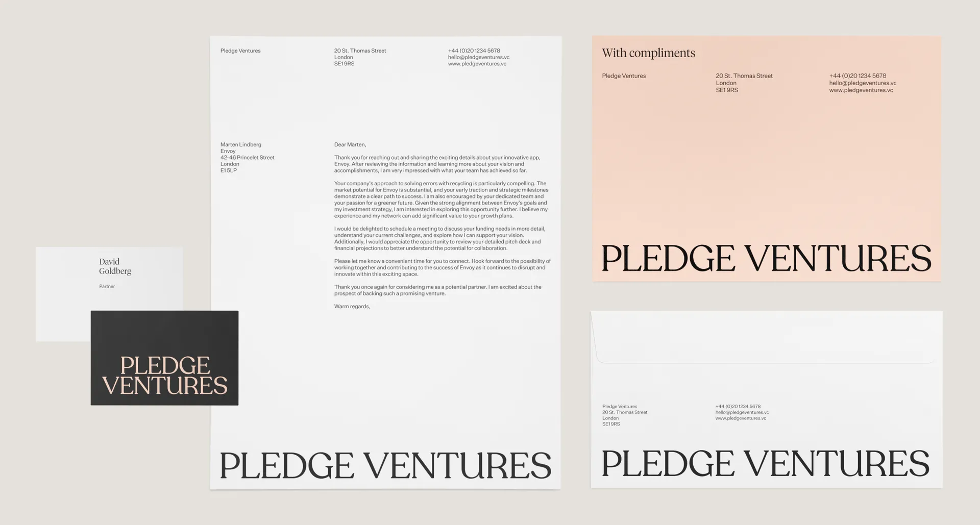
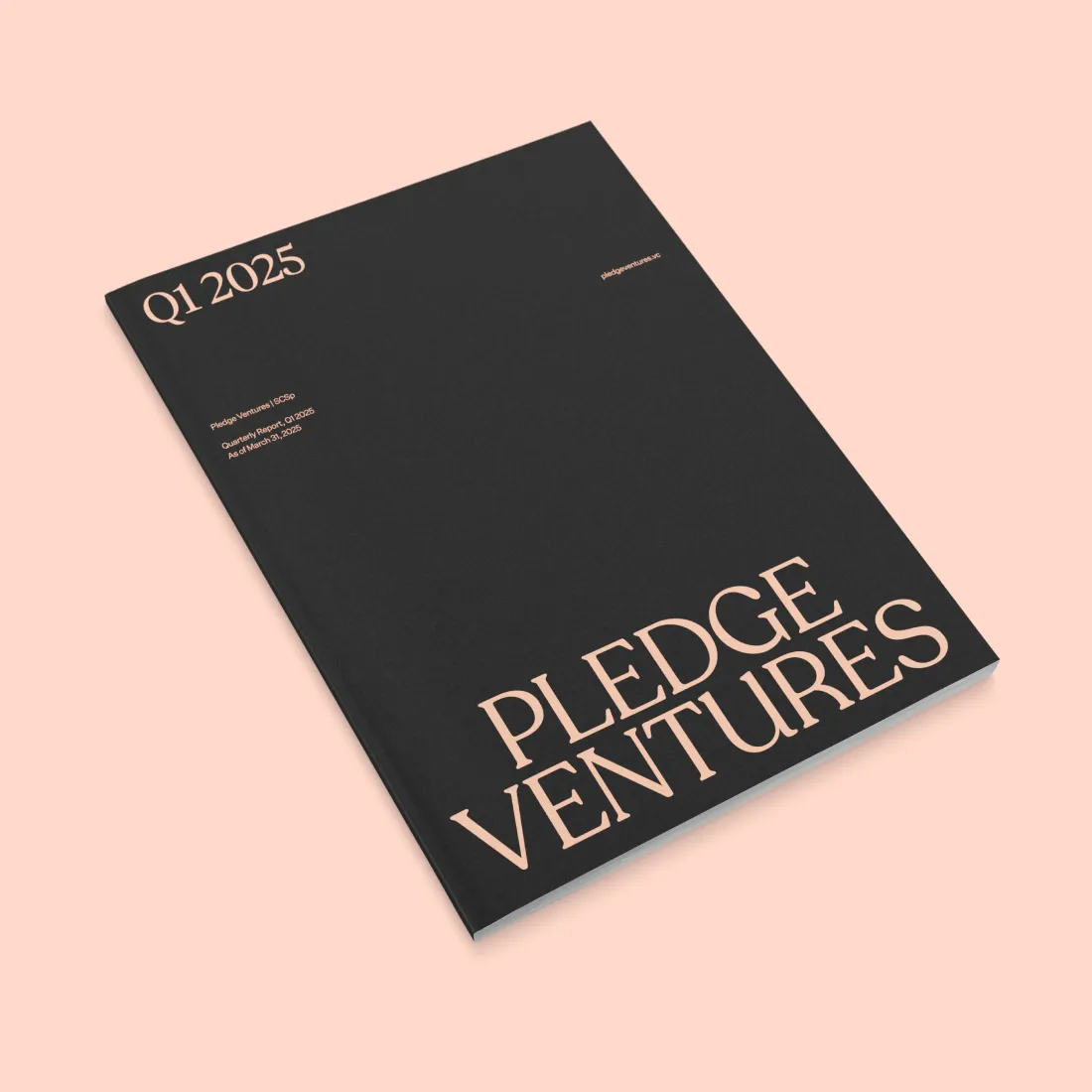
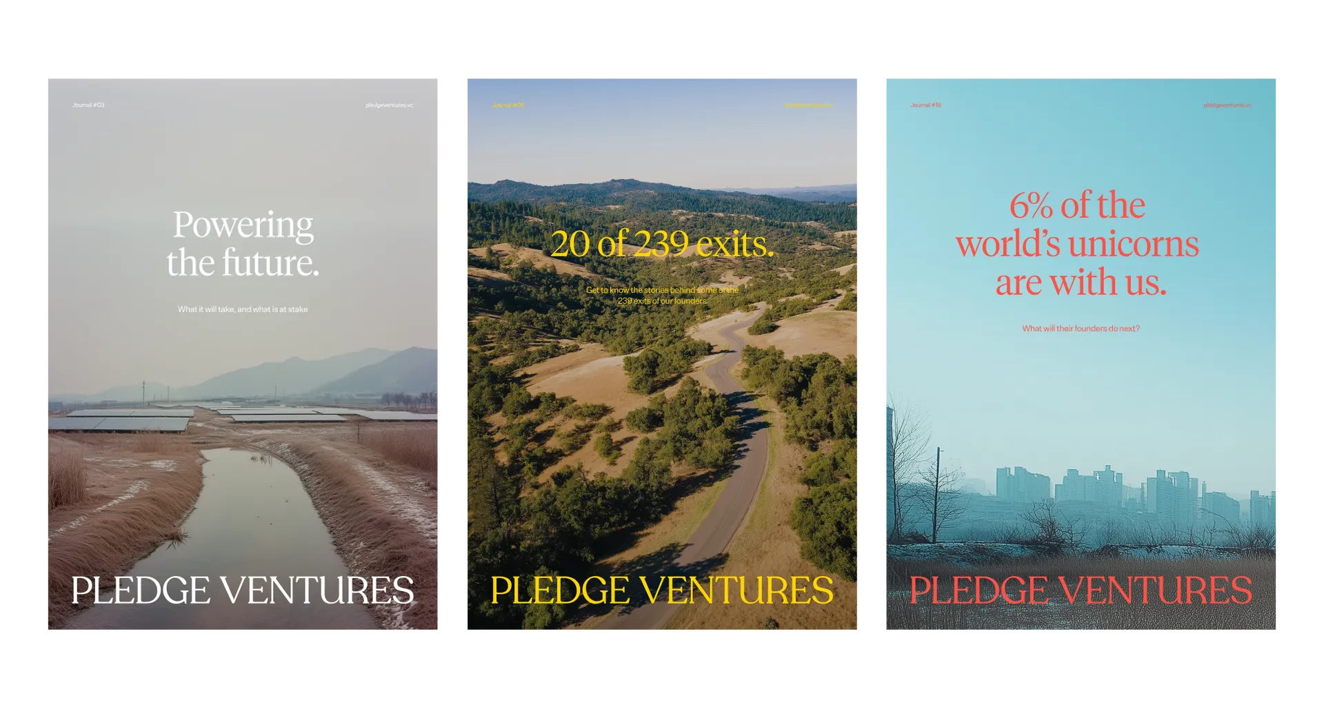
We selected a sharp typographic approach that would set Pledge Ventures apart as a fund with higher quality dealflow and more rigorous, rules based investment standards. A rare choice in the VC space, the high quality serif evokes perceptions of trustworthy publishing and editorial integrity. The use of paragraph rules and hairlines further emphasises this perception.
The typographic approach is exemplified in the custom wordmark, which can be displayed horizontally or stacked dependent on available space.
Continuing to build a position as an insightful, trustworthy, new kind of investment firm, we employed a colour strategy used by financial newspapers from the late 1800s. Back then, the unexpected salmon-pink, contrasted with stark black ink, created an extremely legible and pleasant reading experience that quickly became synonymous with trustworthy financial and business expertise. We wanted to recreate this experience and its associated values for Pledge Ventures.
Imagery for the brand feels utopian and yet realistic, celebrating the effortless integration of technology to our everyday life. Be it computing, AI, mobile technology or transport, the technology Pledge Ventures invests in is shown with people and nature, serving them. The colour grading and depth of field evoke a utopian dreaminess, a sense of optimism in tomorrow. A gentle glow, with no harsh light, is accompanied by muted blacks to soften the overall image. A pastel colour palette enhances the dreamlike quality. For the team portraits, we carried out a day shoot to ensure this soft, optimistic quality was carried through to the photography of Pledge’s people.
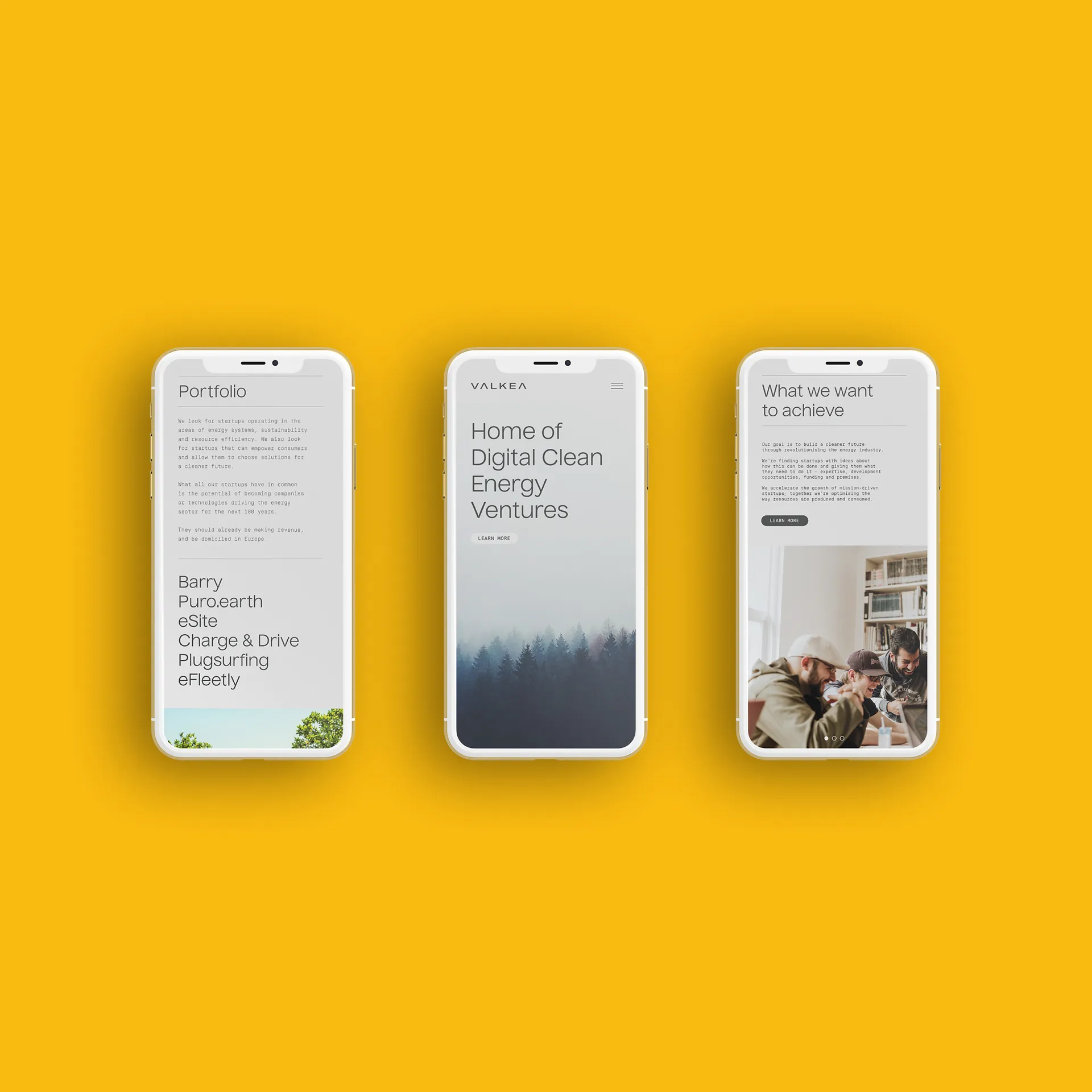
After the initial branding project, we created a simple yet impactful web design, and updated the fund’s deck and other documents to showcase the new brand.

