Before we designed the brand identity, our first task was to name the company. We began with the concept of a palindrome: a name that would read the same forwards and backwards, embodying the circularity the platform had been built to facilitate. Reviver meets this aesthetic brief while also resonating semantically: the platform connects used plastic to those willing to give it a new life. Suitable for global audiences, the significance of the prefix ‘re-’ meaning ‘again’ immediately associates it with recycling and reusing, while ‘vive’ connotes life in many Latin based languages.
The neo-grotesque typeface selection has personality and yet remains as versatile as plastic, while a monospace typeface feels technical even as it reinforces the theme of flowing forms, with quirky ligatures that join one line to another. We advised Reviver’s inhouse design team as they brought the brand home to the trading platform, ensuring all aspects worked across the UI.
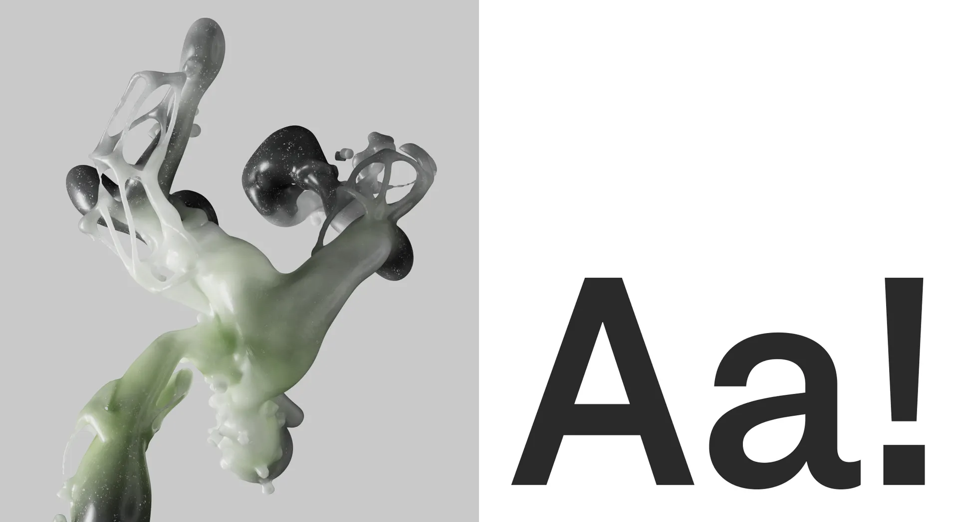


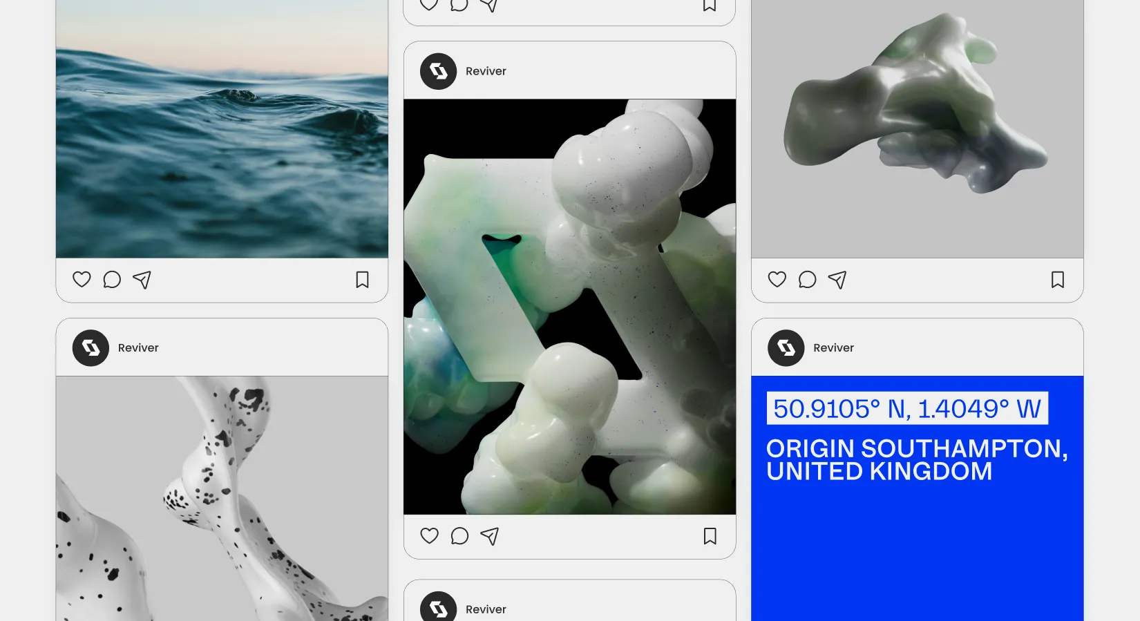
Creating unique and ownable imagery was central to making a brand that felt inspirational and new. The shared mental image of plastic waste is a depressing collage of discarded and dirty bottles polluting oceans, or else transparent bags tangled in nature, ghosts of consumer waste haunting the natural world. This is not the kind of material Reviver deals with — the platform instead tackles industrial plastic waste such as piping. Aside from that, we wanted to focus not on illustrating the waste itself but instead on its transformation.
Our render imagery celebrates the exciting potential of plastic; the properties it was invented for in the first place — namely its malleability. We depict the material as fluid and changeable, ready to take on a new form. This avoids limiting the imagery to representing only one kind of plastic waste — rather it leaves space for the imagination to supply what might be transformed next, and what new life might be awaiting it.


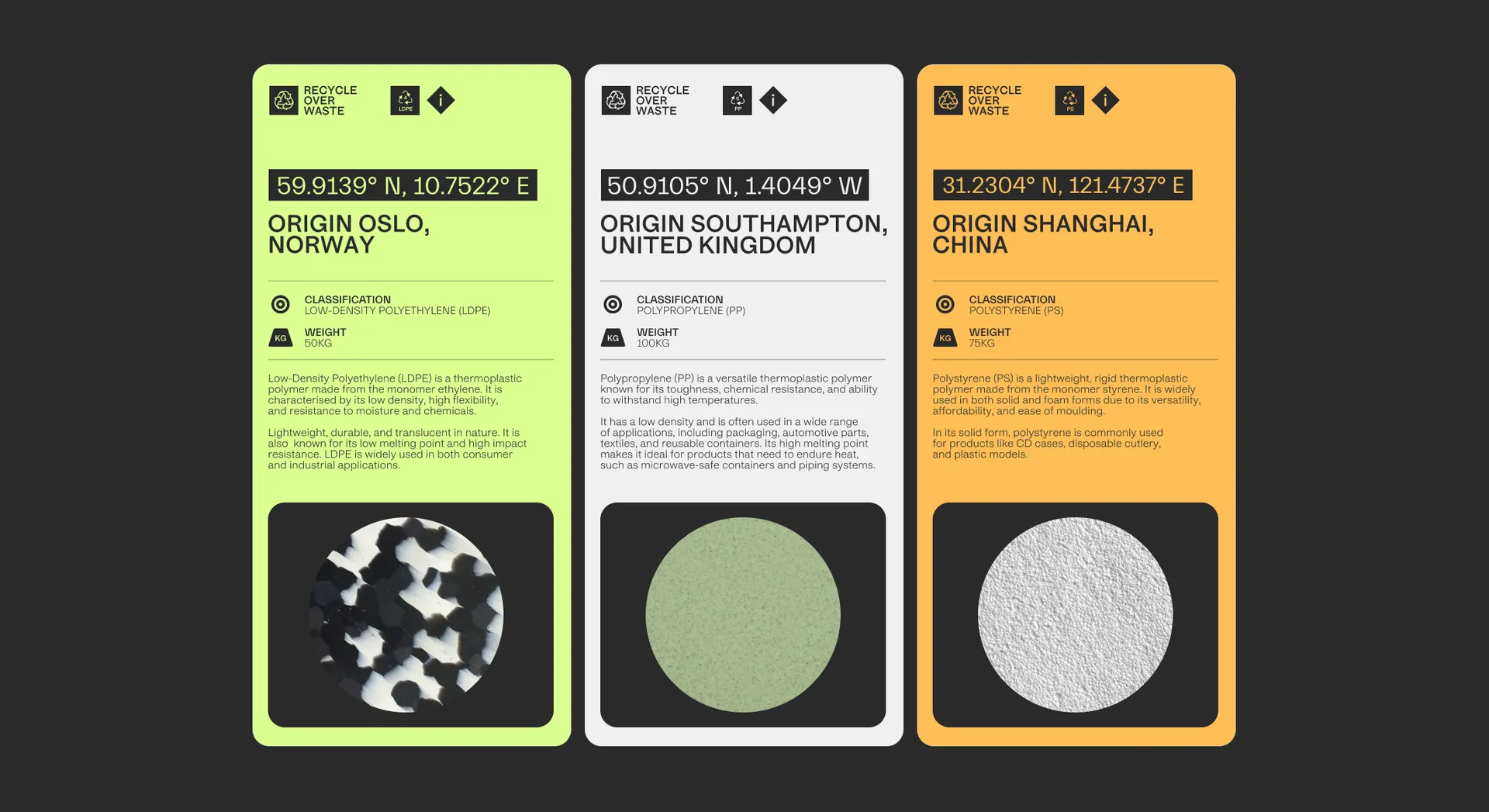
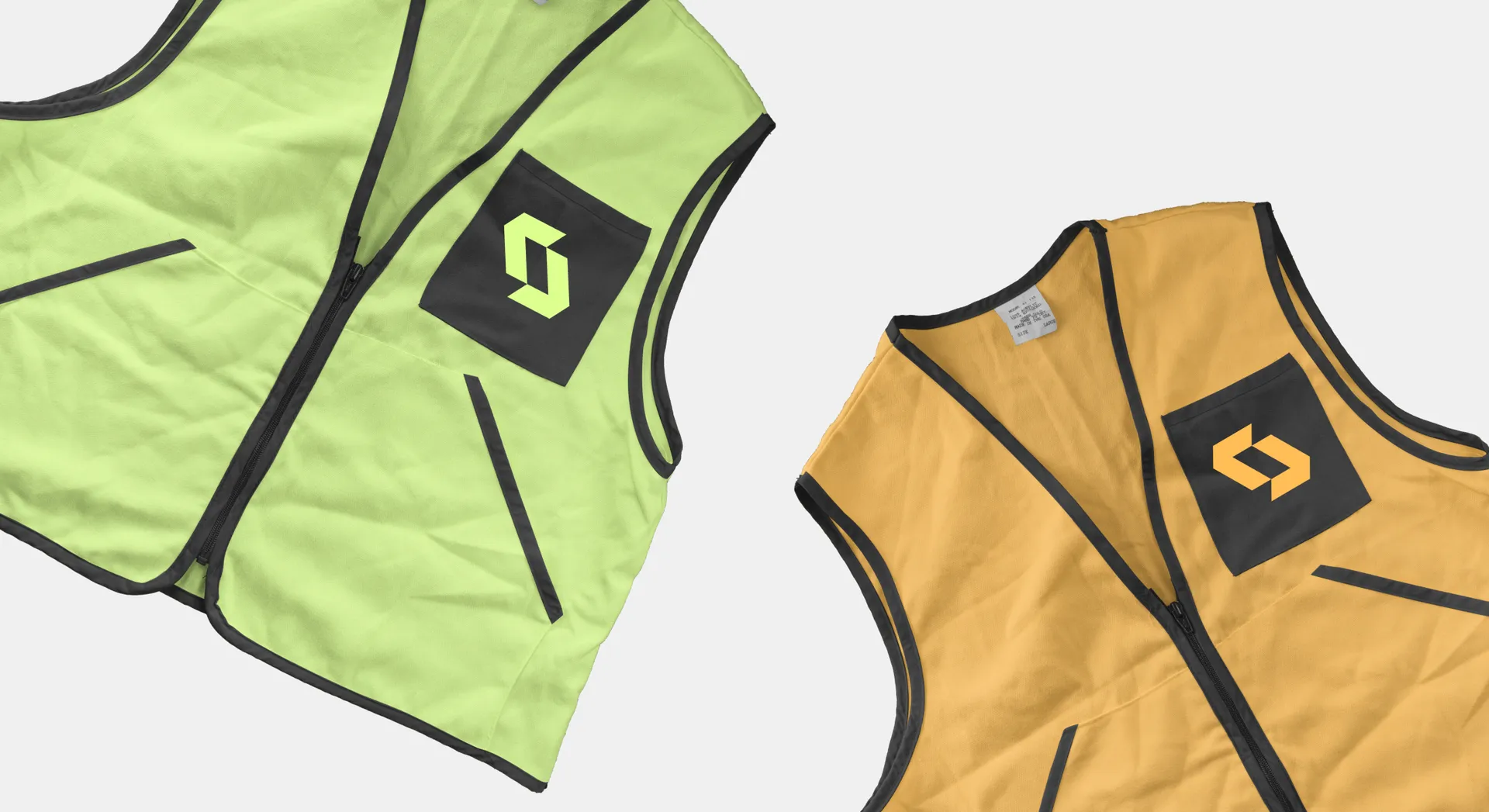
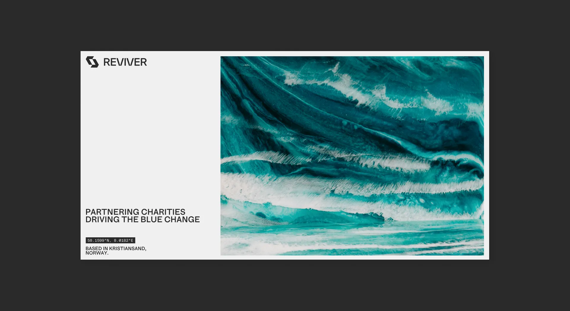
A bright colourway is inspired by ocean life — that which Reviver contributes toward saving not only by providing a marketplace for plastic in some cases recycled from the sea, but by funding charities who study, clean, and protect the oceans. At the same time they translate well to industrial settings, their brightness well suited to high visibility safetywear. These colours continue the theme of transformation as they flow into one another to produce captivating gradients.