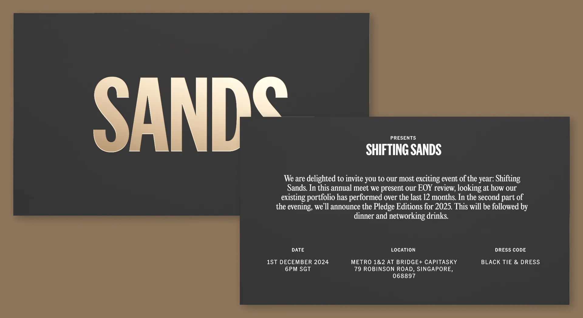
The name provided a perfect metaphor for the team’s investment approach: free to transform, with the movement created by a majority of individual parts. We created shifting sand animations that could be used alone and instantly associated with the brand.
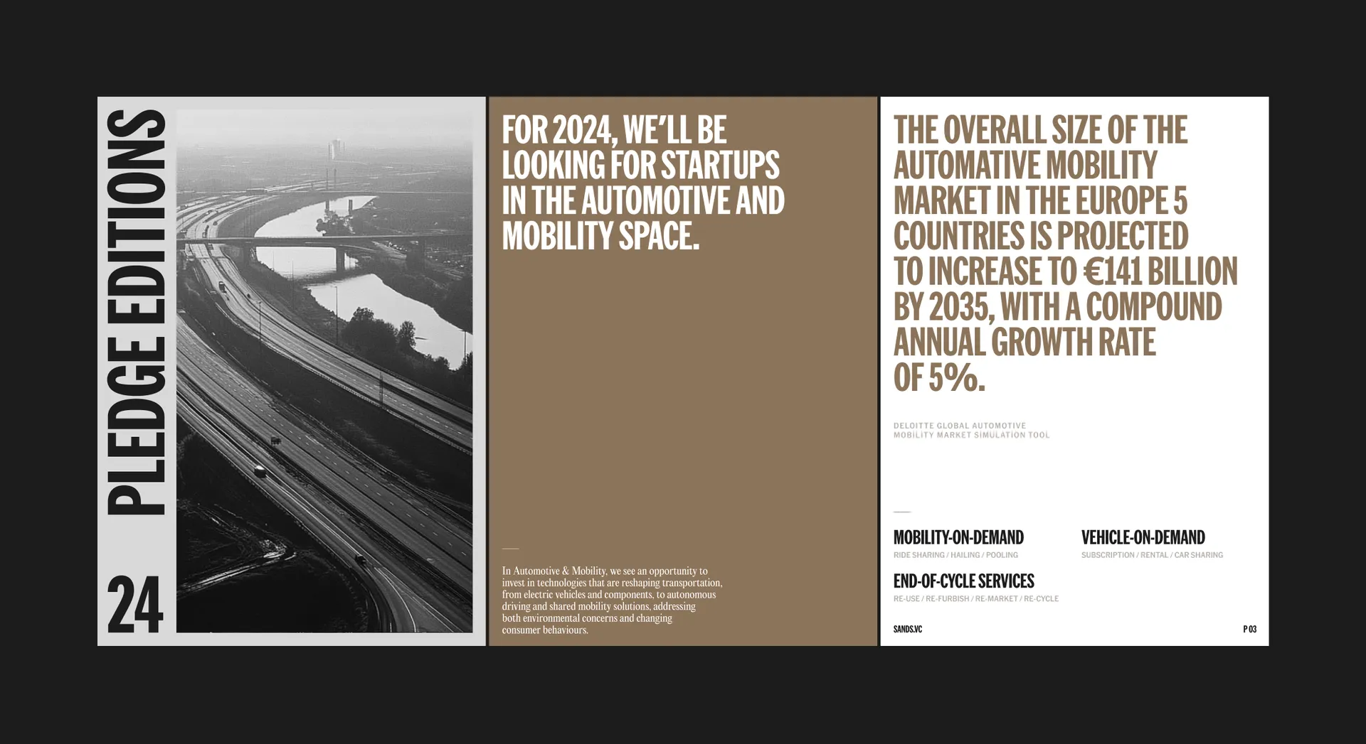
This reflects that, unlike VC funds, SANDS are not tied to a thesis for a decade. Instead, their unique Pledge Editions model allows for shifts in focus, adapting to new discoveries, market changes and the ever developing expertise of members.

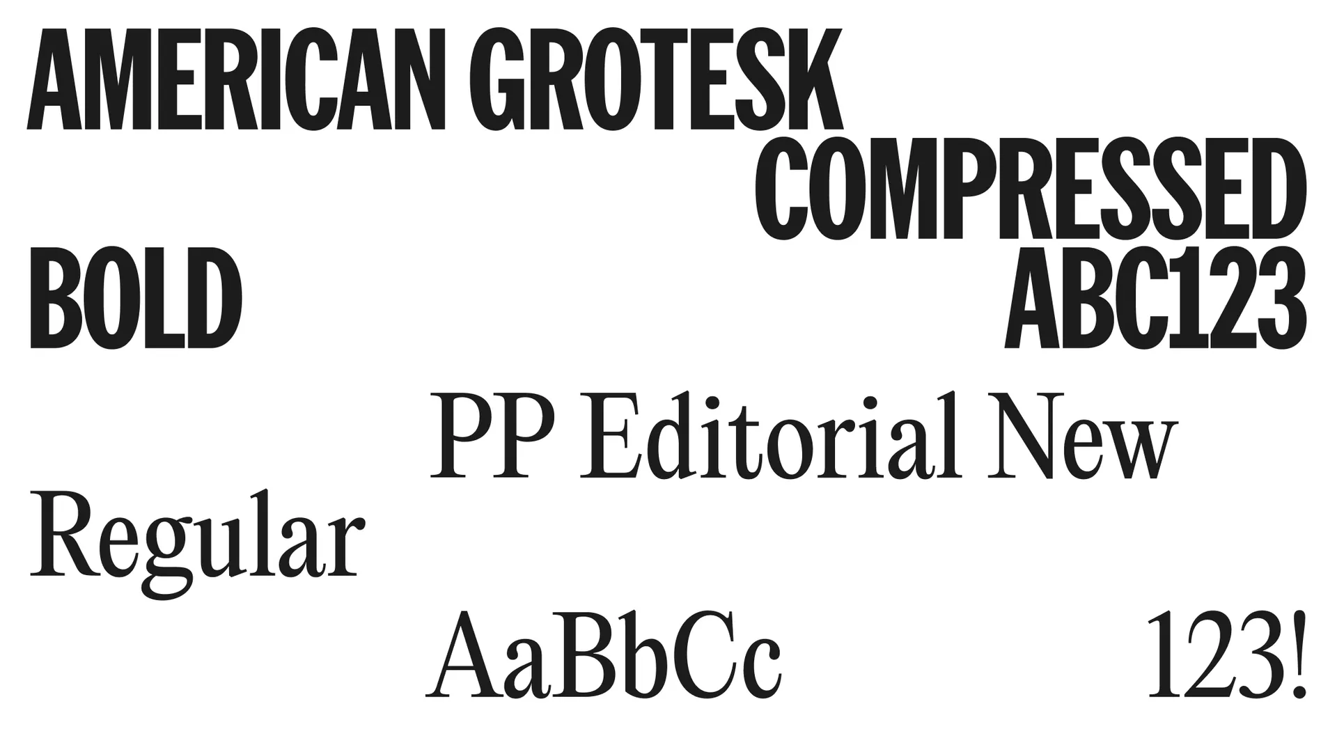
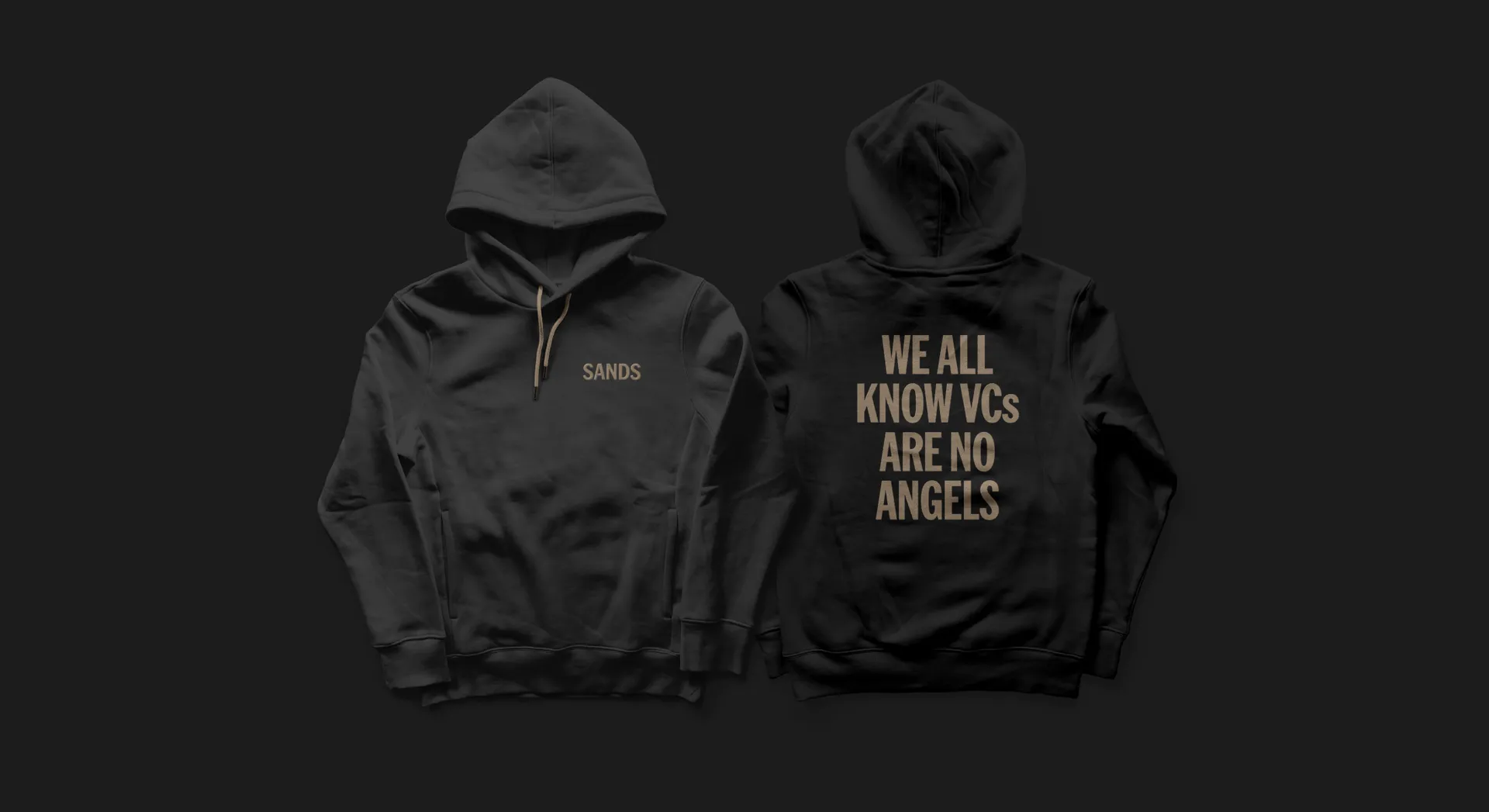
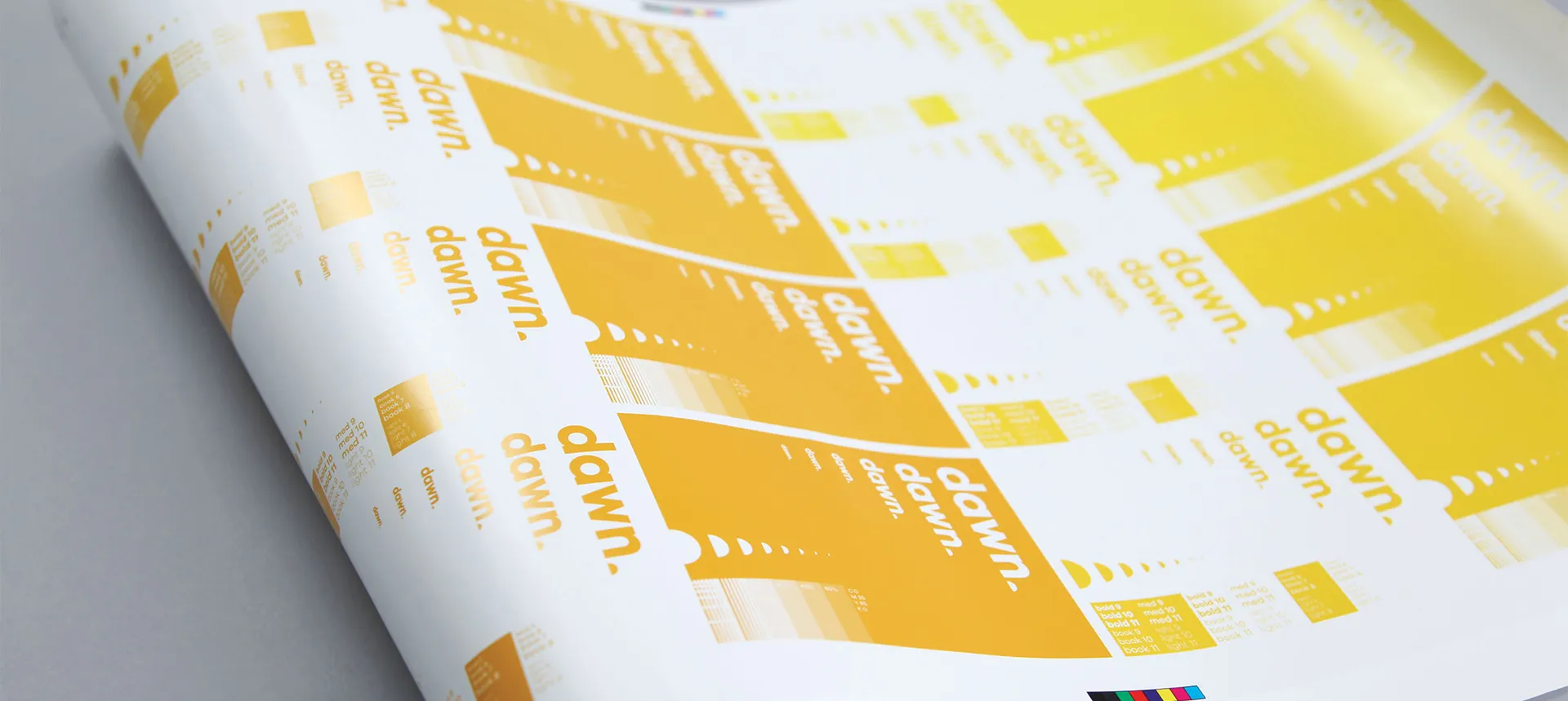
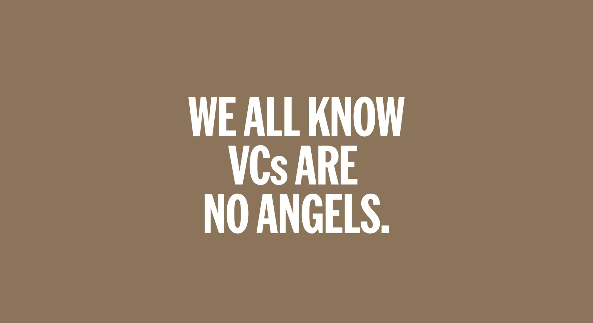
We created a bold message to headline this difference and appeal to potential members and founders alike. We all know VCs are no Angels. SANDS combines the flexibility of an Angel Investment Club with the access and benefits of a VC fund, all without a 10-year commitment. The brand’s headline typeface, American Grotesk by Klim, symbolises the collective’s unique ‘East meets West’ angle. From Yoko Ono to mecha films, American condensed grotesks have fascinated Asian designers. Similarly, condensed serifs used in Asia have caught the eye of progressive designers in the West.
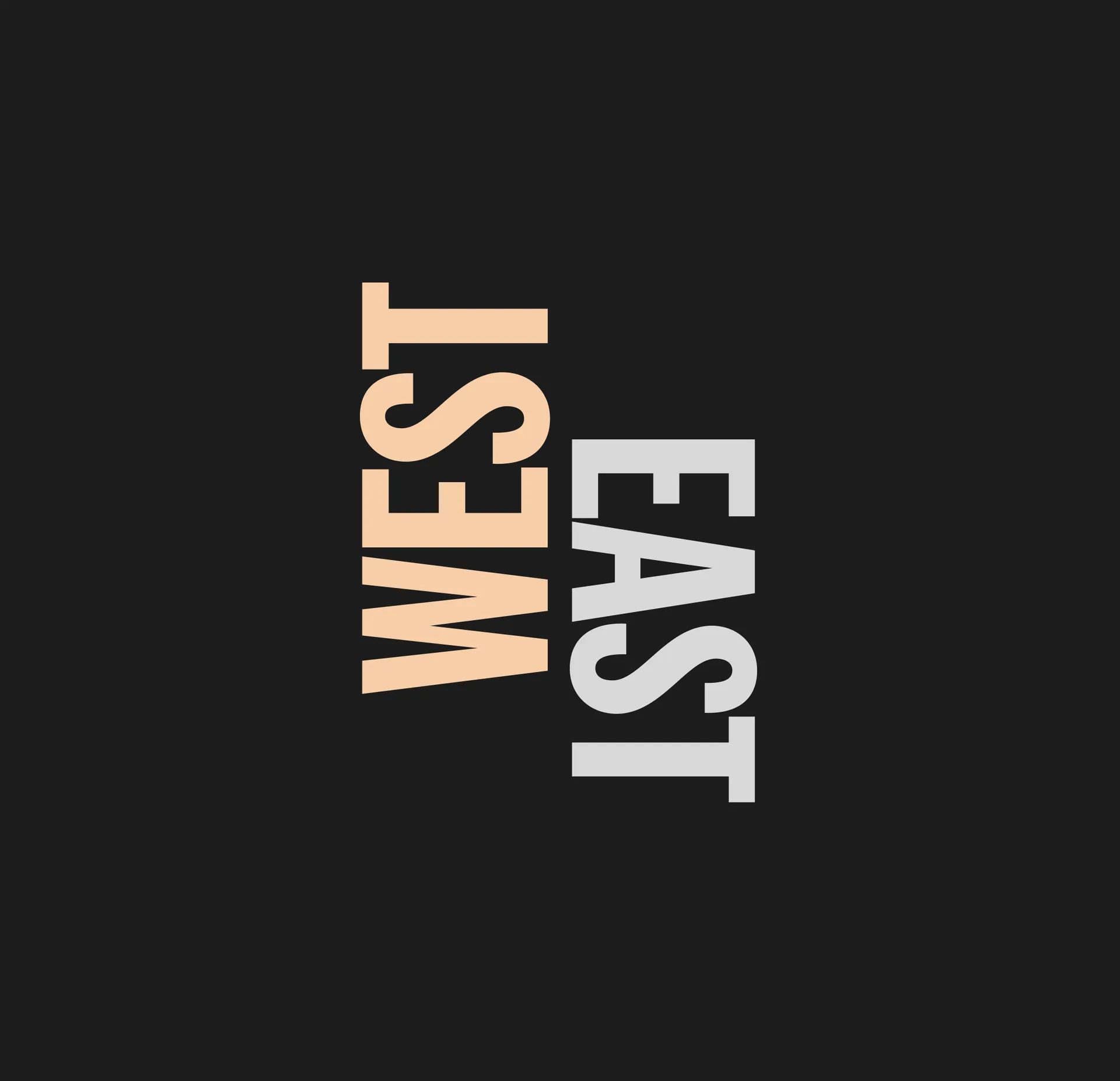
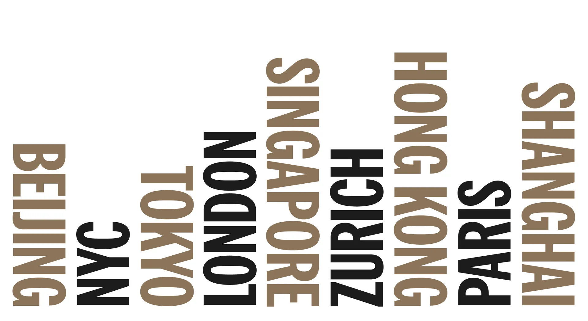
In block capitals, we communicate the locations of SANDS’ members, with the orientation of the name reflecting on which side of the Europe-Asia bridge they sit. To complement the headline typeface, Editorial New by Pangram Pangram was selected for body copy — an elegant narrow serif that adds a rich and contemporary feel.
Drawing inspiration from the name, led by a sandy gold. In creating anything meaningful, capital is a necessary component; for investors it is the primary reason for funding new technology. We leaned into a sheen of gold for the signature colour — as rare in VC branding as it is in the real world.
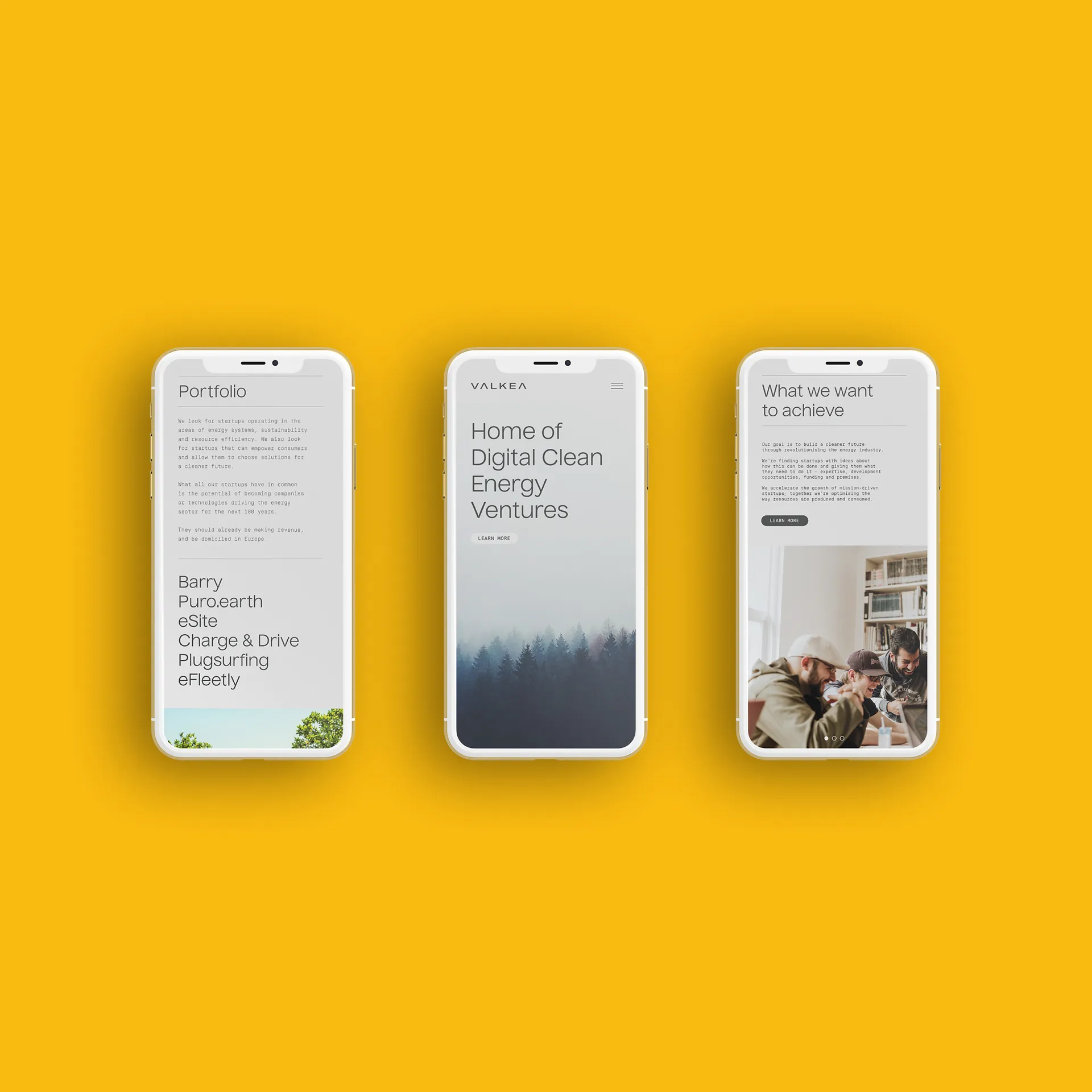
The gold is sparingly and stylishly applied, never tacky or opulent — just a touch of elegance. The subtle metal is paired with black and white, for a strong look with a contrast as bold as the team’s approach. We applied the brand to a revitalised website for the collective, helping new startup founders find fast access to smart capital.
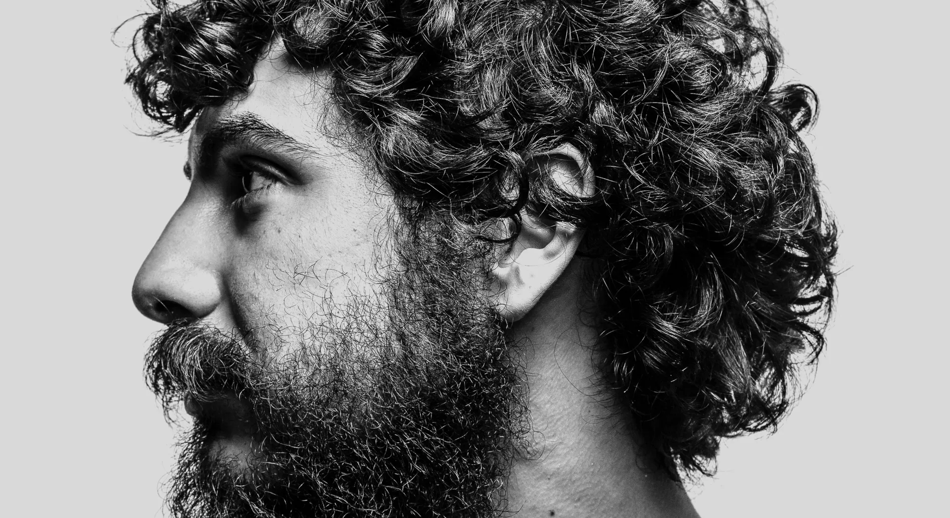
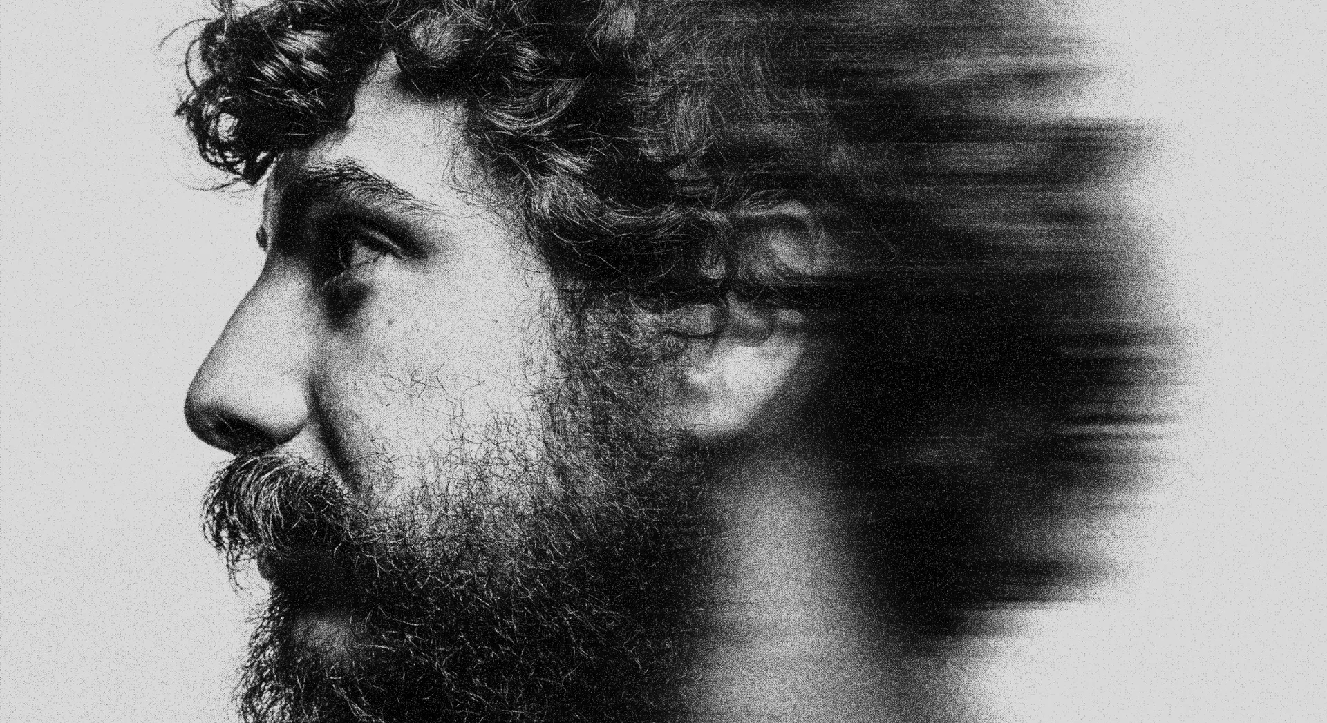
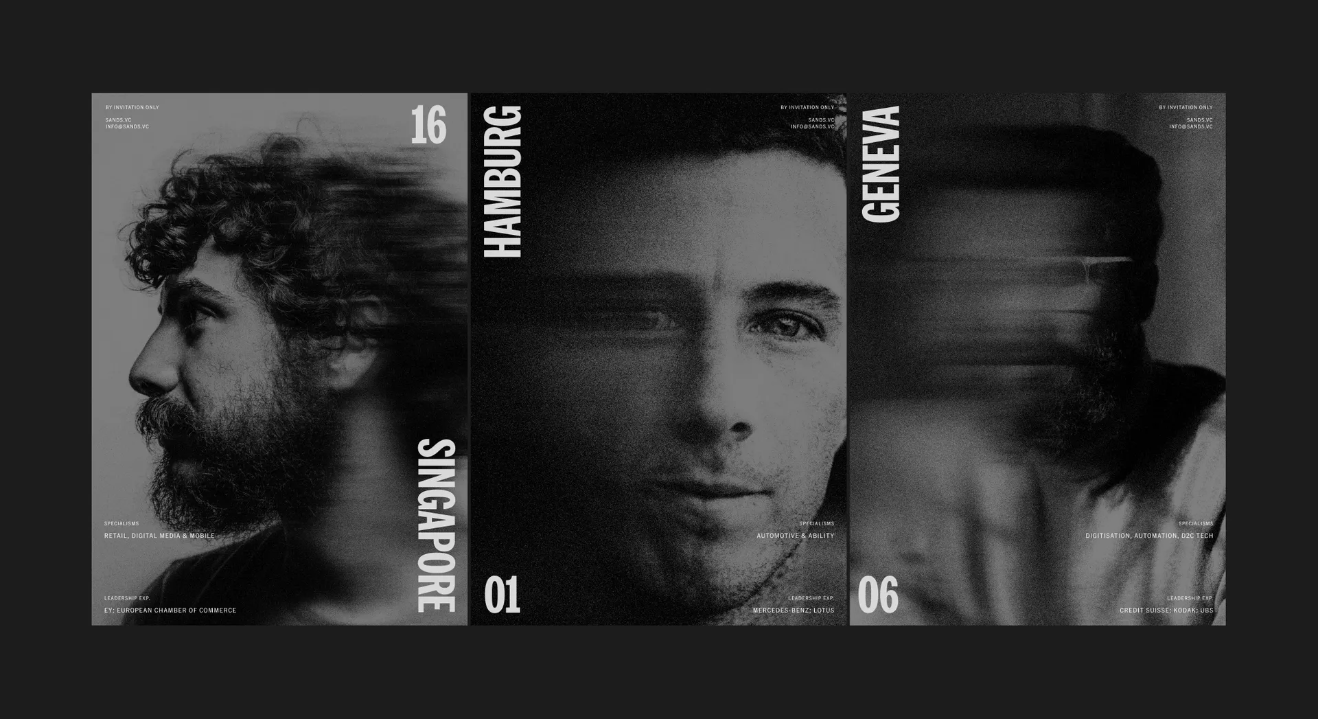
The sand motif found a further usage case in portraiture. Blurring the features of each subject, the grainy treatment allowed us to build out profiles that revealed the impressive expertise, geographical coverage and specialisms of the members, all while protecting their privacy.
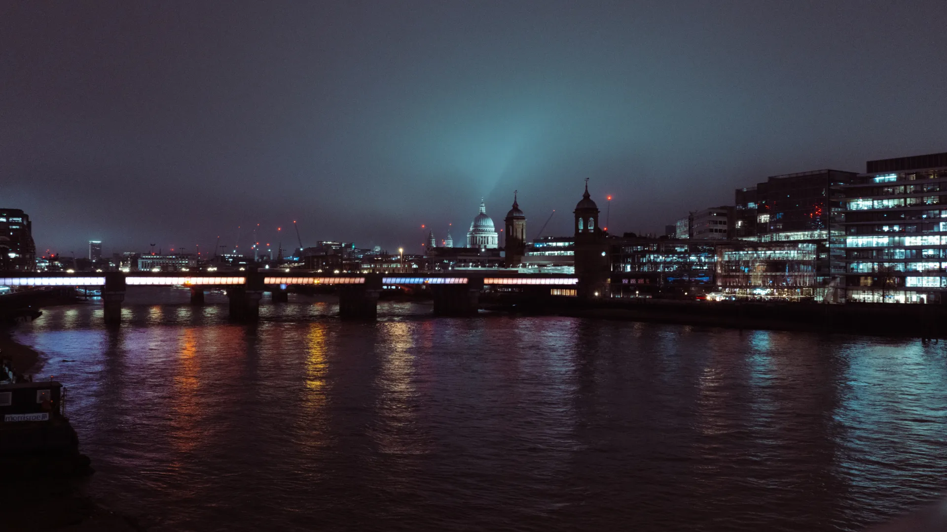
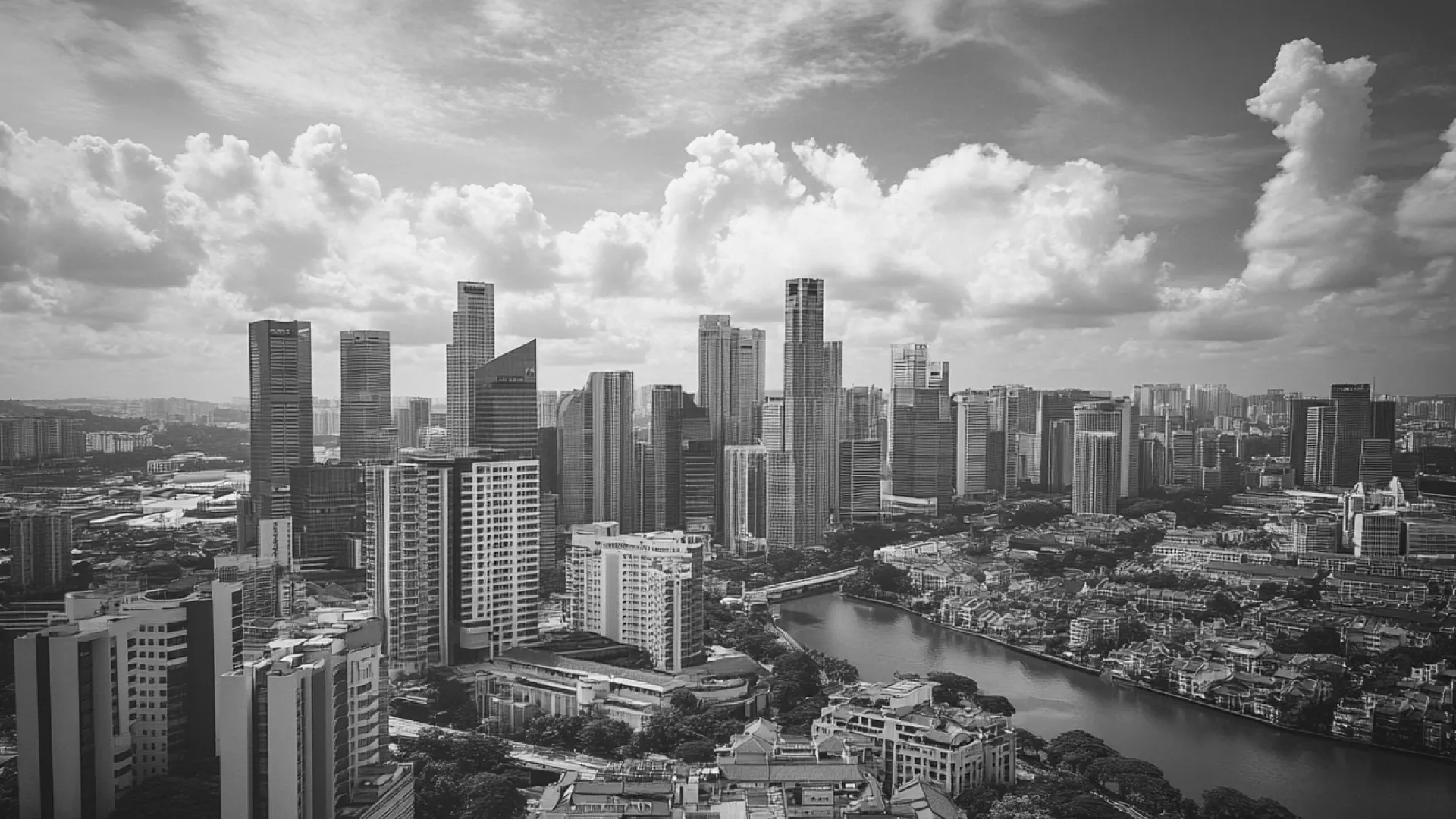
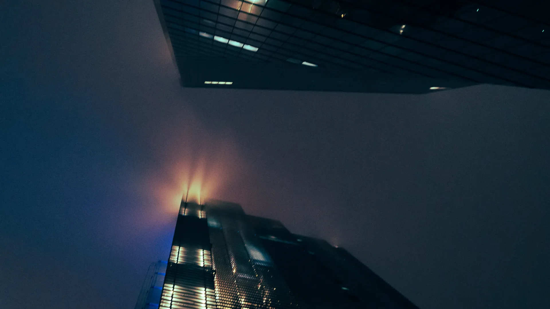
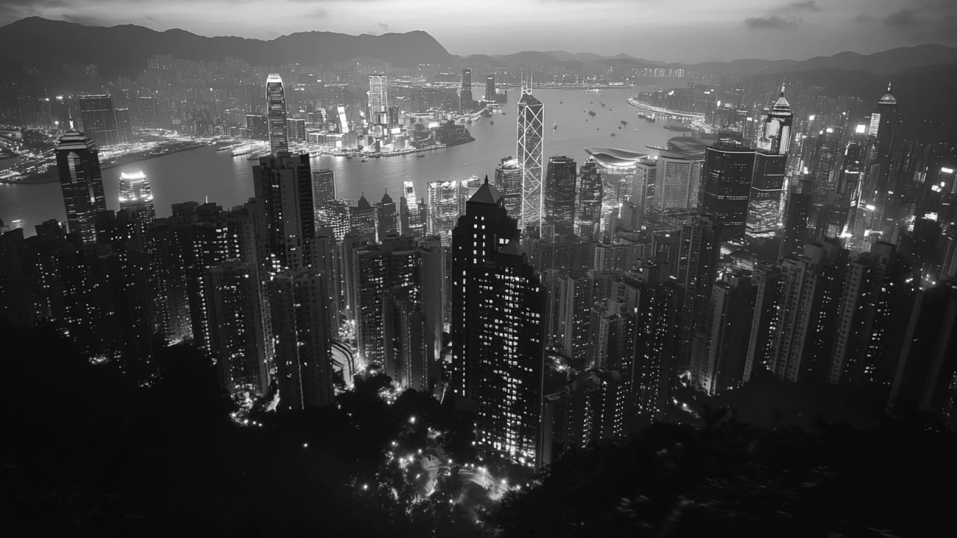
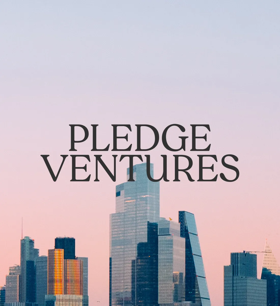
With hubs in Finland, Germany, Switzerland, Singapore and Hong Kong, it was important that we communicated SANDS’ unique reach. Aerial shots of their iconic locations provided a crucial backdrop to the brand assets. These showcase the greatest possible scope of the city to illustrate the team’s broad perspective, while their aspirational feel reinforces the exclusivity of the collective, capped at 75 members.