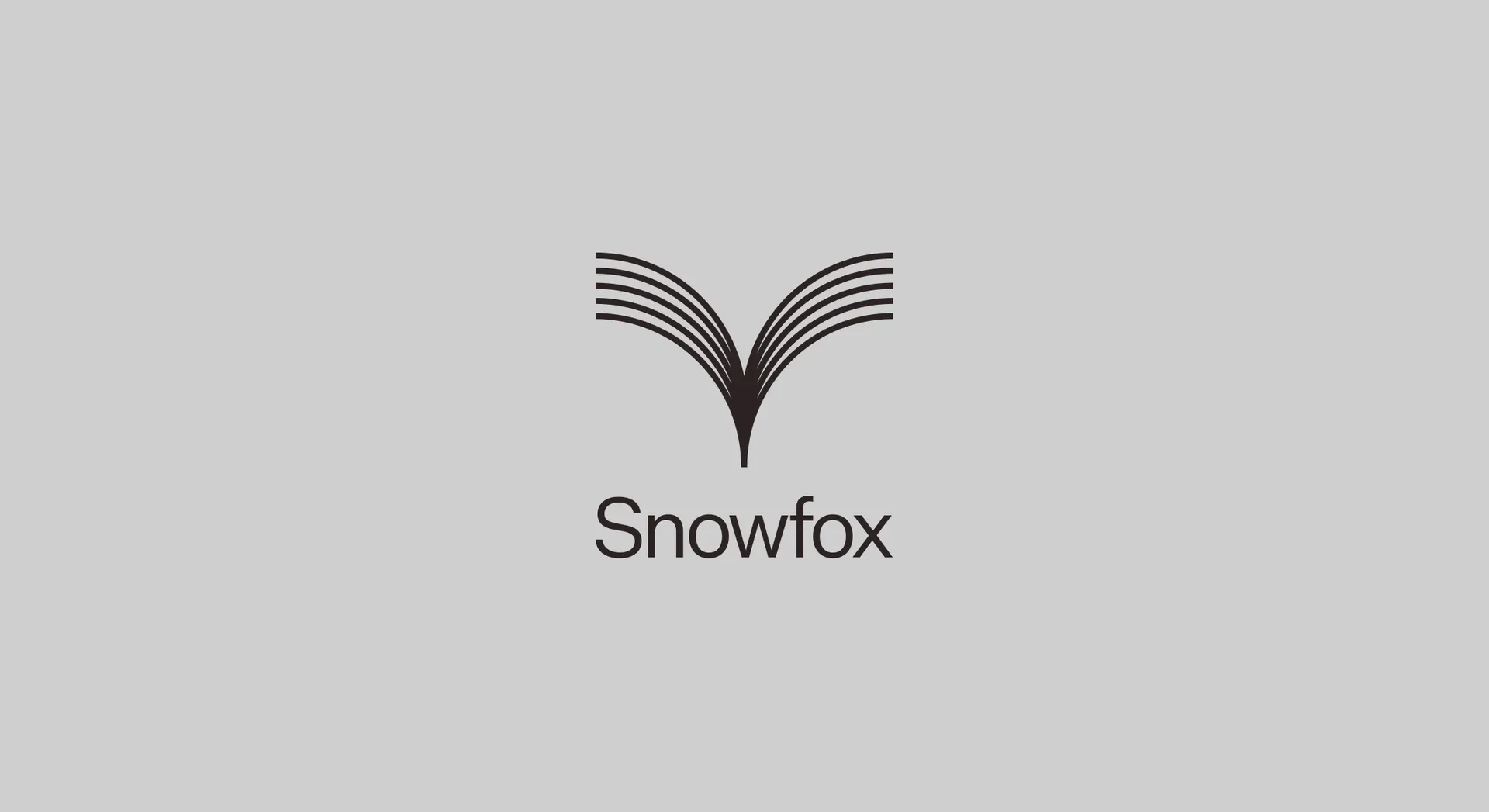
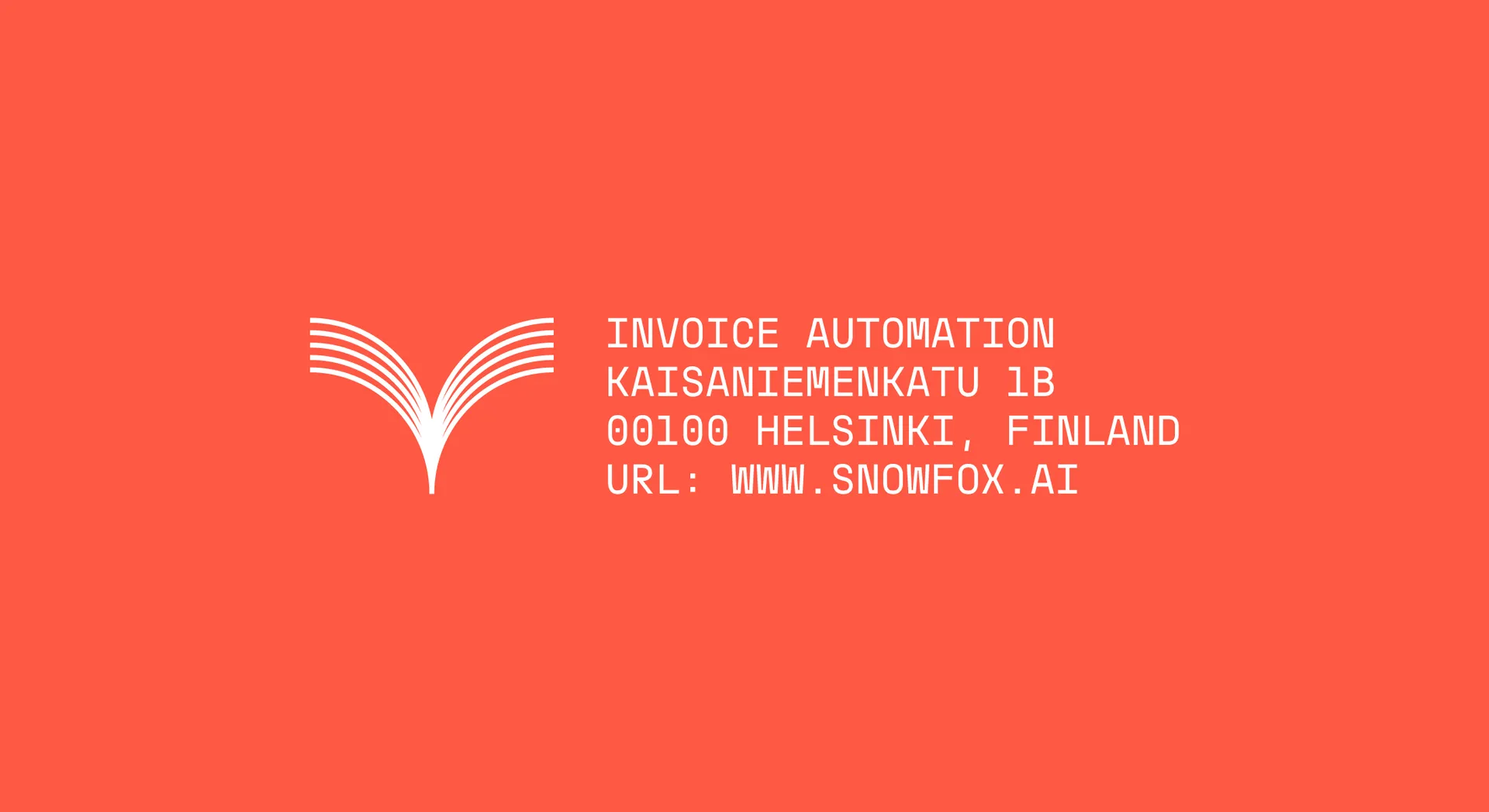
The mark manifests the simplicity and elegance from which the rest of the identity flows. It illustrates Snowfox’s ability to instantly pinpoint a disparate set of data and channel that in to an immediate course of action. Thin lines allude to the software’s precision and accuracy, while the bespokely drawn wordmark the symbol locks up to is a Sans Serif that has been crafted to feel approachable yet professional — like the customer service the company prides itself upon.
Key to the identity is the constellation brand device. Like the mark, this articulates the value add of speed and precision that Snowfox bring to their customers. Animated, we see it drawing the data into itself where it can be processed — unlike other invoice automation tools, Snowfox doesn’t rely on rules input by humans, but rather acts based on its own vast intelligence.

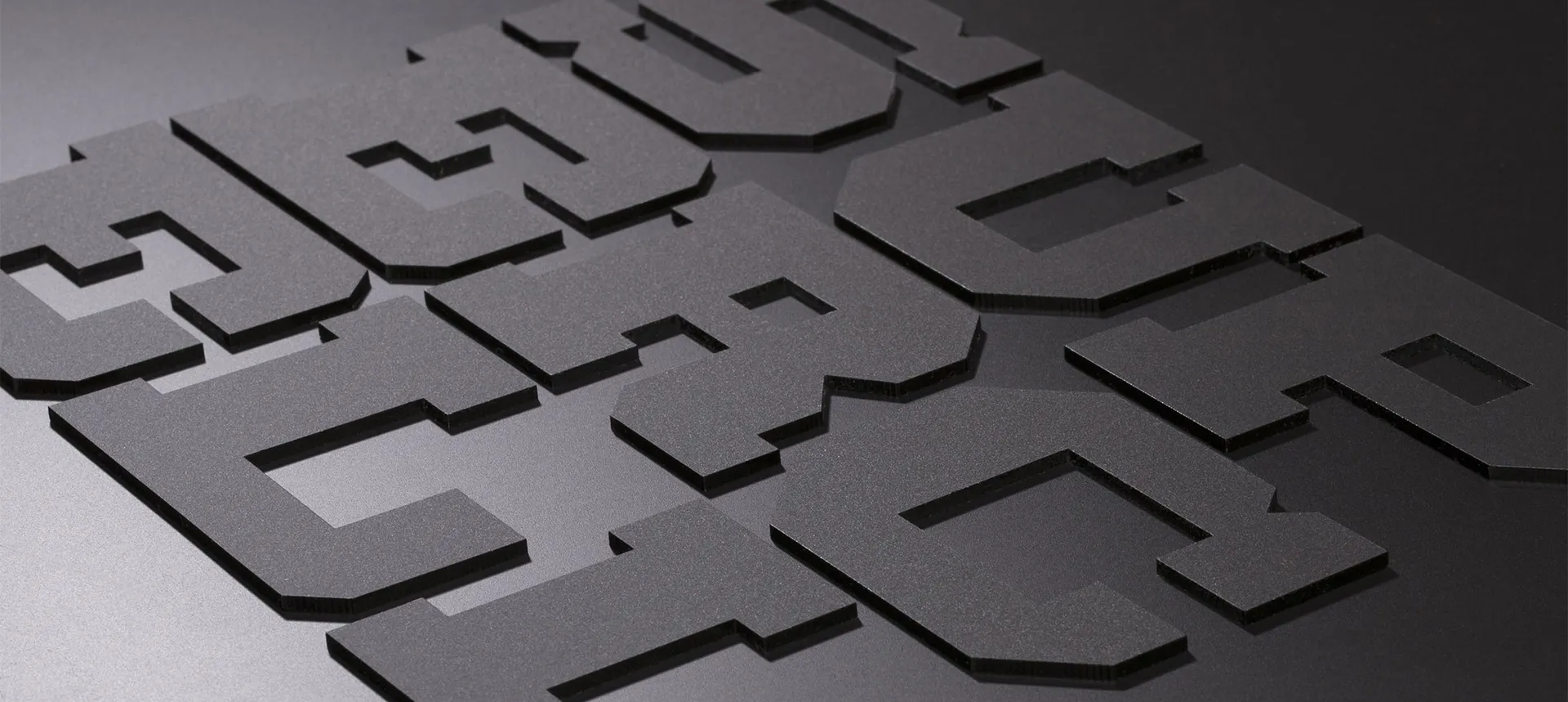
Snowfox utilises Proxy Mono to make a striking display of key data. This typeface was newly created at Proxy — Snowfox, true industry disruptors, are the first company to license it.
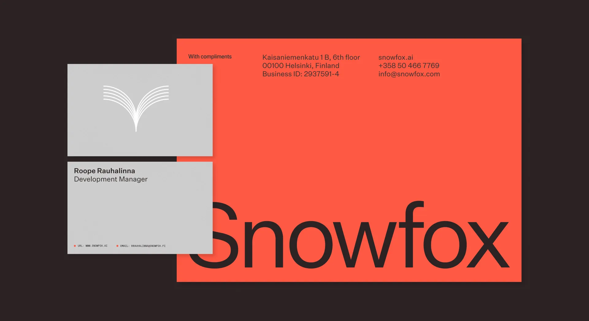
Proxy Mono is paired with Klim's Swiss style grotesk, Untitled Sans, to create a sense of cutting edge reliability. The type adheres to a grid system to evoke the feeling of invisible organisation, alluding to the promise of Snowfox’s offering.
The unexpected colour palette is led by a warm red, associating the brand to other trusted institutions that offer important services, such as postal companies or fire brigades. This is accompanied by neutral tones, predominantly monochrome, to reinforce the elegance and simplicity at the heart of the brand. We worked with Snowfox’s UI team to create a secondary palette for functional use across report charts and the digital platform itself.
The dance between AI tools like Snowfox and the humans they work alongside is the future of the workplace. They make up a ‘super human’ workforce, where inhuman speed and accuracy is combined with very human customer service, for simple and efficient processes. Simplicity is beautiful. Efficiency is elegant. The brand assets come together across Snowfox's digital world to wordlessly communicate these tenets to a global audience.

