In preparation for their launch, Primasun approached us to create a new brand that would allow the company to become a thought leader in the sleep space.
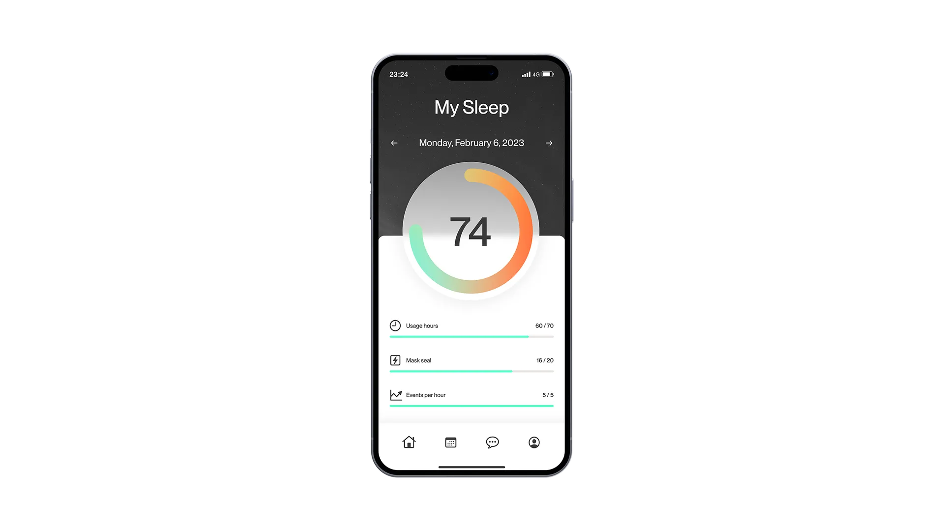
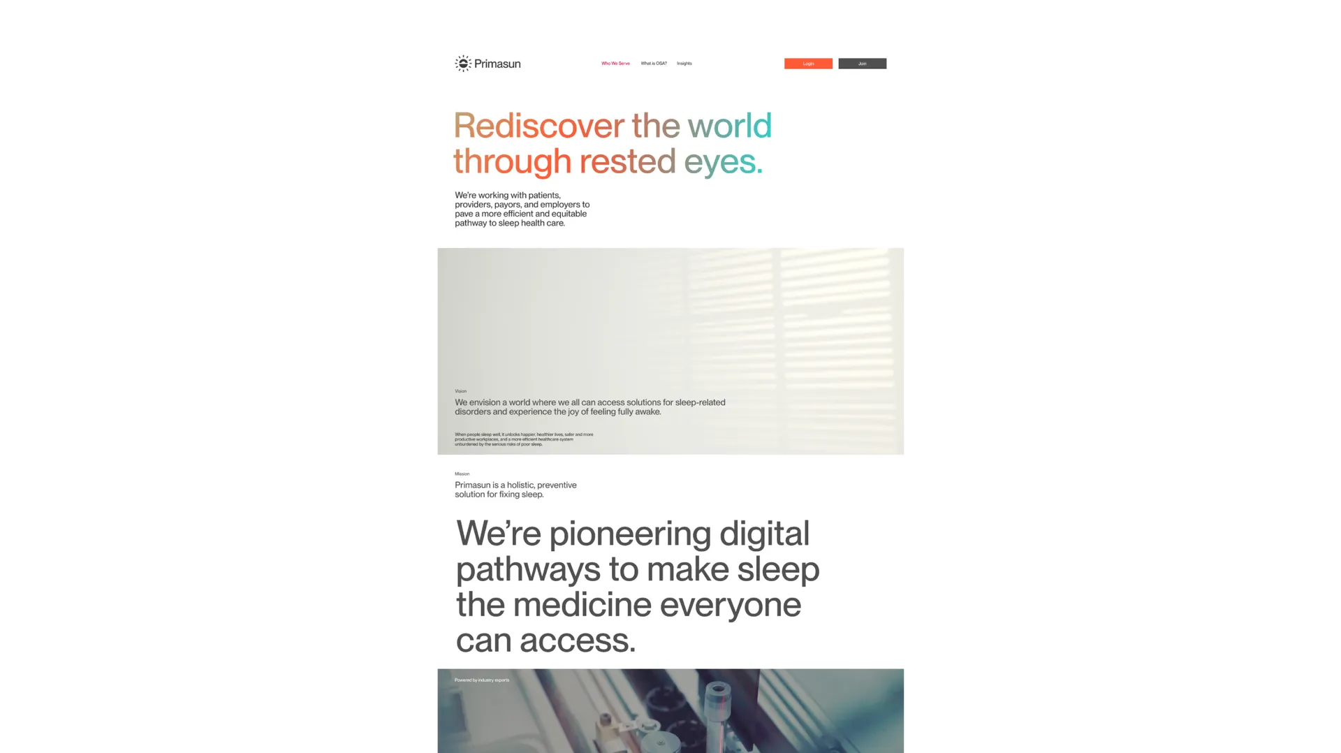
We started the brand positioning work by articulating a simple brand story that galvanises everything Primasun does. Instead of tracking sleep or analysing sleep, the role of the Primasun brand is Fixing sleep.
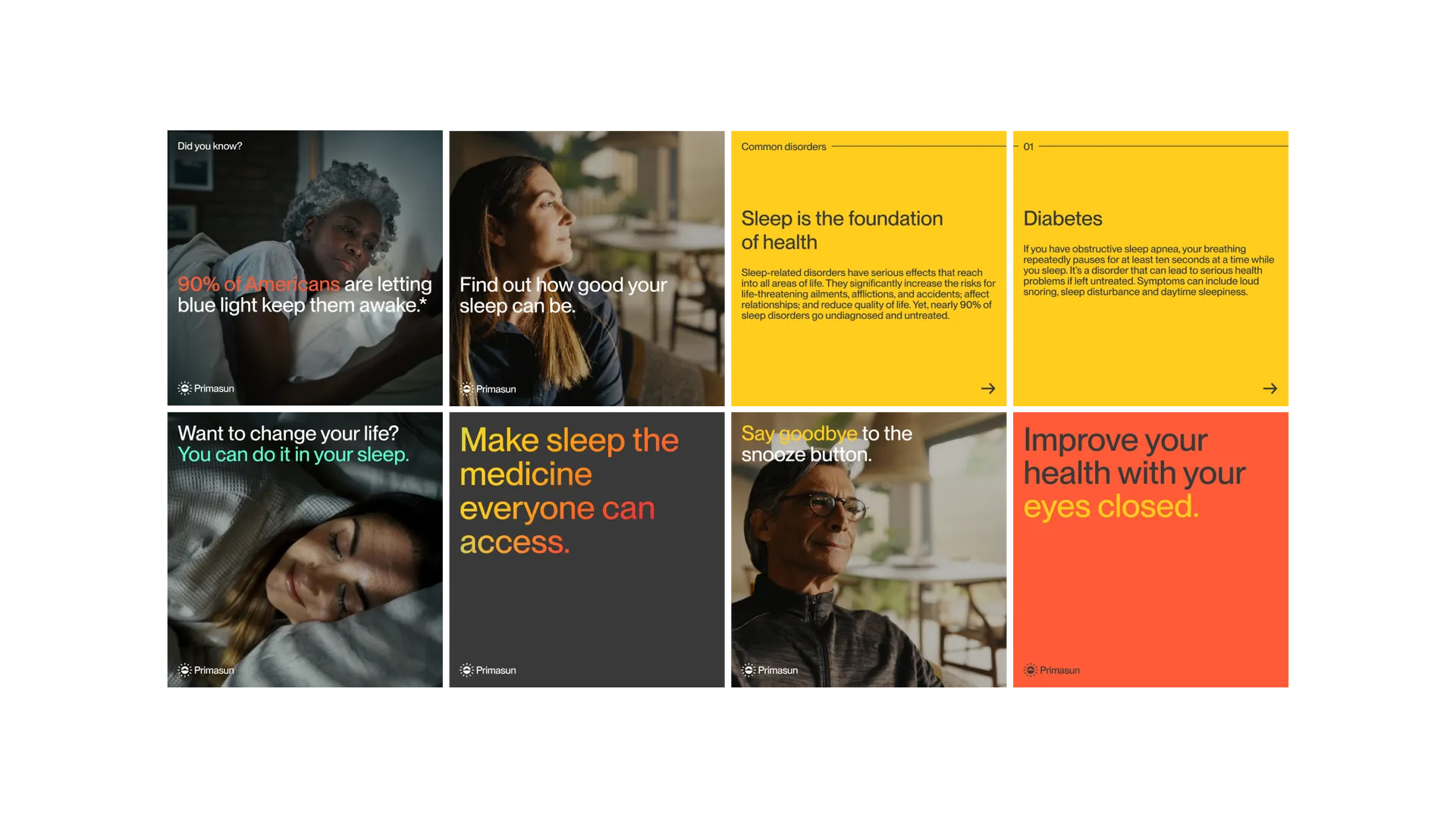
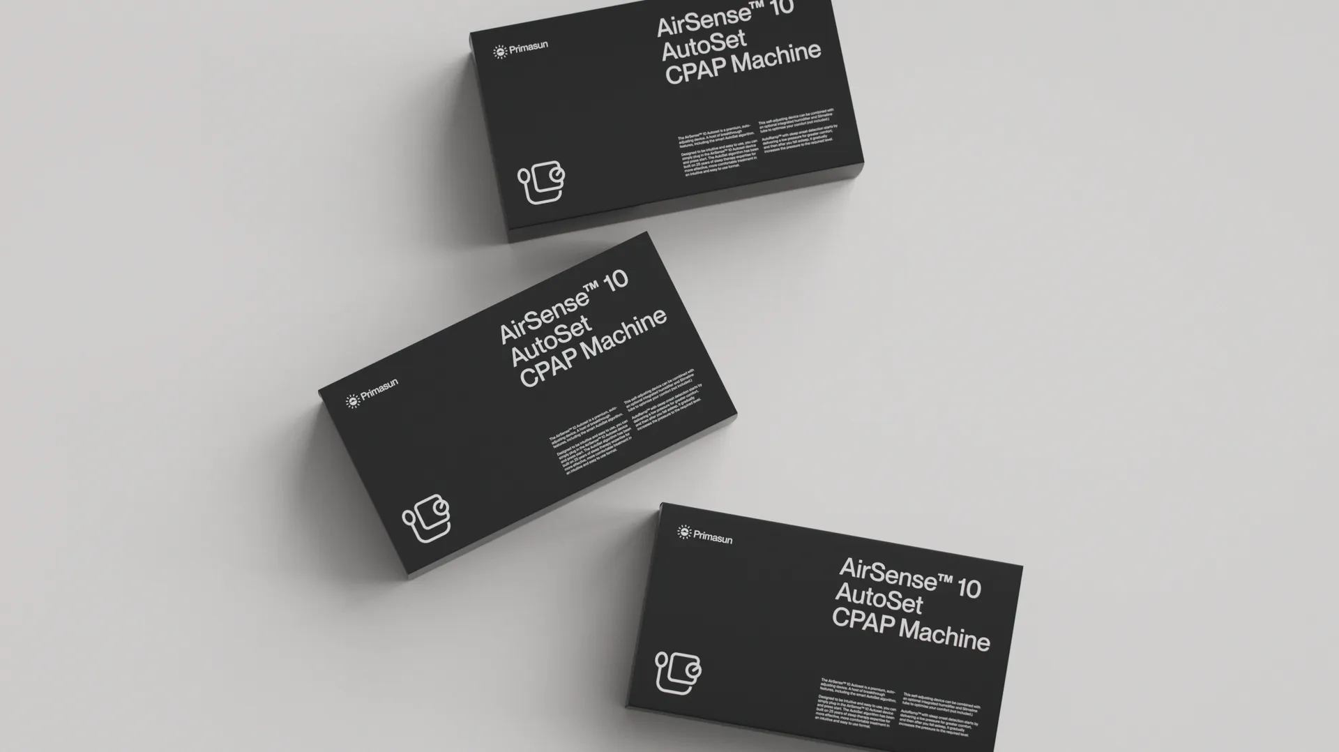
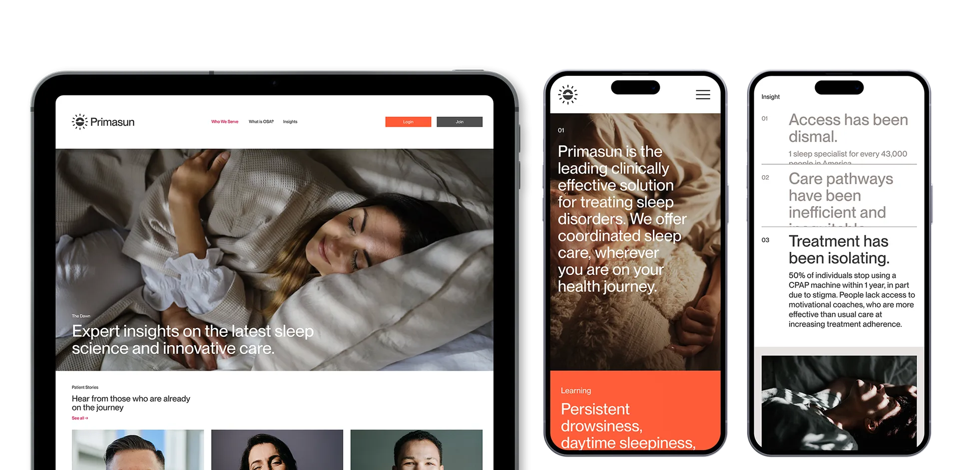
With direction to retain the sun inspired mark from the legacy identity, our design intent was to develop around this a credible, vibrant brand that confidently positions itself as the next chapter of sleep. Rather than sleep, the design focuses — like the original mark — on the outcome: feeling fresh. We created a new brand identity that would feel scientific and clinically credible, positioning sleep as the medicine everyone can access.

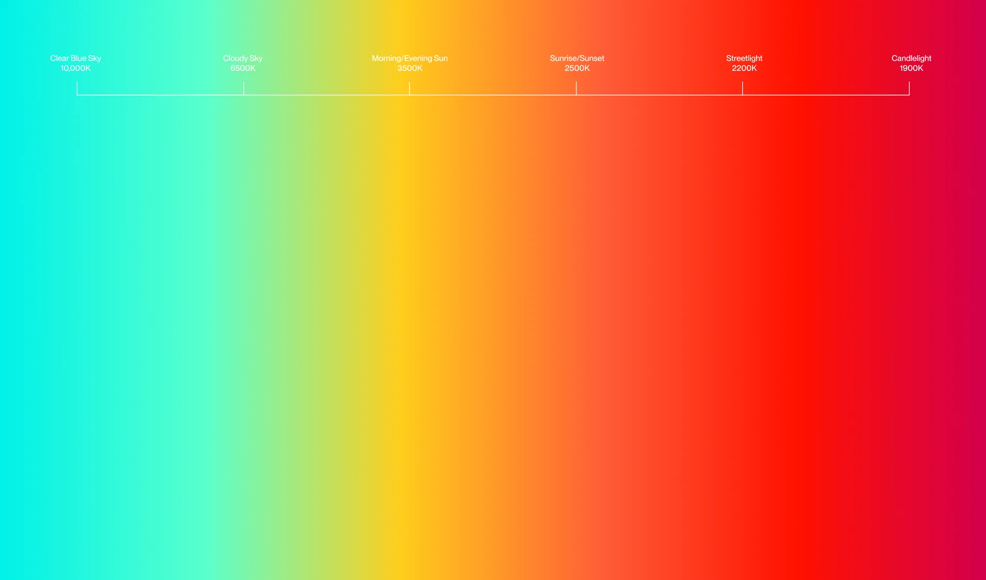
The Primasun colour palette is inspired by the Kelvin scale, which is a unit of measurement used to describe the temperature of a colour.
Our accent palette takes the naming conventions of this scale. Since Clear Blue Sky and Sunrise/Sunset have the most positive connotations to a restful sleep, these are our two main highlight colours.
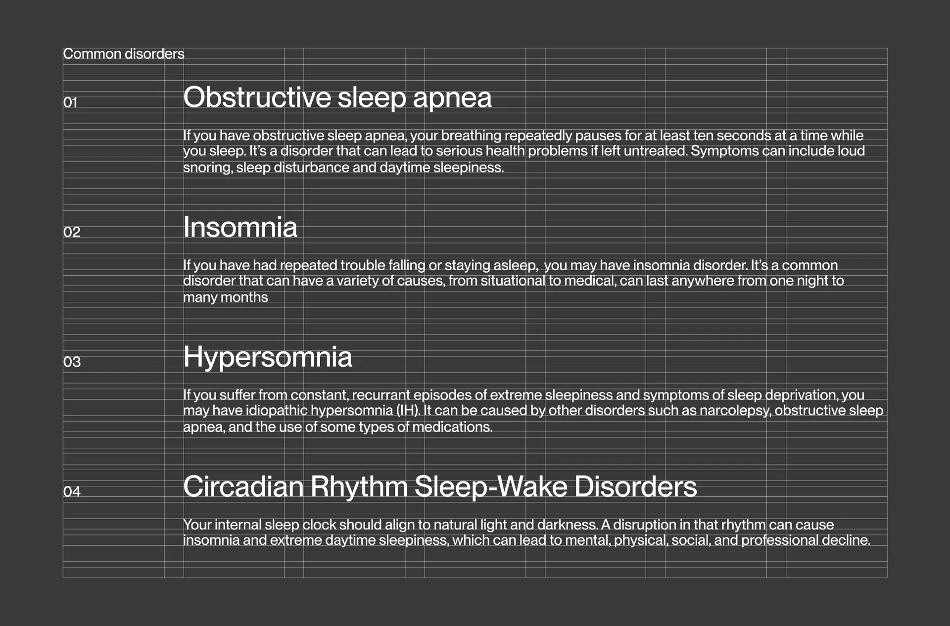
One of the three goals for the visual identity was to appear trustworthy. The entire identity is constructed around one weight, set in a common grid system, using modulations in size to create a comprehensive typographic hierarchy. The wordmark is set in the same typeface, and dynamically lit. This minimalistic approach creates a strength and visual consistency that is just as much a strategic choice as it is a practical one.
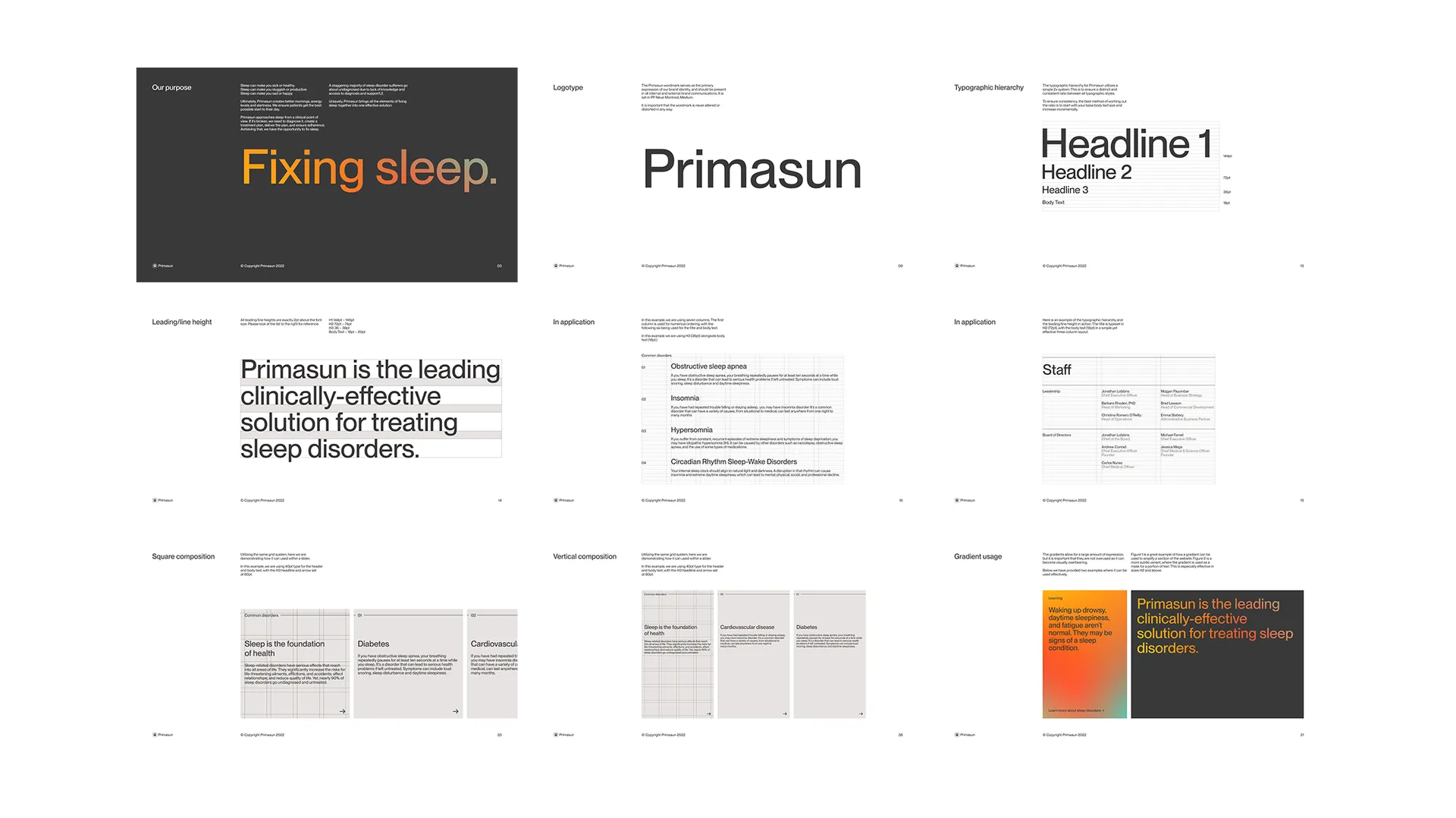
Most of the touchpoints for Primasun are in motion. Website, app, tradeshows, social media — all benefit from an identity that is designed for motion. We created a lighting environment and a gradient system that can be in perpetual motion, like the light of the day.
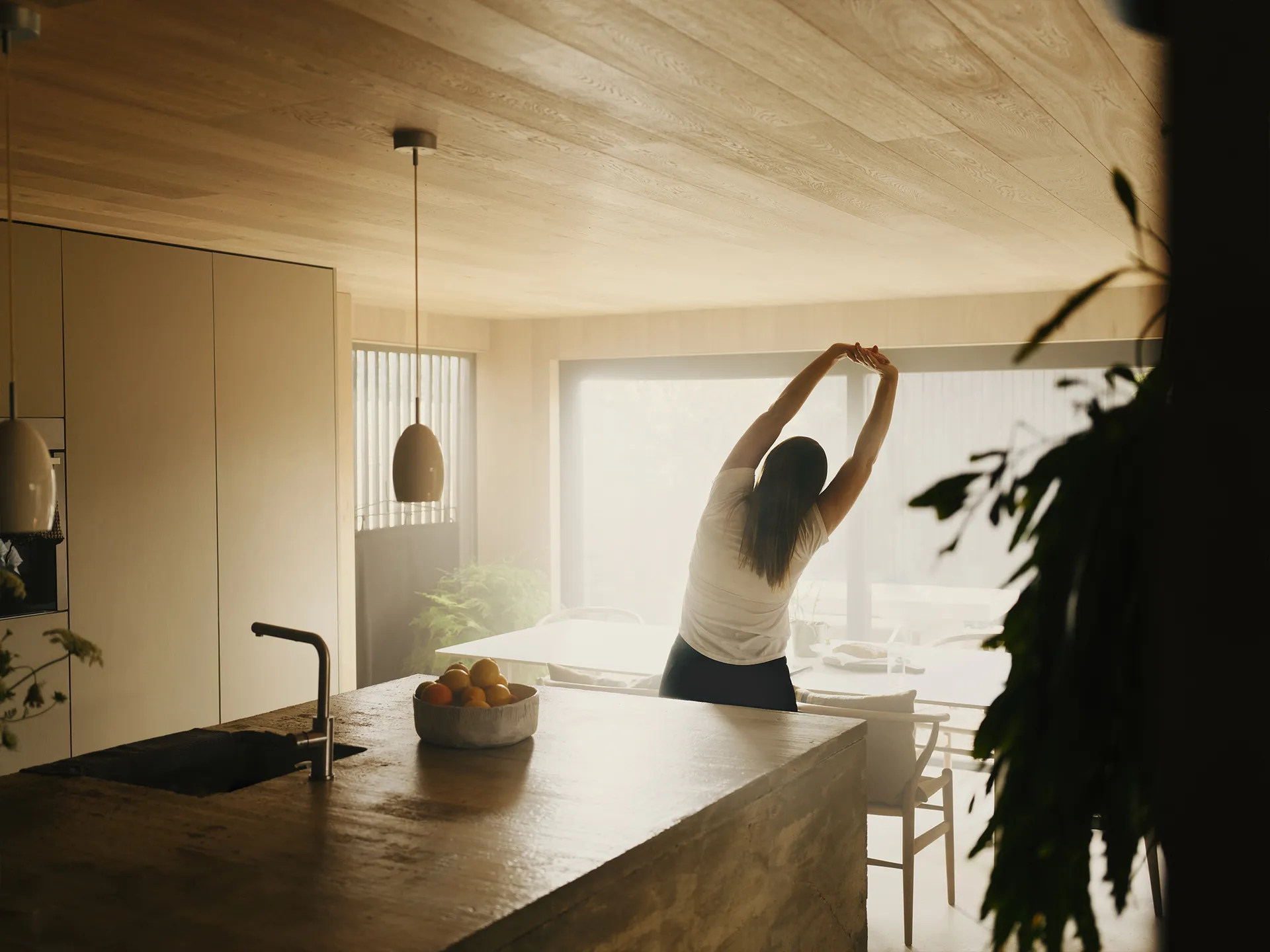
We art directed two photoshoots for Primasun, collaborating with production house MDRN LOVE to create imagery that could be used across Primasun’s assets to associate the company with sleep and restfulness. Still and moving images captured warm morning light, with scenes that evoke a sense of calm, aspiration and a better day.


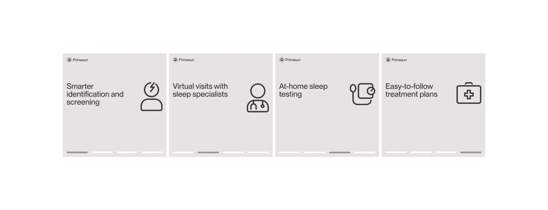
A crucial part of the project was creating assets that are immediately usable. A grid based system for marketing assets, both photographic and typographic, allows for rapid and continuous creation of content for various social channels. These were implemented by PACIFIC, Primasun's performance marketing agency.